The ROWCHARTAREA control allows you to arrange and visualize objects.
The following topics are covered below:
In this example, we will use the ROWCHARTAREA control to develop a very simple "FlowChart Modeller" step-by-step.
This is a large example with lots of Java code. However, you will notice that a large amount of the code is not unknown to you. Detailed explanations are provided in the sample code. Therefore, you should also take close a look at the comment sections in the sample code.
This example consists of the following steps:
We will first design the following layout which contains a ROWCHARTAREA control in which you can drop and arrange different icons.
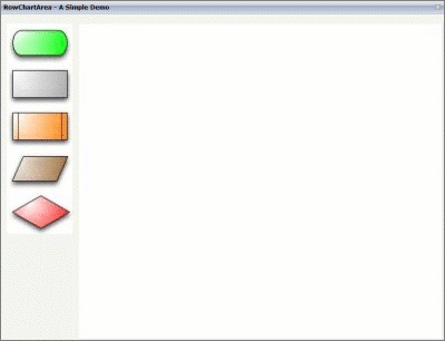
The XML layout definition is:
<pagebody takefullheight="true">
  <itr height="100%">
    <coltable0 width="110" takefullheight="true">
      <rowarea height="100%">
        <vdist></vdist>
        <itr>
          <dropicon image="../cisdemos/images/flowchart_01.jpg"
               draginfo="flow01">
          </dropicon>
        </itr>
        <itr>
          <dropicon image="../cisdemos/images/flowchart_02.jpg"
               draginfo="flow02">
          </dropicon>
        </itr>
    ...
    // Some more ‘Drop Icons’. Define them in the same way as above
    ...
        <vdist height="100%"></vdist>
      </rowarea>
    </coltable0>
    <coltable0 width="100%" takefullheight="true">
      <rowarea height="100%">
        <rowchartarea infoprop="chartareaprop" width="100%" height="100%"
         usegridlines="true" gridlinexdistance="50" gridlineydistance="50">
        </rowchartarea>
      </rowarea>
    </coltable0>
  </itr>
</pagebody>
The Java code of the adapter is:
public class RowChartAreaSimpleDemoAdapter
extends Adapter
{
  /**
   * Name of the adapter property
   * that represents the control on server side.
   * */
  public class RowChartArea extends CHARTAREAInfo
  {
    public RowChartArea() {}

    /**
     * This overwritten method is needed.
     * It takes control of what happens with
     * the dropped objects.
     * */
    public void reactOnDrop(String dropInfo, int xpos, int ypos)
    {
        // On drop, a new FlowChartItem is generated
        FlowChartItem fci = drawFlowChartItem(dropInfo, xpos, ypos);
        // and added to this RowChartArea property
        addChartAreaItem(fci);
    }
  }
  /**
   * This class represents the dropped and visualized items
   * inside the ROWCHARTAREA control.
   *  */
  public class FlowChartItem extends CHARTAREAItem
  {
    // ID for the item type (flowchart_01, flowchart_02, ...).
    int m_itemId;

    // Property for labeling the items.
    CHARTAREAItemText m_txtout = null;
    public CHARTAREAItemText getTxtout() { return m_txtout; }
    public void setTxtout(CHARTAREAItemText txtout)
    {  this.m_txtout = txtout;}

    // This rectangle is needed to show which item is selected
    CHARTAREAItemRect m_rect = null;
    public CHARTAREAItemRect getRect() { return m_rect; }
    public void setRect(CHARTAREAItemRect rect) { this.m_rect = rect; }

    public FlowChartItem(int x, int y, int width,
       int height, String dragIcon, int itemId)
    {
        super(x, y, width, height, dragIcon);
        m_itemId = itemId;
    }

    /**
     * reactOnSelection() and reactOnContextMenuRequest()
     * have to be implemented
     * We will have a closer look at these methods later.
     * */

    /** take care of ContextMenu for the FlowChartItems*/
    public void reactOnContextMenuRequest()
    {  }

    /** take care of what happens if this item is selected  */
    public void reactOnSelection(boolean shiftKey, boolean ctrlKey)
    {
      // save the info which item is last selected
      m_lastSelected = this;
    }
  }

  /**
   * generate a FlowChartItem
   * */
  private FlowChartItem drawFlowChartItem(String dropInfo, int xpos,
          int ypos)
  {
    FlowChartItem fci = null;
    String img = null;

    int itemID = new Integer(dropInfo.substring(dropInfo.length()-1,
                     dropInfo.length())).intValue();

    switch(itemID)
    {
    case 1:
        img = "images/flowchart_01.jpg";
        break;
    case 2:
        img = "images/flowchart_02.jpg";
        break;
    ...
    // some more icons if needed
    ...
    }

    // create a new FlowChartItem
    fci = new FlowChartItem(xpos, ypos, 120, 80,"../cisdemos/"+img,
             itemID);

    // if the object was successfully created, add an image
    if (fci != null)
      fci.addImage(5,5, 1,110,70, img);

    return fci;
    }

    /** Members */
    CHARTAREAInfo m_chartareaprop = new RowChartArea();
    public CHARTAREAInfo getChartareaprop() { return m_chartareaprop; }
    public void setChartareaprop(CHARTAREAInfo value)
     { m_chartareaprop = value; }

    // property that stores the information which item is the last selected
    FlowChartItem m_lastSelected = null;

    /** initialisation - called when creating this instance*/
    public void init()
    { }
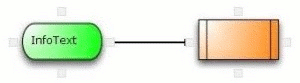
Let us have a look at what we have done so far. In the following example, you can see our layout with some dropped icons.
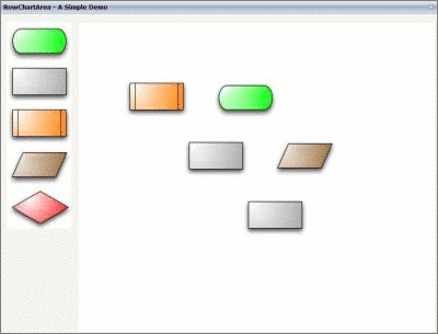
Until now, this example only allows you to drag-and-drop the
FlowChartItem icons into the ROWCHARTAREA control where you can
move the icons.
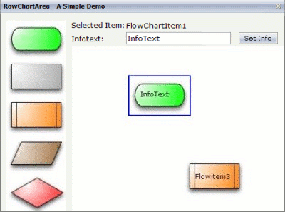
We will now add a label to each FlowChartItem, and we will
add a visualization for the item which is currently selected. Therefore, we
need to add some more XML and Java code.
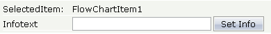
First, we will add the following to the XML layout definition:
<itr align="left">
  <label name="Selected Item:" width="100" asplaintext="true"></label>
  <field valueprop="selectedItem" width="200" displayonly="true"
     noborder="true"></field>
</itr>
<vdist></vdist>
<itr align="left">
  <label name="Infotext:" width="100" invisiblemode="cleared"
     asplaintext="true"></label>
  <field valueprop="infotext" width="200" statusprop="fstatus"
     maxlength="10" noborder="true"></field>
  <hdist></hdist>
  <button name="Set Info" method="onSetInfo" width="75"></button>
</itr>
The new lines look as follows:
The Java code of the adapter is (new code is indicated in bold):
public class FlowChartItem extends CHARTAREAItem
  {
    ...
    /**
     * take care of what happens if this item is selected
     *  */
    public void reactOnSelection(boolean shiftKey, boolean ctrlKey)
    {
  // ==> new
      // bring the infotext of this item to the screen
      m_infotext = m_txtout.getText();
      // and show the itemId
      m_selectedItem = "FlowChartItem "+m_itemId;
      // set the m_infotext field status to edit
      m_fstatus = CS_EDIT;
     // call prvate method setSelected()
      setSelected(this);
  // <== new
    }
  }
...
  private FlowChartItem drawFlowChartItem(String dropInfo, int xpos,
          int ypos)
  {
  ...
    // if the object was successfully created add an image
    if (fci != null)
    {
      fci.addImage(5,5, 1,110,70, img);
  // ==> new
      // create and add a rectangle to the item
      // this is for the visualization of the selected item
      CHARTAREAItemRect rect = fci.addRect(3, 3, -1, 114 , 74, 0,"", "");
      fci.setRect(rect);

      // create and add an empty textfield to the item
      CHARTAREAItemText outputText =
                 fci.addText(25, 30, 2, 85, 15, "","","");
      fci.setTxtout(outputText);
  // <== new
    return fci;
  }

/** Members */
...
  // ==> new
    // property >infotext<
    String m_infotext;
    public String getInfotext() { return m_infotext; }
    public void setInfotext(String value) { m_infotext = value; }

    // property >fstatus<
    String m_fstatus= CS_DISPLAY;
    public String getFstatus() { return m_fstatus; }
    public void setFstatus(String value) { m_fstatus = value; }

    // property >selectedItem<
    String m_selectedItem;
    public String getSelectedItem() { return m_selectedItem; }
    public void setSelectedItem(String value) { m_selectedItem = value; }
  // <== new

...

  // ==> new
  /**
   * Sets the color of the rectangle around the selected item
   * to #0000FF and stores the information which item is the
   * last selected one in m_lastSelected.
   * setSelected(null) resets the color of the selected item to ""
   **/
  private void setSelected(FlowChartItem item)
  {
    if(m_lastSelected != null && m_lastSelected != item)
      m_lastSelected.getRect().setBackgroundColor("");
    if(item != null)
    {
      item.getRect().setBackgroundColor("#0000FF");
      m_lastSelected = item;
    }
  }
  // <== new

...

  // ==> new
  /**
   *  public methods that sets the infotext
   *  and the tooltip to the last selected item.
   *  The method is called if the button 'Set Info' is clicked.
   * */
  public void onSetInfo()
  {
    if(m_lastSelected == null)
      return;
    if(!m_infotext.equalsIgnoreCase(m_lastSelected.getTxtout().getText())&&
        m_infotext != null )
    {
      // set the infotext of the item
      m_lastSelected.getTxtout().setText(m_infotext);
      // and the tooltip
      m_lastSelected.setTooltip(m_infotext);
    }
  }
  // <== new
...
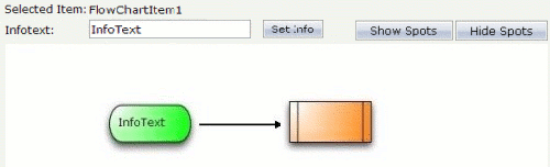
Now, we have a label for each FlowChartItem and a
visualization for the selected item.
We will now draw lines between the single FlowChartItem
icons.
For this purpose, changes to the XML layout are not required. However, we have to add some more Java code:
  // ==> new
  /**
   * a class for the small spots where the connection lines
   * are drawn from/to
   *  */
  public class ConnectionSpot extends CHARTAREASpot
  {
    public ConnectionSpot(int x, int y, int z, int orientation)
    {
      super(x, y, z, orientation);
    }
  /** This method has to be overwritten.
   *  It generates the lines between the items.
   */
    public CHARTAREAConnectionLine buildNewConnectionLine
          (CHARTAREASpot fromSpot, CHARTAREASpot toSpot)
    {
	      //Create a new line
      CHARTAREAConnectionLine line = new
           CHARTAREAConnectionLine(fromSpot,toSpot);
      // set line style
      line.setToSpotStyle(CHARTAREAConnectionLine.LINE_STYLE_ARROW);
      line.setLineColor("000000");
      line.setZIndex(-1);
      return line;
    }
  }
  // <== new
...
  private FlowChartItem drawFlowChartItem(String dropInfo, int xpos,
          int ypos)
  {
  ...
    // if the object was successfully created ...
    if (fci != null)
    {
    ...
  // ==> new
    /**
     *  add the connection spots
     *  each items gets 4
     *  north, south, east and west
     *  */
      fci.addHotspot(new ConnectionSpot(55,0,3,CHARTAREASpot.O_NORTH));
      fci.addHotspot(new ConnectionSpot(55,70,3,CHARTAREASpot.O_SOUTH));
      fci.addHotspot(new ConnectionSpot(110,35,3,CHARTAREASpot.O_EAST));
      fci.addHotspot(new ConnectionSpot(0,35,3,CHARTAREASpot.O_WEST));
  // <== new
}
Now, each FlowChartItem has connection spots and it is
thus possible to connect the items with a line.
We will now add buttons for showing and hiding the connection spots to the layout.
This is the corresponding XML layout definition:
<hdist width="18"></hdist>
<button name="Hide Spots" method="onHideSpots" width="100"></button>
<hdist></hdist>
<button name="Show Spots" method="onShowSpots" width="100"></button>
The Java code of the adapter is:
/** Members */
...
  // ==> new
// property that stores the information whether the spots are (in)visible private boolean m_hotSpotVisible = true;
  // <== new

...

  // ==> new
  /** Makes the 'Connection Spots' invisible */
  public void onHideSpots()
  {
    // save the information whether the spots are visible ore not
    m_hotSpotVisible = false;
    // make the spots invisible
    m_chartareaprop.setAllHotspotsVisible(m_hotSpotVisible);
    // no item selected => no rectangle visible
    setSelected(null);
  }
  /** Makes the 'Connection Spots' visible */
  public void onShowSpots()
  {
    // save the information whether the spots are visible ore not
    m_hotSpotVisible = true;
    // Make the spots visible
    m_chartareaprop.setAllHotspotsVisible(m_hotSpotVisible);
  }
  // <== new
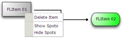
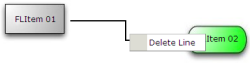
The will now add three different content menus, where each context menu has its own functionality:
A context menu for the FlowChartItem icons:
A context menu for the lines:
A context menu for the ROWCHARTAREA:
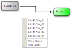
The Java code for the context menus is:
/** Members */
  // ==> new
  FlowChartItem m_itemWithContext = null;
  CHARTAREAConnectionLine m_lineWithContext = null;

  // three properties for the different contextmenus
  TREECollection m_contextMenuLine = new TREECollection();
  TREECollection m_contextMenuItem = new TREECollection();
  TREECollection m_contextMenuArea = new TREECollection();

  /** initialisation - called when creating this instance*/
  public void init()
  {
    // build the contextmenus in the init method
    buildContextMenus();
  }
  // <== new

...

  // ==> new
    /** build the contextmenus */
    private void buildContextMenus()
    {
      LineContextMenuItem node;

      // contextmenu items for the area
      node = new LineContextMenuItem("Add FLOW_01", 1);
      m_contextMenuArea.addTopNode(node, true);
      node = new LineContextMenuItem("Add FLOW_02", 2);
      m_contextMenuArea.addTopNode(node, true);
      node = new LineContextMenuItem("Add FLOW_03", 3);
      m_contextMenuArea.addTopNode(node, true);
      node = new LineContextMenuItem("Add FLOW_04", 4);
      m_contextMenuArea.addTopNode(node, true);
      node = new LineContextMenuItem("Add FLOW_05", 5);
      m_contextMenuArea.addTopNode(node, true);
      node = new LineContextMenuItem(MENUNODEInfo.TYPE_SEPARATOR);
      m_contextMenuArea.addTopNode(node, true);
      node = new LineContextMenuItem("Show Spots", 12);
      m_contextMenuArea.addTopNode(node, true);
      node = new LineContextMenuItem("Hide Spots", 13);
      m_contextMenuArea.addTopNode(node, true);

      // contextmenu items for the FlowChartItems
      node = new LineContextMenuItem("Delete Item", 11);
      m_contextMenuItem.addTopNode(node, true);
      node = new LineContextMenuItem(MENUNODEInfo.TYPE_SEPARATOR);
      m_contextMenuItem.addTopNode(node, true);
      node = new LineContextMenuItem("Show Spots", 12);
      m_contextMenuItem.addTopNode(node, true);
      node = new LineContextMenuItem("Hide Spots", 13);
      m_contextMenuItem.addTopNode(node, true);

      // contextmenu for the lines
      node = new LineContextMenuItem("Delete Line", 21);
      m_contextMenuLine.addTopNode(node, true);
    }
    /**
     * The class for the contextmenu items
     *  */
    public class LineContextMenuItem extends MENUNODEInfo
    {
      /** keeps the information what action should be called in the
       * reactOnContextMenuSelect() method... */
      int m_action;

      public LineContextMenuItem(String text)
      {
        super(text);
        m_action = -1;
      }

      public LineContextMenuItem(String text, int action)
      {
        super(text);
         m_action = action;
      }

      public LineContextMenuItem(String text, String image, int action)
      {
        super(text, image);
        m_action = action;
      }

      public void reactOnSelect()
      {
          reactOnContextMenuSelect(m_action);
      }
  }

  /**
   * React on a click in the contextmenu.
   * depending on the m_action content of the clicked item
   * there are different 'reactions'.
   */
  public void reactOnContextMenuSelect(int action)
  {
    switch(action)
    {
      // new FlowChartItem type 01 to added
      case 1:
        m_chartareaprop.reactOnDrop("flow01",
          m_chartareaprop.getMouseDownX(),m_chartareaprop.getMouseDownY());
      break;
      // new FlowChartItem type 02 to added
      case 2:
        m_chartareaprop.reactOnDrop("flow02",
          m_chartareaprop.getMouseDownX(),m_chartareaprop.getMouseDownY());
      break;
      ...
      // one reaction for each possible ‘FlowChartItem’
      ...
      // delete the selected 'FlowChartItem
      case 11:
      m_itemWithContext.removeAllConnections();
      m_chartareaprop.removeChartAreaItem(m_itemWithContext);
      m_itemWithContext = null;
      setSelected(null);
      m_selectedItem = "";
      m_infotext = "";
      m_fstatus = "DISPLAY";
      break;
      // Make 'Connection Spots' visible
      case 12:
        onShowSpots();
      break;
      // Make 'Connection Spots' invisible
      case 13:
        onHideSpots();
      break;
      // delete selected line
      case 21:
        m_lineWithContext.removeLine();
        m_lineWithContext = null;
      break;
    }
  }
  // <== new
...
  public class RowChartArea extends CHARTAREAInfo
  {
...
    /** reactOnContextMenu for area */
    public void reactOnContextMenuRequest()
    {
  // ==> new
    // open the context menu for the area
      showPopupMenu(m_contextMenuArea);
  // <== new
    }
  // ==> new
    /** reactOnContextMenu for line */
    public void
     reactOnContextMenuRequestConnectionLine(CHARTAREAConnectionLine
       connectionLine)
    {
      m_lineWithContext = connectionLine;
    // open the context menu for the line
      showPopupMenu(m_contextMenuLine);
    }
  // <== new
  }
...
  public class FlowChartItem extends CHARTAREAItem
  {
    ...

  // ==> new
    /** reactOnContextMenu for Item*/
    public void reactOnContextMenuRequest()
    {
      m_itemWithContext=this;
      showPopupMenu(m_contextMenuItem);
    }
  // <== new

    ...
  }
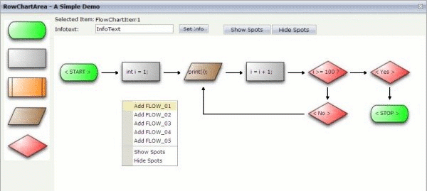
The result of our coding is a simple "for-loop" flowchart. For example (with an opened context menu):
| Basic | |||
| infoprop |
Name of the adapter property that represents the control on server side. Return type must be "CHARTAREAInfo". |
Obligatory | |
| width |
Width of the control. There are three possibilities to define the width: (A) You do not define a width at all. In this case the width of the control will either be a default width or - in case of container controls - it will follow the width that is occupied by its content. (B) Pixel sizing: just input a number value (e.g. "100"). (C) Percentage sizing: input a percantage value (e.g. "50%"). Pay attention: percentage sizing will only bring up correct results if the parent element of the control properly defines a width this control can reference. If you specify this control to have a width of 50% then the parent element (e.g. an ITR-row) may itself define a width of "100%". If the parent element does not specify a width then the rendering result may not represent what you expect. |
Optional |
100 120 140 160 180 200 50% 100% |
| height |
Height of the control. There are three possibilities to define the height: (A) You do not define a height at all. As consequence the control will be rendered with its default height. If the control is a container control (containing) other controls then the height of the control will follow the height of its content. (B) Pixel sizing: just input a number value (e.g. "20"). (C) Percentage sizing: input a percantage value (e.g. "50%"). Pay attention: percentage sizing will only bring up correct results if the parent element of the control properly defines a height this control can reference. If you specify this control to have a height of 50% then the parent element (e.g. an ITR-row) may itself define a height of "100%". If the parent element does not specify a width then the rendering result may not represent what you expect. |
Optional |
100 150 200 250 300 250 400 50% 100% |
| comment |
Comment without any effect on rendering and behaviour. The comment is shown in the layout editor's tree view. |
Optional | |
| pagebaseddragdrop |
Default is false. Allows to 'drag and drop' icons from another frame into the ROWCHARTAREA control. Set to true if you want to enable 'drag and drop' only within the page the ROWCHARTAREA control is placed in. |
Optional |
true false |
| usegridlines |
Enables/Disables 'automatic snap to grid'. Default is true. You can define the X- and Y-Distance of the grid. |
Optional |
true false |
| gridlinesprop |
Name of an adapter property that provides the information if 'automatic snap to grid' is enabled or disabled. As consequence you can control the 'automatic snap to grid' function of the control dynamically. The server side property needs to be of type "boolean". |
Optional | |
| gridlinexdistance |
Define the X-Distance of the gridlines. Default is 50. Notice: The X-Distance does not have any effect if 'automatic snap to grid' is disabled. Please have a look at the USEGRIDLINES and GRIDLINESPROP which are already explained above. |
Optional |
1 2 3 int-value |
| gridlineydistance |
Define the Y-Distance of the gridlines. Default is 50. Notice: The Y-Distance does not have any effect if 'automatic snap to grid' is disabled. Please have a look at the USEGRIDLINES and GRIDLINESPROP which are already explained above. |
Optional |
1 2 3 int-value |