The MENUBUTTON control offers the possibility to arrange buttons in a hierarchy.
The following topics are covered below:
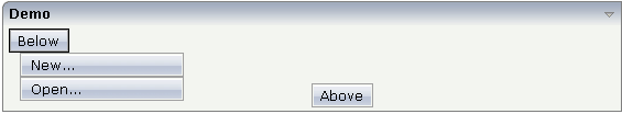
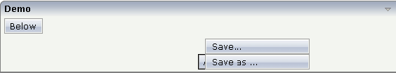
In the following example, there are two menu buttons which act differently when they are selected:
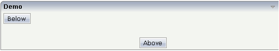
The XML code for the example looks as follows:
<rowarea name="Demo">
    <itr takefullwidth="true">
        <coltable0 width="50%" takefullheight="true">
            <itr>
                <menubutton name="Below" menuposition="below">
                    <menuitem name="New..." method="newFile" pixelwidth="150">
                    </menuitem>
                    <menuitem name="Open..." method="openFile" pixelwidth="150">
                    </menuitem>
                </menubutton>
            </itr>
        </coltable0>
        <coltable0 width="50%">
            <vdist height="50">
            </vdist>
            <itr>
                <menubutton name="Above" menuposition="above">
                    <menuitem name="Save..." method="saveFile" pixelwidth="150">
                    </menuitem>
                    <menuitem name="Save as ..." method="saveAsFile" pixelwidth="150">
                    </menuitem>
                </menubutton>
            </itr>
        </coltable0>
    </itr>
</rowarea>
In the definition of a menu item, a method of the adapter class is exactly referenced like a normal button.
With the MENUBUTTON control, you can build simple menus:
Just place the MENUBUTTON controls inside the HEADER area.
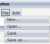
A complex MENU control is also available. The MENU control looks like a real menu, whereas the MENUBUTTON control is a special arrangement of normal buttons. See also the description of the MENU control in Working with Menus.
| Basic | |||
| name |
Text that is displayed inside the control. Please do not specify the name when using the multi language management - but specify a "textid" instead. |
Sometimes obligatory | |
| textid |
Multi language dependent text that is displayed inside the control. The "textid" is translated into a corresponding string at runtime. Do not specify a "name" inside the control if specifying a "textid". |
Sometimes obligatory | |
| comment |
Comment without any effect on rendering and behaviour. The comment is shown in the layout editor's tree view. |
Optional | |
| Appearance | |||
| menuposition |
above if the menu should popup above the base menu button - below if the menu should popup below the base menu button. The default is below. |
Optional |
above below |
| width |
Width of the control. There are three possibilities to define the width: (A) You do not define a width at all. In this case the width of the control will either be a default width or - in case of container controls - it will follow the width that is occupied by its content. (B) Pixel sizing: just input a number value (e.g. "100"). (C) Percentage sizing: input a percantage value (e.g. "50%"). Pay attention: percentage sizing will only bring up correct results if the parent element of the control properly defines a width this control can reference. If you specify this control to have a width of 50% then the parent element (e.g. an ITR-row) may itself define a width of "100%". If the parent element does not specify a width then the rendering result may not represent what you expect. |
Optional |
100 120 140 160 180 200 50% 100% |
| visibleprop |
Name of an adapter property that provides the information if this control is displayed or not. As consequence you can control the visibility of the control dynamically. The server side property needs to be of type "boolean". |
Optional | |
| colspan |
Column spanning of control. If you use TR table rows then you may sometimes want to control the number of columns your control occupies. By default it is "1" - but you may want to define the control to span over more than one columns. The property only makes sense in table rows that are snychronized within one container (i.e. TR, STR table rows). It does not make sense in ITR rows, because these rows are explicitly not synched. |
Optional |
1 2 3 4 5 50 int-value |
| rowspan |
Row spanning of control. If you use TR table rows then you may sometimes want to control the number of rows your control occupies. By default it is "1" - but you may want to define the control to span over more than one columns. The property only makes sense in table rows that are snychronized within one container (i.e. TR, STR table rows). It does not make sense in ITR rows, because these rows are explicitly not synched. |
Optional |
1 2 3 4 5 50 int-value |
| buttonstyle |
CSS style definition that is directly passed into this control. With the style you can individually influence the rendering of the control. You can specify any style sheet expressions. Examples are: border: 1px solid #FF0000 background-color: #808080 You can combine expressions by appending and separating them with a semicolon. Sometimes it is useful to have a look into the generated HTML code in order to know where direct style definitions are applied. Press right mouse-button in your browser and select the "View source" or "View frame's source" function. |
Optional | |
| Basic | |||
| name |
Text that is displayed inside the control. Please do not specify the name when using the multi language management - but specify a "textid" instead. |
Sometimes obligatory | |
| textid |
Multi language dependent text that is displayed inside the control. The "textid" is translated into a corresponding string at runtime. Do not specify a "name" inside the control if specifying a "textid". |
Sometimes obligatory | |
| method |
Method of your adapter object that is executed when clicking on the control. |
Obligatory | |
| pixelwidth |
Width of the control in pixels. |
Obligatory | |
| comment |
Comment without any effect on rendering and behaviour. The comment is shown in the layout editor's tree view. |
Optional | |
| Appearance | |||
| pixelheight |
Height of the control in pixels. |
Optional | |
| itemstyle |
CSS style definition that is directly passed into this control. With the style you can individually influence the rendering of the control. You can specify any style sheet expressions. Examples are: border: 1px solid #FF0000 background-color: #808080 You can combine expressions by appending and separating them with a semicolon. Sometimes it is useful to have a look into the generated HTML code in order to know where direct style definitions are applied. Press right mouse-button in your browser and select the "View source" or "View frame's source" function. |
Optional | |