The IMAGEOUT control is used to present images inside a page. The name of the image is not statically defined inside the layout but is taken from the value of an adapter property.
The following topics are covered below:
XML layout definition:
<rowarea name="Image Out">
    <itr>
        <imageout valueprop="imageName">
        </imageout>
    </itr>
</rowarea>
Java code:
// property >imageName<
String m_imageName ="images/logo.gif";
public String getImageName() { return m_imageName; }
public void setImageName(String value) { m_imageName = value; }
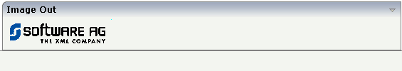
The above layout definition, together with the above Java code, produces a page which looks as follows:
The previous example assumes that the image which is returned by the adapter program is located in such a way that the browser can reach it via a URL: the value "images/logo.gif" points to an image that is directly located inside the web application.
What can you do if the image is stored at a location that cannot be reached via a URL? Have a look at the following adapter program. It will produce exactly the same result as the previous example, but will explicitly load the image from the file system and then display it. Intead of loading the image from the file system, you could also load the image from a database or any other data source.
/** initialisation - called when creating this instance*/
public void init()
{
    // read image by file IO
    byte[] imageBytes = FileManager.readFileIntoByteArray("c:/temp/images/logo.gif",true);
    // add file to session buffer (name = TEST)
    SessionBuffer sb = findCISessionContext().getSessionBuffer();
    m_imageName = sb.addGIF("TEST",imageBytes);
}
You see that the image is read from the file system as a byte array and
is then passed into a SessionBuffer object. This object is
provided by Application Designer: you can store file content inside the buffer under a defined
name. The session buffer returns a URL that allows the browser to access the
file content. The session buffer stores the file in memory. It is bound to the
user's session, i.e. it will be destroyed when the user ends the session. It
also offers interfaces for removing content. You should remove content as quick
as possible in order to save memory inside your application server.
See the Java API documentation for more information about the
SessionBuffer.
| Basic | |||
| valueprop |
Name of adapter property that provides as value the URL of the image that is shown inside the control. The URL must either be an absolute URL or a relative URL. |
Optional | |
| titleprop |
Property of adapter that dynamically defines the title of the control. The title is displayed as tool tip when ther user moves the mouse onto the control. |
Optional | |
| width |
Width of the control. There are three possibilities to define the width: (A) You do not define a width at all. In this case the width of the control will either be a default width or - in case of container controls - it will follow the width that is occupied by its content. (B) Pixel sizing: just input a number value (e.g. "100"). (C) Percentage sizing: input a percantage value (e.g. "50%"). Pay attention: percentage sizing will only bring up correct results if the parent element of the control properly defines a width this control can reference. If you specify this control to have a width of 50% then the parent element (e.g. an ITR-row) may itself define a width of "100%". If the parent element does not specify a width then the rendering result may not represent what you expect. |
Optional |
100 120 140 160 180 200 50% 100% |
| height |
Height of the control. There are three possibilities to define the height: (A) You do not define a height at all. As consequence the control will be rendered with its default height. If the control is a container control (containing) other controls then the height of the control will follow the height of its content. (B) Pixel sizing: just input a number value (e.g. "20"). (C) Percentage sizing: input a percantage value (e.g. "50%"). Pay attention: percentage sizing will only bring up correct results if the parent element of the control properly defines a height this control can reference. If you specify this control to have a height of 50% then the parent element (e.g. an ITR-row) may itself define a height of "100%". If the parent element does not specify a width then the rendering result may not represent what you expect. |
Optional | |
| colspan |
Column spanning of control. If you use TR table rows then you may sometimes want to control the number of columns your control occupies. By default it is "1" - but you may want to define the control to span over more than one columns. The property only makes sense in table rows that are snychronized within one container (i.e. TR, STR table rows). It does not make sense in ITR rows, because these rows are explicitly not synched. |
Optional | |
| rowspan |
Row spanning of control. If you use TR table rows then you may sometimes want to control the number of rows your control occupies. By default it is "1" - but you may want to define the control to span over more than one columns. The property only makes sense in table rows that are snychronized within one container (i.e. TR, STR table rows). It does not make sense in ITR rows, because these rows are explicitly not synched. |
Optional | |
| comment |
Comment without any effect on rendering and behaviour. The comment is shown in the layout editor's tree view. |
Optional | |