The file upload controls simplify the process of uploading files from the client to the server. Two types are available:
The FILEUPLOAD control is represented by a button. When you choose the button, a dialog appears showing the file upload form (field input and a file selection button).
With the FILEUPLOAD2 control, you embed the file upload form into your page.
Both types have the program binding, i.e. you can switch between the two types without touching your code.
The following topics are covered below:
The FILEUPLOAD control simplifies the process of uploading files from the client to the server. Look at the following example:
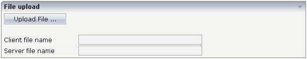
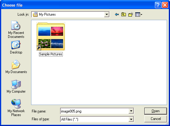
The control - from the look-and-feel perspective - is a button with some special reaction. When you choose the button, the following dialog appears:
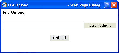
You can either enter a file name or you can invoke the file selection dialog by choosing the button to the right of the field (which appears in the language of the browser).
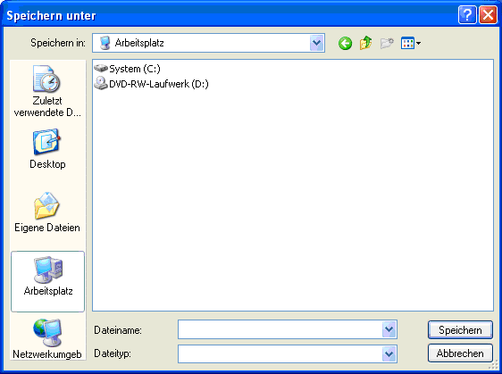
After choosing the button, the first screen looks as follows:
Have a look at the layout definition:
<rowarea name="File upload">
    <itr>
        <fileupload name="Upload File ..." cfileprop="clientFileName"
                    sfileprop="serverFileName" method="onUploadFile">
        </fileupload>
    </itr>
    <vdist height="20">
    </vdist>
    <itr>
        <label name="Client file name" width="150">
        </label>
        <field valueprop="clientFileName" width="250" displayonly="true">
        </field>
    </itr>
    <itr>
        <label name="Server file name" width="150">
        </label>
        <field valueprop="serverFileName" width="250" displayonly="true">
        </field>
    </itr>
</rowarea>
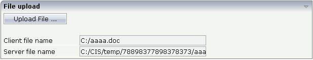
The FILEUPLOAD control references to two properties. The
cfileprop property references to a property in
which the client file name of the uploaded file is written. The
sfileprop property references to a property in
which the server file name of the uploaded file is written; after the upload is
finished, the file is copied into a server-side directory of your Application Designer
installation and is accessible by normal file I/O operations.
With the method property, you define which
method is called when a file is uploaded.
Each file gets a unique file name on the server - you have full access to the file and you can process the file as you need it, e.g. you can also delete it after usage.
The Java code looks as follows:
import com.softwareag.cis.server.Adapter;

// This class is a generated one.

public class FileUploadAdapter
    extends Adapter
{
    // property >clientFileName<
    String m_clientFileName;
    public String getClientFileName() { return m_clientFileName; }
    public void setClientFileName(String value) { m_clientFileName = value; }

    // property >serverFileName<
    String m_serverFileName;
    public String getServerFileName() { return m_serverFileName; }
    public void setServerFileName(String value) { m_serverFileName = value; }

    /** */
    public void onUploadFile()
    {
        outputMessage(MT_SUCCESS, "Upload was successful!");
    }
}
See the Java API documentation for
com.softwareag.cis.file.FileManager. If you do not have
file access routines on your own, you may use this one in order to read the
file created on the server when using the upload button. For example, it offers
the methods:
byte[] readFileIntoByteArray
String[] readTextFileIntoStrings
 String
                  readTextFileIntoString/readTextFileIntoStringWithLineBreak
The result of the upload processing is the generation of a server side file. Why do we pass the information as a file and not as an in-memory byte array? Reason: by doing so, we do not get problems if your application server runs out of memory when uploading very large files. Only a part of the upload file is in memory, i.e. when uploading, the server file is written in certain blocks - the memory blocked by the upload processing has a maximum size of this block (16 KBytes).
The location of the file is the temporary directory that is provided by the servlet container in which the web application that uses Application Designer runs.
Note:
Part of the Servlet 2.2 protocol is the definition of the
ServletContext. Part of this API is the obligatory API that passes a temporary
directory to web applications.
With the FILEUPLOAD2 control, you embed the file upload form into your page.
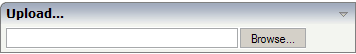
You can either enter a file name or you can invoke the file selection dialog by choosing the button to the right of the field (which appears in the language of the browser).
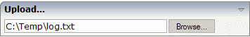
After choosing the file, the screen looks as follows:
Have a look at the layout definition:
<rowarea name="Upload...">
   <itr>
        <fileupload2 width="300" cfileprop=" clientFileName" sfileprop="serverFileName" method=" onUploadFile">
       </fileupload2>
    </itr>
</rowarea>
The FILEUPLOAD2 control references to two properties. The
cfileprop property references to a property in
which the client file name of the uploaded file is written. The
sfileprop property references to a property in
which the server file name of the uploaded file is written; after the upload is
finished, the file is copied into a server-side directory of your Application Designer
installation and is accessible by normal file I/O operations.
With the method property, you define which
method is called when a file is uploaded.
Each file gets a unique file name on the server - you have full access to the file and you can process the file as you need it, e.g. you can also delete it after usage.
The Java code looks as follows:
import com.softwareag.cis.server.Adapter;

// This class is a generated one.

public class FileUploadAdapter
    extends Adapter
{
    // property >clientFileName<
    String m_clientFileName;
    public String getClientFileName() { return m_clientFileName; }
    public void setClientFileName(String value) { m_clientFileName = value; }

    // property >serverFileName<
    String m_serverFileName;
    public String getServerFileName() { return m_serverFileName; }
    public void setServerFileName(String value) { m_serverFileName = value; }

    /** */
    public void onUploadFile()
    {
        outputMessage(MT_SUCCESS, "Upload was successful!");
    }
}
Note:
The coding is exactly the same when using the FILEUPLOAD control.
You can switch between the two types (FILEUPLOAD and FILEUPLOAD2) without
touching your code.
| Basic | |||
| name |
Text that is displayed inside the control. Please do not specify the name when using the multi language management - but specify a "textid" instead. |
Sometimes obligatory | |
| textid |
Multi language dependent text that is displayed inside the control. The "textid" is translated into a corresponding string at runtime. Do not specify a "name" inside the control if specifying a "textid". |
Sometimes obligatory | |
| cfileprop |
Name of adapter property in which the client's file name is passed at upload time. |
Obligatory | |
| sfileprop |
Name of adapter property, in which at upload time - the name of the file is written - which is a copy of the client file but in the server's file system. Please pay attention that this file name is a unique one and has nothing to do with the client's file name! |
Obligatory | |
| method |
Method called inside the adapter when a file is uploaded. The file's data is available at the point of time this method is called. |
Obligatory | |
| comment |
Comment without any effect on rendering and behaviour. The comment is shown in the layout editor's tree view. |
Optional | |
| Appearance | |||
| image |
URL of image that is displayed inside the control. Any image type (.gif, .jpg, ...) that your browser does understand is valid. Use the following options to specify the URL: (A) Define the URL relative to your page. Your page is generated directly into your project's folder. Specifiying "images/xyz.gif" will point into a directory parallel to your page. Specifying "../HTMLBasedGUI/images/new.gif" will point to an image of a neighbour project. (B) Define a complete URL, like "http://www.softwareag.com/images/logo.gif". |
Optional |
gif jpg jpeg |
| width |
Width of the control. There are three possibilities to define the width: (A) You do not define a width at all. In this case the width of the control will either be a default width or - in case of container controls - it will follow the width that is occupied by its content. (B) Pixel sizing: just input a number value (e.g. "100"). (C) Percentage sizing: input a percantage value (e.g. "50%"). Pay attention: percentage sizing will only bring up correct results if the parent element of the control properly defines a width this control can reference. If you specify this control to have a width of 50% then the parent element (e.g. an ITR-row) may itself define a width of "100%". If the parent element does not specify a width then the rendering result may not represent what you expect. |
Optional |
100 120 140 160 180 200 50% 100% |
| height |
Height of the control. There are three possibilities to define the height: (A) You do not define a height at all. As consequence the control will be rendered with its default height. If the control is a container control (containing) other controls then the height of the control will follow the height of its content. (B) Pixel sizing: just input a number value (e.g. "20"). (C) Percentage sizing: input a percantage value (e.g. "50%"). Pay attention: percentage sizing will only bring up correct results if the parent element of the control properly defines a height this control can reference. If you specify this control to have a height of 50% then the parent element (e.g. an ITR-row) may itself define a height of "100%". If the parent element does not specify a width then the rendering result may not represent what you expect. |
Optional |
100 150 200 250 300 250 400 50% 100% |
| visibleprop |
Name of an adapter property that provides the information if this control is displayed or not. As consequence you can control the visibility of the control dynamically. The server side property needs to be of type "boolean". |
Optional | |
| invisiblemode |
This property has three possible values: (1) "invisible": the button is not visible without occupying any space. (2) "disabled": the button is deactivated: it is "grayed" and does not show any roll over effects any more. (3)"cleared": the button is not visible but it still occupies space. |
Optional |
invisible cleared |
| buttonstyle |
CSS style definition that is directly passed into this control. With the style you can individually influence the rendering of the control. You can specify any style sheet expressions. Examples are: border: 1px solid #FF0000 background-color: #808080 You can combine expressions by appending and separating them with a semicolon. Sometimes it is useful to have a look into the generated HTML code in order to know where direct style definitions are applied. Press right mouse-button in your browser and select the "View source" or "View frame's source" function. |
Optional | |
| align |
Horizontal alignment of control in its column. Each control is "packaged" into a column. The column itself is part of a row (e.g. ITR or TR). Sometimes the size of the column is bigger than the size of the control itself. In this case the "align" property specifies the position of the control inside the column. In most cases you do not require the align control to be explicitly defined because the size of the column around the controls exactly is sized in the same way as the contained control. If you want to directly control the alignment of text: in most text based controls there is an explicit property "textalign" in which you align the control's contained text. |
Optional |
left center right |
| valign |
Vertical alignment of control in its column. Each control is "packaged" into a column. The column itself is part of a row (e.g. ITR or TR). Sometimtes the size of the column is bigger than the size of the control. In this case the "align" property specify the position of the control inside the column. |
Optional |
top middle bottom |
| colspan |
Column spanning of control. If you use TR table rows then you may sometimes want to control the number of columns your control occupies. By default it is "1" - but you may want to define the control to span over more than one columns. The property only makes sense in table rows that are snychronized within one container (i.e. TR, STR table rows). It does not make sense in ITR rows, because these rows are explicitly not synched. |
Optional |
1 2 3 4 5 50 int-value |
| rowspan |
Row spanning of control. If you use TR table rows then you may sometimes want to control the number of rows your control occupies. By default it is "1" - but you may want to define the control to span over more than one columns. The property only makes sense in table rows that are snychronized within one container (i.e. TR, STR table rows). It does not make sense in ITR rows, because these rows are explicitly not synched. |
Optional |
1 2 3 4 5 50 int-value |
| Binding | |||
| cfileprop | (already explained above) | ||
| sfileprop | (already explained above) | ||
| method | (already explained above) | ||
| visibleprop | (already explained above) | ||
| Online Help | |||
| title |
Text that is shown as tooltip for the control. Either specify the text "hard" by using this TITLE property - or use the TITLETEXTID in order to define a language dependent literal. |
Optional | |
| titletextid |
Text ID that is passed to the multi lanaguage management - representing the tooltip text that is used for the control. |
Optional | |
| Basic | |||
| width |
Width of the control. There are three possibilities to define the width: (A) You do not define a width at all. In this case the width of the control will either be a default width or - in case of container controls - it will follow the width that is occupied by its content. (B) Pixel sizing: just input a number value (e.g. "100"). (C) Percentage sizing: input a percantage value (e.g. "50%"). Pay attention: percentage sizing will only bring up correct results if the parent element of the control properly defines a width this control can reference. If you specify this control to have a width of 50% then the parent element (e.g. an ITR-row) may itself define a width of "100%". If the parent element does not specify a width then the rendering result may not represent what you expect. |
Optional |
100 120 140 160 180 200 50% 100% |
| cfileprop |
Name of adapter property in which the client's file name is passed at upload time. |
Optional | |
| sfileprop |
Name of adapter property, in which at upload time - the name of the file is written - which is a copy of the client file but in the server's file system. Please pay attention that this file name is a unique one and has nothing to do with the client's file name! |
Optional | |
| method |
Method called inside the adapter when a file is uploaded. The file's data is available at the point of time this method is called. |
Optional | |
| withsubmitbutton |
If set to "TRUE" adds an additional button to the control to start the file upload. |
Optional |
true false |
| submitbuttonname |
The name of the submit button in case WITSUBMITBUTTON is set to "true". |
Optional | |
| submitbuttontextid |
"Textid" for the name of the submitbutton if WITHSUBMITBUTTON is set to "true". |
Optional | |
| comment |
Comment without any effect on rendering and behaviour. The comment is shown in the layout editor's tree view. |
Optional | |
| Binding | |||
| cfileprop | (already explained above) | ||
| sfileprop | (already explained above) | ||
| method | (already explained above) | ||
| visibleprop |
Name of an adapter property that provides the information if this control is displayed or not. As consequence you can control the visibility of the control dynamically. The server side property needs to be of type "boolean". |
Optional | |
| invisiblemode |
If the visibility of the control is determined dynamically by an adapter property then there are two rendering modes if the visibility is "false": (1) "invisible": the control is not visible. (2)"cleared": the control is not visible but it still occupies space. |
Optional |
invisible disabled cleared |
| Appearance | |||
| invisiblemode | (already explained above) | ||
| rowspan |
Row spanning of control. If you use TR table rows then you may sometimes want to control the number of rows your control occupies. By default it is "1" - but you may want to define the control to span over more than one columns. The property only makes sense in table rows that are snychronized within one container (i.e. TR, STR table rows). It does not make sense in ITR rows, because these rows are explicitly not synched. |
Optional |
1 2 3 4 5 50 int-value |
| colspan |
Column spanning of control. If you use TR table rows then you may sometimes want to control the number of columns your control occupies. By default it is "1" - but you may want to define the control to span over more than one columns. The property only makes sense in table rows that are snychronized within one container (i.e. TR, STR table rows). It does not make sense in ITR rows, because these rows are explicitly not synched. |
Optional |
1 2 3 4 5 50 int-value |
| darkbackground |
Normally the background is in light colour but the CIS style sheets also have a dark(er) grey colour to be used. If DARKBACKGROUND is set to true then the darker background colour is chosen. This property typically is used to integrate light coloured controls into darker container areas. |
Optional |
true false |