The DATEINPUT control is used to input a date or a date with time. The input can be done both with the keyboard or by opening a pop-up in which the user can browse through a calendar. The calendar can be controlled by server side processing in the following way:
You can define a valid-from and a valid-to date. Thus, the control will not allow the user to input an invalid date.
You can explicitly control the color and the tooltip information inside the calendar. For example, you may set up a calendar in which vacation times are hightlighted in a certain way.
The following topics are covered below:
The most simple usage scenario is to just use the DATEINPUT control in the following way:
<rowarea name="Dateinput">
    <itr>
        <label name="Order Date" width="120">
        </label>
        <dateinput valueprop="orderDate" width="120">
        </dateinput>
    </itr>
</rowarea>
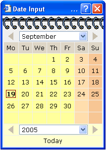
The corresponding screen looks like this:

The user may directly enter a date into the field (the format of the input is specified by the session's date display settings) or may open the calendar pop-up by clicking on the field's icon:
The server-side adapter class looks like this:
public class DateInputAdapter
    extends Adapter
{
    // property >orderDate<
    CDate m_orderDate;
    public CDate getOrderDate() { return m_orderDate; }
    public void setOrderDate(CDate value) { m_orderDate = value; }
}
Instead of using a property of type CDate,
you may also use a simple String property. In this
case, the date string is passed in the format
"YYYYMMDD".
By using the control's properties fromprop
and toprop, you can bind the control to adapter
properties that define a time range that can be selected by the user:
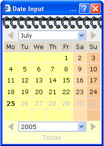
In the date control, you can only input dates between the 3rd and the 15th of June. The corresponding tag definition of the DATEINPUT control looks like this:
<dateinput valueprop="orderDate" width="120" fromprop="fromDate" toprop="toDate">
</dateinput>
The server-side adapter holds the properties
fromDate and
toDate:
public class DateInputAdapter
    extends Adapter
{
    // property >orderDate<
    CDate m_orderDate;
    public CDate getOrderDate() { return m_orderDate; }
    public void setOrderDate(CDate value) { m_orderDate = value; }

    // property >fromDate<
    CDate m_fromDate = new CDate("20050701");
    public CDate getFromDate() { return m_fromDate; }
    public void setFromDate(CDate value) { m_fromDate = value; }

    // property >toDate<
    CDate m_toDate = new CDate("20050725");
    public CDate getToDate() { return m_toDate; }
    public void setToDate(CDate value) { m_toDate = value; }

}
You may also specify only the fromprop
property: in this case, the user may select all dates following the specified
date. (Same with only specifying the toprpop
property.)
By using the property datatype, you can use
the DATEINPUT control for inputting a time stamp:
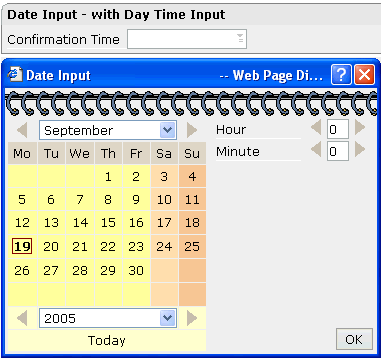
The corresponding layout definition is:
<rowarea name="Date Input - with Day Time Input">
    <itr>
        <label name="Confirmation Time" width="120">
        </label>
        <dateinput valueprop="confirmationTime" width="120" datatype="datetime">
        </dateinput>
    </itr>
</rowarea>
The control now refers on the server side to a property of type
CTimestamp:
// property >confirmationTime<
CTimeStamp m_confirmationTime;
public CTimeStamp getConfirmationTime() { return m_confirmationTime; }
public void setConfirmationTime(CTimeStamp value) { m_confirmationTime = value; }
Using the property secondsvisprop, you can
bind the control to a boolean adapter property which decides whether the user
can input the time with or without seconds.
| Basic | |||
| valueprop |
Server side property representation of the control. |
Optional | |
| width |
Width of the control. There are three possibilities to define the width: (A) You do not define a width at all. In this case the width of the control will either be a default width or - in case of container controls - it will follow the width that is occupied by its content. (B) Pixel sizing: just input a number value (e.g. "100"). (C) Percentage sizing: input a percantage value (e.g. "50%"). Pay attention: percentage sizing will only bring up correct results if the parent element of the control properly defines a width this control can reference. If you specify this control to have a width of 50% then the parent element (e.g. an ITR-row) may itself define a width of "100%". If the parent element does not specify a width then the rendering result may not represent what you expect. |
Optional |
100 120 140 160 180 200 50% 100% |
| datatype |
By default, the DATEINPUT control is managing a day. By explicitly setting a datatype you can define that the control is managing a day and time. In the first use type CDATE within your adapter program - in the second case use type CTIMESTAMP. |
Optional |
date datetime ------------------------ xs:date xs:dateTime |
| comment |
Comment without any effect on rendering and behaviour. The comment is shown in the layout editor's tree view. |
Optional | |
| Binding | |||
| valueprop | (already explained above) | ||
| fromprop |
Name of an adapter property to provide for a lower limit. Property must return an object of type CDATE. The value is used for client side validation of user input. |
Optional | |
| toprop |
Name of an adapter property to provide for a upper limit. Property must return an object of type CDATE. The value is used for client side validation of user input. |
Optional | |
| infoprop |
Name of an adapter property to provide for style information that is used inside the date popup. The property must return an object of type DATEINPUTInfo. |
Optional | |
| secondsvisprop |
Name of an adapter property to provide for a boolean that indicates if to show additional seconds. This property make sense only if property DATATYPE is set to "daytime". |
Optional | |
| statusprop |
Name of the adapter property that dynamically passes information how the field should be rendered and how it should act. |
Optional | |
| flush |
Flushing behaviour of the input control. By default an input into the control is registered within the browser client - and communicated to the server adapter object when a user e.g. presses a button. By using the FLUSH property you can change this behaviour. Setting FLUSH to "server" means that directly after changing the input a synchronization with the server adapter is triggered. As consequence you directly can react inside your adapter logic onto the change of the corresponding value. - Please be aware of that during the synchronization always all changed properties - also the ones that were changed before - are transferred to the adapter object, not only the one that triggered the synchonization. Setting FLUSH to "screen" means that the changed value is populated inside the page. You use this option if you have redundant usage of the same property inside one page and if you want to pass one changed value to all its representaion directly after changing the value. |
Optional |
screen server |
| flushmethod |
When the data synchronization of the control is set to FLUSH="server" then you can specify an explicit method to be called when the user updates the content of the control. By doing so you can distinguish on the server side from which control the flush of data was triggered. |
Optional | |
| Appearance | |||
| invisiblemode |
If the visibility of the control is determined dynamically by an adapter property then there are two rendering modes if the visibility is "false": (1) "invisible": the control is not visible. (2)"cleared": the control is not visible but it still occupies space. |
Optional |
invisible cleared |
| displayonly |
If set to true, the FIELD will not be accessible for input. It is just used as an output field. |
Optional |
true false |
| align |
Horizontal alignment of control in its column. Each control is "packaged" into a column. The column itself is part of a row (e.g. ITR or TR). Sometimes the size of the column is bigger than the size of the control itself. In this case the "align" property specifies the position of the control inside the column. In most cases you do not require the align control to be explicitly defined because the size of the column around the controls exactly is sized in the same way as the contained control. If you want to directly control the alignment of text: in most text based controls there is an explicit property "textalign" in which you align the control's contained text. |
Optional |
left center right |
| valign |
Vertical alignment of control in its column. Each control is "packaged" into a column. The column itself is part of a row (e.g. ITR or TR). Sometimtes the size of the column is bigger than the size of the control. In this case the "align" property specify the position of the control inside the column. |
Optional |
top middle bottom |
| inputstyle |
CSS style definition that is directly passed into this control. With the style you can individually influence the rendering of the control. You can specify any style sheet expressions. Examples are: border: 1px solid #FF0000 background-color: #808080 You can combine expressions by appending and separating them with a semicolon. Sometimes it is useful to have a look into the generated HTML code in order to know where direct style definitions are applied. Press right mouse-button in your browser and select the "View source" or "View frame's source" function. |
Optional |
background-color: #FF0000 color: #0000FF font-weight: bold |
| rowspan |
Row spanning of control. If you use TR table rows then you may sometimes want to control the number of rows your control occupies. By default it is "1" - but you may want to define the control to span over more than one columns. The property only makes sense in table rows that are snychronized within one container (i.e. TR, STR table rows). It does not make sense in ITR rows, because these rows are explicitly not synched. |
Optional |
1 2 3 4 5 50 int-value |
| colspan |
Column spanning of control. If you use TR table rows then you may sometimes want to control the number of columns your control occupies. By default it is "1" - but you may want to define the control to span over more than one columns. The property only makes sense in table rows that are snychronized within one container (i.e. TR, STR table rows). It does not make sense in ITR rows, because these rows are explicitly not synched. |
Optional |
1 2 3 4 5 50 int-value |
| noborder |
Boolean value defining if the control has a border. Default is "false". |
Optional |
true false |
| transparentbackground |
Boolean value defining if the control is rendered with a transparent background. Default is "false". |
Optional |
true false |
| tabindex |
Index that defines the tab order of the control. Controls are selected in increasing index order and in source order to resolve duplicates. |
Optional |
-1 0 1 2 5 10 32767 |
| Valuehelp | |||
| popupicon |
URL of image that is displayed inside the right corner of the field to indicate to the user that there is some value help available.. Any image type (.gif, .jpg, ...) that your browser does understand is valid. Use the following options to specify the URL: (A) Define the URL relative to your page. Your page is generated directly into your project's folder. Specifiying "images/xyz.gif" will point into a directory parallel to your page. Specifying "../HTMLBasedGUI/images/new.gif" will point to an image of a neighbour project. (B) Define a complete URL, like "http://www.softwareag.com/images/logo.gif". |
Optional |
gif jpg jpeg |
| popupinputonly |
Boolean property that control if a field with POPUPMETHOD defined is still usable for keyboard input. If "false" (= default) then the user can input a value either directly via keyboard or by using the popupmethod's help. If set to "true" then no keyboard input is possible - but only selection from the popup-method's help. |
Optional |
true false |
| popuponalt40 |
Value help in a field is triggered either by clicking with the mouse or by pressing a certain key inside the field. The "traditional" keys are "cusrsor-down", "F7" or "F4". Sometimes you do not want to mix other "cursor-down" behaviour (e.g. scrolling in lists) with the value help behaviour. In this case switch this property to "true" - and the value help will only come up anymore when "alt-cursor-down" is pressed. |
Optional |
true false |
| Online Help | |||
| title |
Text that is shown as tooltip for the control. Either specify the text "hard" by using this TITLE property - or use the TITLETEXTID in order to define a language dependent literal. |
Optional | |
| titletextid |
Text ID that is passed to the multi lanaguage management - representing the tooltip text that is used for the control. |
Optional | |
| titleprop |
Property of adapter that dynamically defines the title of the control. The title is displayed as tool tip when ther user moves the mouse onto the control. |
Optional | |
| helpid |
Help id that is passed to the online help management in case the user presses F1 on the control. |
Optional | |