This document covers the following topics:
If you want to find out how the current layout definitions are rendered on the page, you can preview the layout. The HTML preview of the layout is shown in the preview area. For example:
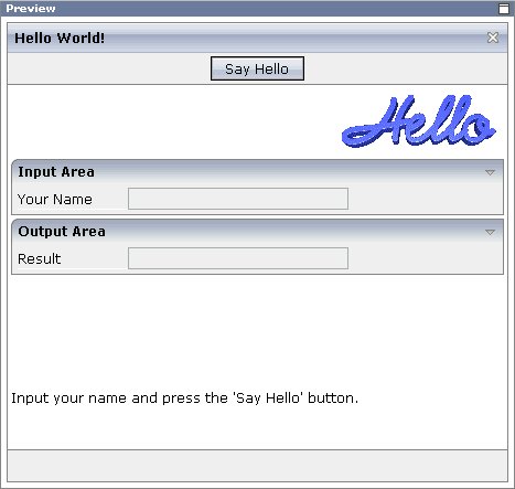
The preview area is a sensitive area. When you select a control in the preview area (for example, the title bar), this control is automatically selected in the layout tree.
 To preview the layout
Choose the following button which is shown at the top of the Layout Painter.
The preview area is updated according to the defined preview mode (see below).
If the system finds wrong definitions, a corresponding message is displayed in the status bar. You can view the protocol to display more information about the problems that occurred when generating the preview page. See Protocol in the section Configuration, Log and Status Information.
When the preview button is used with one of the other tools which are shown in the preview area, the tool is refreshed so that the latest information is shown. This is helpful, for example, if the Code Assistant is currently active in the preview area and you define a new method in the properties area. If you want to display this new method immediately in the Code Assistant, you choose the preview button.
You can define that a quick preview button is to be shown in addition to the regular preview button. See Preferences in the section Configuration, Log and Status Information.
You set the preview mode on the tab of the Layout Painter.
Note:
In the SWT client, you set the preview mode on a separate tab with
the name .
There are two different preview modes:
This is the default setting.
As long as is activated, the latest changes to the adapter class (which have been made in the Java development environment) are used when you preview your layout.
When the name of an adapter class has not been defined in the
model property of the page, or when an adapter
class has been defined which does not yet exist, an error screen is shown when
you try to preview your layout. In this case, you have the possibility to
activate . Your layout will then be
loaded with an empty adapter. This means that you will not have any
functionality. Any changes that you make in your Java development environment
will not be reflected in the preview.
You can define which preview mode is to be active by default when the Layout Painter is started. See Preferences in the section Configuration, Log and Status Information.
In the SWT client, the following options are available from the tab:
When this option is selected, the preview is shown as in the SWT client.
When this option is selected, the preview is shown as in the browser.
When you change the preview configuration, this is immediately considered in the preview area.
When you select a control in the layout tree or in the HTML preview, its properties are shown in the properties area below the layout tree. Example:
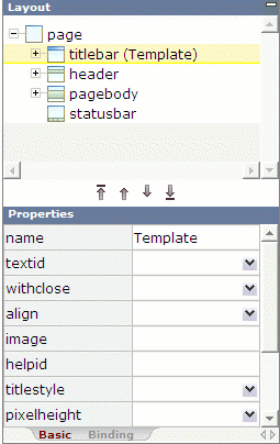
If required, you have expand the layout tree until the control is shown for which you want to set the properties (for example, by clicking the plus sign in front of a node).
Note:
By clicking the icon of a node, you hide or expand the node's
subnodes.
You can set properties in different ways:
The properties are explained in the Layout Elements documentation in which you can view the descriptions for all properties of a control at one glance.
You can set the properties directly in the properties area.
To set a property in the properties area
Select the node for the control in the layout tree.
Or:
Select the control in the HTML preview.
The properties for this control are now shown in the properties area at the bottom. For some properties, default entries are provided.
Specify the value for the required property.
Note:
The values of some important properties (for example, the
name or textid of the
Title Bar control) are shown in the layout area: in
round brackets after the XML tag. If you modify the value of such a property,
the changed value will be visible when you click on the layout tree.
You can set the properties using the Property Editor. In this case, you can access detailed help information on each property.
To set a property using the Property Editor
Select the node for the control in the layout tree.
Or:
Select the control in the HTML preview.
From the tab of the Layout Painter, choose .
The Property Editor dialog appears, listing all properties of the control. Example:
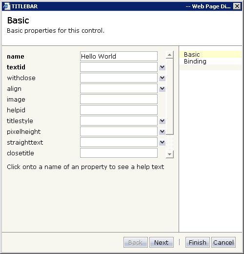
For some controls, the properties are spread over several pages.
If required, choose the button to display more properties for this control.
Or:
Choose the corresponding entry on the right of the dialog.
Choose the name of a property to display detailed information on this property. This information is shown below the list of properties.
Enter the required value for a property in the text box or, if available, choose the value from the drop-down list box.
Choose the button to close the dialog.
Any changes you have applied in the dialog are saved.
You can set the properties using the Event Editor. The Event Editor is used in the same way as the Property Editor, but it shows only the properties which bear a reference to the program code.
To set a property using the Event Editor
Select the node for the control in the layout tree.
Or:
Select the control in the HTML preview.
From the tab of the Layout Painter, choose .
The Event Editor dialog appears, listing only the
*prop and *method
properties of the control. Example:
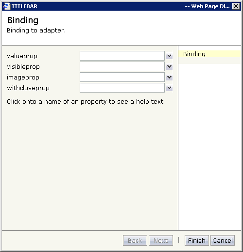
Choose the name of a property to display detailed information on this property. This information is shown below the list of properties.
Enter the required value for a property in the text box or, if available, choose the value from the drop-down list box.
Choose the button to close the dialog.
Any changes you have applied in the dialog are saved.
The controls that you can add to the layout can be found in the various sections of the controls palette. You simply drag them from the controls palette onto the corresponding node in the layout tree or to the HTML preview. The HTML preview is immediately refreshed.
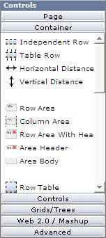
For detailed information on the controls, see the Layout Elements documentation.
Note:
You can also add controls to the layout tree as described in
Managing the Nodes in the
Layout Tree.
To add a control to the layout
Open the required section of the controls palette by choosing the corresponding button (for example, the button).
When you move the mouse over a control, a tool tip appears which also displays the control name which will be used in the XML layout. For example:
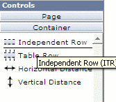
Drag the control from the controls palette onto the required node in the layout tree.
Or:
Drag the control from the controls palette and drop it in the HTML
preview.
Note:
A control can only be inserted at a valid position. Thus, it may
happen that the control is not inserted in the node which was highlighted when
you dropped the control, but at a different position.
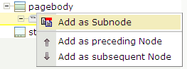
When you drop information, the system will sometimes respond by offering a context menu with certain options about where to place the control. Depending on the current context, different commands are available. For example:
Note:
When you move the mouse outside the context menu, the context
menu disappears. The control is not inserted in this case.
The new node is automatically selected in the layout tree so that you can maintain its properties directly in the properties area.
Instead of setting the corresponding property for a control, you can change the appearance of text (for example, on a button) using the commands in the Text section of the tab.
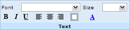
You can change the following:
font
font size
style (bold, italic, underline)
alignment (left, center, right)
border (not available in the SWT client)
font color
To change the appearance of text
Select the node for the control in the layout tree.
Or:
Select the control in the HTML preview.
Open the tab of the Layout Painter and choose the desired effect in the Text section.
Your change is immediately shown in the HTML preview.
Not available in the SWT client.
You can define a background image for your page. The image must be a file with the extension gif, jpeg or jpg.
To define a background image
From the tab of the Layout Painter, choose .
A dialog appears.
Specify the path to your image file or use the button to do so.
You have to specify an image file from your local file system. The file must be located in the same directory as your web application (or any subdirectory). When you specify an absolute path, this will automatically be converted to a relative path.
Choose the button.
Not available in the SWT client.
You can assign a style sheet to your page. This can either be a predefined style sheet or one of your own style sheets that you have created using the Style Sheet Editor. The style sheet must be a file with the extension css.
Instead of setting the corresponding property for the page (see Static Selection of the Style Sheet File in the Special Development Topics), you can define a style sheet as described below.
To define a style sheet
From the tab of the Layout Painter, choose .
A dialog appears.
Specify the path to your style sheet or use the button to do so.
You have to specify a style sheet from your local file system. The file must be located in the same directory as your web application (or any subdirectory). When you specify an absolute path, this will automatically be converted to a relative path.
Choose the button.
You can assign hot keys to the controls PAGE, FIELD and ROWTABLEAREA2.
For example, you can define the hot key CTRL+S for calling the
method onSave. When hot keys can be defined for a
control, a Hot keys tab is available in the properties
area.
See also Extended Hot Key Management in the Special Development Topics.
To define hot keys
Select the control for which you want to define hot keys.
Note:
When a control is selected for which hot keys cannot be defined,
your hot key definition will apply to the PAGE control.
From the tab of the Layout Painter, choose .
A dialog appears. When hot keys have already been defined, they are shown. Example:
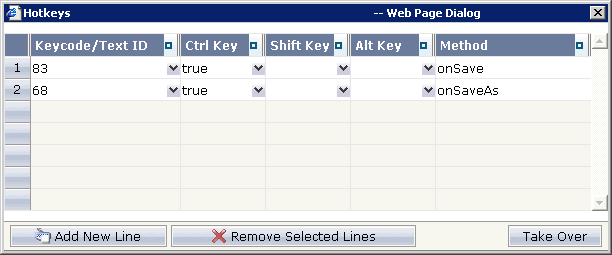
When hotkeys have already been defined, choose the button to add an additional hotkey.
Note:
To remove a hot key, select the corresponding row and choose the
button.
From the drop-down list box in the first column, select the key that you want to use as a hot key. For example, "83" represents the S key and "120" represents the F9 key.
Or:
In the text box of the drop-down list box in the first column, enter
a text ID that is to be translated by the multi language management.
Define each key (CTRL, SHIFT and/or ALT) which is to be used for the hot key by selecting "true" from the corresponding drop-down list box.
Note:
If neither "true" nor
"false" is selected for a key, the default setting
"false" is used.
In the Method column, specify the name of the method that is to be invoked when the user presses the hot key.
When all hot keys have been defined, choose the button.
The following topics are covered below:
You can manage the nodes in the layout tree using the following buttons which are shown below the layout tree:
| Button | Description |
|---|---|
 |
Moves the selected node up to first position in the tree. |
 |
Moves the selected node up to the previous position in the tree. |
 |
Moves the selected node down to the next position in the tree. |
 |
Moves the selected node down to last position in the tree. |
When an operation is not allowed, a corresponding message is shown in the status bar.
You can manage the nodes in the layout tree using the following commands from the tab of the Layout Painter:
| Button | Command | Description |
|---|---|---|
 |
Cut | Cuts the selected node. |
 |
Copy | Copies the selected node. |
 |
Delete | Deletes the selected node. |
 |
Undo | Undoes the previous action. The previous action can be, for example, a move operation or a changed property value. |
 |
Redo | Redoes the previous undo action. |
 |
Paste as first | Pastes the cut or copied node as the first subnode of the selected node. |
 |
Paste as last | Pastes the cut or copied node as the last subnode of the selected node. |
Note:
To copy and paste information in the properties area, use the key
combinations CTRL+C and CTRL+V.
You copy or move the nodes in the layout tree using drag-and-drop.
To copy or move a node using drag-and-drop
Select the node you want to move so that it is highlighted.
Press SHIFT or CTRL, if you want to select more than one node.
Press the left mouse button and keep it pressed.
Drag the mouse to the target node.
While you drag the mouse, a tool tip in light colors is shown for the node(s) you are currently dragging.
Release the mouse button.
A context menu appears and you have choose one of the following commands:
| Command | Description |
|---|---|
| Adds a copy of the selected node before the target node. | |
| Adds a copy of the selected node after the target node. | |
| Moves the selected node and inserts it before the target node. | |
| Moves the selected node and inserts it after the target node. |
Note:
When the copy or move operation is not allowed, the context menu
does not appear. Instead, a corresponding message is shown in the status
bar.
Choose the required command from the context menu.
Note:
To cancel the drag process, move the mouse outside the context
menu. The context menu will disappear and any selected nodes will keep their
current position.
You can manage the nodes in the layout tree using context menus. The following commands may appear in a context menu:
| Command | Description |
|---|---|
| Adds a control as the first subnode of the selected node. A cascading menu is available for this command, containing all controls that can be added as a subnode of the selected node. | |
| Adds a control as the last subnode of the selected node. A cascading menu is available for this command, containing all controls that can be added as a subnode of the selected node. | |
| Adds a control before the selected node, on the same level as the selected node. A cascading menu is available for this command, containing all controls that can be added as a sidenode of the selected node. | |
| Adds a control after the selected node, on the same level as the selected node. A cascading menu is available for this command, containing all controls that can be added as a sidenode of the selected node. | |
| Cuts the selected node. | |
| Copies the selected node. | |
| Pastes the cut or copied node as the first subnode of the selected node. | |
| Pastes the cut or copied node as the last subnode of the selected node. | |
| Deletes the selected node. | |
| Invokes the Property Editor. | |
| Opens all subnodes of the selected node. | |
| Closes all subnodes of the selected node. |
When you save the layout, all of your changes in the Layout Painter are saved. This includes, for example, code that has been generated with the Code Assistant and language-specific texts that have been defined with the Literal Assistant.
When you save a layout for the first time, an HTML file is generated (in addition to the XML file) which is placed into the root directory of your application project. This HTML file is updated each time you save the layout.
Note:
When you save the page, the
preview area is
automatically updated.
To save the page
Choose the following button which is shown at the top of the Layout Painter.
To save the page with a different name
From the tab of the Layout Painter, choose .
A dialog box appears.
Enter the new file name. The name must end with ".xml"
Choose the button.
A copy of the previous layout is now available in the current project. It can be edited immediately.
Not available in the SWT client.
You can display and test the current layout, which is normally shown in the preview area, in a separate browser window. The browser shows the URL that is used to invoke this page, for example, http://localhost:51000/cis/servlet/StartCISPage?PAGEURL=/cisyourfirstproject/helloworld.html&POPUPTITLE=cisyourfirstproject/helloworld.
To display the layout in a new browser window
From the tab of the Layout Painter, choose .