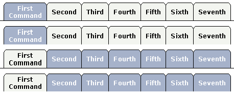
The TABSEL control looks as shown in the following example:

The number of tabs is dynamically defined at runtime. There are various output options:
With/without a horizontal line below the control.
Normal or reverse coloring.
Like the TABSTRIP control, the TABSEL control does not provide internal containers that are switched when selecting tabs. It just represents one tab line.
The following topics are covered below:
The XML layout of above example is:
<pagebody horizdist="false">
    <tabsel tabselprop="tabsel">
    </tabsel>
    <vdist height="10">
    </vdist>
    <tabsel tabselprop="tabsel" bottomborder="false">
    </tabsel>
    <vdist height="10">
    </vdist>
    <tabsel tabselprop="tabsel" bottomborder="true" reversecolors="true">
    </tabsel>
    <vdist height="10">
    </vdist>
    <tabsel tabselprop="tabsel" bottomborder="false" reversecolors="true">
    </tabsel>
</pagebody>
The adapter code is:
import com.softwareag.cis.server.Adapter;
import com.softwareag.cis.server.util.TABSELInfo;

// This class is a generated one.

public class TabSelAdapter
    extends Adapter
{
    // ------------------------------------------------------------------------
    // inner classes
    // ------------------------------------------------------------------------

    // class >TabselInfo<
    public class TabselInfo extends TABSELInfo
    {
        public void reactOnSelect()
        {
            outputMessage(MT_SUCCESS,"Selected: " + getSelectedItem());
        }
    }

    // ------------------------------------------------------------------------
    // properties
    // ------------------------------------------------------------------------

    // property >tabsel<
    TabselInfo m_tabsel = new TabselInfo();
    public TabselInfo getTabsel() { return m_tabsel; }

    /** initialisation - called when creating this instance*/
    public void init()
    {
        // Fill TABSEL
        m_tabsel.exchangeItems(new String[]
                                          {
                                          "First Command",
                                          "Second",
                                          "Third",
                                          "Fourth",
                                          "Fifth",
                                          "Sixth",
                                          "Seventh"
                                          });
    }
}
On the server side, the control is associated with an instance of class
MyTABSELInfo - derived from
TABSELInfo. The instance is loaded with the available
tabs. When the user selectes a tab, a method
reactOnSelect is called inside the instance. The
program can access the selected item by using
getSelectedItem() - returning the index of the item
selected.
| Basic | |||
| tabselprop |
Name of the adapter property representing the TABSEL control on server side. The property must be of type "TABSELInfo". Please find further information inside the Java API Documentation. |
Obligatory | |
| bottomborder |
If set to "true" then a bottom border is rendered below the tab selection. If set to "false" then no bottom border will be drawn. |
Optional |
true false |
| reversecolors |
Reverses the color scheme of the TABSEL control. |
Optional |
true false |
| leftindent |
Inserts a horizontal distance left of the first "tab" and shifts the "tabs" to the right as consequence. The value you may define represents the number of pixels that are inserted. |
Optional |
1 2 3 int-value |
| comment |
Comment without any effect on rendering and behaviour. The comment is shown in the layout editor's tree view. |
Optional | |