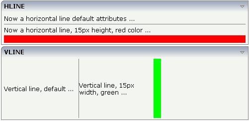
Both controls are actually not container controls, but they are typically used for structuring content - this is the reason why they are mentioned here. The controls are rather simple: they represent lines. HLINE represents a horizontal line and VLINE represents a vertical line.
Have a look at this demo:

The corresponding XML layout definition is:
<rowarea name="HLINE">
    <itr>
        <label name="Now a horizontal line default attributes ..." asplaintext="true">
        </label>
    </itr>
    <hline>
    </hline>
    <itr>
        <label name="Now a horizontal line, 15px height, red color ..." asplaintext="true">
        </label>
    </itr>
    <hline height="15" color="#FF0000">
    </hline>
</rowarea>
<rowarea name="VLINE" height="150">
    <itr height="100%">
        <label name="Vertical line, default ..." width="150" asplaintext="true">
        </label>
        <vline>
        </vline>
        <label name="Vertical line, 15px width, green ..." width="150" asplaintext="true">
        </label>
        <vline width="15" color="#00FF00">
        </vline>
    </itr>
</rowarea>
For each line, you can define its width/height and its color.
The following topics are covered below:
| Basic | |||
| width |
Width of the control. There are three possibilities to define the width: (A) You do not define a width at all. In this case the width of the control will either be a default width or - in case of container controls - it will follow the width that is occupied by its content. (B) Pixel sizing: just input a number value (e.g. "100"). (C) Percentage sizing: input a percantage value (e.g. "50%"). Pay attention: percentage sizing will only bring up correct results if the parent element of the control properly defines a width this control can reference. If you specify this control to have a width of 50% then the parent element (e.g. an ITR-row) may itself define a width of "100%". If the parent element does not specify a width then the rendering result may not represent what you expect. |
Optional | |
| color |
Color of the control. Value must follow format "#rrggbb", e.g. #000000 for black. |
Optional |
#FF0000 #00FF00 #0000FF #FFFFFF #808080 #000000 |
| comment |
Comment without any effect on rendering and behaviour. The comment is shown in the layout editor's tree view. |
Optional | |
| Basic | |||
| height |
Height of the control. There are three possibilities to define the height: (A) You do not define a height at all. As consequence the control will be rendered with its default height. If the control is a container control (containing) other controls then the height of the control will follow the height of its content. (B) Pixel sizing: just input a number value (e.g. "20"). (C) Percentage sizing: input a percantage value (e.g. "50%"). Pay attention: percentage sizing will only bring up correct results if the parent element of the control properly defines a height this control can reference. If you specify this control to have a height of 50% then the parent element (e.g. an ITR-row) may itself define a height of "100%". If the parent element does not specify a width then the rendering result may not represent what you expect. |
Optional | |
| color |
Color of the control. Value must follow format "#rrggbb", e.g. #000000 for black. |
Optional | |
| comment |
Comment without any effect on rendering and behaviour. The comment is shown in the layout editor's tree view. |
Optional | |