The ABSDYNICON is similar to the ABSICON control. Main difference: whereas the name of the image is defined statically by the ABSICON control, it is derived from an adapter property by the ABSDYNICON control. The image can be changed by the application. The ABSDYNICON is used to display the dynamic traffic lights in the previous example.
It is also possible to specify the height and the width of an ABSDYNICON control by binding these values to corresponding adapter properties. For example, use this feature to display a numeric value by a graphical bar which changes its size depending on this value.
In addition, it is also possible to specify the coordinates
(x/y/z)
of the ABSDYNICON dynamically. Maybe you want to display an icon representing a
car and want to update regularly its position by properties of your adapter
object.
This document covers the following topics:
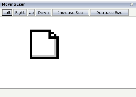
The following example demonstrates the possibility to specify dynamically the size and coordinates of the ABDSDYNICON control. It looks as follows:

By clicking on the buttons you manipulate the size and the position of the icon.
The XML layout definition looks as follows:
<page model="MovingIconAdapter">
    <absfolder name="ABSFolderMovingIcon">
        <absdynicon valueprop="iconName" xprop="x" yprop="y" zprop="z" heightprop="height"
                    widthprop="width">
        </absdynicon>
    </absfolder>
    <titlebar name="Moving Icon">
    </titlebar>
    <header align="left" withdistance="false">
        <button name="Left" method="moveLeft">
        </button>
        <button name="Right" method="moveRight">
        </button>
        <button name="Up" method="moveUp">
        </button>
        <button name="Down" method="moveDown">
        </button>
        <button name="Increase Size" method="increase">
        </button>
        <button name="Decrease Size" method="decrease">
        </button>
    </header>
    <pagebody>
    </pagebody>
    <statusbar withdistance="false">
    </statusbar>
</page>
The coordinates and the size for the ABSDYNICON control are derived from adapter properties. The adapter class source is:
import com.softwareag.cis.server.Adapter;

// This class is a generated one.

public class MovingIconAdapter
    extends Adapter
{
    // property >height<
    int m_height=100;
    public int getHeight() { return m_height; }
    public void setHeight(int value) { m_height = value; }

    // property >iconName<
    String m_iconName= "images/new.gif";
    public String getIconName() { return m_iconName; }
    public void setIconName(String value) { m_iconName = value; }

    // property >width<
    int m_width=100;
    public int getWidth() { return m_width; }
    public void setWidth(int value) { m_width = value; }

    // property >x<
    int m_x=100;
    public int getX() { return m_x; }
    public void setX(int value) { m_x = value; }

    // property >y<
    int m_y=100;
    public int getY() { return m_y; }
    public void setY(int value) { m_y = value; }

    // property >z<
    int m_z;
    public int getZ() { return m_z; }
    public void setZ(int value) { m_z = value; }

    /** */
    public void decrease()
    {
        m_width -= 20;
        m_height -= 20;
    }

    /** */
    public void increase()
    {
        m_width += 20;
        m_height += 20;
    }

    /** */
    public void moveLeft() { m_x -= 20; }
    public void moveRight() { m_x += 20; }
    public void moveUp() { m_y -= 20; }
    public void moveDown() { m_y += 20; }
}
| Basic | |||
| valueprop |
Name of the adapter property providing the URL of the image to be displayed as an icon. |
Obligatory | |
| method |
Method being called inside the adapter when clicking on the icon. You do not have to define a value but can also use the icon just as a dynamic image display. |
Optional | |
| x |
X position in pixels. |
Optional | |
| y |
Y position in pixels. |
Optional | |
| z |
Z position. |
Optional | |
| xprop |
Name of property returning the X position. |
Optional | |
| yprop |
Name of property returning the Y position. |
Optional | |
| zprop |
Name of property returning the Z position. |
Optional | |
| height |
Height of icon in pixels. |
Optional | |
| width |
Width of icon in pixels. |
Optional | |
| heightprop |
Name of property returning the height. |
Optional | |
| widthprop |
Name of property returning the width. |
Optional | |
| title |
Text that is shown as tooltip for the control. Either specify the text "hard" by using this TITLE property - or use the TITLETEXTID in order to define a language dependent literal. |
Optional | |
| comment |
Comment without any effect on rendering and behaviour. The comment is shown in the layout editor's tree view. |
Optional | |
There are three options to set the size of an icon:
The icon is displayed in its original size - you do not have to
specify any of the properties height,
width, heightprop,
widthprop.
The icon is displayed with a defined size which does not change - you
have to specify the height and
width property values with the corresponding pixel
values.
The icon is displayed with a defined size which changes dynamically -
you have to specify the heightprop and
widthprop property values and you have to provide
the corresponding adapter properties.
There are two options for setting the position of an icon:
Static definition by the x,
y and z
properties.
Dynamic definition by adapter properties which are specified by the
xprop, yprop and
zprop properties.