The FIELD control is used for entering data. It provides the following features:
Normal input/output of text.
Password input.
Dynamic control if input is allowed.
Dynamic highlighting of field in case of errors.
Flush the input directly to the server when leaving the field.
Start a server method on pressing F4 or F7 or on click - useful for value help pop-up dialogs
Adapt the output to a data type (e.g. transfer "YYYYMMDD" to a visible date field)
The following topics are covered below:

The XML layout definition is:
<rowarea name="Fields">
    <itr>
        <field valueprop="factor4" flush="screen" length="10">
        </field>
        <hdist>
        </hdist>
        <field valueprop="factor4" flush="screen" length="10" password="true">
        </field>
        <hdist>
        </hdist>
        <field valueprop="factor4" flush="screen" length="10" displayonly="true">
        </field>
        <hdist>
        </hdist>
        <field valueprop="factor4" flush="screen" length="10">
        </field>
        <hdist>
        </hdist>
    </itr>
</rowarea>
For better visibility, distance controls were added between the FIELD controls.
As mentioned previously, you can dynamically control the input status of a FIELD by a property of the adapter class. The following example shows how to do this.
The XML layout looks as follows:
<rowarea name="Dynamic Field">
    <itr>
        <field valueprop="factor1" flush="server" length="10">
        </field>
        <hdist>
        </hdist>
        <field valueprop="factor1" flush="server" statusprop="factor1status" length="10">
        </field>
    </itr>
</rowarea>
There are two fields that show the same adapter property
factor1. The first field definition is without any
restrictions, the second one depends on the input status of the property
factor1Status.
The adapter program looks as follows:
// property >factor1<
int m_factor1=5;
public int getFactor1() {return m_factor1;}
public void setFactor1(int value) { m_factor1 = value; }

//  property >factor1status<
String m_factor1status;
public String getFactor1status()
{
    if (m_factor1 > 100)     return "DISPLAY";
    else if (m_factor1 > 10)    return "ERROR";
    else                    return "EDIT";
}
public void setFactor1status(String value) { m_factor1status = value; }
Now let us see what happens if different numbers are entered:
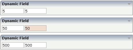
The right field changes its input status according to the value of the
property factor1Status. There are four different
values that can be returned as status information:
EDIT
The field is displayed as a normal field.
ERROR
The field indicates an error with its value.
DISPLAY
The field is only displayed.
FOCUS
The field is displayed as a normal field; it requests the focus.
By using regular expressions, you can check the user's input into a field in a very powerful way. Regular expressions are a standardized way (W3C) of describing the format of strings. You can use it, for example, to check whether the user entered an article number correctly - following some conventions that are defined inside your application.
Regular expressions can be plugged to a field control so that it checks the input of the user against the expression. The check is done when the user has left the field. If the check is successful, nothing happens - if it fails, an error message pops up indicating to the user that the input did not match the field's requirements.
There are two ways of plugging regular expressions to the field:
Static Definition
The regular expression is directly defined inside the control's
definition.
Dynamic Definition
Inside the control, you specify a property that passes the expression
at runtime.
The following example shows a field in which you enter a telephone number. A regular expression checks whether the number is entered in the right format:
![]()
The field is defined in the following way:
<field valueprop="phone" width="100" validation="[0-9 )(-/+]+">
</field>
The regular expression "[0-9)(-/+]+" indicates that the following can be entered
A string that has any number of characters: "[]+".
A string that has only characters which are "0-9)(-/+".
If the user enter a wrong value, the following message appears:
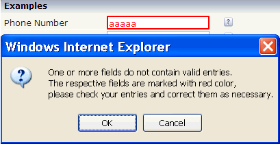
In the field, you can specify the float value for the
datatype property. Consequently, the field's input
will automatically be interpreted as float input - and e.g. decimal separators
will be added.
In addition, you can specify the number of valid decimal digits: the
number is not defined in a fixed way inside the control but is derived from a
server side property (decimaldigitsprop property).
Maybe you have an application that inputs and outputs amounts with a certain
currency reference. Depending on the currency, the number of decimal digits
behind the comma may be different.
The FIELD control supports a value help - i.e. you can offer the user a support pop-up for a field that e.g. lets the user select valid values instead of typing them manually. The value help bases on a generic mechanism that allows you to define any kind of your own value help pop-ups - but there are also two predefined ways to quickly create a simple value help that lets the user select values from a list.
First, the description of the generic framework: The FIELD control has a
property popupmethod. If you fill this property,
then there are two consequences:
The field shows a little icon on the very right.
The field is value help-sensitive: if the user clicks on the icon or
clicks with the right mouse button into the field, then the method on server
side that is referenced by the popupmethod
property is called.
You see that the value help is triggered in the client, but the actual value help processing is launched from the server adapter method that is referenced. What the method does is completely up to you - in most cases, it shows a certain pop-up.
Have a look at the following example:

The XML layout definition is:
<rowarea name="Address">
    <itr>
        <label name="Titel" width="120">
        </label>
        <field valueprop="titel" width="50" popupmethod="openIdValueHelp">
        </field>
    </itr>
</rowarea>
The implementation in the adapter is:
// property >titel<
String m_titel;
public String getTitel() { return m_titel; }
public void setTitel(String value) { m_titel = value; }

public void onValueHelpTitel()
{
   openPopup("/HTMLBasedGUI/empty.html");
}
When the user chooses the icon in the title field,
onValueHelpTitle() is called. The method itself opens
a certain pop-up. It is completely up to you to specify the reaction - maybe
you do not want to open a pop-up but want to navigate to another page.
See Working with Page
Navigation in the Working with Pages
documentation for more details on pop-up management. Be aware of the
fact that - just as with any other method which is, for example, called by a
button - all the data of the screen is first transferred into your adapter
before the method is called. For example, if the user enters
"M" into the title field and then invokes the value
help, then setTitle() is invoked first and after this
onValueHelpTitle() is invoked. The same happens to any
other data that was modified on the screen prior to the help request.
Sometimes you want to define a generic way of reacting to value requests
- you do not want to have one explicit method per field to be called - but you
want to define one method referenced by all fields. For this purpose, there is
a method findValueRequestProperty() that you inherit
from the Adapter class. This method returns the name of the property that is
referenced as valueprop inside the corresponding
field.
Based on the popupmethod mechanism that is
explained in the previous section, there are simple ways of providing a
standard value help for field inputs:
The predefined pop-up method openIdValueHelp
requests a list of valid values from the adapter and displays the list in a
pop-up from which the user can select a value. The list is fetched by following
a certain naming convention: the adapter must provide for a method with the
name findValidValuesForXxx() where
"Xxx" is the name of the property.
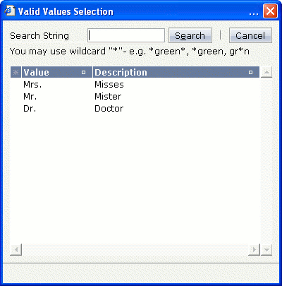
The predefined pop-up method openIdValueCombo
uses the same findValidValuesForXxx() method, but
displays the result similar to a combo box:
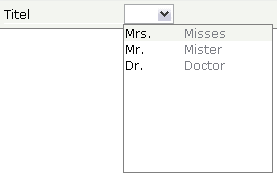
The predefined pop-up method
openIdValueComboOrPopup is a mixture of the methods
described above. For performance reasons, small lists are displayed in a combo
box and large lists are displayed in a pop-up. By default, lists containing up
to 100 entries are shown in a combo box. Using the parameter
maxitemsinfieldcombo of the configuration file
cisconfig.xml,
you can control the maximum number of entries that are to be shown in the combo
box.
The corresponding adapter code is:
// property >titel<
String m_titel;
public String getTitel() { return m_titel; }
public void setTitel(String value) { m_titel = value; }

public ValidValueLine[] findValidValuesForTitel()
{
    ValidValueLine[] result = new ValidValueLine[3];
    result[0] = new ValidValueLine("Mrs.","Misses");
    result[1] = new ValidValueLine("Mr.","Mister");
    result[2] = new ValidValueLine("Dr.","Doctor");
    return result;
}
Note that the method is called at the point of time when the user requests value help.
The ValidValueLine also supports a
constructor in which only the value of the field is passed - without further
description.
When having read the previous sections on value help, be aware that at
the point in time when the value help is called (e.g. when
findValidValuesFor...() is called), all data input
that was done on the browser client has already been transferred into your
adapter object.
This means: you already have access to the property that a user entered before invoking the value help.
Consequence: inside your reaction on the value help request (e.g. in
your implementation of findValidValuesFor...()), you
can already filter the valid values against what the user has already
entered.
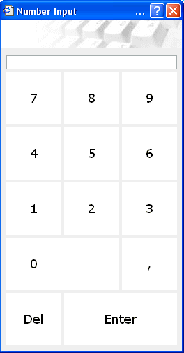
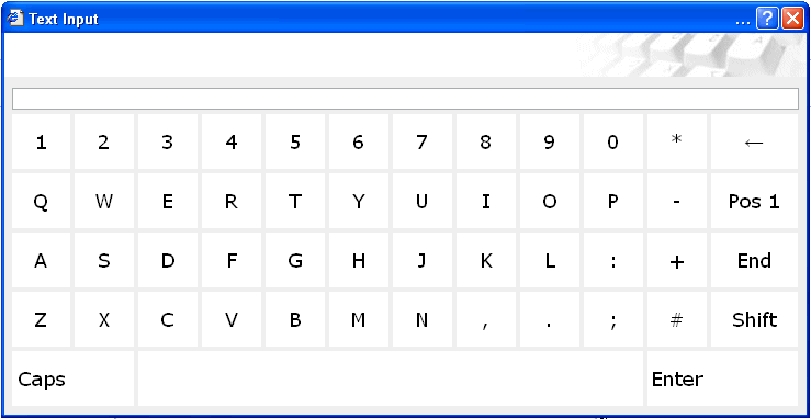
As mentioned in the property list, the field is able to offer touch screen support. Have a look at the following example:

If the user clicks into the area in which you can see a keyboard shining through as background, the user will get one of the following pop-ups - depending on the data type assigned to the FIELD control.
The XML layout definition is:
<rowarea name="Demo">
    <itr>
        <label name="Integer Input" width="100">
        </label>
        <field valueprop="intValue" width="150" touchpadinput="true" datatype="int">
        </field>
    </itr>
    <itr>
        <label name="Float Input" width="100">
        </label>
        <field valueprop="floatValue" width="150" touchpadinput="true" datatype="float">
        </field>
    </itr>
    <itr>
        <label name="Text Input" width="100">
        </label>
        <field valueprop="stringValue" width="250" touchpadinput="true">
        </field>
    </itr>
</rowarea>
In all FIELD controls, the property
touchpadinput is set to
"true". The server side adapter processing does not
differ in any way from the normal adapter processing.
| Basic | |||
| valueprop |
Server side property representation of the control. |
Obligatory | |
| width |
Width of the control. There are three possibilities to define the width: (A) You do not define a width at all. In this case the width of the control will either be a default width or - in case of container controls - it will follow the width that is occupied by its content. (B) Pixel sizing: just input a number value (e.g. "100"). (C) Percentage sizing: input a percantage value (e.g. "50%"). Pay attention: percentage sizing will only bring up correct results if the parent element of the control properly defines a width this control can reference. If you specify this control to have a width of 50% then the parent element (e.g. an ITR-row) may itself define a width of "100%". If the parent element does not specify a width then the rendering result may not represent what you expect. |
Sometimes obligatory |
100 120 140 160 180 200 50% 100% |
| comment |
Comment without any effect on rendering and behaviour. The comment is shown in the layout editor's tree view. |
Optional | |
| Appearance | |||
| width | (already explained above) | ||
| length |
Width of FIELD in amount of characters. WIDTH and LENGTH should not be used together. Note that the actual size of the control depends on the font definition if using the LENGTH property. |
Optional |
5 10 15 20 int-value |
| maxlength |
Maximum number of characters that a user may enter into this FIELD. This property is not depending on the LENGTH property - please do not get confused by the similar naming. MAXLENGTH has nothing to do with the optical sizing of the control but only with the number of characters you may input. |
Optional |
5 10 15 20 int-value |
| autotab |
If set to true, an automatic tab is executed for fields with a specified MAXLENGTH when the maxlength value is reached. For fields without a MAXLENGTH specified it has no effect. Default is true. |
Optional |
true false |
| textalign |
Alignment of text inside the control. |
Optional |
left center right |
| password |
If set to "true", each entered character is displayed as a '*'. |
Optional |
true false |
| displayonly |
If set to true, the FIELD will not be accessible for input. It is just used as an output field. |
Optional |
true false |
| direction |
Presets the default(BiDi) direction of the control. Use black string in order to have the default value. |
Optional |
rtl ltr |
| uppercase |
If "true" then all input is automatically transferred to upper case characters. |
Optional |
true false |
| align |
Horizontal alignment of control in its column. Each control is "packaged" into a column. The column itself is part of a row (e.g. ITR or TR). Sometimes the size of the column is bigger than the size of the control itself. In this case the "align" property specifies the position of the control inside the column. In most cases you do not require the align control to be explicitly defined because the size of the column around the controls exactly is sized in the same way as the contained control. If you want to directly control the alignment of text: in most text based controls there is an explicit property "textalign" in which you align the control's contained text. |
Optional |
left center right |
| valign |
Vertical alignment of control in its column. Each control is "packaged" into a column. The column itself is part of a row (e.g. ITR or TR). Sometimtes the size of the column is bigger than the size of the control. In this case the "align" property specify the position of the control inside the column. |
Optional |
top middle bottom |
| colspan |
Column spanning of control. If you use TR table rows then you may sometimes want to control the number of columns your control occupies. By default it is "1" - but you may want to define the control to span over more than one columns. The property only makes sense in table rows that are snychronized within one container (i.e. TR, STR table rows). It does not make sense in ITR rows, because these rows are explicitly not synched. |
Optional |
1 2 3 4 5 50 int-value |
| rowspan |
Row spanning of control. If you use TR table rows then you may sometimes want to control the number of rows your control occupies. By default it is "1" - but you may want to define the control two span over more than one columns. The property only makes sense in table rows that are snychronized within one container (i.e. TR, STR table rows). It does not make sense in ITR rows, because these rows are explicitly not synched. |
Optional |
1 2 3 4 5 50 int-value |
| fieldstyle |
CSS style definition that is directly passed into this control. With the style you can individually influence the rendering of the control. You can specify any style sheet expressions. Examples are: border: 1px solid #FF0000 background-color: #808080 You can combine expressions by appending and separating them with a semicolon. Sometimes it is useful to have a look into the generated HTML code in order to know where direct style definitions are applied. Press right mouse-button in your browser and select the "View source" or "View frame's source" function. |
Optional |
background-color: #FF0000 color: #0000FF font-weight: bold |
| noborder |
Boolean value defining if the control has a border. Default is "false". |
Optional |
true false |
| transparentbackground |
Boolean value defining if the control is rendered with a transparent background. Default is "false". |
Optional |
true false |
| bgcolorprop |
Property of the adapter object to provide the background color of the control. |
Optional | |
| fgcolorprop |
Name of adapter property that passes back a color value (e.g. "#FF0000" for red color). The color value is used as text color in the control. - The background color is automatically chosen dependent from the text color: for light text colors the background color is black, for dark text colors the color is default. Use BGCOLORPROP to choose both - text and background color. |
Optional | |
| invisiblemode |
If the visibility of the control is determined dynamically by an adapter property then there are two rendering modes if the visibility is "false": (1) "invisible": the control is not visible. (2)"cleared": the control is not visible but it still occupies space. |
Optional |
invisible cleared |
| tabindex |
Index that defines the tab order of the control. Controls are selected in increasing index order and in source order to resolve duplicates. |
Optional |
-1 0 1 2 5 10 32767 |
| Binding | |||
| valueprop | (already explained above) | ||
| alwaysflush |
If set to TRUE then a specified server flushmethod is also called in case the value has not changed. The default is FALSE, meaning that a server flushmethod is only called for a changed value. |
Optional |
true false |
| flush |
Flushing behaviour of the input control. By default an input into the control is registered within the browser client - and communicated to the server adapter object when a user e.g. presses a button. By using the FLUSH property you can change this behaviour. Setting FLUSH to "server" means that directly after changing the input a synchronization with the server adapter is triggered. As consequence you directly can react inside your adapter logic onto the change of the corresponding value. - Please be aware of that during the synchronization always all changed properties - also the ones that were changed before - are transferred to the adapter object, not only the one that triggered the synchonization. Setting FLUSH to "screen" means that the changed value is populated inside the page. You use this option if you have redundant usage of the same property inside one page and if you want to pass one changed value to all its representaion directly after changing the value. |
Optional |
screen server |
| flushmethod |
When the data synchronization of the control is set to FLUSH="server" then you can specify an explicit method to be called when the user updates the content of the control. By doing so you can distinguish on the server side from which control the flush of data was triggered. |
Optional | |
| contextmenu |
If set to TRUE for a field myfield, method/event reactOnContextMenuMyfield will be called/triggered on right mouse click. In this method/event you can set a contextmenu correspondingly. Please use the attribute CONTEXTMENUMETHOD in case you would like to use a different method/eventname. In case a valid value is specified for the CONTEXTMENUMETHOD attribute, the value for the CONTEXTMENU attribute is ignored. Default value is FALSE. |
Optional |
true false |
| contextmenumethod |
Name of the method on adapter level that is called when the user presses the right mouse button in an empty area. |
Optional | |
| displayprop |
Name of adapter property that controls whether the field is displayonly(true) or not (false). By using this property you can dynamically control the "display"-status of the control by your adapter object. |
Optional | |
| statusprop |
Name of the adapter property that dynamically passes information how the field should be rendered and how it should act. |
Optional | |
| valuetextprop |
Name of the adapter property that provides a "human understandable" description for the value: in some cases you enter an id into a FIELD but want to display the id and a description to the user. At runtime, the values provided by the VALUEPROP- and the VALUETEXTPROP-property are combined into one text (string) that is returned into the FIELD. |
Optional | |
| textidmode |
If using property "valuetextprop" then a field knows an id and a text for a certain value. There are three types of display: either both are shown together, separated by an "-" (e.g. "id - text"). Or only text is shown or only the id is shown. If not defined at all then the system's default text id-mode will be chosen. The default mode can be defined as part of the CIS session context. |
Optional |
0 1 2 |
| titleprop |
Property of adapter that dynamically defines the title of the control. The title is displayed as tool tip when ther user moves the mouse onto the control. |
Optional | |
| bgcolorprop | (already explained above) | ||
| fgcolorprop | (already explained above) | ||
| autocallpopupmethod |
Use property AUTOCALLPOPUPMETHOD to invoke the field's value help method with a certain offset (milliseconds) after last key down event |
Optional |
true false |
| lengthprop |
Property of the adapter that defines the width of FIELD in amount of characters. |
Optional | |
| maxlengthprop |
Name of adapter property that passes back the maximum number of characters that a user may enter into this FIELD. Consider to use MAXLENGTH to define this number in a static way. |
Optional | |
| Validation | |||
| datatype |
By default, the FIELD control is managing its content as string. By explicitly setting a datatype you can define that the control... ...will check the user input if it reflects the datatype. E.g. if the user inputs "abc" into a field with datatype "int" then a corresponding error message will popup when the user leaves the field. ...will format the data coming from the server or coming form the user input: if the field has datatype "date" and the user inputs "010304" then the input will be translated into "01.03.2004" (or other representation, dependent on date format settings). In addition valeu popups are offered for the user automatically for some datatypes: e.g. when specifying datatype "date" the automatically the field provides a calendar input popup. Please note: the datatype "float" is named a bit misleading - it represents any decimal format number. The server side representation may be a float value, but also can be a double or a BigDecimal property. |
Optional |
date float int long time timestamp color xs:decimal xs:double xs:date xs:dateTime xs:time ------------------------ N n.n P n.n string n L xs:boolean xs:byte xs:short |
| editmask |
NATPAGE only: Natural edit mask. |
Optional | |
| validationrules |
Contains information used for Data Validation. Use the Validation Rules Editor to make changes! |
Optional | |
| validation |
Regular expression against which the content of the field is checked on client side when the user changes the field. If the validation fails then an error message popup up and informs the user about the wrong input. |
Optional |
[a-zA-Z0-9_.-] {1,}\\@[a-zA-Z0-9_.-] {1,}\\.\\w{2,}\\d{5} [0-9 )(-/+]+ |
| validationprop |
Property out of which the regular expression is dynamically read. Works the same way as VALIDATION but in a dynamic way. |
Optional | |
| validationuserhint |
If a client side validation fails due to wrong user input then an error popup is opened. If you define a hint inside this property then the hint is output to the user in order to tell in which way to input the value. The hint is not language dependent. |
Optional | |
| validationuserhintprop |
If using validation expressions (either property "validation" or "validationprop") then a popup comes up if the user inputs wrong values into a field. Inside this popup a certain text may be added in order to explain to the user what he/she did not correctly input. This text can be either statically defined or dynamically - by using this property reference. |
Optional | |
| digits |
Number that specifiies how many digits are to be displayed (ie digits before the comma). If using this feature then the DATATYPE property must be set to 'float'. See also DECIMALDIGITS. |
Optional |
1 2 3 int-value |
| digitsprop |
Property of the adapter that passes back information how many digits are to be displayed (ie digits before the comma). If using this feature then the DATATYPE property must be set to 'float'. |
Optional | |
| decimaldigits |
Number that specifiies how many decimal digits are to be displayed. If using this feature then the DATATYPE property must be set to 'float'. |
Optional |
1 2 3 int-value |
| decimaldigitsprop |
Property of the adapter that passes back information how many decimal digits are to be displayed. If using this feature then the DATATYPE property must be set to 'float'. |
Optional | |
| spinrangemin |
An integer value which defines the lower bound of the value range. |
Optional |
1 2 3 int-value |
| spinrangemax |
An integer value which defines the upper bound of the value range. |
Optional |
1 2 3 int-value |
| Valuehelp | |||
| popupmethod |
Name of the adapter's method that is called when the user requests value help by pressing F4 or F7 or by clicking into the FIELD with the right mouse button. See at chapter 'Popup Dialog Management' for more details. If the POPUPMETHOD is defined, a small icon is shown inside the field to indicate to the user that there is some value help available. |
Optional |
openIdValueCombo openIdValueHelp openIdValueComboOrPopup |
| popupinputonly |
Boolean property that control if a field with POPUPMETHOD defined is still usable for keyboard input. If "false" (= default) then the user can input a value either directly via keyboard or by using the popupmethod's help. If set to "true" then no keyboard input is possible - but only selection from the popup-method's help. |
Optional |
true false |
| popupprop |
Name of an adapter's boolean property to provide information whether a POPUPMETHOD is available (true) or not (false). This feature is used in scenarios in which a FIELD offers e.g. value help or not, depending on business logic inside the adapter. |
Optional | |
| popuponalt40 |
Value help in a field is triggered either by clicking with the mouse or by pressing a certain key inside the field. The "traditional" keys are "cusrsor-down", "F7" or "F4". Sometimes you do not want to mix other "cursor-down" behaviour (e.g. scrolling in lists) with the value help behaviour. In this case switch this property to "true" - and the value help will only come up anymore when "alt-cursor-down" is pressed. |
Optional |
true false |
| popupcombowidth |
Pixel width of the standard "openIdValueCombo" popup dialog. Default is field width or at least 150 pixel. |
Optional |
1 2 3 int-value |
| popupicon |
URL of image that is displayed inside the right corner of the field to indicate to the user that there is some value help available.. Any image type (.gif, .jpg, ...) that your browser does understand is valid. Use the following options to specify the URL: (A) Define the URL relative to your page. Your page is generated directly into your project's folder. Specifiying "images/xyz.gif" will point into a directory parallel to your page. Specifying "../HTMLBasedGUI/images/new.gif" will point to an image of a neighbour project. (B) Define a complete URL, like "http://www.softwareag.com/images/logo.gif". |
Optional |
gif jpg jpeg |
| touchpadinput |
Boolean property that decides if touch pad support is offered for the FIELD control. The default is "false". If switched to "true" then you can input data into the field via a touch pad. As consequence you can use this control for making inputs through a touch terminal. |
Optional |
true false |
| onlinehelp | |||
| helpid |
Help id that is passed to the online help management in case the user presses F1 on the control. |
Optional | |
| title |
Text that is shown as tooltip for the control. Either specify the text "hard" by using this TITLE property - or use the TITLETEXTID in order to define a language dependent literal. |
Optional | |
| titletextid |
Text ID that is passed to the multi lanaguage management - representing the tooltip text that is used for the control. |
Optional | |
| formula |
Contains information used by the Formula Editor. Use the Formula Editor to make changes! |
Optional | |
| Hot Keys | |||
| hotkeys |
Comma separated list of hot keys. A hotkey consists of a list of keys and a method name. Separate the keys by "-" and the method name again with a comma Example: ctrl-alt-65;onCtrlAltA;13;onEnter ...defines two hot keys. Method onCtrlAltA is invoked if the user presses Ctrl-Alt-A. Method "onEnter" is called if the user presses the ENTER key. Use the popup help within the Layout Painter to input hot keys. |
Optional | |
| Miscellaneous | |||
| testtoolid |
Use this attribute to assign a fixed control identifier that can be later on used within your test tool in order to do the object identification |
Optional | |
| autocallpopupmethodoffset |
The offset (milliseconds) after the last key down event for calling the AUTOCALLPOPUPMETHOD. Makes only sense if an AUTOCALLPOPUPMETHOD is specified. |
Optional |
1 2 3 int-value |