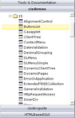
The button list represents a vertical arrangement of buttons. The number of buttons and the name on each button are dynamically derived from the adapter.
The controls always occupy 100% of the given width and occupy the height required by the buttons.
The following topics are covered below:

The XML layout definition is:
<pagebody>
    <buttonlist buttonlistprop="buttonlist">
    </buttonlist>
</pagebody>
The Java code of the adapter is:
import com.softwareag.cis.server.Adapter;
import com.softwareag.cis.server.util.BUTTONLISTInfo;
import com.softwareag.cis.server.util.BUTTONLISTItem;

// This class is a generated one.

public class TabSelAdapter
    extends Adapter
{
    // class >MyBLItem<
    public class MyBLItem extends BUTTONLISTItem
    {
        public MyBLItem(BUTTONLISTInfo info, String text)
        {
            super(info, text);
        }

        public void execute()
        {
            outputMessage("S","Button " + getText() + " was pressed!");
        }
    }

    // property >buttonlist<
    BUTTONLISTInfo m_buttonlist = new BUTTONLISTInfo();
    public BUTTONLISTInfo getButtonlist() { return m_buttonlist; }

    /** initialisation - called when creating this instance*/
    public void init()
    {
        // Fill Buttomlist
        MyBLItem item;
        item = new MyBLItem(m_buttonlist,"Hello");
        item = new MyBLItem(m_buttonlist,"this");
        item = new MyBLItem(m_buttonlist,"is");
        item = new MyBLItem(m_buttonlist,"CIS");
    }
}
The list of items can be changed inside the adapter. The button list will react accordingly on the client side.
If the user clicks a button on the client side, the
execute() method will be called in the object of the
BUTTONLISTInfo collection which represents the button.
Your reaction can be added accordingly.
Sorry for the naming, but this seems to be the most common way to make you understand what is meant: in many applications, you find the following arrangement of controls in order to arrange a set of functions to be called by a user:

The way to build this control is to combine the following:
One BUTTONLIST at the top of the page.
One tree control in the middle (see Working with Trees).
One BUTTONLIST at the bottom of the page.
Depending on the clicking of the user, the two BUTTONLIST controls change the number of contained buttons in a way that they "mirror one another".
| Basic | |||
| buttonlistprop |
Name of the adapter property that rerpesents the control on adapter side. The property must be of name BUTTONLISTInfo. Please view the Java API Documentation for more information. |
Obligatory | |
| pixeldistance |
Pixel distance between the buttons that are rendered. |
Optional |
1 2 3 int-value |
| buttonstyle |
CSS style definition that is directly passed into this control. With the style you can individually influence the rendering of the control. You can specify any style sheet expressions. Examples are: border: 1px solid #FF0000 background-color: #808080 You can combine expressions by appending and separating them with a semicolon. Sometimes it is useful to have a look into the generated HTML code in order to know where direct style definitions are applied. Press right mouse-button in your browser and select the "View source" or "View frame's source" function. |
Optional |
background-color: #FF0000 color: #0000FF font-weight: bold |
| imageheight |
Pixel height of image inside button. |
Optional | |
| imagewidth |
Pixel width of image inside button. |
Optional | |
| tabindex |
Index that defines the tab order of the control. Controls are selected in increasing index order and in source order to resolve duplicates. |
Optional |
-1 0 1 2 5 10 32767 |
| comment |
Comment without any effect on rendering and behaviour. The comment is shown in the layout editor's tree view. |
Optional | |
| Miscellaneous | |||
| testtoolid |
Use this attribute to assign a fixed control identifier that can be later on used within your test tool in order to do the object identification |
Optional | |