When you select a control, you can specify information on the following tabs:
The Attributes tab is used to specify the list of attributes.
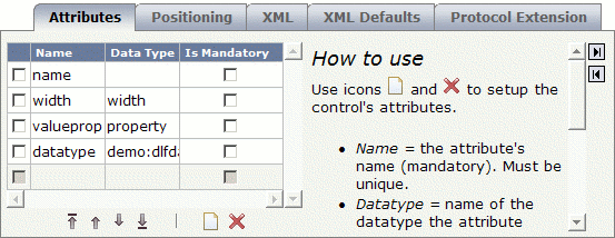
The following buttons are provided below the list of attributes:
| Button | Description |
|---|---|
 |
Moves the selected attribute(s) up to first position in the list. |
 |
Moves the selected attribute(s) up to the previous position in the list. |
 |
Moves the selected attribute(s) down to the next position in the list. |
 |
Moves the selected attribute(s) down to last position in the list. |
 |
Adds an empty line in which you can specify a property. |
 |
Deletes the selected attribute(s). |
To define a property, use the
button to add an empty line and specify the following information
in this line:
The name of a property. The name must be unique within this attribute list.
Optional. The name of a data type to which the attribute refers. The data type can be an Application Designer data type (see the data type definitions in the file editor.xml) or a user-defined data type.
Optional. When this check box is selected, a value for the corresponding attribute must be set.
In the case of XML macros, the generation protocol will show an error message if input is missing.
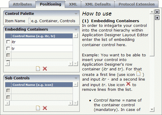
The Positioning tab is used to specify the following:
the section of the controls palette which is to contain the control, and
the containers and subcontrols in which the user will be able to insert the control.
The following buttons are provided on this tab:
| Button | Description |
|---|---|
|
Adds an empty line in the corresponding list. |
|
Deletes the selected control(s) from the corresponding list. |
Specify the following information:
The section of the controls palette in which your new controls are to be included. You can either specify an existing section such as , or you can specify a new section.
For example, when you specify the name "MyControls", you have to choose the button in the controls palette to display your controls.
This list determines the availability in the Layout Painter.
Use the
button to add one or more empty lines and specify the names of the
containers (such as ITR or TR) in which your new control can be inserted as a
subnode. If specify your own containers, do not forget to use the library
prefix.
In the Layout Painter, the new control can then be selected from:
Context Menu
The new control will be offered for selection in the Layout Painter when
you invoke the context menu for an embedding container control.
For example, when you define a new control with the name "test:mycontrol" and define the ITR control as an embedding container, this control will be available as follows:
Controls Palette
The new control will be available in the controls palette of the
Layout Painter. It is shown when you open the corresponding section of the controls
palette. For example, when you have defined that control is to appear in the
MyControls section, you have to choose the
button.
The Layout Painter will use a default image in the controls palette. However, you can assign your own image; in this case, you have to observe the following rules:
The image must be a GIF file.
The name of the image must have the following structure:
ctrl<LIBRARY-NAME>_<CONTROL-NAME>.gif
For example:
ctrlTEST_MYCONTROL.gif
The image must be stored in the directory <your-webapplication>/cis/config/controlimages.
The preferred width is 16 pixels and the preferred height is 16 pixels.
Your control can be a container itself (for example, if you want to be able to insert Application Designer's ICON control into your control). In this case, you enter the list of the subcontrols here.
Use the
button to add one or more empty lines and specify the names of the
subcontrols (such as ICON). If you specify your own controls, do not forget to
use the library prefix.
The XML tab is used to specify an XML macro.
Typically, your control combines existing controls to form a more complex control with a certain dedicated task. You take what is available and group it into certain units.
With an XML macro, you compose your control directly in XML and therefore do not need to provide for a tag handler class.
See also Defining an XML Macro in the Examples section.
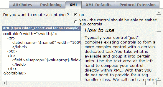
Specify the following information:
Select one of the following option buttons:
no
When this button is selected, your control cannot embed other
controls. BUTTON is an example of such a control.
yes
When this button is selected, your control is a container control
which can embed other controls. ITR and ROWAREA are examples of container
controls.
Enter your macro in this text box.
Only applies to an XML macro.
When you have entered an XML macro on the XML tab, you can use the XML Defaults tab to define the default values for the attributes (optional).
All attributes that are currently defined on the Attributes tab are automatically provided on the XML Defaults tab.
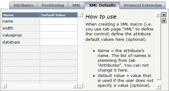
Specify the following information:
The default value will be used if the user does not specify a value.
Only applies to an XML macro.
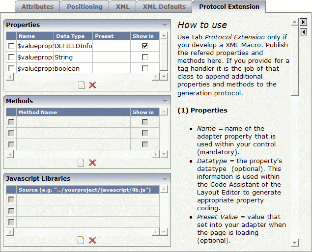
When you have entered an XML macro on the XML tab, you use the Protocol Extension tab to publish the referenced properties and methods. If you provide for a tag handler, it is the job of this class to append additional properties and methods to the generation protocol.
See also XML Macro with a Server-Side Representative in the Examples section.
The following buttons are provided on this tab:
| Button | Description |
|---|---|
|
Adds an empty line in the corresponding list. |
|
Deletes the selected line(s) from the corresponding list. |
Specify the following information:
Use the
button to add one or more empty lines and specify the
following:
The name of the adapter property that is used in your control.
Optional. The data type of the property. This information is used in the Code Assistant (which is part of the Layout Painter) to generate appropriate property coding.
Optional. The value that is set in your adapter when the page is loading.
When this check box is selected, the property appears in the Code Assistant. By default, this check box is selected.
You should only select this check box for the properties that must be provided by the adapter.
Use the
button to add one or more empty lines and specify the
following:
The name of the adapter method.
When this check box is selected, the method appears in the Code Assistant. By default, this check box is selected.
You should only select this check box for the methods that must be provided by the adapter.
Use the
button to add one or more empty lines and specify the
following:
The URL that points to your JavaScript library.