Add a Filter for Apps in a Workspace
You can add a form to your workspace that allows users to filter the information shown in one or more apps within the workspace. Filters can be added regardless of whether the underlying mashable or mashup has input parameters that also perform filtering.
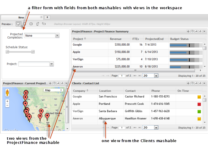
The example shown here has three views based on two mashables and a filter form:
You define the individual fields or other controls to include in the filter form based on the fields available in any app in the workspace. You also control the placement of controls to make the filter form easy to use.
To add a filter form to a workspace
1. Start a new workspace or open an existing workspace in Mashboard.
2. Add all the apps and views that should be in this workspace.
3. Select the Palette menu, expand the Controls section and drag Filter Controls into the location where you want to filter to be placed in the workspace.
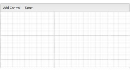
An editing canvas opens where you can add controls and manage the layout of the filter form.
4. Click Add Control to add one field or other type of control for filtering one or more views or apps within the workspace.
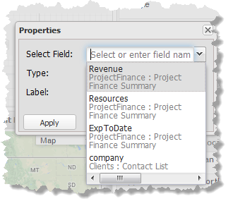
5. Select the field to be filtered by this control. The list includes every column in data from every mashable or mashup used in this workspace.
6. Choose the type of control to include in the form for this field. The types that are available depend on the type of data for the field you have selected:
 Drop down
: a list of available values drops down. Users can only select from these values. Use this only with columns that have a limited number of possible values and very long drop down lists are hard to use.
This type of control is available for fields of any datatype.
Radio Button: one radio button is provided for each possible value for this field. Use this only with columns that have a very limited number of possible values to ensure that users can easily find a specific value.
This type of control is available for fields of any datatype.
Slider: a control with upper and lower limit sliding buttons to allow users to select a range of numeric values. This provides a continuous range to play with but can be difficult to have fine grained control of the range.
This type of control is available only for fields with numeric data.
Text: users must type in the value to use for filtering. This is the most flexible control, allowing filtering to work with fields that have very large possible values.
This type of control is available for fields of any datatype.
7. Update the default Label, if needed, and click Apply.
8. Drag the control within the canvas to move it to the preferred location. Or expand the default size of the control.
9. Add more controls, as needed. Click Done once the form is complete and satisfactory.
The completed form displays. Test the controls to see the automatic interactions in the various apps within the workspace.