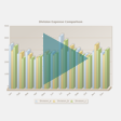
Column Chart
Column charts display numeric data points as vertical bars for a set of records. Columns can be rendered in two dimensions or three. Columns can also be stacked. For horizontal "bars", use the
Bar Chart instead. For a reverse relationship between records and data points, see
Sparkline Column.
There are two common patterns for data in bar and column charts:

Numerical data distributed by a frequency, such as time intervals.
This is some times called a histogram. Although time is a common distribution, it isn't required. Any numeric distribution works.
Numeric data sorted into categories, such as expense categories.
With categories, the order in which categories are presented is defined by the order it appears within results.