Preview and Finalize the Presentation
The Preview step lets you finalize the presentation for the app and preview your choices for desktop and mobile devices:
Preview the App in Different Devices and Orientations
Use the device toobar to change the preview for the app to:
Important: | The previews for mobile devices may not include all views you have chosen for this app. Or a mobile preview can be completely blank if the app is not mobile compatible. See About Desktop and Mobile Compatibility for Apps for more information. |
Select the Layout for Views
For apps with multiple views, you can also change the layout used to arrange each view in Preview:
| Tabbed = each view appears in a separate tab that users can click to switch views. |
| Combo = the app has a single current view which users can switch by selecting a different view from a pull-down list. |
| Two Column = views are organized in a two-column grid. |
| Stacked = views are stacked vertically in one column. |
| Wide Top Row = similar to a two-column layout, except the first row spans both columns. |
If needed, return to Select Views and change the order of the views to get the desired effect
Select a Theme
App styling
Themes, in the Preview step, choose a color for the window, border and title bar for apps. If you have multiple views and choose to show the view titles, this also sets the color for the view title bar. The theme defaults to gray, simply choose another color if desired.
Chart styling (default themes and custom themes)
Choose a Charts Theme in the drop-down menu. Charts themes are predefined color sets for the look and feel of your charts (default themes are None, Carbon, Fint, Ocean, Zune). The selected theme will be applied to all displayed charts in your app.
In addition you can add your own custom themes to the Chart Theme drop-down menu. Therefor insert your chart theme file in the following folder and use the code block below.
presto-install/apache-tomee-jaxrs/webapps/presto/hub/third-party/FusionChartsXT/themes/v0.0.3/fusioncharts.theme.custom.js
Presto.FusionCharts.ThemeManager.add([
{
name:"theme-name",
theme:{
base:{
chart:{}
}
}
//here the user must be follow the sample theme there.
}
]);
The added chart theme option will only applied to this specific app. If you want to set a global default chart theme, then you must set this option in Admin Console -> Platform features -> Look and feel -> Charts tab.
Set Pagination and Miscellaneous Properties
You also set pagination and miscellaneous properties for the app in Preview.
Many apps have repeating items in their information, sometimes only a few and sometimes a very large number of items. Showing all the items at once can be overwhelming to users and can make the app perform very slowly.
Pagination lets you control how many repeating items appear on one page (display of the app) and provides buttons to allow users to page through the data. However, pagination may not be appropriate for some kinds of views, such as a pie chart or some types of maps, where it is important to show all items together.
The two properties that you can set for pagination in the Preview step include:
 Enable pagination
: this is set by default which adds a pagination toolbar in
every view of the app to allow users to flip to other pages. Clear this option to show all repeating items in every view of the app.
Note: | Because pagination for the app applies to all of views in the app, it is sometimes better to create several basic apps with individual views so that you can control pagination individually. If you want these views to appear together, use a workspace to group the individual apps. |
 Rows per page
: this determines how many repeating items can appear on one page within the app. This defaults to 20, but you can choose another value.
Miscellaneous properties for the app include:
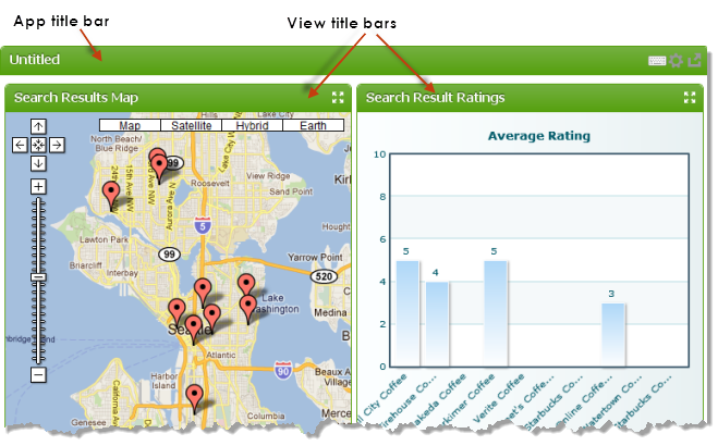
 Show View Title
 is set by default, which adds a title bar above each view along with the
 Maximize V iew
 toolbar button. Clear this option to remove view title bars everywhere this app is published.
 Height
 and
Width default to
auto which allows the app to fit into the height or width of the page area wherever the app is published. You can set a suggested maximum height or maximum width as a number of pixels, although this is less flexible and is not guaranteed to be used.
Note: | Changing the width and height does not change the preview of the app, but may change the size of the app when it is published or embedded in other environments. |
 Auto Refresh Interval
 defaults to zero. Users must manually refresh data with the Refresh toolbar button on the app’s title bar. If the data for this app changes frequently, set this to the number of seconds that should elapse before the app automatically refreshes its data.
Sorting and Filtering Properties
You can add tools for other users to allow them to dynamically sort or filter results for this app based on their own criteria. These tools appear, along with the form for input parameters, when users click the
 App Tools
 button in the app title bar. Click to see these tools in action.
You control which tools are available with these properties:
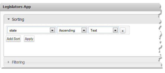
 Enable Sorting
 adds a form to app tools where users can add sorting rules.

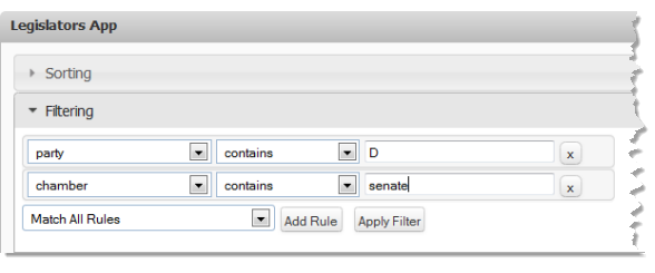
 Enable Filtering
 adds a form to app tools where users can filter results with one or more rules.


