Configuring tree control icons
You can optionally configure tree control icons, using images of your choice, to visually indicate the type of elements in the tree, for example, Production or Sales, whether the element is in a critical state, and to also propagate the status of priority elements to the top of the tree.
The use of one or both of the following icons is optional. Each node in the tree control can display these two configurable icons:

Type icon — Use the type icon to assign static images to nodes that indicate either the type of element it contains, or its level in the tree. By default, a folder image is used for all non-leaf nodes, and a document image is used for all leaf nodes.
For example, if you have groups of elements based on geographic location, you could assign an icon for the country, state and city (for example, US, California, San Francisco). Or, if you have groups of elements based on their function, you could assign an icon for each function (Purchases, Operations, Sales, and so forth). You can also assign images for each depth in the tree for a visual indication of where you are while navigating within the tree.
Status icon — Use the status icon to assign images that are used when an element in the tree has a specified value. You can also configure the status in order of priority so that the most critical status is propagated up the tree first. By default, there is no status icon.
If a node has a type icon and a status icon, the type icon always appears to the left of the status icon.
Attaching a tree control icon to data
For convenience, both the type icon and the status icon can be attached to data. The type icon and status icon have different data table requirements. Typically, an attachment to a static XML file containing the appropriate tables is used. The following describes the data table format requirements:
Type icon — To attach the type icon to data, use the
nodeTypeProperties property. The data attachment must be a two-column table. Typically, a static XML file containing the table is used. The first column must contain string values of
_node (for non-leaf nodes),
_leaf (for leaf nodes), numeric values for depth, or string values that match the node labels, or the values from the column in
valueTable specified by the
nodeTypeColumnName property. The second column must be the path to the
.png,
.gif, or
.jpg image. The default assignments are
_node,
rtvTreeNode16.png and
_leaf,
rtvTreeLeaf16.png. The column names are not important.
Status icon — To attach the status icon to data, use the
nodeStatusProperties property. The data attachment must be a three-column table. Typically, a static XML file containing the table is used. The first column must contain string values that match values from the column in
valueTable specified by the
nodeStatusColumnName property. The second column must be the path to the
.png,
.gif, or
.jpg image. The third column must contain the non-negative integer priority value.
A static XML file is read once each time you run Dashboard Viewer. If you specify (or modify) an XML source using the Application Options dialog, you may specify whether that XML source is static. For details, see Creating XML Sources.
Configuring tree control type icons
Type icons indicate the type of node in the tree. The type icon for each node is determined either by the value of a column in the valueTable property, or by the node position in the tree. By default, the type icon appears to the left of the node label.
This section describes how to configure type icons using the Node Properties dialog. You can also configure type icons by attaching the nodeTypeProperties property to data.
To configure the type icon, use the
nodeTypeProperties property to define a two-column table of data. Select the
nodeTypeProperties property in the property sheet, then click the

button to open the
Node Properties dialog.
In the
Node Properties dialog, the
Node Depth or Type column lists the available nodes. The first two rows,
non-leaf node and
leaf node, indicate the default settings: non-leaf nodes in the tree use a folder image and leaf nodes use a document image. To change the default setting, click the
button in the
Image column for the node and choose an icon from the
Select Image dialog.
The next five rows, numbered 0 - 4, represent the node depth or level, zero (0) being the root node. The Image column lists the icons being used for each node. By default, the Image column for all of those rows is <blank>, indicating that the non-leaf node and leaf node icon assignments are used. Icon assignments override non-leaf node and leaf node assignments.
You can also assign an image icon based on node level. Such an icon provides a visual indication of where you are while navigating in the tree. To assign an image to a specific node level in the tree, click the
button for one of the rows numbered
0 - 4 in the
Image column and choose an icon from the
Select Image dialog. Repeat for each node level.
You can assign an image icon based on node labels you create that describe the nodes as a group. For example, suppose the
Node Depth or Type column contains the string
Davies with the

image selected.
This means that all nodes whose label matches the
Davies string display the
image in the tree.
To assign an image to a specific node type in the tree, assign a column name in the nodeTypeColumnName property. Select the nodeTypeProperties property in the property sheet, then click on the button to open the Node Properties dialog. Click New to add a custom row to the table. A drop-down list of values for the column assigned to the nodeTypeColumnName property appears in the Node Depth or Type column. Select a column name from the drop-down list. Click the button in the Image column and choose an icon (to use for all nodes that have that column name in the valueTable row that corresponds to the node) from the Select Image dialog.
You can also type a string in the Node Depth or Type column and the Image column.
To not use an icon, in the Node Properties dialog, select the icon in the Image column, then click Clear.
Note that the root node is invisible if the rootNodeLabel property is blank.
Configuring tree control status icons
Status icons indicate the current state of a node. You can configure the status icon to propagate the status of a child node up the tree to its ancestors. The status icon shown for an ancestor node corresponds to the current highest status priority among all of its descendants.
The status icon for a node is determined by the discrete value of a specified column in the valueTable property. The values can be strings or numbers. The comparison is done for an exact match. If the current status value for a tree node does not match any of the values you specify in the nodeStatusProperties property, no status icon is displayed for that node.
By default, the status icon appears on the left of the node label. The value, Left or Right, is specified in the nodeStatusIconPos property. If a node has both a type icon and a status icon, the type icon always appears to the left of the status icon. By default, no status icons appear in the tree.
This section describes how to configure status icons using the
Node Properties dialog. You can also configure status icons by attaching the
nodeStatusProperties property to data. For details about that, see
Attaching a tree control icon to data.
To configure status icons, specify the status table column name in the nodeStatusColumnName property, then use the nodeStatusProperties property to define a three-column table of data and configure icon behavior. The nodeStatusProperties property is visible only if the nodeStatusColumnName property is non-blank.
Select the
nodeStatusProperties property in the property sheet, then click the
button to open the
Node Properties dialog.
In the Node Properties dialog, to map an image to a node status, click New, then click in the Status Value column. A drop-down list appears containing all values in the node status column of the valueTable property (which you previously specified in the nodeStatusColumnName property). Select a value from the drop-down list.
Click the
button in the
Image column for the node and choose an icon from the
Select Image dialog. This icon is used as the status icon for all nodes that match the value selected in the
Status column.
Click the
button in the
Priority column for the node and assign an integer value:
0,
1,
2,
3,
4,
5, or a higher number. There is no upper limit on the number. The largest number is the highest priority and is propagated up the tree first. A value of zero (0) is not propagated. You might want to assign a value of zero to multiple nodes so that they do not propagate up the tree. A non-zero value can be assigned only once.
For example, suppose the nodeStatusColumnName property is set to the Application Status table column of the valueTable property. You could define the mapping for the nodeStatusProperties property as follows:
Status Value | Image | Priority |
Blocked | | 2 |
Running | | 1 |
The values in the
Application Status column of each row in the
valueTable property is compared to the two values listed in the
Status Value column (
Blocked and
Running). If the
Application Status value in one of the rows is
Blocked, the

status icon is displayed as the status icon for that row. If there is no match, for example, the
Application Status value in one of the rows is unknown, no status icon is displayed in the tree node for that row. Because the
status icon is assigned the highest priority, the
status icon is always propagated up the tree first. If none of the rows has a
Blocked status, the

status icon is propagated up the tree.
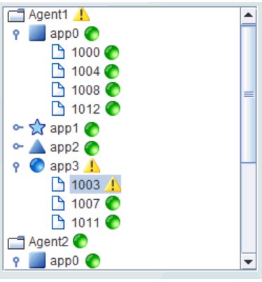
For example, in the following image, the priority status of a single node, app3/1003, is propagated up to its parent, app3, and also to the top-level ancestor, Agent1.