Using series and non-series bar charts
Data in bar charts can be displayed as both series and non-series data. This is determined by the rowSeriesFlag property.
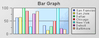
If the rowSeriesFlag property is enabled, one group of bars will be shown for each numeric column in the data attachment. Within the group for each numeric column, there will be a bar for each row in that column. Column names will be used for the x-axis labels. If your data attachment has a label column and the rowLabelVisFlag is selected, data from this column will be used in the legend. If your data attachment does not have a label column, select the rowNameVisFlag checkbox to use row names in the legend. By default, the label column is the first non-numeric text column in your data. Specify a column name in the labelColumnName property to set the label column to a specific column.
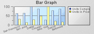
If the rowSeriesFlag property is not enabled, one group of bars will be shown for each row in your data attachment. Within the group for each row, there will be a bar for each column in that row. Column names will appear in the legend. If your data attachment has a label column and the rowLabelVisFlag is selected, data from this column will appear on the x-axis. If your data attachment does not have a label column, select the rowNameVisFlag checkbox to use row names on the x-axis. By default, the label column is the first non-numeric text column in your data. Specify a column name in the labelColumnName property to set the label column to a specific column.
1. Create a new dashboard, select the Graphs tab in the Object Palette, and add a Bar Graph object to the dashboard canvas.
By default the rowSeriesFlag property is enabled and the chart appears as follows.
2. With the graph object selected, in the Object Properties panel, select the rowSeriesFlag property and disable it.
3. Select the xAxisFlag property and enable it.
The chart will now appear as follows.