COLINFOS is a container control that allows to dynamically show and hide single columns in a ROWTABLEAREA2 control. The COLINFOS container can only contain COLINFO controls. Each COLINFO control is responsible for one column.
Notes:
COLGROUP and COL
elements as defined with the HTML 4.01 specification.
visibleprop property of the
GRIDCOLHEADER
control instead.
The following topics are covered below:
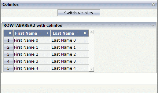
The table in this example has three columns: the first column contains a SELECTOR control for the numbers, the second column contains a FIELD control for the first names, and the third column contains a FIELD control for the last names.
The second column (first name) can be visible.

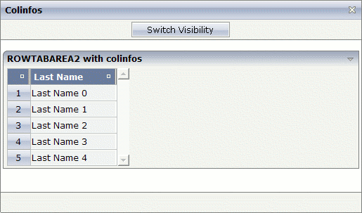
You can also hide the second column (first name).

The XML layout definition is:
<pagebody>
  <rowarea name="ROWTABAREA2 with colinfos">
  <rowtablearea2 griddataprop="lines" rowcount="5">
    <colinfos>
    <colinfo></colinfo>
    <colinfo visibleprop="col2"></colinfo>
    </colinfos>
    <tr>
    <gridcolheader name=" " width="30">
    </gridcolheader>
    <gridcolheader name="First Name" width="120">
    </gridcolheader>
    <gridcolheader name="Last Name" width="120">
    </gridcolheader>
    </tr>
    <repeat>
    <str valueprop="selected">
      <selector valueprop="selected" width="30" singleselect="true">
      </selector>
      <field valueprop="fname" width="120" displayonly="true"
         noborder="true">
      </field>
      <field valueprop="lname" width="120" displayonly="true"
         noborder="true">
      </field>
    </str>
    </repeat>
  </rowtablearea2>
  </rowarea>
</pagebody>
A COLINFO control is required for each column that is to be shown/hidden dynamically. The responsibility for the columns goes from left to right. Thus, the first COLINFO control applies to the first column, the second COLINFO control applies to the second column, and so on.
In the above example, two COLINFO controls are used even though only
the second column is to be shown/hidden. The first COLINFO control is required
since the columns are calculated from left to right. Since the first COLINFO
control does not have a visibleprop property, this
column is always visible.
If you would omit the first COLINFO control, the
visibleprop property of the remaining COLINFO
control would be applied to the first column containing the numbers (and not to
the second column containing the first name).
A third COLINFO control is not required in this example, since you do not want to show/hide the third column containing the last name.
The Java code of the adapter is:
public class colinfosAdapter
extends Adapter
{
  // property >col2<
  boolean m_col2 = true;
  public boolean getCol2() { return m_col2; }
  public void setCol2(boolean value) { m_col2 = value; }

  // class >LinesItem<
  public class LinesItem
  {
    // property >fname<
    String m_fname;
    public String getFname() { return m_fname; }
    public void setFname(String value) { m_fname = value; }

    // property >lname<
    String m_lname;
    public String getLname() { return m_lname; }
    public void setLname(String value) { m_lname = value; }

    // property >selected<
    boolean m_selected;
    public boolean getSelected() { return m_selected; }
    public void setSelected(boolean value) { m_selected = value; }
  }

  // property >lines<
  GRIDCollection m_lines = new GRIDCollection();
  public GRIDCollection getLines() { return m_lines; }

  /** initialisation - called when creating this instance*/
  public void init()
  {
    // generate some content for the displayed lines ...
    LinesItem item;
    for (int i = 0; i < 5; i++)
    {
      item = new LinesItem();
      item.m_fname = "First Name " +i;
      item.m_lname = "Last Name "+i;
      m_lines.add(item);
    }
  }

  public void onSwitch()
  {
  // switch visibility of the second column
    m_col2 = !m_col2;
  }
}
| Basic | |||
| comment |
Comment without any effect on rendering and behaviour. The comment is shown in the layout editor's tree view. |
Optional | |
| Basic | |||
| visibleprop |
Name of property that tells if the corresponding column that is associated with the colinfo-control is displayed or not. Property must be of type "boolean". |
Optional | |
| comment |
Comment without any effect on rendering and behaviour. The comment is shown in the layout editor's tree view. |
Optional | |