
Responsive pages adapt the layout to the device. The page renders well on a variety of devices and window or screen sizes without designing different pages for different devices.
Responsive pages are based on the Bootstrap framework 4.6 (refer to https://getbootstrap.com/docs/4.6/).
Responsiveness is achieved via CSS (Cascading Style Sheets) and the Bootstrap grid system. The Bootstrap grid system is made up of:
Containers
An unlimited number of rows per container
A maximum of 12 columns per row
The following shows the basic layout of a responsive page in NJX:
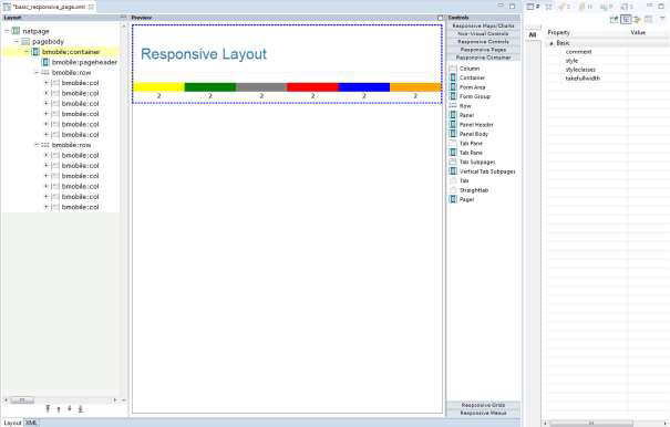
You usually have one bmobile:container control. Under this you place
several bmobile:row containers as subnodes. Each row is divided into a
maximum of 12 columns. The bmobile:col control spans 1-12 columns. All
bmobile:col controls of a bmobile:row should not span more
than 12 columns altogether.
In the example above the bmobile:rows each have 6
bmobile:col controls. Each bmobile:col spans 2 columns on
every device. The number of columns spanned by a bmobile:col is specified
via CSS. The corresponding CSS style class is set as value in the property
styleclasses.
Bootstrap supports the setting of device-dependent style classes. The naming convention is:
none (for phones - screens less than 576px wide)
sm (for phones - screens equal to or greater than 576px wide)
md (for tablets - screens equal to or greater than 778px wide)
lg (for desktops - screens equal to or greater than 992px wide)
xl (for wide desktops - screens equal to or greater than 1200px wide)
The class col-6 defines that the control spans 6 columns on an extra
small device. Classes for different devices can be combined. Each class scales up, so
if you wish to set the same widths for extra small, small (=sm) and medium (=md)
devices you only need to specify the extra small class – like col-6.
Based on this you place your controls into rows/cols so that the layout adapts to the different sizes of different devices.
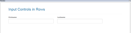
On a large device like a desktop, you want to arrange several input controls side by side in one row:
But on a small device like a smartphone you want to arrange the input controls underneath each other:
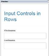
For the example above the following classes have been specified in the NJX layout:
<bmobile:row>
     <bmobile:col styleclasses="col-12 col-md-6">
          <bmobile:flabel name="Firstname"></bmobile:flabel>
          <bmobile:ffield valueprop="firstname"></bmobile:ffield>
     </bmobile:col>
     <bmobile:col styleclasses="col-12 col-md-6">
          <bmobile:flabel name="Lastname"></bmobile:flabel>
          <bmobile:ffield valueprop="lastname"></bmobile:ffield>
     </bmobile:col>
</bmobile:row>
It defines a row with 2 bmobile:col controls. Each control spans 12
columns on extra small and small devices and 6 columns on medium and larger devices.
It’s sufficient to specify the classes for the extra small (col-12) and medium
(col-md-6) devices. When 12 columns are reached the next control is rendered
underneath.
Rendering including responsiveness is based on CSS. The responsive controls of NJX are built with Bootstrap which brings a set of style classes for its components.
Many of the style classes are applied automatically to the controls. You don’t need to do anything or even know about them.
But especially the Bootstrap framework also supports many style classes which you can
additionally apply to use the powerful features of Bootstrap. You can set these
classes as values of the styleclasses property in the corresponding
control.
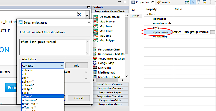
Some of the most popular Bootstrap classes for a control are shown in the Properties view of the Layout Painter. Clicking on the button to the right of the styleclasses property, opens a dialog. You can select from the suggested styleclasses. The text below the selected class explains its usage. Add one, or several classes. Classnames of any classes can be applied when separated by a blank.
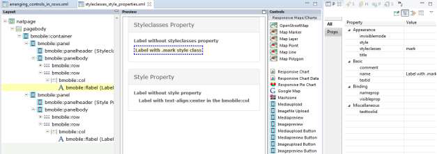
The following shows an example from the NaturalAjaxDemos:
You can also add general, control-independent style classes from Bootstrap which are not in the drop-down box.
Below is an example for the Bootstrap .mark style class:
Here you find a complete list of the Bootstrap classes: https://www.w3schools.com/bootstrap4/bootstrap_ref_all_classes.asp.
The current version of Natural for Ajax is based on Bootstrap 4.6.
Like with non-responsive pages you can also apply an additional CSS file to a layout
page via setting the property addstylesheetfile in the
NATPAGE control. Then you can also use any of your own CSS classes from
your stylesheet file in the styleclasses property.
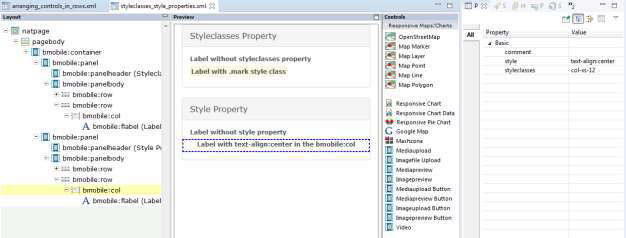
Settings in the style property overwrite the style classes. The style details of style classes are defined in a .css style sheet file. You can easily change the .css file without changing the layouts. Also, you just define a style class once and re-use it in many layouts. When using the style property, the style is set hard coded in the controls. We recommend using style classes whenever possible. There are some rare situations in which you want to adapt the style just for a few controls in a single layout. In these cases, you use the style property.
In the example below you use a style="text-align:center" to center
text.
Another situation in which you might want to use the style property is in macro controls. A macro control is defined in a central location and just re-used. This allows to change the value of a style property in only one place and re-use the macro control in many layouts.
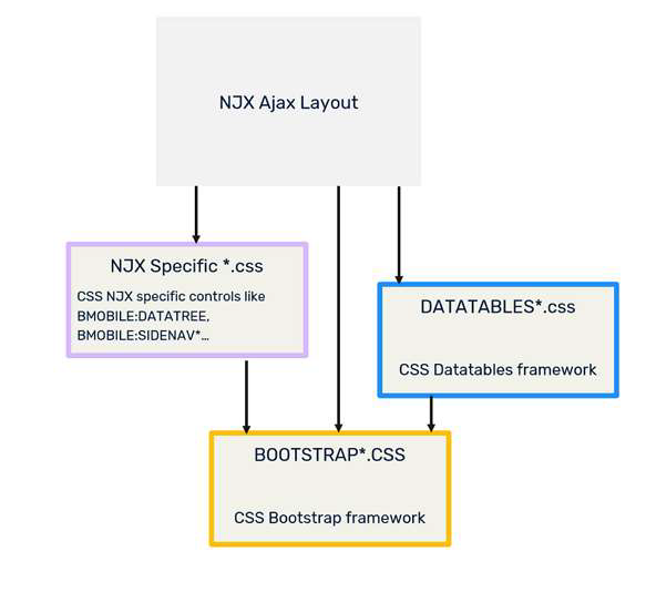
Besides the Bootstrap style classes, NJX itself defines some NJX-specific style classes. Ultimately, the responsive grids are built with the DataTables framework, which also brings a set of style classes.
A responsive NJX page which contains responsive grids automatically includes the following style sheet files:
A Bootstrap style sheet file, which contains the style classes for all Bootstrap components.
A DataTables style sheet file, which contains the style classes for grids.
A style sheet file, which contains NJX-specific style classes.
Optional: An own additional stylesheet.
NJX contains a default Bootstrap CSS file with the name bootstrap.min.css. This is automatically applied to each responsive page layout.
NJX uses DataTables (https://datatables.net/) for the responsive grids. It includes 2
alternative CSS files to render the BMOBILE:SIMPLEGRID control:
dataTables.bootstrap4.css.min: Includes style classes for styling
based on Bootstrap 4. It integrates well with the Bootstrap CSS. For instance, the
buttons of the grid are styled according to the applied Bootstrap theme.
jquery.dataTables.css.min: Includes style classes for styling based
on the JQuery UI.
Per default NJX uses the dataTables.bootstrap4.min.css. But you can
change this default per layout page. Simply set the url of the
jquery.dataTables.css in the datatablesstylesheetfile
property of the NATPAGE tag.
The style classes are applied automatically to the controls. You don’t need to know
about these classes or even set them in the styleclasses property. It’s
all done for you by the NJX framework.
NJX provides style classes to render controls. For non-responsive page layouts, the file <mywebapp>/cis/styles/CIS_DEFAULT.css is applied per default. For responsive page layouts, NJX applies the file <mywebapp>/cis/styles/responsive/BMOBILE4_Default.css per default.
Some of the style classes in BMOBILE4_Default.css adapt the
style classes defined for Bootstrap and/or DataTables slightly. Some of the defined
style adds new classes to render NJX controls like the BMOBILE:DATATREE
and the BMOBILE:SIDEBAR* controls or adds helper classes, which you can
use in the styleclasses property to adapt the rendering
correspondingly.
The single style settings are described directly in the file
BMOBILE4_Default.css as comments.
Important
DO NOT MODIFY THE BMOBILE4_Default.css DIRECTLY!
Instead, follow the customization guide in the next section to adapt
settings.
In most cases you want to apply your own specific style to your application – with your company or product's colors and shapes. The following describes the steps:
Set your Bootstrap theme.
Rebuild your NJX-specific Style Classes with your Bootstrap theme and set the adapted NJX-specific classes.
Optional: Customize your NJX-specific Style Classes.
Optional: Set your Datatables theme. Usually this is not required because the Datatables style automatically adapts very well to the Bootstrap theme.
Optional: Add your own additional style sheet.
NJX uses Bootstrap components to implement the responsive NJX controls. All Bootstrap style classes for the existing Bootstrap components are included in a .css file. Variations of this .css file exist which apply different looks and feels. These variations are called themes. One theme might define a blue button color and another theme might define a grey button color or rounded corners. NJX includes the Cerulean theme from https://bootswatch.com/cerulean/for Bootstrap version 4 as default.
If you want to use a different theme in your NJX applications, you basically have 3 options:
Download a free theme. Several providers of free themes exist. One example is https://bootswatch.com.
Buy a theme from corresponding theme providers.
Create your own theme. To create your own theme, some theme builder tools exist. An example is https://bootstrap.build/
In all 3 cases the result is a .css file containing the corresponding Bootstrap classes. Normally the name for the minified file is bootstrap.min.css.
Note
We cannot guarantee that any downloadable samples or output produced by such
third-party services or tools will be fully compatible. Before using and downloading,
please check the licenses under which the web service, the tool or the output are
provided by the authors.
Per default, NJX uses the Bootstrap theme <mywebapp>/HTMLBasedGUI/bootstrap4/css/boostrap.min.css.
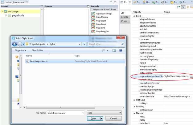
If you want to set a different Bootstrap theme in your responsive page layout, do the following:
In your NaturalONE project, place the bootstrap.min.css into the styles subfolder of your User Interface Component. If you have several User Interface Components, create a “Global User Interface Component” – as described in the NaturalONE documentation - and place it there.
If you only want to set this theme for a single layout and not the complete
application you can use the responsivestylesheetfile property in the
NATPAGE to set your Bootstrap theme as shown in the example below:
If you want to set your own Bootstrap theme for the whole application, you can
create a corresponding NATPAGE template – as described in the documentation
NaturalONE > Ajax Developer > Getting Started with the Layout
Painter > Creating Custom Layout Templates – and set the
responsivestylesheetfile property in your template. Alternatively,
you can set the attribute defaultresponsivecss in the
cisconfig.xml file as shown below:
<cisconfig defaultresponsivecss="../myuserinterfacecomponent/styles/mybootstrap.css"
For more information on how to work with cisconfig.xml files in NaturalONE, see the documentation NaturalONE > Ajax Developer > Getting Started with Ajax Developer > Using Ajax Configuration Files.
If you change defaultresponsivecss in the
cisconfig.xml file, you need to rebuild the User Interface
Components in your Natural ONE projects.
NJX versions will be upgraded to higher Bootstrap versions from time to time. Please check the release notes if a new Bootstrap version has been applied. In case a new Bootstrap version has been applied, it is strongly recommended to replace your custom Bootstrap themes with the corresponding themes for this version. It is not guaranteed that the NJX with the new Bootstrap version will work with Bootstrap themes of lower Bootstrap versions.
Bootstrap supports Syntactically Awesome Style Sheets (SASS). This allows you to adapt Bootstrap themes to your needs by setting single variables. The big advantage is that you simply need to set the variables and don’t need to rewrite or overwrite the CSS classes themselves. A Bootstrap theme usually also consists of a file with the name _variables.scss. This file contains a set of variables you can customize and these variables can be used by other style sheets. This allows you to simply rebuild the NJX-specific style classes with the specific settings of your theme, as explained in the next section. Be sure to create or download the _variables.scss file for your theme.
The default style classes in BMOBILE4_Default.css match the style of the default Bootstrap theme used in NJX. If you are using a different Bootstrap theme you usually need to create a stylesheet file which matches the style (colors, fonts, etc.) of your custom Bootstrap theme. You don’t need to modify any CSS directly because the NJX-specific style classes are based on the Bootstrap SASS variables. You simply need to rebuild the NJX-specific CSS file.
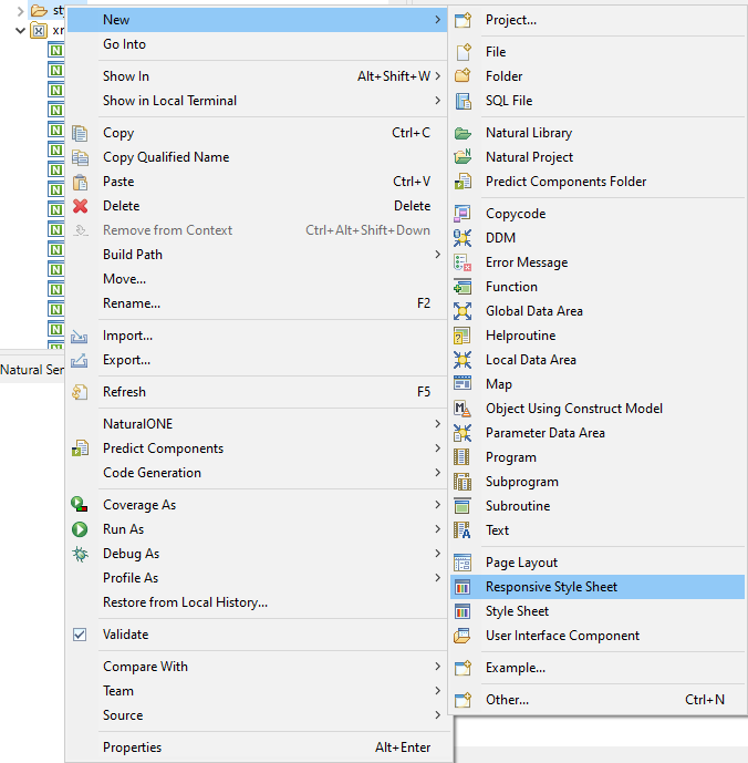
In your NaturalONE, open the context menu (right-click) and then select “New/Responsive Style Sheet” as shown below:
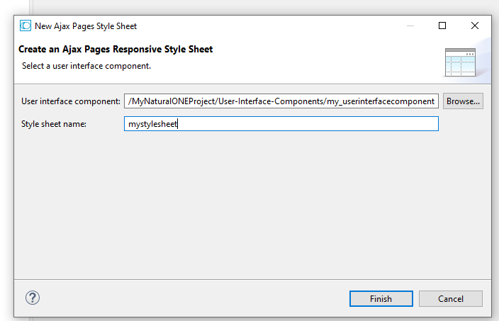
Enter a name for your CSS file in the opened wizard and press “Finish”:
This will create the following files in the ./styles subfolder of your User Interface Component:
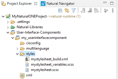
The table below explains the purposes of the three files in the ./styles subfolder:
| File name | Purpose |
|---|---|
| mystylesheet_build.xml | Ant script which generates the NJX-specific CSS file using the mystylesheet_variables.scss and mystylesheet.scss files. |
| mystylesheet_variables.scss | SASS variable settings in case you would like to customize the NJX-specific CSS (optional). |
| mystylesheet.scss | The main SASS file which contains all the imports for the generation. You only need to adapt the first import for your specific Bootstrap theme as described below. |
The file mystylesheet.scss is opened automatically in an Eclipse editor. The first import statement imports the _variables.scss file of the default Bootstrap theme of NJX. You need to adapt the path to the _variables.scss file of your Bootstrap theme.
If you copied your theme to the ./styles/mytheme subfolder of your User Interface Component, you would change the line:
@import "C:/myworkspace/.naturalone/apachetomcat/webapps/cisnatural/HTMLBasedGUI/bootstrap4/scss/bootswatch_cerulean/variables";to
@import "mytheme/variables";That’s all you need to change in the mystylesheet.scss files. For a further example, have a look at the mydarklynjx.css in the njxdemos/styles folder of the NaturalAjaxDemos.
To generate a CSS file from the SASS files, you need a SASS compiler. Currently NJX does not include a SASS compiler. NJX itself uses the SASS compiler https://github.com/sass/dart-sass, which can be downloaded via npm (see https://sass-lang.com/dart-sass). Be sure to use a Bootstrap 4.6 compatible SASS compiler as described here: https://getbootstrap.com/docs/4.6/getting-started/build-tools/#sass.
The mystylesheet_build.xml file is a ready-to-use Ant script for generating the CSS file. All you need to set is the path of your SASS compiler as Variable when running the Ant script.
Example:
ant -Dsass=c:/mynpm/npm/sass.cmd
The Ant script will create the NJX-specific CSS file mystylesheet.css for your Bootstrap theme.
Besides regenerating the NJX-specific CSS so that it reflects your Bootstrap theme, you can also customize the NJX-specific CSS classes. Instead of modifying the classes directly, the customization is done via SASS variables. The file ./cis/styles/responsive/scss/_njxvariables.scss of your NJX installation contains several variables for the NJX-specific CSS.
If you want to change specific settings, do the following:
Copy the specific variable definition you want to change from the _njxvariables.scss file into your mystylesheet_variables.scss file.
Adapt the settings.
Rebuild the NJX-specific CSS by running the Ant script mystylesheet_build.xml as described above.
You’ll find two commented-out examples in the mystylesheet_variables.scss file:
// Examples for BMOBILE:SIMPLEGRID control
                // Show the edit buttons on hover
                // $njx-simplegrid-edit-onhover: true;
                // change color for selected lines to orange
                // $njx-simplegrid-select-bg: rgba($orange, .3);
If you want to set your NJX-specific CSS file in your responsive page layout, do the following:
For a single layout you can use the stylesheetfile property in the
NATPAGE.
If you want to set it for the whole application, you can create a corresponding
NATPAGE template – as described in the documentation NaturalONE >
Ajax Developer > Getting Started with the Layout Painter > Creating Custom
Layout Templates – and set the styleseheetfile property
in your template. Alternatively, you can set the attribute
defaultbmobilecss in the cisconfig.xml file as
shown below:
<cisconfig defaultmobilecss="../myuserinterfacecomponent/styles/BMOBILE_Mystyle.css"
For more information on how to work with cisconfig.xml files in NaturalONE, see the documentation NaturalONE > Ajax Developer > Getting Started with Ajax Developer > Using Ajax Configuration Files.
If you changed the defaultbmobilecss in the
cisconfig.xml file, then you need to rebuild your User
Interface Components in your NaturalONE projects.
Newer NJX versions often bring new style classes for the new supported features. If you created a custom NJX style sheet file as described above, be sure to check the release notes for more information. Upgrading from NJX 9.1.2 and earlier (Bootstrap 3) to NJX 9.1.3 (Bootstrap 4) requires you to upgrade your style sheet file as described above.
Per default, NJX uses the DataTables theme <mywebapp>/HTMLBasedGUI/datatables/css/dataTables.bootstrap4.min.css. This renders the responsive grids using the Bootstrap style. As an alternative, you can set the file <mywebapp>/HTMLBasedGUI/datatables/css/jquery.dataTables.css as DataTables theme. This renders the responsive grids using the jquery style.
If you want to customize the rendering for either the “Bootstrap” or the “jquery” styling variant, you can create your own DataTables theme. DataTables provide an online theme creator tool to create own themes with your preferred colors and styles. It also provides downloads of customized stylesheets. For more information see https://datatables.net/manual/styling/ and https://datatables.net/download/.
The result is a .css file containing the corresponding DataTables style classes.
Note
We cannot guarantee that any downloadable samples or output produced by such
third-party services or tools will be fully compatible. Before using and downloading,
please check the licenses under which the web service, the tool or the output are
provided by the authors.
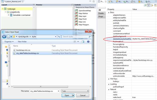
If you want to set a different DataTables theme in your responsive page layout do the following:
In your NaturalONE project, place the corresponding .css file in the styles subfolder of your User Interface Component. If you have several User Interface Components, create a “Global User Interface Component” – as described in the NaturalONE documentation - and place the .css file there.
For a single layout, you can use the datatablesstylesheetfile
property in the NATPAGE to set your DataTables theme as shown in the example
below:
If you want to set your own DataTables theme for the whole application, you can
create a corresponding NATPAGE template – as described in the documentation
NaturalONE > Ajax Developer > Getting Started with the Layout
Painter > Creating Custom Layout Templates – and set the
datatablesstylesheetfile property in your template. Alternatively,
you can set the attribute defaultdatatablescss in the
cisconfig.xml file as shown below:
<cisconfig defaultdatatablecss="../myuserinterfacecomponent/styles/mydatatables.css"
For more information on how to work with cisconfig.xml files in NaturalONE, see the documentation NaturalONE > Ajax Developer > Getting Started with Ajax Developer > Using Ajax Configuration Files.
If you changed the defaultdatatablescss in the
cisconfig.xml file, you need to rebuild your User
Interfaces in your NaturalONE projects.
NJX versions will be upgraded to higher DataTables versions from time to time. Please check the release notes if a new DataTable version has been applied. In case a new DataTable version has been applied, it is strongly recommended to replace your custom DataTables themes by corresponding themes for this version. It is not guaranteed that the NJX with the new DataTables version will work with DataTables themes of lower DataTables versions.
Do NOT edit Bootstrap or DataTables themes directly. Otherwise, you need to manually apply these changes for each and every version upgrade. If you have for instance your Bootstrap theme, but just want to modify some settings, then use the SASS variables as described above for the customization.
Only if this is not possible you could add the corresponding rules to an own
additional stylesheet file and set this file in the property
addstylesheetfile of the NATPAGE control in your layout
page. You need to use the !important statement. The example below
changes the font size for buttons in the Bootstrap .btn style
class:
.btn
{
   font-size: 18px !important;
}
Prefer using the styleclasses property over the style
property.
If you see that you are creating many own additional style classes or having lots of additional style settings directly in your layouts, then consider using a different Bootstrap theme instead.
Prefer using themes over creating own style classes.
Always place your custom CSS files in the styles subfolder of one User Interface Component. Prefer using a “Global User Interface Component” for this.
Prefer using the cisconfig.xml settings
(defaultbmobilecss, defaultresponsivecss and
defaultdatatablescss) over using the corresponding NATPAGE properties
in all your layouts.
