
This document covers the following topics:
The following example shows a TEXTGRID2 control:
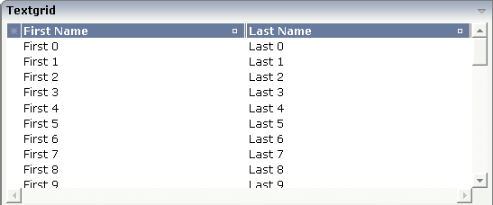
There are two columns which hold data. There is one column at the very left which displays a selection icon - in addition to a yellow background for a selected line. Even and odd lines are displayed in slightly different colors. At the very right of each title column, there is a symbol which indicates the sorting status; if you double-click on this symbol, the column is sorted first in ascending direction and, when clicking again, in descending direction. Change the sequence of columns by dragging the title of a column and dropping it on another column's title. Depending from where you drop, the column is either moved left or right.
The asterisk in the upper left corner of the grid is used to
select/deselect all lines in the grid. The behavior depends on the setting of
the singleselect property which determines whether
multiple lines can be selected in the grid (default) or whether only one line
can be selected:
Multiple Line Selection Mode
When you choose the asterisk for the first time, all lines are
selected. When you choose the asterisk a second time, all lines are
deselected.
Single Line Selection Mode
When you choose the asterisk (no matter how often), an existing
selected line is deselected.
The XML layout definition is:
<rowarea name="Textgrid">
    <itr takefullwidth="true" fixlayout="true">
        <textgrid2 griddataprop="lines" width="100%" height="200" selectprop="selected"
                   hscroll="true">
            <column name="First Name" property="firstName" width="50%">
            </column>
            <column name="Last Name" property="lastName" width="50%">
            </column>
        </textgrid2>
    </itr>
    <vdist height="5">
    </vdist>
</rowarea>
The TEXTGRID2 definition is bound to a grid data property
lines.
Inside the TEXTGRID2 control definition there are two columns. These
columns are bound to the properties firstName and
lastName.
In the parameter data area of the adapter, the grid data is represented by the following data structure:
1 LINES (1:*)
2 FIRSTNAME (U) DYNAMIC
2 LASTNAME (U) DYNAMIC
2 SELECTED (L)
Maybe you wonder why there is a
selected field in the
adapter parameter data area of the previous example.
This field is required for indicating which lines are
currently selected and which are not. Each line which is displayed in the
TEXTGRID2 control is represented in the adapter by an array occurrence of the array
LINES. Therefore, the selection status of the grid (which
lines are selected and which lines are not) is mirrored by the corresponding
selected field of each
array
occurrence.
| Basic | |||
| griddataprop |
Name of the adapter parameter that represents the grid in the adapter. |
Obligatory | |
| width |
Width of the control. There are three possibilities to define the width: (A) You do not define a width at all. In this case the width of the control will either be a default width or - in case of container controls - it will follow the width that is occupied by its content. (B) Pixel sizing: just input a number value (e.g. "100"). (C) Percentage sizing: input a percantage value (e.g. "50%"). Pay attention: percentage sizing will only bring up correct results if the parent element of the control properly defines a width this control can reference. If you specify this control to have a width of 50% then the parent element (e.g. an ITR-row) may itself define a width of "100%". If the parent element does not specify a width then the rendering result may not represent what you expect. |
Obligatory |
100 120 140 160 180 200 50% 100% |
| height |
Height of the control. There are three possibilities to define the height: (A) You do not define a height at all. As consequence the control will be rendered with its default height. If the control is a container control (containing) other controls then the height of the control will follow the height of its content. (B) Pixel sizing: just input a number value (e.g. "20"). (C) Percentage sizing: input a percentage value (e.g. "50%"). Pay attention: percentage sizing will only bring up correct results if the parent element of the control properly defines a height this control can reference. If you specify this control to have a height of 50% then the parent element (e.g. an ITR-row) may itself define a height of "100%". If the parent element does not specify a width then the rendering result may not represent what you expect. |
Obligatory |
100 150 200 250 300 250 400 50% 100% |
| comment |
Comment without any effect on rendering and behaviour. The comment is shown in the layout editor's tree view. |
Optional | |
| Selection | |||
| selectableprop |
Name of the adapter parameter that specifies wether a row in the grid is selectable (=true) or not (=false). The default is selectable. |
Optional | |
| selectprop |
Name of the adapter parameter that is used to mark if an individual row of the text grid is selected. If the user selects a text grid row, the value "true" is passed into the corresponding array element of the adapter parameter. |
Optional | |
| singleselect |
If set to "true" then only one row can be selected inside the text grid. - If set to "false" then multiple lines can be selected by using Ctrl- and Shift-key during mouse selection. Default is "false". |
Optional |
true false |
| singleselectprop |
Name of an adapter parameter that dynamically defines whether SINGLESELECT is true or false. |
Optional | |
| onclickmethod |
Name of the event that is sent to the adapter when the user selects a row. In the event handler you can find the selected rows by iterating through the rows and finding out which one's selected element is set to "true". |
Optional | |
| ondblclickmethod |
Name of the event that is sent to the adapter when the user selects a row by a double click. In the event handler you can find the selected rows by iterating through the rows and finding out which one's selected element is set to "true". |
Optional | |
| withselectioncolumn |
When defining a SELECTPROP property then automatically a selection column is added as first left column of the grid. Inside the column an icon inidicates if a row is currently selected. Set this property to "false" in order to avoid the selection column. |
Optional |
true false |
| withselectioncolumnicon |
Flag that indicates whether the selection column shows a "select all" icon on top. Default is true. |
Optional |
true false |
| fgselect |
if switched to true then an additional "graying" of selected lines will be activated. Switch this property to "true" if you have coloured textgrid cells: the selection colour will not override the colour of each cell, as consequence you require an additional effect in order to make the user see which row is selected. |
Optional |
true false |
| focusedprop |
Name of an adapter parameter that is used to mark if an individual row of the text grid should receive the focus. If the user selects a text grid row, the value "true" is passed into the corresponding array element of the adapter parameter. |
Optional | |
| Right Mouse Button | |||
| oncontextmenumethod |
Name of the event that is sent to the adapter when the user clicks with the right mouse button onto an empty area of the grid. |
Optional | |
| singleselectcontextmenu |
With SHIFT and CTRL key the user can select multiple lines (use property SINGLESELECT to suppress this feature). Use this property to ensure that the context menu is requested only for a single line. Default is "false". |
Optional |
true false noselection |
| enabledefaultcontextmenu |
Use this property to enable the default context menu of the browser within the textgrid. Please note: do not enable the browser's context menu if your application itself provides for a context menu. Default is "false". |
Optional |
true false |
| Appearance | |||
| width | (already explained above) | ||
| height | (already explained above) | ||
| minapparentrows |
Number of rows that are displayed independent of the size of the server side collection. |
Optional |
1 2 3 int-value |
| hscroll |
Definition of the horizontal scrollbar's appearance. You can define that the scrollbars only are shown if the content is exceeding the control's area ("auto"). Or scrollbars can be shown always ("scroll"). Or scrollbars are never shown - and the content is cut ("hidden"). Default is "auto". |
Sometimes obligatory |
auto scroll hidden |
| withtitlerow |
If defined as "false" then no top title row is shown. "True" is default. |
Optional |
true false |
| colspan |
Column spanning of control. If you use TR table rows then you may sometimes want to control the number of columns your control occupies. By default it is "1" - but you may want to define the control to span over more than one columns. The property only makes sense in table rows that are snychronized within one container (i.e. TR, STR table rows). It does not make sense in ITR rows, because these rows are explicitly not synched. |
Optional |
1 2 3 4 5 50 int-value |
| rowspan |
Row spanning of control. If you use TR table rows then you may sometimes want to control the number of rows your control occupies. By default it is "1" - but you may want to define the control to span over more than one columns. The property only makes sense in table rows that are snychronized within one container (i.e. TR, STR table rows). It does not make sense in ITR rows, because these rows are explicitly not synched. |
Optional |
1 2 3 4 5 50 int-value |
| personalizable |
If defined to "false" then no re-arranging of columns is offered to the user. Default is "true". This means: if using COLUMN controls inside the grid definition then the user can re-arrange the sequence of columns by dragging and dropping them within the top title row. |
Optional |
true false |
| stylevariant |
Some controls offer the possibility to define style variants. By this style variant you can address different styles inside your style sheet definition file (.css). If not defined "normal" styles are chosen, if defined (e.g. "VAR1") then other style definitions (xxxVAR1xxx) are chosen. Purpose: you can set up style variants in the style sheet defintion and use them multiple times by addressing them via the "stylevariant" property. CIS currently offers two variants "VAR1" and "VAR2" but does not predefine any semantics behind - this is up to you! |
Optional |
VAR1 VAR2 |
| stylevariantprop |
Name of the adapter parameter which dynamically defines the STYLEVARIANT value at runtime. |
Optional |
VAR1 VAR2 |
| backgroundstyle |
CSS style definition that is directly passed into this control. With the style you can individually influence the rendering of the control. You can specify any style sheet expressions. Examples are: border: 1px solid #FF0000 background-color: #808080 You can combine expressions by appending and separating them with a semicolon. Sometimes it is useful to have a look into the generated HTML code in order to know where direct style definitions are applied. Press right mouse-button in your browser and select the "View source" or "View frame's source" function. |
Optional | |
| vscroll |
Definition of the vertical scrollbar's appearance. You can define that scrollbars only are shown if the content is exceeding the control's area ("auto"). Or scrollbars can be shown always ("scroll"). Or scrollbars are never shown - and the content is cut ("hidden"). Default is "scroll". |
Optional |
auto scroll hidden |
| withrollover |
The textgrid controls provide for a so called "roll over" effect. The row that is currently below the mouse pointer is highlighted in a certain way. Use this property to disable the roll over effect (Default is TRUE). |
Optional |
true false |
| fixedcolumnsizes |
When switching the FIXEDCOLUMNSIZES property to value "true" then internally the grid is arranged in a way that the area always determines its size out of the width specification of the COLUMN controls. The browser does not look into the column contents in order to try to optimise the size of the area - but always follows the width that you define. |
Optional |
true false |
| requiredheight |
Minimum height of the control in pixels. Use this property to ensure a minimum height if the overall control's height is a percentage of the available space - i.e. if value of property HEIGHT is a percentage (e.g. 100%). Please note:You must not use FIXLAYOUT at the surrounding row container (ITR and ROWAREA). Otherwise: if the available space is less than the required height the end of the control is just cut off. |
Optional |
1 2 3 int-value |
| disablecolumnresizing |
Flag that indicates if the user can change the width of the grid columns. Default is false. |
Optional |
true false |
| disablecolumnmoving |
Flag that indicates if the user can change the order of grid columns. Default is false. |
Optional |
true false |
| tabindex |
Index that defines the tab order of the control. Controls are selected in increasing index order and in source order to resolve duplicates. |
Optional |
-1 0 1 2 5 10 32767 |
| Drag And Drop | |||
| draginfoprop |
Name of the row item property that passes back the line's "drag info". When using this attribute the grid lines can be dragged onto "drop targets" (e.g. DROPICON control). The dragged line is identified by its "drag info". Use any string/information applicable. |
Optional | |
| Natural | |||
| njx:natname |
If a Natural variable with a name not valid for Application Designer (for instance #FIELD1) shall be bound to the control, a different name (for instance HFIELD1) can be bound instead. If the original name (in this case #FIELD1) is then specified in this attribute, the original name is generated into the parameter data area of the Natural adapter and a mapping between the two names is generated into the PROCESS PAGE statement of the Natural adapter. This mapping must not break a once defined group structure. If for instance a grid control that is bound to a name of GRID1 contains fields that are bound to FIELD1 and FIELD2 respectively, the corresponding njx:natname values may be #GRID1.#FIELD1 and #GRID1.#FIELD2, but not #GRID1.#FIELD1 and #MYGRID1.#FIELD2. |
Optional | |
| njx:natcomment |
The value of this attribute is generated as comment line into the parameter data area of the Natural adapter, before the field name. The Map Converter, for instance, uses this attributes to indicate for a generated statusprop variable to which field the statusprop belongs. |
Optional | |
| Miscellaneous | |||
| testtoolid |
Use this attribute to assign a fixed control identifier that can be later on used within your test tool in order to do the object identification |
Optional | |
| Deprecated | |||
| directselectevent |
Use ONCLICKMETHOD and ONDBLCLICKMETHOD instead. |
Optional |
ondblclick onclick |
| directselectmethod |
Use ONCLICKMETHOD and ONDBLCLICKMETHOD instead. |
Optional | |
The COLUMN tag is the typical tag that is placed inside a TEXTGRID2 definition. The COLUMN definition defines a column with its binding to a property of the collection elements.
Tip:
If you set the property headernowrap="false", you
usually have to increase the height of the header in the style sheet of your
layout page. You can do this in the Style Sheet Editor: Go to the
Style Details tab, expand the tree for TEXTGRID and then
adjust the height value for
TEXTGRIDCellHeaderUnsorted.
| Basic | |||
| name |
Text that is displayed inside the control. Please do not specify the name when using the multi language management - but specify a "textid" instead. |
Sometimes obligatory | |
| textid |
Multi language dependent text that is displayed inside the control. The "textid" is translated into a corresponding string at runtime. Do not specify a "name" inside the control if specifying a "textid". |
Sometimes obligatory | |
| property |
Property of the row item object that represents the column's content. The content typically is straight text but can also be "complex HTML". |
Obligatory | |
| width |
Width of the control. There are two possibilities to define the width: (A) Pixel sizing: just input a number value (e.g. "100"). (B) Percentage sizing: input a percentage value (e.g. "50%"). Pay attention: percentage sizing will only bring up correct results if the parent element (textgrid2, textgridsss2) of the control properly defines a width this control can reference. |
Obligatory |
100 120 140 160 180 200 50% 100% |
| comment |
Comment without any effect on rendering and behaviour. The comment is shown in the layout editor's tree view. |
Optional | |
| Appearance | |||
| datatype |
By default, the control is managing its content as string. By explicitly setting a datatype you can define that the control will format the data coming from the server: if the field has datatype "date" and the user inputs "010304" then the input will be translated into "01.03.2004" (or other representation, dependent on date format settings). Please note: the datatype "float" is named a bit misleading - it represents any decimal format number. The server side representation may be a float value, but also can be a double or a BigDecimal property. |
Optional |
date float int long time timestamp color xs:decimal xs:double xs:date xs:dateTime xs:time |
| align |
Horizontal alignment of the control's content. Default is "center". |
Optional |
left center right |
| straighttext |
If the text of the control contains HTML tags then these are by default interpreted by the browser. Specifiying STRAIGHTTEXT as "true" means that the browser will directly render the characters without HTML interpretation. Example: if you want to output the source of an HTML text then STRAIGHTTEXT should be set to "true". |
Optional |
true false |
| convertspaces |
If switched to "true" then all spaces inside the text that is rendered into the column are converted to non breakable spaces. Use this option if you have "meaningful" spaces inside the values you return from the server adapter object, e.g. if outputting some ASCII protocol inside a column. |
Optional |
true false |
| cuttextline |
If switched to "false" then the content of the column is broken if it excceeds the column's width definition. Default is "true" i.e. if the content is too big for the column cell then it is cut. |
Optional |
true false |
| withsorticon |
Flag that indicates if a small sort indicator is shown within the right corner of the control. Default is TRUE. |
Optional |
true false |
| headerimage |
URL of image that is displayed inside the control. Any image type (.gif, .jpg, ...) that your browser does understand is valid. Use the following options to specify the URL: (A) Define the URL relative to your page. Your page is generated directly into your project's folder. Specifiying "images/xyz.gif" will point into a directory parallel to your page. Specifying "../HTMLBasedGUI/images/new.gif" will point to an image of a neighbour project. (B) Define a complete URL, like "http://www.softwareag.com/images/logo.gif". |
Optional | |
| headernowrap |
The textual content of the header is not wrapped automatically. No line break will be performed automatically by the browser. If you want the text of the header to be wrapped, set the value to "false". |
Optional |
true false |
| Binding | |||
| property | (already explained above) | ||
| textstyleprop |
Name of the adapter parameter that provides a style-string that is used for rendering the column's content. As consequence you can indiviudally assign a CSS-style to each cell of your text grid. |
Optional | |
| textclassprop |
Name of the adapter parameter that provides a style class to be used for rendering the content. You can set up a limited number of style classes inside your style sheet definition - and dynamically reference them per grid cell. |
Optional | |
| imageprop |
Name of the adapter parameter that provides an image URL. The image is rendered at the very left of the column's area - in front of the text (PROPERTY property definition). |
Optional | |
| linkmethod |
Name of the event that is sent to the adapter if user clicks the column's text. |
Optional | |
| celllinkmethodprop |
Name of the row item property that passes back the name of a method or null. If the method name is not null then the corresponding column (cells) will show the text as method link. On click the provided row item cell method is called. |
Optional | |
| celltitleprop |
Name of the adapter parameter that provides the tooltip of this cell. |
Optional | |
| Online help | |||
| title |
Text that is shown as tooltip for the control. Either specify the text "hard" by using this TITLE property - or use the TITLETEXTID in order to define a language dependent literal. |
Optional | |
| titletextid |
Text ID that is passed to the multi lanaguage management - representing the tooltip text that is used for the control. |
Optional | |
| sorttitle |
Text that is shown as tooltip for the sort indicator. Either input text by using this SORTTITLE property - or use the SORTTITLETEXTID in order to define a language dependent literal. |
Optional | |
| sorttitletextid |
Text ID that is passed to the multi lanaguage management - representing the tooltip text for the sort indicator. |
Optional | |
| celltitleprop | (already explained above) | ||
| Natural | |||
| njx:natname |
If a Natural variable with a name not valid for Application Designer (for instance #FIELD1) shall be bound to the control, a different name (for instance HFIELD1) can be bound instead. If the original name (in this case #FIELD1) is then specified in this attribute, the original name is generated into the parameter data area of the Natural adapter and a mapping between the two names is generated into the PROCESS PAGE statement of the Natural adapter. This mapping must not break a once defined group structure. If for instance a grid control that is bound to a name of GRID1 contains fields that are bound to FIELD1 and FIELD2 respectively, the corresponding njx:natname values may be #GRID1.#FIELD1 and #GRID1.#FIELD2, but not #GRID1.#FIELD1 and #MYGRID1.#FIELD2. |
Optional | |
| njx:natsysvar |
If the control shall be bound to a Natural system variable, this attribute specifies the name of the system variable. |
Optional | |
| njx:natsysio |
If the control shall be bound to a Natural system variable with the attribute njx:natsysvar, this attribute indicates if the system variable is modifiable. The default is false. |
Optional | |
| njx:natstringtype |
If the control shall be bound to a Natural system variable of string format with the attribute njx:natsysvar, this attribute indicates the format of the string, A (code page) or U (Unicode). The default is A. |
Optional | |
| njx:natcv |
Name of a Natural control variable that shall be assigned to the control. |
Optional | |
| njx:natcomment |
The value of this attribute is generated as comment line into the parameter data area of the Natural adapter, before the field name. The Map Converter, for instance, uses this attributes to indicate for a generated statusprop variable to which field the statusprop belongs. |
Optional | |
The example from the previous sections will now be enhanced in order to demonstrate how to control the style of cells inside a TEXTGRID2 control dynamically:
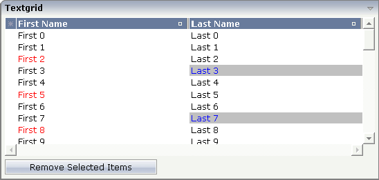
Some of the cells in the TEXTGRID2 control are rendered with a
different style than the normal one. Each COLUMN definition has the property
textstyleprop:
<rowarea name="Textgrid">
    <itr takefullwidth="true" fixlayout="true">
        <textgrid2 griddataprop="lines" width="100%" height="200" selectprop="selected"
                   hscroll="true">
            <column name="First Name" property="firstName" width="50%"
                    textstyleprop="firstNameStyle">
            </column>
            <column name="Last Name" property="lastname" width="50%"
                    textstyleprop="lastNameStyle">
            </column>
        </textgrid2>
    </itr>
    <vdist height="5">
    </vdist>
    <itr>
        <button name="Remove Selected Items" method="onRemoveSelectedItems">
        </button>
    </itr>
</rowarea>
There are situations in which the number and the format of the columns of a text grid cannot be defined in a fixed way inside the layout definition. The column type CSVCOLUMN allows you to dynamically define columns of a grid by your program.
The properties of the CSVCOLUMN control are:
| Basic | |||
| titlesprop |
Name of adapter property provding a semicolon-separated string containing the titles to be displayed. Example for a value that is passed back by the property: "First Name;Last Name;Street"" |
Obligatory | |
| valuesprop |
$en/popupwizard/njx_csvcolumn_attr_valuesprop$ |
Obligatory | |
| widthsprop |
Name of adapter property provding a semicolon-separated string containing the widths of the columns to be displayed. Example for a value that is passed back by the property: "100;200;100%"" |
Obligatory | |
| alignsprop |
$en/popupwizard/njx_csvcolumn_attr_alignsprop$ |
Sometimes obligatory | |
| backgroundsprop |
$en/popupwizard/njx_csvcolumn_attr_backgroundsprop$ |
Optional | |
| proprefsprop |
$en/popupwizard/njx_csvcolumn_attr_proprefsprop$ |
Optional | |
| comment |
Comment without any effect on rendering and behaviour. The comment is shown in the layout editor's tree view. |
Optional | |
| Appearance | |||
| straighttext |
If the text of the control contains HTML tags then these are by default interpreted by the browser. Specifiying STRAIGHTTEXT as "true" means that the browser will directly render the characters without HTML interpretation. Example: if you want to output the source of an HTML text then STRAIGHTTEXT should be set to "true". |
Optional |
true false |
| cuttextline |
If switched to "false" then the content of the column is broken if it excceeds the column's width definition. Default is "true" i.e. if the content is too big for the column cell then it is cut. |
Optional |
true false |
| headernowrap |
The textual content of the header is not wrapped automatically. No line break will be performed automatically by the browser. If you want the text of the header to be wrapped, set the value to "false". |
Optional |
true false |
| withgridcolheaders |
Flag that indicates if the user can resize column widths and re-order columns by drag and drop. Default is false. If set to true the corresponding adapter program must register as "column change event" listener. Use method TEXTGRIDCollection.registerGridColHeaderChangeListener for that. |
Optional |
true false |
| Binding | |||
| textstyleprop |
Name of the adapter parameter that provides a style-string that is used for rendering the column's content. As consequence you can indiviudally assign a CSS-style to each cell of your text grid. |
Optional | |
| textclassprop |
Name of the adapter parameter that provides a style class to be used for rendering the content. You can set up a limited number of style classes inside your style sheet definition - and dynamically reference them per grid cell. |
Optional | |
| straighttextprop |
Name of the adapter parameter which dynamically defines whether STRAIGHTTEXT is true or false. |
Optional | |
| sorttitlesprop |
$en/popupwizard/njx__attr_sorttitlesprop$ |
Optional | |
| tooltiptitlesprop |
$en/popupwizard/njx__attr_tooltiptitlesprop$ |
Optional | |
| linkmethodsprop |
$en/popupwizard/njx_csvcolumn_attr_linkmethodsprop$ |
Optional | |
| celllinkmethodsprop |
$en/popupwizard/njx_csvcolumn_attr_celllinkmethodsprop$ |
Optional | |
| celltooltiptitleprop |
Name of the property of the row item object that passes back (comma separated) tool tip titles. The titles will show up if the user is moving slowly the mouse over the grid cells. |
Optional | |
| imageprop |
Name of the property of the row item object that passes back (comma separated) image URLs. The URL must either be an absolute URL or a relative URL. |
Optional | |
| headerimageprop |
Name of the adapter parameter which provides a comma separated list of image URLs. The images are applied to the header. |
Optional | |
| Natural | |||
| njx:natname |
If a Natural variable with a name not valid for Application Designer (for instance #FIELD1) shall be bound to the control, a different name (for instance HFIELD1) can be bound instead. If the original name (in this case #FIELD1) is then specified in this attribute, the original name is generated into the parameter data area of the Natural adapter and a mapping between the two names is generated into the PROCESS PAGE statement of the Natural adapter. This mapping must not break a once defined group structure. If for instance a grid control that is bound to a name of GRID1 contains fields that are bound to FIELD1 and FIELD2 respectively, the corresponding njx:natname values may be #GRID1.#FIELD1 and #GRID1.#FIELD2, but not #GRID1.#FIELD1 and #MYGRID1.#FIELD2. |
Optional | |
| njx:natstringtype |
If the control shall be bound to a Natural system variable of string format with the attribute njx:natsysvar, this attribute indicates the format of the string, A (code page) or U (Unicode). The default is A. |
Optional | |
| njx:natcomment |
The value of this attribute is generated as comment line into the parameter data area of the Natural adapter, before the field name. The Map Converter, for instance, uses this attributes to indicate for a generated statusprop variable to which field the statusprop belongs. |
Optional | |