
The ROWTABLEAREA3 control is a specialized ROWTABLEAREA2 grid which is used to bind a two-dimensional Natural array to a grid. The grid cells are rendered as FIELD controls.
Other than with the ROWTABLEAREA2 control, you do not need to define the number of grid columns at design time. Instead, you define the number of columns and rows dynamically at runtime.
The ROWTABLEAREA3 control supports server-side scrolling and sorting, just like the ROWTABLEAREA2 control. This concept is explained in Server-Side Scrolling and Sorting. An example for the usage of server-side scrolling and sorting with the ROWTABLEAREA2 control is contained in the Natural for Ajax demos.
This document covers the following topics:
You can find the following example in the Natural for Ajax demos.
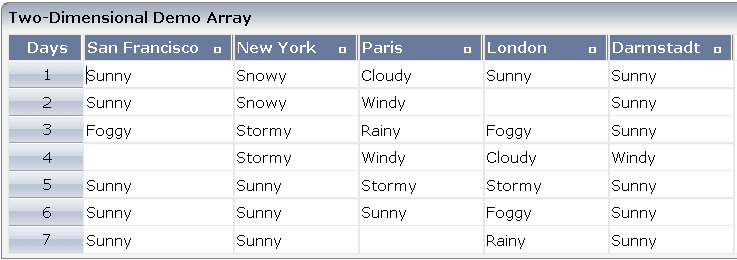
The XML layout definition for the grid is:
<rowarea name="Two-Dimensional Demo Array">
    <rowtablearea3 griddataprop="gridArray" gridpropsprop="gridArrayProps"
     rowcount="7" firstrowcolwidths="true" width="100%">
       <tr3>
         <gridcolheader textalign="center" name="Days" width="60"
          propref="selected" withsorticon="false">
         </gridcolheader>
         <gridcolheader3 nameprop="gridColHeaderDays"
          widthprop="headerDaysWidthProp">
         </gridcolheader3>
         <hdist width="100%"></hdist>
       </tr3>
       <repeat3>
         <str3 valueprop="selected" withalterbackground="true">
           <selector valueprop="selected" width="60">
           </selector>
           <field3 width="100%" statusprop="gridStatus" titleprop="gridTitle"
            noborder="true" datatype="string">
           </field3>
           <hdist width="100%"></hdist>
         </str3>
       </repeat3>
    </rowtablearea3>
</rowarea>
The above layout contains three major parts that you need to define for your grid. These parts are described in the topics below:
In the ROWTABLEAREA3 control, the properties
griddataprop and
gridpropsprop define the bindings to the Natural
application. Other than the ROWTABLEARE2 control, the ROWTABLEAREA3 control
supports separate properties for the data shown in the grid cells
(griddataprop) and the rendering data for the grid
cells (gridpropsprop). Other properties such as
rowcount,
firstrowcolwidth and
width are used in the same way as in the
ROWTABLEAREA2 control.
The TR3 control is a specialized TR container control that is used to define the grid headers. Since the column count is dynamically defined at runtime by the Natural application, you simply define one GRIDCOLHEADER3 control to render all headers of the grid data.
The GRIDCOLHEADER3 control is a specialized GRIDCOLHEADER control.
Other than with the GRIDCOLHEADER control, width and name values are
dynamically specified at runtime. For this purpose, the GRIDCOLHEADER3 control
supports properties such as nameprop and
widthprop.
In the above example, a selector column is defined as the first column, in addition to the real data columns. This selector column does not contain business data; its purpose is just rendering. Therefore, the header for the selector is defined via a GRIDCOLHEADER control and the corresponding rendering values are defined at design time.
GRIDCOLHEADER3 refers to the two-dimensional Natural data array. GRIDCOLHEADER refers to the specific SELECTOR column.
The grid content is defined within a REPEAT3 block. The REPEAT3
control is a specialized REPEAT control. As in ROWTABLEAREA2, its content
defines a row which is repeated within the grid as defined by the
rowcount property. Besides the real data shown in
a grid, a row can have an additional SELECTOR control and can make use of the
HDIST control to fine-tune the rendering in the browser.
The FIELD3 control is a specialized FIELD control which defines the rendering of the grid cells. Since the number of cells is dynamically defined at runtime, you just define one FIELD3 control to specify the rendering of all grid cells in a homogenous way.
The STR3 control is a specialized STR control which contains the above-mentioned parts of a row: SELECTOR (optional), FIELD3 and HDIST (optional).
In the parameter data area of the adapter, the grid data of the above example is represented by the data structures described below.
1 GRIDARRAY (A/1:*,1:*) DYNAMIC
The name of the data structure is defined in the
griddataprop property of the ROWTABLEAREA3
control. The specific type of a single cell - here (A) DYNAMIC -
can be defined in the datatype property of the
FIELD3 control.
1 GRIDARRAYPROPS
2 HEADERS (1:*)
3 GRIDCOLHEADERDAYS (A) DYNAMIC
3 HEADERDAYSWIDTHPROP (A) DYNAMIC
2 ROWS (1:*)
3 COLS (1:*)
4 GRIDSTATUS (A) DYNAMIC
4 GRIDTITLE (A) DYNAMIC
3 SELECTED (L)
By default, the name of the data structure is the same as the name
of the two-dimensional array (see above), followed by
"PROPS". Alternatively, you can specify your own
name in the gridpropsprop property of the
ROWTABLEAREA3 control.
This data structure contains rendering information for the headers
and all grid cells. HEADERS, ROWS and
COLS are predefined names and are added to this structure
correspondingly. Other fields such as GRIDCOLHEADERDAYS,
HEADERDAYSWIDTHPROP, GRIDSTATUS,
GRIDTITLE and SELECTED are generated based on the
properties specified in GRIDCOLHEADER3, FIELD3, HDIST and the container
controls of the grid.
1 GRIDARRAYINFO
2 ROWCOUNT (I4)
2 SIZE (I4)
2 SORTPROPS (1:*)
3 ASCENDING (L)
3 PROPNAME (A) DYNAMIC
2 TOPINDEX (I4)
If the grid has been configured for server-side scrolling and sorting, the data structure contains additional fields that control server-side scrolling and sorting. The usage is the same as in the ROWTABLEAREA2 control.
By default, the name of the data structure is the same as the name
of the two-dimensional array (see above), followed by
"INFO". Alternatively, you can specify your own name
in the gridinfoprop property of the ROWTABLEAREA3
control.
The advantage of the ROWTABLEAREA3 grid is that it separates the
data structure for the business data (the GRIDARRAY above) from
the data structure for the rendering data (the GRIDARRAYPROPS
above). Having two separate data structures allows you to directly bind grids
to existing business data. However, having two data structures requires making
the two data structures the same size in regard to rows and columns. The
Natural application is in charge of resizing the corresponding data structures.
See the examples in the Natural for Ajax demos for a simple implementation
pattern.
To easily find out which cells of the grids have been modified,
you can specify the name of a Natural control variable in the
njx:natcv property of the ROWTABLEAREA3 control.
The control variable can be defined within the grid data structure or outside
of the grid data structure.
<rowtablearea3 griddataprop="lines" njx:natcv="lines(*,*).mycell-cv" rowcount="5" >
   <repeat3>
      <str3 valueprop="selected">
         <selector valueprop="selected">
         </selector>
         <field3 titleprop="fld3titleprop" noborder="true" transparentbackground="true">
         </field3>
         <hdist width="100%">
         </hdist>
         <xcidatadef dataprop="mycell-cv" datatype="C">
         </xcidatadef>
       </str3>
    </repeat3>
</rowtablearea3>
This will generate the following Natural data structure:
1 LINESPROPS
2 ROWS (1:*)
3 COLS (1:*)
4 FLD3TITLEPROP (A) DYNAMIC
4 MYCELL-CV (C)
3 SELECTED (L)
1 LINES (A/1:*,1:*) DYNAMIC
<rowtablearea3 griddataprop="lines" njx:natcv="mycell-cv(*,*)"  rowcount="5" >
  <repeat3>
     <str3 valueprop="selected">
        <selector valueprop="selected">
        </selector>
        <field3 titleprop="fld3titleprop" noborder="true" transparentbackground="true">
        </field3>
        <hdist width="100%">
        </hdist>
      </str3>
  </repeat3>
</rowtablearea3>
...
<xcidatadef dataprop="mycell-cv" datatype="C" array="true" arraydimension="2">
</xcidatadef>
This will generate the following Natural data structure:
1 LINESPROPS
2 ROWS (1:*)
3 COLS (1:*)
4 FLD3TITLEPROP (A) DYNAMIC
3 SELECTED (L)
1 LINES (A/1:*,1:*) DYNAMIC
1 MYCELL-CV (C/1:*,1:*)
value-of-griddataprop.onTopindexChanged
value-of-griddataprop.onFirstPage
(block scrolling only)
value-of-griddataprop.onLastPage
(block scrolling only)
value-of-griddataprop.onPageDown
(block scrolling only)
value-of-griddataprop.onPageUp
(block scrolling only)
value-of-griddataprop.onCtrlSelect
value-of-griddataprop.onSelect
value-of-griddataprop.onShiftSelect
value-of-griddataprop.onSelectAll
value-of-griddataprop.onDeselectAll
value-of-griddataprop.onSort
value-of-griddataprop.reactOnContextMenuRequest
| Basic | |||
| rowcount |
Number of rows that are rendered inside the control. There are two ways of using this property - dependent on whether you in addition define the HEIGHT property: If you do NOT define the HEIGHT property then the control is rendered with exactly the number of rows that are defined as ROWCOUNT value. If a HEIGHT value is defined in addition (e.g. as percentage value "100%") then the number of rows depend on the actual height of the control. The ROWCOUNT value in this case indicates the maximum number of rows that are picked from the server. You should define this value in a way so that it is not too low - otherwise your grid will not be fully filled. On the other hand it should not be defined too high ("100") because this causes more communication traffic and more rendering effort inside the browser. |
Optional |
1 2 3 int-value |
| height |
Height of the control. There are three possibilities to define the height: (A) You do not define a height at all. As consequence the control will be rendered with its default height. If the control is a container control (containing) other controls then the height of the control will follow the height of its content. (B) Pixel sizing: just input a number value (e.g. "20"). (C) Percentage sizing: input a percentage value (e.g. "50%"). Pay attention: percentage sizing will only bring up correct results if the parent element of the control properly defines a height this control can reference. If you specify this control to have a height of 50% then the parent element (e.g. an ITR-row) may itself define a height of "100%". If the parent element does not specify a width then the rendering result may not represent what you expect. |
Optional |
100 150 200 250 300 250 400 50% 100% |
| width |
Width of the control. There are three possibilities to define the width: (A) You do not define a width at all. In this case the width of the control will either be a default width or - in case of container controls - it will follow the width that is occupied by its content. (B) Pixel sizing: just input a number value (e.g. "100"). (C) Percentage sizing: input a percantage value (e.g. "50%"). Pay attention: percentage sizing will only bring up correct results if the parent element of the control properly defines a width this control can reference. If you specify this control to have a width of 50% then the parent element (e.g. an ITR-row) may itself define a width of "100%". If the parent element does not specify a width then the rendering result may not represent what you expect. |
Sometimes obligatory |
100 120 140 160 180 200 50% 100% |
| firstrowcolwidths |
If set to "true" then the grid is sized according to its first row. This first row typically is a header-TR-row in which GRIDCOLHEADER controls are used as column headers for the subsequent rows. Default is "false", i.e. the grid is sized according to its "whole content". Please note: when using the GRIDCOLHEADER control within the header-TR-row this property must be set to "true" - otherwise column resizing (by drag and drop) does not work correctly. |
Sometimes obligatory |
true false |
| maxcols |
$en/popupwizard/rowtablearea_attr_maxcols$ |
Optional |
1 2 3 int-value |
| comment |
Comment without any effect on rendering and behaviour. The comment is shown in the layout editor's tree view. |
Optional | |
| Appearance | |||
| withborder |
If set to "false" then no thin border is drawn around the controls that are contained in the grid. Default is "true". |
Optional |
true false |
| hscroll |
Definition of the horizontal scrollbar's appearance. You can define that the scrollbars only are shown if the content is exceeding the control's area ("auto"). Or scrollbars can be shown always ("scroll"). Or scrollbars are never shown - and the content is cut ("hidden"). Default is "hidden". |
Optional |
auto scroll hidden |
| vscroll |
Definition of the vertical scrollbar's appearance. You can define that scrollbars only are shown if the content is exceeding the control's area ("auto"). Or scrollbars can be shown always ("scroll"). Or scrollbars are never shown - and the content is cut ("hidden"). Default is "scroll". |
Optional |
auto scroll hidden |
| firstrowcolwidths | (already explained above) | ||
| clipboardaccess |
If switched to true then the content of the grid can be selected and exported into the client's clipboard. |
Optional |
true false |
| withblockscrolling |
If switched to "true" then the grid will show small scroll icons by which the user can scroll the grid's content. Scrolling typically is done by using the grid's scrollbar - the scroll icons that are switched on by this property are an additional possibility to scroll. |
Optional |
true false |
| touchpadinput |
If set to "true" then touch screen icons for scrolling are displayed in addition. Default is "false". |
Optional |
true false |
| requiredheight |
Minimum height of the control in pixels. Use this property to ensure a minimum height if the overall control's height is a percentage of the available space - i.e. if value of property HEIGHT is a percentage (e.g. 100%). Please note:You must not use FIXLAYOUT at the surrounding row container (ITR and ROWAREA). Otherwise: if the available space is less than the required height the end of the control is just cut off. |
Optional |
1 2 3 int-value |
| tablestyle |
CSS style definition that is directly passed into this control. With the style you can individually influence the rendering of the control. You can specify any style sheet expressions. Examples are: border: 1px solid #FF0000 background-color: #808080 You can combine expressions by appending and separating them with a semicolon. Sometimes it is useful to have a look into the generated HTML code in order to know where direct style definitions are applied. Press right mouse-button in your browser and select the "View source" or "View frame's source" function. |
Optional |
background-color: #FF0000 color: #0000FF font-weight: bold |
| darkbackground |
Normally the background is in light colour but the CIS style sheets also have a dark(er) grey colour to be used. If DARKBACKGROUND is set to true then the darker background colour is chosen. This property typically is used to integrate light coloured controls into darker container areas. |
Optional |
true false |
| invisiblemodeincompletelastrow |
If set to "invisible" an incomplete last row is not shown. |
Optional |
invisible visible |
| Binding | |||
| fwdtabkeyfilter |
By default the FWDTABKEYMETHOD is called if the user presses the TAB key within the veryfirst cell of the grid. Input the name of a cell's VALUEPROP to associate the method call with any other column. |
Optional | |
| bwdtabkeyfilter |
By default the BWDTABKEYMETHOD is called if the user presses the SHIFT and TAB keys within the very first cell of the grid. Input the name of a cell's VALUEPROP to associate the method call with any other column. |
Optional | |
| Hot Keys | |||
| hotkeys |
Semicolon separated list of hot keys. A hotkey consists of a list of keys and a method name. Separate the keys by "-" and the method name again with a semicolon Example: ctrl-alt-65;onCtrlAltA;13;onEnter ...defines two hot keys. Method onCtrlAltA is invoked if the user presses Ctrl-Alt-A. Method "onEnter" is called if the user presses the ENTER key. Use the popup help within the Layout Painter to input hot keys. |
Optional | |
| Natural | |||
| njx:natname |
If a Natural variable with a name not valid for Application Designer (for instance #FIELD1) shall be bound to the control, a different name (for instance HFIELD1) can be bound instead. If the original name (in this case #FIELD1) is then specified in this attribute, the original name is generated into the parameter data area of the Natural adapter and a mapping between the two names is generated into the PROCESS PAGE statement of the Natural adapter. This mapping must not break a once defined group structure. If for instance a grid control that is bound to a name of GRID1 contains fields that are bound to FIELD1 and FIELD2 respectively, the corresponding njx:natname values may be #GRID1.#FIELD1 and #GRID1.#FIELD2, but not #GRID1.#FIELD1 and #MYGRID1.#FIELD2. |
Optional | |
| njx:natcv |
Name of a Natural control variable that shall be assigned to the control. |
Optional | |
| njx:natcomment |
The value of this attribute is generated as comment line into the parameter data area of the Natural adapter, before the field name. The Map Converter, for instance, uses this attributes to indicate for a generated statusprop variable to which field the statusprop belongs. |
Optional | |
| Basic | |||
| visibleprop |
Name of the adapter parameter that provides the information if this control is displayed or not. As consequence you can control the visibility of the control dynamically. |
Optional | |
| height |
Height of the control. There are three possibilities to define the height: (A) You do not define a height at all. As consequence the height of the control will follow the height of its content. (B) Pixel sizing: just input a number value (e.g. "20"). Please note: the row content may overrule this setting. The height setting "100px" of an embedded textbox will beat a row height of "50px". (C) Percentage sizing: input a percantage value (e.g. "50%"). Pay attention: percentage sizing will only bring up correct results if the parent element of the control properly defines a height this control can reference. If you specify this control to have a height of 50% then the parent element may itself define a height of "100%". If the parent element does not specify a width then the rendering result may not represent what you expect. |
Optional |
100 150 200 250 300 250 400 50% 100% |
| withalterbackground |
Flag that indicates if the grid line shows alternating background color (like rows within a textgrids). Default is false. Please note: controls inside the row must have transparent background. In case of the FIELD control simply set property TRANSPARENTBACKGROUND to true. |
Optional |
true false |
| trstyle |
CSS style definition that is directly passed into this control. With the style you can individually influence the rendering of the control. You can specify any style sheet expressions. Examples are: border: 1px solid #FF0000 background-color: #808080 You can combine expressions by appending and separating them with a semicolon. Sometimes it is useful to have a look into the generated HTML code in order to know where direct style definitions are applied. Press right mouse-button in your browser and select the "View source" or "View frame's source" function. |
Optional |
background-color: #FF0000 color: #0000FF font-weight: bold |
| trstyleprop |
Name of the adapter parameter that dynamically provides explicit style information for the control. |
Optional | |
| comment |
Comment without any effect on rendering and behaviour. The comment is shown in the layout editor's tree view. |
Optional | |
| Basic | |||
| nameprop |
Name of adapter parameter which dynamically provides the text that is shown inside the control. |
Sometimes obligatory | |
| textidprop |
Name of the adapter property that provides the multi language dependent text which is displayed inside the control. The "textid" is translated into a corresponding string at runtime. Do not specify a "name" inside the control if specifying a "textid". |
Sometimes obligatory | |
| widthprop |
Name of the adapter parameter that provided the width of the control. There are three possibilities to define the width: (A) You do not define a width at all. In this case the width of the control will either be a default width or - in case of container controls - it will follow the width that is occupied by its content. (B) Pixel sizing: just input a number value (e.g. "100"). (C) Percentage sizing: input a percantage value (e.g. "50%"). Pay attention: percentage sizing will only bring up correct results if the parent element of the control properly defines a width this control can reference. If you specify this control to have a width of 50% then the parent element (e.g. an ITR-row) may itself define a width of "100%". If the parent element does not specify a width then the rendering result may not represent what you expect. |
Obligatory | |
| Appearance | |||
| nowrap |
The textual content of the header is not wrapped automatically. No line break will be performed automatically by the browser. If you want the text of the header to be wrapped, set the value to "false". |
Optional |
true false |
| stylevariant |
Some controls offer the possibility to define style variants. By this style variant you can address different styles inside your style sheet definition file (.css). If not defined "normal" styles are chosen, if defined (e.g. "VAR1") then other style definitions (xxxVAR1xxx) are chosen. Purpose: you can set up style variants in the style sheet defintion and use them multiple times by addressing them via the "stylevariant" property. CIS currently offers two variants "VAR1" and "VAR2" but does not predefine any semantics behind - this is up to you! |
Optional |
VAR1 VAR2 VAR3 VAR4 |
| textalign |
Alignment of text inside the control. |
Optional |
left center right |
| rowspan |
Row spanning of control. If you use TR table rows then you may sometimes want to control the number of rows your control occupies. By default it is "1" - but you may want to define the control to span over more than one columns. The property only makes sense in table rows that are snychronized within one container (i.e. TR, STR table rows). It does not make sense in ITR rows, because these rows are explicitly not synched. |
Optional |
1 2 3 4 5 50 int-value |
| colspan |
Column spanning of control. If you use TR table rows then you may sometimes want to control the number of columns your control occupies. By default it is "1" - but you may want to define the control to span over more than one columns. The property only makes sense in table rows that are snychronized within one container (i.e. TR, STR table rows). It does not make sense in ITR rows, because these rows are explicitly not synched. |
Optional |
1 2 3 4 5 50 int-value |
| Binding | |||
| nameprop | (already explained above) | ||
| textidprop | (already explained above) | ||
| widthprop | (already explained above) | ||
| titleprop |
Name of the adapter parameter that provides the text which is shown as tooltip for the control. Either specify the text "hard" by using this TITLE property - or use the TITLETEXTID in order to define a language dependent literal. |
Optional | |
| titletextidprop |
Name of the adapter parameter that provides the text ID which is passed to the multi lanaguage management - representing the tooltip text that is used for the control. |
Optional | |
| withsorticonprop |
Name of the adapter parameter that provides the flag which indicates if a small sort indicator is shown within the right corner of the control. Default is TRUE. |
Optional | |
| sorttitleprop |
Name of the adapter parameter that provides the text which is shown as tooltip for the sort indicator. Either input text by using this SORTTITLE property - or use the SORTTITLETEXTID in order to define a language dependent literal. |
Optional | |
| sorttitletextidprop |
Name of the adapter parameter that provides the text ID which is passed to the multi lanaguage management - representing the tooltip text for the sort indicator. |
Optional | |
| Comment | |||
| comment |
Comment without any effect on rendering and behaviour. The comment is shown in the layout editor's tree view. |
Optional | |
| Basic | |||
| withalterbackground |
Flag that indicates if the grid line shows alternating background color (like rows within a textgrids). Default is false. Please note: controls inside the row must have transparent background. In case of the FIELD control simply set property TRANSPARENTBACKGROUND to true. |
Optional |
true false |
| showifempty |
Flag that indicates if an unused row is visible. Example: if set to false a grid with rowcount ten and a server side collection size of seven will hide the three remaining rows. Default is false. |
Optional |
true false |
| comment |
Comment without any effect on rendering and behaviour. The comment is shown in the layout editor's tree view. |
Optional | |
| Natural | |||
| njx:natname |
If a Natural variable with a name not valid for Application Designer (for instance #FIELD1) shall be bound to the control, a different name (for instance HFIELD1) can be bound instead. If the original name (in this case #FIELD1) is then specified in this attribute, the original name is generated into the parameter data area of the Natural adapter and a mapping between the two names is generated into the PROCESS PAGE statement of the Natural adapter. This mapping must not break a once defined group structure. If for instance a grid control that is bound to a name of GRID1 contains fields that are bound to FIELD1 and FIELD2 respectively, the corresponding njx:natname values may be #GRID1.#FIELD1 and #GRID1.#FIELD2, but not #GRID1.#FIELD1 and #MYGRID1.#FIELD2. |
Optional | |
| njx:natcv |
Name of a Natural control variable that shall be assigned to the control. |
Optional | |
| njx:natcomment |
The value of this attribute is generated as comment line into the parameter data area of the Natural adapter, before the field name. The Map Converter, for instance, uses this attributes to indicate for a generated statusprop variable to which field the statusprop belongs. |
Optional | |
| Basic | |||
| width |
Width of the control. There are three possibilities to define the width: (A) You do not define a width at all. In this case the width of the control will either be a default width or - in case of container controls - it will follow the width that is occupied by its content. (B) Pixel sizing: just input a number value (e.g. "100"). (C) Percentage sizing: input a percantage value (e.g. "50%"). Pay attention: percentage sizing will only bring up correct results if the parent element of the control properly defines a width this control can reference. If you specify this control to have a width of 50% then the parent element (e.g. an ITR-row) may itself define a width of "100%". If the parent element does not specify a width then the rendering result may not represent what you expect. |
Sometimes obligatory |
100 120 140 160 180 200 50% 100% |
| comment |
Comment without any effect on rendering and behaviour. The comment is shown in the layout editor's tree view. |
Optional | |
| Appearance | |||
| width | (already explained above) | ||
| length |
Width of FIELD in amount of characters. WIDTH and LENGTH should not be used together. Note that the actual size of the control depends on the font definition if using the LENGTH property. |
Optional |
5 10 15 20 int-value |
| maxlength |
Maximum number of characters that a user may enter. This property is not depending on the LENGTH property - please do not get confused by the similar naming. MAXLENGTH has nothing to do with the optical sizing of the control but only with the number of characters you may input. |
Optional |
5 10 15 20 int-value |
| autotab |
If set to true, an automatic tab is executed for fields with a specified MAXLENGTH when the maxlength value is reached. For fields without a MAXLENGTH specified it has no effect. Default is true. |
Optional |
true false |
| textalign |
Alignment of text inside the control. |
Optional |
left center right |
| password |
If set to "true", each entered character is displayed as a '*'. |
Optional |
true false |
| displayonly |
If set to true, the FIELD will not be accessible for input. It is just used as an output field. |
Optional |
true false |
| direction |
Presets the default(BiDi) direction of the control. Use black string in order to have the default value. |
Optional |
rtl ltr |
| uppercase |
If "true" then all input is automatically transferred to upper case characters. |
Optional |
true false |
| align |
Horizontal alignment of control in its column. Each control is "packaged" into a column. The column itself is part of a row (e.g. ITR or TR). Sometimes the size of the column is bigger than the size of the control itself. In this case the "align" property specifies the position of the control inside the column. In most cases you do not require the align control to be explicitly defined because the size of the column around the controls exactly is sized in the same way as the contained control. If you want to directly control the alignment of text: in most text based controls there is an explicit property "textalign" in which you align the control's contained text. |
Optional |
left center right |
| valign |
Vertical alignment of control in its column. Each control is "packaged" into a column. The column itself is part of a row (e.g. ITR or TR). Sometimtes the size of the column is bigger than the size of the control. In this case the "align" property specify the position of the control inside the column. |
Optional |
top middle bottom |
| colspan |
Column spanning of control. If you use TR table rows then you may sometimes want to control the number of columns your control occupies. By default it is "1" - but you may want to define the control to span over more than one columns. The property only makes sense in table rows that are snychronized within one container (i.e. TR, STR table rows). It does not make sense in ITR rows, because these rows are explicitly not synched. |
Optional |
1 2 3 4 5 50 int-value |
| rowspan |
Row spanning of control. If you use TR table rows then you may sometimes want to control the number of rows your control occupies. By default it is "1" - but you may want to define the control to span over more than one columns. The property only makes sense in table rows that are snychronized within one container (i.e. TR, STR table rows). It does not make sense in ITR rows, because these rows are explicitly not synched. |
Optional |
1 2 3 4 5 50 int-value |
| fieldstyle |
CSS style definition that is directly passed into this control. With the style you can individually influence the rendering of the control. You can specify any style sheet expressions. Examples are: border: 1px solid #FF0000 background-color: #808080 You can combine expressions by appending and separating them with a semicolon. Sometimes it is useful to have a look into the generated HTML code in order to know where direct style definitions are applied. Press right mouse-button in your browser and select the "View source" or "View frame's source" function. |
Optional |
background-color: #FF0000 color: #0000FF font-weight: bold |
| noborder |
Boolean value defining if the control has a border. Default is "false". |
Optional |
true false |
| transparentbackground |
Boolean value defining if the control is rendered with a transparent background. Default is "false". |
Optional |
true false |
| invisiblemode |
If the visibility of the control is determined dynamically by an adapter property then there are two rendering modes if the visibility is "false": (1) "invisible": the control is not visible. (2)"cleared": the control is not visible but it still occupies space. |
Optional |
invisible cleared |
| Binding | |||
| alwaysflush |
If set to TRUE then a specified server flushmethod is also called in case the value has not changed. The default is FALSE, meaning that a server flushmethod is only called for a changed value. |
Optional |
true false |
| flush |
Flushing behaviour of the input control. By default an input into the control is registered within the browser client - and communicated to the server adapter object when a user e.g. presses a button. By using the FLUSH property you can change this behaviour. Setting FLUSH to "server" means that directly after changing the input a synchronization with the server adapter is triggered. As consequence you directly can react inside your adapter logic onto the change of the corresponding value. - Please be aware of that during the synchronization always all changed properties - also the ones that were changed before - are transferred to the adapter object, not only the one that triggered the synchonization. Setting FLUSH to "screen" means that the changed value is populated inside the page. You use this option if you have redundant usage of the same property inside one page and if you want to pass one changed value to all its representation directly after changing the value. |
Optional |
screen server |
| textidmode |
If using property "valuetextprop" then a field knows an id and a text for a certain value. There are three types of display: either both are shown together, separated by an "-" (e.g. "id - text"). Or only text is shown or only the id is shown. If not defined at all then the system's default text id-mode will be chosen. The default mode can be defined as part of the CIS session context. |
Optional |
0 1 2 |
| Validation | |||
| datatype |
By default, the FIELD control is managing its content as string. By explicitly setting a datatype you can define that the control... ...will check the user input if it reflects the datatype. E.g. if the user inputs "abc" into a field with datatype "int" then a corresponding error message will popup when the user leaves the field. ...will format the data coming from the server or coming form the user input: if the field has datatype "date" and the user inputs "010304" then the input will be translated into "01.03.2004" (or other representation, dependent on date format settings). In addition valeu popups are offered for the user automatically for some datatypes: e.g. when specifying datatype "date" the automatically the field provides a calendar input popup. Please note: the datatype "float" is named a bit misleading - it represents any decimal format number. The server side representation may be a float value, but also can be a double or a BigDecimal property. |
Optional |
date float int long time timestamp color xs:decimal xs:double xs:date xs:dateTime xs:time |
| editmask |
NATPAGE only: A subset of the Natural edit masks is supported depending on the data type. |
Optional | |
| validationrules |
Contains information used for Data Validation. Use the Validation Rules Editor to make changes! |
Optional | |
| validation |
Regular expression against which the content of the field is checked on client side when the user changes the field. If the validation fails then an error message popup up and informs the user about the wrong input. |
Optional |
[a-zA-Z0-9_.-] {1,}\\@[a-zA-Z0-9_.-] {1,}\\.\\w{2,}\\d{5} [0-9 )(-/+]+ |
| validationuserhint |
If a client side validation fails due to wrong user input then an error popup is opened. If you define a hint inside this property then the hint is output to the user in order to tell in which way to input the value. The hint is not language dependent. |
Optional | |
| digits |
Number that specifiies how many digits are to be displayed (ie digits before the comma). If using this feature then the DATATYPE property must be set to 'float'. See also DECIMALDIGITS. |
Optional |
1 2 3 int-value |
| decimaldigits |
Specifies the number of displayed decimal digits. If using this feature then the DATATYPE property must be set to 'float'. |
Optional |
1 2 3 int-value |
| spinrangemin |
An integer value which defines the lower bound of the value range. |
Optional |
1 2 3 int-value |
| spinrangemax |
An integer value which defines the upper bound of the value range. |
Optional |
1 2 3 int-value |
| Valuehelp | |||
| popupinputonly |
Boolean property that control if a field with POPUPMETHOD defined is still usable for keyboard input. If "false" (= default) then the user can input a value either directly via keyboard or by using the popupmethod's help. If set to "true" then no keyboard input is possible - but only selection from the popup-method's help. |
Optional |
true false |
| popuponalt40 |
Value help in a field is triggered either by clicking with the mouse or by pressing a certain key inside the field. The "traditional" keys are "cusrsor-down", "F7" or "F4". Sometimes you do not want to mix other "cursor-down" behaviour (e.g. scrolling in lists) with the value help behaviour. In this case switch this property to "true" - and the value help will only come up anymore when "alt-cursor-down" is pressed. |
Optional |
true false |
| popupcombowidth |
Pixel width of the standard "openIdValueCombo" popup dialog. Default is field width or at least 150 pixel. |
Optional |
1 2 3 int-value |
| popupicon |
URL of image that is displayed inside the right corner of the field to indicate to the user that there is some value help available.. Any image type (.gif, .jpg, ...) that your browser does understand is valid. Use the following options to specify the URL: (A) Define the URL relative to your page. Your page is generated directly into your project's folder. Specifiying "images/xyz.gif" will point into a directory parallel to your page. Specifying "../HTMLBasedGUI/images/new.gif" will point to an image of a neighbour project. (B) Define a complete URL, like "http://www.softwareag.com/images/logo.gif". |
Optional |
gif jpg jpeg |
| touchpadinput |
Boolean property that decides if touch pad support is offered for the FIELD control. The default is "false". If switched to "true" then you can input data into the field via a touch pad. As consequence you can use this control for making inputs through a touch terminal. |
Optional |
true false |
| onlinehelp | |||
| helpid |
Help id that is passed to the online help management in case the user presses F1 on the control. |
Optional | |
| title |
Text that is shown as tooltip for the control. Either specify the text "hard" by using this TITLE property - or use the TITLETEXTID in order to define a language dependent literal. |
Optional | |
| titletextid |
Text ID that is passed to the multi lanaguage management - representing the tooltip text that is used for the control. |
Optional | |
| formula |
Contains information used by the Formula Editor. Use the Formula Editor to make changes! |
Optional | |
| Hot Keys | |||
| hotkeys |
Semicolon separated list of hot keys. A hotkey consists of a list of keys and a method name. Separate the keys by "-" and the method name again with a semicolon Example: ctrl-alt-65;onCtrlAltA;13;onEnter ...defines two hot keys. Method onCtrlAltA is invoked if the user presses Ctrl-Alt-A. Method "onEnter" is called if the user presses the ENTER key. Use the popup help within the Layout Painter to input hot keys. |
Optional | |
| Miscellaneous | |||
| testtoolid |
Use this attribute to assign a fixed control identifier that can be later on used within your test tool in order to do the object identification |
Optional | |
| autocallpopupmethodoffset |
The offset (milliseconds) after the last key down event for calling the AUTOCALLPOPUPMETHOD. Makes only sense if an AUTOCALLPOPUPMETHOD is specified. |
Optional |
1 2 3 int-value |