
The MGDGRID control is an extension of the ROWTABLEAREA2 control. It allows to insert, copy and delete rows of the grid.
Like the ROWTABLEAREA2 control, the MGDGRID control supports server-side scrolling and sorting. This concept is explained in Server-Side Scrolling and Sorting. An example for the usage of server-side scrolling and sorting with the ROWTABLEAREA2 control is contained in the Natural for Ajax demos. The same example can be used to illustrate the usage of server-side scrolling and sorting with the MGDGRID control.
This document covers the following topics:
See also STR Properties which are described with the ROWTABLEAREA2 control.
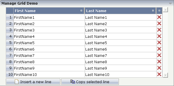
There is a grid that contains a header row and 10 lines. Each line contains two fields and a "delete row" control.
Each of the function controls (insert, copy, delete) can be added at the top of the MGDGRID, below the MGDGRID or within the lines of the MGDGRID.
Look at the corresponding layout definition:
<rowarea name="Manage Grid Demo">
  <mgdgrid griddataprop="mglines" rowcount="10" width="100%" firstrowcolwidths="true">
    <tr>
      <label name="  " width="25" asheadline="true">
      </label>
      <gridcolheader name="First Name" width="50%">
      </gridcolheader>
      <gridcolheader name="Last Name" width="50%" >
      </gridcolheader>
      <gridcolheader width="20">
      </gridcolheader>
      <hdist></hdist>
    </tr>
    <repeat>
      <str valueprop="selected" showifempty="true">
        <selector valueprop="selected" singleselect="true">
        </selector>
        <field valueprop="fname" width="100%">
        </field>
        <field valueprop="lname" width="100%">
        </field>
        <rowdelete>
        </rowdelete>
      </str>
    </repeat>
    <mgdfunctions>
      <rowinsert title="Insert a new line">
      </rowinsert>
      <rowcopy title="Copy selected line">
      </rowcopy>
    </mgdfunctions>
  </mgdgrid>
</rowarea>
The MGDGRID control is an extension to the ROWTABLEAREA2 control. See the description of the ROWTABLEAREA2 control for further information.
In the parameter data area of the adapter, the grid data is represented by the following data structure:
1 MGLINES (1:*)
2 FNAME (U) DYNAMIC
2 LNAME (U) DYNAMIC
2 SELECTED (L)
If the grid has been configured for server-side scrolling and
sorting, the data structure contains additional fields that control server-side
scrolling and sorting (see below). In order to use server-side scrolling and
sorting, set the property natsss in NATPAGE to
"true".
1 MGLINES (1:*)
2 FNAME (U) DYNAMIC
2 LNAME (U) DYNAMIC
2 SELECTED (L)
1 LINESINFO
2 ROWCOUNT (I4)
2 SIZE (I4)
2 SORTPROPS (1:*)
3 ASCENDING (L)
3 PROPNAME (U) DYNAMIC
2 TOPINDEX (I4)
value-of-griddataprop.onCtrlSelect
value-of-griddataprop.onSelect
value-of-griddataprop.onShiftSelect
value-of-griddataprop.onSort
value-of-griddataprop.onTopindexChanged
| Basic | |||
| griddataprop |
Name of the adapter parameter that represents the control in the adapter. |
Obligatory | |
| rowcount |
Number of rows that are rendered inside the control. There are two ways of using this property - dependent on whether you in addition define the HEIGHT property: If you do NOT define the HEIGHT property then the control is rendered with exactly the number of rows that are defined as ROWCOUNT value. If a HEIGHT value is defined in addition (e.g. as percentage value "100%") then the number of rows depend on the actual height of the control. The ROWCOUNT value in this case indicates the maximum number of rows that are picked from the server. You should define this value in a way so that it is not too low - otherwise your grid will not be fully filled. On the other hand it should not be defined too high ("100") because this causes more communication traffic and more rendering effort inside the browser. |
Optional | |
| height |
Height of the control. There are three possibilities to define the height: (A) You do not define a height at all. As consequence the control will be rendered with its default height. If the control is a container control (containing) other controls then the height of the control will follow the height of its content. (B) Pixel sizing: just input a number value (e.g. "20"). (C) Percentage sizing: input a percentage value (e.g. "50%"). Pay attention: percentage sizing will only bring up correct results if the parent element of the control properly defines a height this control can reference. If you specify this control to have a height of 50% then the parent element (e.g. an ITR-row) may itself define a height of "100%". If the parent element does not specify a width then the rendering result may not represent what you expect. |
Optional |
100 150 200 250 300 250 400 50% 100% |
| width |
Width of the control. There are three possibilities to define the width: (A) You do not define a width at all. In this case the width of the control will either be a default width or - in case of container controls - it will follow the width that is occupied by its content. (B) Pixel sizing: just input a number value (e.g. "100"). (C) Percentage sizing: input a percantage value (e.g. "50%"). Pay attention: percentage sizing will only bring up correct results if the parent element of the control properly defines a width this control can reference. If you specify this control to have a width of 50% then the parent element (e.g. an ITR-row) may itself define a width of "100%". If the parent element does not specify a width then the rendering result may not represent what you expect. |
Sometimes obligatory |
100 120 140 160 180 200 50% 100% |
| firstrowcolwidths |
If set to "true" then the grid is sized according to its first row. This first row typically is a header-TR-row in which GRIDCOLHEADER controls are used as column headers for the subsequent rows. Default is "false", i.e. the grid is sized according to its "whole content". Please note: when using the GRIDCOLHEADER control within the header-TR-row this property must be set to "true" - otherwise column resizing (by drag and drop) does not work correctly. |
Sometimes obligatory |
true false |
| comment |
Comment without any effect on rendering and behaviour. The comment is shown in the layout editor's tree view. |
Optional | |
| Appearance | |||
| withborder |
If set to "false" then no thin border is drawn around the controls that are contained in the grid. Default is "true". |
Optional |
true false |
| hscroll |
Definition of the horizontal scrollbar's appearance. You can define that the scrollbars only are shown if the content is exceeding the control's area ("auto"). Or scrollbars can be shown always ("scroll"). Or scrollbars are never shown - and the content is cut ("hidden"). Default is "hidden". |
Optional |
auto scroll hidden |
| vscroll |
Definition of the vertical scrollbar's appearance. You can define that scrollbars only are shown if the content is exceeding the control's area ("auto"). Or scrollbars can be shown always ("scroll"). Or scrollbars are never shown - and the content is cut ("hidden"). Default is "scroll". |
Optional |
auto scroll hidden |
| firstrowcolwidths | (already explained above) | ||
| clipboardaccess |
If switched to true then the content of the grid can be selected and exported into the client's clipboard. |
Optional |
true false |
| withblockscrolling |
If switched to "true" then the grid will show small scroll icons by which the user can scroll the grid's content. Scrolling typically is done by using the grid's scrollbar - the scroll icons that are switched on by this property are an additional possibility to scroll. |
Optional |
true false |
| touchpadinput |
If set to "true" then touch screen icons for scrolling are displayed in addition. Default is "false". |
Optional |
true false |
| requiredheight |
Minimum height of the control in pixels. Use this property to ensure a minimum height if the overall control's height is a percentage of the available space - i.e. if value of property HEIGHT is a percentage (e.g. 100%). Please note:You must not use FIXLAYOUT at the surrounding row container (ITR and ROWAREA). Otherwise: if the available space is less than the required height the end of the control is just cut off. |
Optional |
1 2 3 int-value |
| tablestyle |
CSS style definition that is directly passed into this control. With the style you can individually influence the rendering of the control. You can specify any style sheet expressions. Examples are: border: 1px solid #FF0000 background-color: #808080 You can combine expressions by appending and separating them with a semicolon. Sometimes it is useful to have a look into the generated HTML code in order to know where direct style definitions are applied. Press right mouse-button in your browser and select the "View source" or "View frame's source" function. |
Optional |
background-color: #FF0000 color: #0000FF font-weight: bold |
| Binding | |||
| oncontextmenumethod |
Name of the event that is sent to the adapter when the user presses the right mouse button in the grid, but not on an existing row, but in an empty area of the grid. |
Optional | |
| fwdtabkeymethod |
Name of the event that is sent to the adapter when the user presses the TAB key within the very last cell of the grid (last cell within the last line). Use property FWDTABKEYFILTER to associate this call with a grid column. |
Optional | |
| fwdtabkeyfilter |
By default the FWDTABKEYMETHOD is called if the user presses the TAB key within the veryfirst cell of the grid. Input the name of a cell's VALUEPROP to associate the method call with any other column. |
Optional | |
| bwdtabkeymethod |
Name of the event that is sent to the adapter when the user presses SHIFT and TAB keys within the first cell of a grid line. Use property BWDTABKEYFILTER to associate this call with a cell of choice. |
Optional | |
| bwdtabkeyfilter |
By default the BWDTABKEYMETHOD is called if the user presses the SHIFT and TAB keys within the very first cell of the grid. Input the name of a cell's VALUEPROP to associate the method call with any other column. |
Optional | |
| Hot Keys | |||
| hotkeys |
Semicolon separated list of hot keys. A hotkey consists of a list of keys and a method name. Separate the keys by "-" and the method name again with a semicolon Example: ctrl-alt-65;onCtrlAltA;13;onEnter ...defines two hot keys. Method onCtrlAltA is invoked if the user presses Ctrl-Alt-A. Method "onEnter" is called if the user presses the ENTER key. Use the popup help within the Layout Painter to input hot keys. |
Optional | |
| Natural | |||
| njx:natname |
If a Natural variable with a name not valid for Application Designer (for instance #FIELD1) shall be bound to the control, a different name (for instance HFIELD1) can be bound instead. If the original name (in this case #FIELD1) is then specified in this attribute, the original name is generated into the parameter data area of the Natural adapter and a mapping between the two names is generated into the PROCESS PAGE statement of the Natural adapter. This mapping must not break a once defined group structure. If for instance a grid control that is bound to a name of GRID1 contains fields that are bound to FIELD1 and FIELD2 respectively, the corresponding njx:natname values may be #GRID1.#FIELD1 and #GRID1.#FIELD2, but not #GRID1.#FIELD1 and #MYGRID1.#FIELD2. |
Optional | |
| njx:natcomment |
The value of this attribute is generated as comment line into the parameter data area of the Natural adapter, before the field name. The Map Converter, for instance, uses this attributes to indicate for a generated statusprop variable to which field the statusprop belongs. |
Optional | |
| Basic | |||
| image |
URL that points to the image that is shown as icon. The URL either is an absolute URL or a relative URL. If using a relative URL then be aware of that the generated page is located directly inside your project's directory. Example: "images/icon.gif" points to an icon in an images-folder that is parallel to the page itself. "../HTMLBasedGUI/images/new.gif" point to a URL that is located inside a different project. |
Obligatory | |
| comment |
Comment without any effect on rendering and behaviour. The comment is shown in the layout editor's tree view. |
Optional | |
| Binding | |||
| visibleprop |
Name of the adapter parameter that provides the information if this control is displayed or not. As consequence you can control the visibility of the control dynamically. |
Optional | |
| Online Help | |||
| title |
Text that is shown as tooltip for the control. Either specify the text "hard" by using this TITLE property - or use the TITLETEXTID in order to define a language dependent literal. |
Optional | |
| titletextid |
Text ID that is passed to the multi lanaguage management - representing the tooltip text that is used for the control. |
Optional | |