The NJX:MASHZONE control is used to integrate an ARIS MashZone application into a Natural for Ajax page. The data to be displayed is provided by a Natural application. The NJX:MASHZONE control itself consists of a display area for the MashZone application (similar to the area defined with a SUBPAGE control) and of a set of data containers representing the data sources of a MashZone data feed.
To use the NJX:MASHZONE control, you must also add an NJX:OBJECTS control to your page layout. The NJX:OBJECTS control is used to transport the data objects from the Natural application to the Natural for Ajax server.
The following topics are covered below:
If you want to use the NJX:MASHZONE control, you have to consider the following:
The product ARIS MashZone must have been installed beforehand. Although it is not necessary to install ARIS MashZone on the same host as the Natural for Ajax server, you have to keep in mind that data files that have been generated by Natural for Ajax must be accessible by ARIS MashZone.
The ARIS MashZone application that is going to be displayed inside the NJX:MASHZONE control must have been created beforehand. Especially the data source structures on which the data feeds for this MashZone application are based must already be known during application creation time.
The Natural application used to generate the MashZone data must take care of the correct structure of the data so that the data files generated during runtime correspond to the structures that have been defined for the MashZone application. If, for example, some data source in CSV file format is used in the MashZone application, the Natural application has to provide the data in exactly the same format.
The XML layout definition is:
<pagebody>
    <mash:mashzone valueprop="mymash" height="750" width="1000">
    </mash:mashzone>
</pagebody>
Sample program:
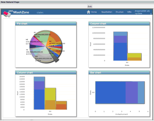
DEFINE DATA LOCAL
/* MashZone control
1 MYMASH
2 DATASOURCE (1:*)
3 OBJECTID (A) DYNAMIC
3 FILENAME (A) DYNAMIC
3 REFRESH (L)
2 URL (A) DYNAMIC
/* Objects control
1 XCIOBJECTS (1:*)
2 CONTENT (B) DYNAMIC
2 CONTENTID (A) DYNAMIC
2 CONTENTTYPE (A) DYNAMIC
/* Local variables
1 #MYBLOB (B) DYNAMIC
1 #MYCLOB (A) DYNAMIC
1 #MYURL (A) DYNAMIC
END-DEFINE
/*
/* Fill actual data with a fixed structure
/*
COMPRESS         'State   ; GDI              ; Per Capita GDI    ; Per Capita Income ;
 Debt            ; Per Capita Debt ; Undeployment' H'0a' INTO #MYCLOB LEAVING NO
COMPRESS #MYCLOB 'BW      ; 352.600.000.000  ; 32.811            ; 19.261            ;
 44.113.000.000  ; 4.109           ; 4,0'          H'0a' INTO #MYCLOB LEAVING NO
.
.
.
#MYBLOB := #MYCLOB
/*
/* Fill object control data structure
/*
CALLNAT "MAKEURL" XCIOBJECTS(*) #MYBLOB #MYURL 'MYMASHID'
/*
/* Fill MashZone control data structure
/*
MYMASH.URL := 'http://myhost:16360/mashzone/guest/app/Viewer.html
?guid=70a107ab-e04e-4ac6-88dc-f8cd35601649&language=en&plainmode=true'
EXPAND ARRAY MYMASH.DATASOURCE TO (1:1)
MYMASH.OBJECTID(1) := #MYURL
MYMASH.FILENAME(1) := 'C:\Temp\states.csv'
MYMASH.REFRESH(1)  := TRUE
/* display page
PROCESS PAGE USING "MYMASH"
/* handle events
DECIDE ON FIRST *PAGE-EVENT
 VALUE U'nat:page.end',U'nat:browser.end'
  /* Page closed.
  IGNORE
 VALUE U'onExit'
  /* TODO: Implement event code.
  PROCESS PAGE UPDATE FULL
 NONE VALUE
  /* Unhandled events.
  PROCESS PAGE UPDATE
END-DECIDE
*
END
Note:
In this version of the NJX:MASHZONE control, it is only possible to
use absolute path names in the FILENAME element of the MashZone
control data structure. This may lead to undesirable effects when the Natural
application is processed by multiple clients in parallel. If this is the case,
the Natural application must assure that the update of the files happens in a
controlled manner, for example, by applying the REFRESH flag
accordingly.
1 MYMASH
2 DATASOURCE (1:*)
3 FILENAME (A) DYNAMIC
3 OBJECTID (A) DYNAMIC
3 REFRESH (L)
2 URL (A) DYNAMIC
The data structure for one NJX:MASHZONE control consists of the following elements:
URL must be filled with the URL of the specific MashZone
application.
For each DATASOURCE occurrence, the following elements
have to be filled:
| Element | Description |
|---|---|
FILENAME |
The name of the file on which the data feed definition of the MashZone application is based. |
OBJECTID |
The "nat:" URL obtained when filling the NJX:OBJECTS structures with the BLOB contents. |
REFRESH |
Indicates whether the BLOB content is to be copied into the file during the next page update. This should be set to TRUE during the initial page load in order to fill the file accordingly. Possible values: TRUE or FALSE. |
Most control properties are identical with the properties of the same names of the SUBPAGE control.
| Basic | |||
| width |
Width of the control. There are three possibilities to define the width: (A) You do not define a width at all. In this case the width of the control will either be a default width or - in case of container controls - it will follow the width that is occupied by its content. (B) Pixel sizing: just input a number value (e.g. "100"). (C) Percentage sizing: input a percantage value (e.g. "50%"). Pay attention: percentage sizing will only bring up correct results if the parent element of the control properly defines a width this control can reference. If you specify this control to have a width of 50% then the parent element (e.g. an ITR-row) may itself define a width of "100%". If the parent element does not specify a width then the rendering result may not represent what you expect. |
Sometimes obligatory |
100 120 140 160 180 200 50% 100% |
| height |
Height of the control. There are three possibilities to define the height: (A) You do not define a height at all. As consequence the control will be rendered with its default height. If the control is a container control (containing) other controls then the height of the control will follow the height of its content. (B) Pixel sizing: just input a number value (e.g. "20"). (C) Percentage sizing: input a percantage value (e.g. "50%"). Pay attention: percentage sizing will only bring up correct results if the parent element of the control properly defines a height this control can reference. If you specify this control to have a height of 50% then the parent element (e.g. an ITR-row) may itself define a height of "100%". If the parent element does not specify a width then the rendering result may not represent what you expect. |
Sometimes obligatory |
100 150 200 250 300 250 400 50% 100% |
| comment |
Comment without any effect on rendering and behaviour. The comment is shown in the layout editor's tree view. |
Optional | |
| Appearance | |||
| width | (already explained above) | ||
| height | (already explained above) | ||
| scrolling |
Definition of the scrollbar's appearance. You can define that the scrollbars only are shown if the content is exceeding the control's area ("auto"). Or scrollbars can be shown always ("scroll"). Or scrollbars are never shown - and the content is cut ("hidden"). Default is "auto". |
Optional |
auto yes no |
| pagestyle |
CSS style definition that is directly passed into this control. With the style you can individually influence the rendering of the control. You can specify any style sheet expressions. Examples are: border: 1px solid #FF0000 background-color: #808080 You can combine expressions by appending and separating them with a semicolon. Sometimes it is useful to have a look into the generated HTML code in order to know where direct style definitions are applied. Press right mouse-button in your browser and select the "View source" or "View frame's source" function. |
Optional | |
| colspan |
Column spanning of control. If you use TR table rows then you may sometimes want to control the number of columns your control occupies. By default it is "1" - but you may want to define the control to span over more than one columns. The property only makes sense in table rows that are snychronized within one container (i.e. TR, STR table rows). It does not make sense in ITR rows, because these rows are explicitly not synched. |
Optional |
1 2 3 4 5 50 int-value |
| rowspan |
Row spanning of control. If you use TR table rows then you may sometimes want to control the number of rows your control occupies. By default it is "1" - but you may want to define the control to span over more than one columns. The property only makes sense in table rows that are snychronized within one container (i.e. TR, STR table rows). It does not make sense in ITR rows, because these rows are explicitly not synched. |
Optional |
1 2 3 4 5 50 int-value |
| Binding | |||
| valueprop |
Name of the adapter parameter that provides the content of the control. |
Obligatory | |
| Natural | |||
| njx:natname |
If a Natural variable with a name not valid for Application Designer (for instance #FIELD1) shall be bound to the control, a different name (for instance HFIELD1) can be bound instead. If the original name (in this case #FIELD1) is then specified in this attribute, the original name is generated into the parameter data area of the Natural adapter and a mapping between the two names is generated into the PROCESS PAGE statement of the Natural adapter. This mapping must not break a once defined group structure. If for instance a grid control that is bound to a name of GRID1 contains fields that are bound to FIELD1 and FIELD2 respectively, the corresponding njx:natname values may be #GRID1.#FIELD1 and #GRID1.#FIELD2, but not #GRID1.#FIELD1 and #MYGRID1.#FIELD2. |
Optional | |
| njx:natcomment |
The value of this attribute is generated as comment line into the parameter data area of the Natural adapter, before the field name. The Map Converter, for instance, uses this attributes to indicate for a generated statusprop variable to which field the statusprop belongs. |
Optional | |