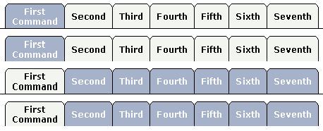
The TABSEL control looks as shown in the following example:

The number of tabs is dynamically defined at runtime. There are various output options:
With/without a horizontal line below the control.
Normal or reverse coloring.
Like the TABSTRIP control, the TABSEL control does not provide internal containers that are switched when selecting tabs. It just represents one tab line.
The following topics are covered below:
1 TABS
2 SELECTEDITEM (I4)
2 TSITEMS (1:*)
3 ID (U) DYNAMIC
3 NAME (U) DYNAMIC
3 TITLE (U) DYNAMIC
value-of-tabselprop.onSelect
| Basic | |||
| tabselprop |
Name of the adapter parameter that represents the control in the adapter. |
Obligatory | |
| bottomborder |
If set to "true" then a bottom border is rendered below the tab selection. If set to "false" then no bottom border will be drawn. |
Optional |
true false |
| reversecolors |
Reverses the color scheme of the TABSEL control. |
Optional |
true false |
| leftindent |
Inserts a horizontal distance left of the first "tab" and shifts the "tabs" to the right as consequence. The value you may define represents the number of pixels that are inserted. |
Optional |
1 2 3 int-value |
| comment |
Comment without any effect on rendering and behaviour. The comment is shown in the layout editor's tree view. |
Optional | |