
The ROWTABAREA or COLTABAREA container is the representation of a tab control. A tab area consists of the ROWTABAREA or COLTABAREA definition. Inside this definition, you define TABPAGE containers representing the individual pages between which you can navigate.
Example:
<pagebody>
    <rowtabarea height="200" name1="Left Tab" page1="LEFT" name2="Right Tab" page2="RIGHT">
        <tabpage id="LEFT" takefullheight="true">
        </tabpage>
        <tabpage id="RIGHT" takefullheight="true">
        </tabpage>
    </rowtabarea>
</pagebody>
The above XML layout produces the following page:
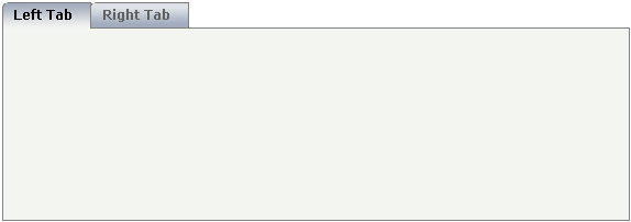
Inside the ROWTABAREA definition, specify the name and the ID of each
area you want to display. Pay attention to the naming of the
page* properties: the name must not contain any
blank spaces or non-alphanumeric characeters. Start the
page* values with a character, not with a
number.
Specify the individual toggle areas - by the TABPAGE definition. Each
TABPAGE holds an ID which must be equal to the definition on ROWTABAREA level.
Each TABPAGE has a display property which is set
to "none" for all TABPAGE definitions except the
first one.
Each TABPAGE is a container itself - i.e. inside the TABPAGE, place controls (or containers) by adding ITR or TR rows and place elements into these rows.
The following topics are covered below:
| Basic | |||
| height |
Height of the control. There are three possibilities to define the height: (A) You do not define a height at all. As consequence the control will be rendered with its default height. If the control is a container control (containing) other controls then the height of the control will follow the height of its content. (B) Pixel sizing: just input a number value (e.g. "20"). (C) Percentage sizing: input a percentage value (e.g. "50%"). Pay attention: percentage sizing will only bring up correct results if the parent element of the control properly defines a height this control can reference. If you specify this control to have a height of 50% then the parent element (e.g. an ITR-row) may itself define a height of "100%". If the parent element does not specify a width then the rendering result may not represent what you expect. |
Obligatory |
100 150 200 250 300 250 400 50% 100% |
| leftindent |
Inserts a horizontal distance left of the first "tab" and shifts the "tabs" to the right as consequence. The value you may define represents the number of pixels that are inserted. |
Optional |
1 2 3 int-value |
| scrollable |
If set to "true" then small icons will appear on the right border of the control. If the size of the "tabs" is too big and some tabs are cut as consequence then you can use these icons for scrolling left and right. |
Optional |
true false |
| name1 |
Text that is shown in the corresponding "tab". Either define the text as NAME or as language dependent TEXTID. |
Sometimes obligatory | |
| textid1 |
Text ID that is transferred in a corresponding literal at runtime by the multi language management. |
Sometimes obligatory | |
| page1 |
Id of the TABPAGE that is defined as child of the TABAREA. Use an id that is unique within the page and that is a "healthy" id: starting with characters, without blanks and without "strange" characters. For each "tab" of the TABAREA you have to create one corresponding TABPAGE below - holding exactly the id that is defined in the PAGE property. |
Obligatory | |
| withclose1 |
If you want a close-icon to be shown at the right top corner of the tab, set this property value to "true". Default is "false". |
Optional |
true false |
| name2 |
Text that is shown in the corresponding "tab". Either define the text as NAME or as language dependent TEXTID. |
Optional | |
| textid2 |
Text ID that is transferred in a corresponding literal at runtime by the multi language management. |
Optional | |
| page2 |
Id of the TABPAGE that is defined as child of the TABAREA. Use an id that is unique within the page and that is a "healthy" id: starting with characters, without blanks and without "strange" characters. For each "tab" of the TABAREA you have to create one corresponding TABPAGE below - holding exactly the id that is defined in the PAGE property. |
Optional | |
| withclose2 |
If you want a close-icon to be shown at the right top corner of the tab, set this property value to "true". Default is "false". |
Optional |
true false |
| name3 |
Text that is shown in the corresponding "tab". Either define the text as NAME or as language dependent TEXTID. |
Optional | |
| textid3 |
Text ID that is transferred in a corresponding literal at runtime by the multi language management. |
Optional | |
| page3 |
Id of the TABPAGE that is defined as child of the TABAREA. Use an id that is unique within the page and that is a "healthy" id: starting with characters, without blanks and without "strange" characters. For each "tab" of the TABAREA you have to create one corresponding TABPAGE below - holding exactly the id that is defined in the PAGE property. |
Optional | |
| withclose3 |
If you want a close-icon to be shown at the right top corner of the tab, set this property value to "true". Default is "false". |
Optional |
true false |
| name4 |
Text that is shown in the corresponding "tab". Either define the text as NAME or as language dependent TEXTID. |
Optional | |
| textid4 |
Text ID that is transferred in a corresponding literal at runtime by the multi language management. |
Optional | |
| page4 |
Id of the TABPAGE that is defined as child of the TABAREA. Use an id that is unique within the page and that is a "healthy" id: starting with characters, without blanks and without "strange" characters. For each "tab" of the TABAREA you have to create one corresponding TABPAGE below - holding exactly the id that is defined in the PAGE property. |
Optional | |
| withclose4 |
If you want a close-icon to be shown at the right top corner of the tab, set this property value to "true". Default is "false". |
Optional |
true false |
| name5 |
Text that is shown in the corresponding "tab". Either define the text as NAME or as language dependent TEXTID. |
Optional | |
| textid5 |
Text ID that is transferred in a corresponding literal at runtime by the multi language management. |
Optional | |
| page5 |
Id of the TABPAGE that is defined as child of the TABAREA. Use an id that is unique within the page and that is a "healthy" id: starting with characters, without blanks and without "strange" characters. For each "tab" of the TABAREA you have to create one corresponding TABPAGE below - holding exactly the id that is defined in the PAGE property. |
Optional | |
| withclose5 |
If you want a close-icon to be shown at the right top corner of the tab, set this property value to "true". Default is "false". |
Optional |
true false |
| name6 |
Text that is shown in the corresponding "tab". Either define the text as NAME or as language dependent TEXTID. |
Optional | |
| textid6 |
Text ID that is transferred in a corresponding literal at runtime by the multi language management. |
Optional | |
| page6 |
Id of the TABPAGE that is defined as child of the TABAREA. Use an id that is unique within the page and that is a "healthy" id: starting with characters, without blanks and without "strange" characters. For each "tab" of the TABAREA you have to create one corresponding TABPAGE below - holding exactly the id that is defined in the PAGE property. |
Optional | |
| withclose6 |
If you want a close-icon to be shown at the right top corner of the tab, set this property value to "true". Default is "false". |
Optional |
true false |
| name7 |
Text that is shown in the corresponding "tab". Either define the text as NAME or as language dependent TEXTID. |
Optional | |
| textid7 |
Text ID that is transferred in a corresponding literal at runtime by the multi language management. |
Optional | |
| page7 |
Id of the TABPAGE that is defined as child of the TABAREA. Use an id that is unique within the page and that is a "healthy" id: starting with characters, without blanks and without "strange" characters. For each "tab" of the TABAREA you have to create one corresponding TABPAGE below - holding exactly the id that is defined in the PAGE property. |
Optional | |
| withclose7 |
If you want a close-icon to be shown at the right top corner of the tab, set this property value to "true". Default is "false". |
Optional |
true false |
| name8 |
Text that is shown in the corresponding "tab". Either define the text as NAME or as language dependent TEXTID. |
Optional | |
| textid8 |
Text ID that is transferred in a corresponding literal at runtime by the multi language management. |
Optional | |
| page8 |
Id of the TABPAGE that is defined as child of the TABAREA. Use an id that is unique within the page and that is a "healthy" id: starting with characters, without blanks and without "strange" characters. For each "tab" of the TABAREA you have to create one corresponding TABPAGE below - holding exactly the id that is defined in the PAGE property. |
Optional | |
| withclose8 |
If you want a close-icon to be shown at the right top corner of the tab, set this property value to "true". Default is "false". |
Optional |
true false |
| name9 |
Text that is shown in the corresponding "tab". Either define the text as NAME or as language dependent TEXTID. |
Optional | |
| textid9 |
Text ID that is transferred in a corresponding literal at runtime by the multi language management. |
Optional | |
| page9 |
Id of the TABPAGE that is defined as child of the TABAREA. Use an id that is unique within the page and that is a "healthy" id: starting with characters, without blanks and without "strange" characters. For each "tab" of the TABAREA you have to create one corresponding TABPAGE below - holding exactly the id that is defined in the PAGE property. |
Optional | |
| withclose9 |
If you want a close-icon to be shown at the right top corner of the tab, set this property value to "true". Default is "false". |
Optional |
true false |
| name10 |
Text that is shown in the corresponding "tab". Either define the text as NAME or as language dependent TEXTID. |
Optional | |
| textid10 |
Text ID that is transferred in a corresponding literal at runtime by the multi language management. |
Optional | |
| page10 |
Id of the TABPAGE that is defined as child of the TABAREA. Use an id that is unique within the page and that is a "healthy" id: starting with characters, without blanks and without "strange" characters. For each "tab" of the TABAREA you have to create one corresponding TABPAGE below - holding exactly the id that is defined in the PAGE property. |
Optional | |
| withclose10 |
If you want a close-icon to be shown at the right top corner of the tab, set this property value to "true". Default is "false". |
Optional |
true false |
| name11 |
Text that is shown in the corresponding "tab". Either define the text as NAME or as language dependent TEXTID. |
Optional | |
| textid11 |
Text ID that is transferred in a corresponding literal at runtime by the multi language management. |
Optional | |
| page11 |
Id of the TABPAGE that is defined as child of the TABAREA. Use an id that is unique within the page and that is a "healthy" id: starting with characters, without blanks and without "strange" characters. For each "tab" of the TABAREA you have to create one corresponding TABPAGE below - holding exactly the id that is defined in the PAGE property. |
Optional | |
| withclose11 |
If you want a close-icon to be shown at the right top corner of the tab, set this property value to "true". Default is "false". |
Optional |
true false |
| name12 |
Text that is shown in the corresponding "tab". Either define the text as NAME or as language dependent TEXTID. |
Optional | |
| textid12 |
Text ID that is transferred in a corresponding literal at runtime by the multi language management. |
Optional | |
| page12 |
Id of the TABPAGE that is defined as child of the TABAREA. Use an id that is unique within the page and that is a "healthy" id: starting with characters, without blanks and without "strange" characters. For each "tab" of the TABAREA you have to create one corresponding TABPAGE below - holding exactly the id that is defined in the PAGE property. |
Optional | |
| withclose12 |
If you want a close-icon to be shown at the right top corner of the tab, set this property value to "true". Default is "false". |
Optional |
true false |
| name13 |
Text that is shown in the corresponding "tab". Either define the text as NAME or as language dependent TEXTID. |
Optional | |
| textid13 |
Text ID that is transferred in a corresponding literal at runtime by the multi language management. |
Optional | |
| page13 |
Id of the TABPAGE that is defined as child of the TABAREA. Use an id that is unique within the page and that is a "healthy" id: starting with characters, without blanks and without "strange" characters. For each "tab" of the TABAREA you have to create one corresponding TABPAGE below - holding exactly the id that is defined in the PAGE property. |
Optional | |
| withclose13 |
If you want a close-icon to be shown at the right top corner of the tab, set this property value to "true". Default is "false". |
Optional |
true false |
| name14 |
Text that is shown in the corresponding "tab". Either define the text as NAME or as language dependent TEXTID. |
Optional | |
| textid14 |
Text ID that is transferred in a corresponding literal at runtime by the multi language management. |
Optional | |
| page14 |
Id of the TABPAGE that is defined as child of the TABAREA. Use an id that is unique within the page and that is a "healthy" id: starting with characters, without blanks and without "strange" characters. For each "tab" of the TABAREA you have to create one corresponding TABPAGE below - holding exactly the id that is defined in the PAGE property. |
Optional | |
| withclose14 |
If you want a close-icon to be shown at the right top corner of the tab, set this property value to "true". Default is "false". |
Optional |
true false |
| name15 |
Text that is shown in the corresponding "tab". Either define the text as NAME or as language dependent TEXTID. |
Optional | |
| textid15 |
Text ID that is transferred in a corresponding literal at runtime by the multi language management. |
Optional | |
| page15 |
Id of the TABPAGE that is defined as child of the TABAREA. Use an id that is unique within the page and that is a "healthy" id: starting with characters, without blanks and without "strange" characters. For each "tab" of the TABAREA you have to create one corresponding TABPAGE below - holding exactly the id that is defined in the PAGE property. |
Optional | |
| withclose15 |
If you want a close-icon to be shown at the right top corner of the tab, set this property value to "true". Default is "false". |
Optional |
true false |
| name16 |
Text that is shown in the corresponding "tab". Either define the text as NAME or as language dependent TEXTID. |
Optional | |
| textid16 |
Text ID that is transferred in a corresponding literal at runtime by the multi language management. |
Optional | |
| page16 |
Id of the TABPAGE that is defined as child of the TABAREA. Use an id that is unique within the page and that is a "healthy" id: starting with characters, without blanks and without "strange" characters. For each "tab" of the TABAREA you have to create one corresponding TABPAGE below - holding exactly the id that is defined in the PAGE property. |
Optional | |
| withclose16 |
If you want a close-icon to be shown at the right top corner of the tab, set this property value to "true". Default is "false". |
Optional |
true false |
| Binding | |||
| openedindexprop |
Name of adapter parameter which represents the index of the "tab" that is currently opened. There are two ways of using the property: either you can define which "tab" should be opened or you can react to "tab" selections by the user. (Also have a look onto the property OPENMETHOD!). The property must be of type "int" or "Integer" (or "String"). The left most "tab" represents index "0", the next one "1", etc. |
Optional | |
| openmethod |
Name of the event that is sent to the adapter when the user does a "tab" selection. The index of the "tab" that is opened can be transferred to the adapter by using the property OPENEDINDEXPROP. |
Optional | |
| visibleprop1 |
Name of property that defines if the corresponding tag is visible or not. NOTICE: If you want the framework to automatically set the focus to the first visible tab you also must apply a name for the attribute OPENEDINDEXPROP. You don't have to set a value at runtime, but you need to specify a valid name. |
Optional | |
| visibleprop2 |
Name of property that defines if the corresponding tag is visible or not. NOTICE: If you want the framework to automatically set the focus to the first visible tab you also must apply a name for the attribute OPENEDINDEXPROP. You don't have to set a value at runtime, but you need to specify a valid name. |
Optional | |
| visibleprop3 |
Name of property that defines if the corresponding tag is visible or not. NOTICE: If you want the framework to automatically set the focus to the first visible tab you also must apply a name for the attribute OPENEDINDEXPROP. You don't have to set a value at runtime, but you need to specify a valid name. |
Optional | |
| visibleprop4 |
Name of property that defines if the corresponding tag is visible or not. NOTICE: If you want the framework to automatically set the focus to the first visible tab you also must apply a name for the attribute OPENEDINDEXPROP. You don't have to set a value at runtime, but you need to specify a valid name. |
Optional | |
| visibleprop5 |
Name of property that defines if the corresponding tag is visible or not. NOTICE: If you want the framework to automatically set the focus to the first visible tab you also must apply a name for the attribute OPENEDINDEXPROP. You don't have to set a value at runtime, but you need to specify a valid name. |
Optional | |
| visibleprop6 |
Name of property that defines if the corresponding tag is visible or not. NOTICE: If you want the framework to automatically set the focus to the first visible tab you also must apply a name for the attribute OPENEDINDEXPROP. You don't have to set a value at runtime, but you need to specify a valid name. |
Optional | |
| visibleprop7 |
Name of property that defines if the corresponding tag is visible or not. NOTICE: If you want the framework to automatically set the focus to the first visible tab you also must apply a name for the attribute OPENEDINDEXPROP. You don't have to set a value at runtime, but you need to specify a valid name. |
Optional | |
| visibleprop8 |
Name of property that defines if the corresponding tag is visible or not. NOTICE: If you want the framework to automatically set the focus to the first visible tab you also must apply a name for the attribute OPENEDINDEXPROP. You don't have to set a value at runtime, but you need to specify a valid name. |
Optional | |
| visibleprop9 |
Name of property that defines if the corresponding tag is visible or not. NOTICE: If you want the framework to automatically set the focus to the first visible tab you also must apply a name for the attribute OPENEDINDEXPROP. You don't have to set a value at runtime, but you need to specify a valid name. |
Optional | |
| visibleprop10 |
Name of property that defines if the corresponding tag is visible or not. NOTICE: If you want the framework to automatically set the focus to the first visible tab you also must apply a name for the attribute OPENEDINDEXPROP. You don't have to set a value at runtime, but you need to specify a valid name. |
Optional | |
| visibleprop11 |
Name of property that defines if the corresponding tag is visible or not. NOTICE: If you want the framework to automatically set the focus to the first visible tab you also must apply a name for the attribute OPENEDINDEXPROP. You don't have to set a value at runtime, but you need to specify a valid name. |
Optional | |
| visibleprop12 |
Name of property that defines if the corresponding tag is visible or not. NOTICE: If you want the framework to automatically set the focus to the first visible tab you also must apply a name for the attribute OPENEDINDEXPROP. You don't have to set a value at runtime, but you need to specify a valid name. |
Optional | |
| visibleprop13 |
Name of property that defines if the corresponding tag is visible or not. NOTICE: If you want the framework to automatically set the focus to the first visible tab you also must apply a name for the attribute OPENEDINDEXPROP. You don't have to set a value at runtime, but you need to specify a valid name. |
Optional | |
| visibleprop14 |
Name of property that defines if the corresponding tag is visible or not. NOTICE: If you want the framework to automatically set the focus to the first visible tab you also must apply a name for the attribute OPENEDINDEXPROP. You don't have to set a value at runtime, but you need to specify a valid name. |
Optional | |
| visibleprop15 |
Name of property that defines if the corresponding tag is visible or not. NOTICE: If you want the framework to automatically set the focus to the first visible tab you also must apply a name for the attribute OPENEDINDEXPROP. You don't have to set a value at runtime, but you need to specify a valid name. |
Optional | |
| visibleprop16 |
Name of property that defines if the corresponding tag is visible or not. NOTICE: If you want the framework to automatically set the focus to the first visible tab you also must apply a name for the attribute OPENEDINDEXPROP. You don't have to set a value at runtime, but you need to specify a valid name. |
Optional | |
| disabledprop1 |
Name of the adapter parameter that dynamically defines if the control is disabled or enabled at runtime. If the value at runtime is set to TRUE the control is visible but disabled. In COLTABAREA controls this property is only supported for IE. |
Optional | |
| disabledprop2 |
Name of the adapter parameter that dynamically defines if the control is disabled or enabled at runtime. If the value at runtime is set to TRUE the control is visible but disabled. In COLTABAREA controls this property is only supported for IE. |
Optional | |
| disabledprop3 |
Name of the adapter parameter that dynamically defines if the control is disabled or enabled at runtime. If the value at runtime is set to TRUE the control is visible but disabled. In COLTABAREA controls this property is only supported for IE. |
Optional | |
| disabledprop4 |
Name of the adapter parameter that dynamically defines if the control is disabled or enabled at runtime. If the value at runtime is set to TRUE the control is visible but disabled. In COLTABAREA controls this property is only supported for IE. |
Optional | |
| disabledprop5 |
Name of the adapter parameter that dynamically defines if the control is disabled or enabled at runtime. If the value at runtime is set to TRUE the control is visible but disabled. In COLTABAREA controls this property is only supported for IE. |
Optional | |
| disabledprop6 |
Name of the adapter parameter that dynamically defines if the control is disabled or enabled at runtime. If the value at runtime is set to TRUE the control is visible but disabled. In COLTABAREA controls this property is only supported for IE. |
Optional | |
| disabledprop7 |
Name of the adapter parameter that dynamically defines if the control is disabled or enabled at runtime. If the value at runtime is set to TRUE the control is visible but disabled. In COLTABAREA controls this property is only supported for IE. |
Optional | |
| disabledprop8 |
Name of the adapter parameter that dynamically defines if the control is disabled or enabled at runtime. If the value at runtime is set to TRUE the control is visible but disabled. In COLTABAREA controls this property is only supported for IE. |
Optional | |
| disabledprop9 |
Name of the adapter parameter that dynamically defines if the control is disabled or enabled at runtime. If the value at runtime is set to TRUE the control is visible but disabled. In COLTABAREA controls this property is only supported for IE. |
Optional | |
| disabledprop10 |
Name of the adapter parameter that dynamically defines if the control is disabled or enabled at runtime. If the value at runtime is set to TRUE the control is visible but disabled. In COLTABAREA controls this property is only supported for IE. |
Optional | |
| disabledprop11 |
Name of the adapter parameter that dynamically defines if the control is disabled or enabled at runtime. If the value at runtime is set to TRUE the control is visible but disabled. In COLTABAREA controls this property is only supported for IE. |
Optional | |
| disabledprop12 |
Name of the adapter parameter that dynamically defines if the control is disabled or enabled at runtime. If the value at runtime is set to TRUE the control is visible but disabled. In COLTABAREA controls this property is only supported for IE. |
Optional | |
| disabledprop13 |
Name of the adapter parameter that dynamically defines if the control is disabled or enabled at runtime. If the value at runtime is set to TRUE the control is visible but disabled. In COLTABAREA controls this property is only supported for IE. |
Optional | |
| disabledprop14 |
Name of the adapter parameter that dynamically defines if the control is disabled or enabled at runtime. If the value at runtime is set to TRUE the control is visible but disabled. In COLTABAREA controls this property is only supported for IE. |
Optional | |
| disabledprop15 |
Name of the adapter parameter that dynamically defines if the control is disabled or enabled at runtime. If the value at runtime is set to TRUE the control is visible but disabled. In COLTABAREA controls this property is only supported for IE. |
Optional | |
| disabledprop16 |
Name of the adapter parameter that dynamically defines if the control is disabled or enabled at runtime. If the value at runtime is set to TRUE the control is visible but disabled. In COLTABAREA controls this property is only supported for IE. |
Optional | |
| titleprop1 |
Property of adapter that dynamically defines the title of the control. The title is displayed as tool tip when ther user moves the mouse onto the control. |
Optional | |
| titleprop2 |
Property of adapter that dynamically defines the title of the control. The title is displayed as tool tip when ther user moves the mouse onto the control. |
Optional | |
| titleprop3 |
Property of adapter that dynamically defines the title of the control. The title is displayed as tool tip when ther user moves the mouse onto the control. |
Optional | |
| titleprop4 |
Property of adapter that dynamically defines the title of the control. The title is displayed as tool tip when ther user moves the mouse onto the control. |
Optional | |
| titleprop5 |
Property of adapter that dynamically defines the title of the control. The title is displayed as tool tip when ther user moves the mouse onto the control. |
Optional | |
| titleprop6 |
Property of adapter that dynamically defines the title of the control. The title is displayed as tool tip when ther user moves the mouse onto the control. |
Optional | |
| titleprop7 |
Property of adapter that dynamically defines the title of the control. The title is displayed as tool tip when ther user moves the mouse onto the control. |
Optional | |
| titleprop8 |
Property of adapter that dynamically defines the title of the control. The title is displayed as tool tip when ther user moves the mouse onto the control. |
Optional | |
| titleprop9 |
Property of adapter that dynamically defines the title of the control. The title is displayed as tool tip when ther user moves the mouse onto the control. |
Optional | |
| titleprop10 |
Property of adapter that dynamically defines the title of the control. The title is displayed as tool tip when ther user moves the mouse onto the control. |
Optional | |
| titleprop11 |
Property of adapter that dynamically defines the title of the control. The title is displayed as tool tip when ther user moves the mouse onto the control. |
Optional | |
| titleprop12 |
Property of adapter that dynamically defines the title of the control. The title is displayed as tool tip when ther user moves the mouse onto the control. |
Optional | |
| titleprop13 |
Property of adapter that dynamically defines the title of the control. The title is displayed as tool tip when ther user moves the mouse onto the control. |
Optional | |
| titleprop14 |
Property of adapter that dynamically defines the title of the control. The title is displayed as tool tip when ther user moves the mouse onto the control. |
Optional | |
| titleprop15 |
Property of adapter that dynamically defines the title of the control. The title is displayed as tool tip when ther user moves the mouse onto the control. |
Optional | |
| titleprop16 |
Property of adapter that dynamically defines the title of the control. The title is displayed as tool tip when ther user moves the mouse onto the control. |
Optional | |
| tabselectedstyleprop1 |
Name of the adapter parameter that dynamically defines the style for a tab which is selected. NOTICE: When using this property you must also set the property OPENEDINDEXPROP. You don't have to set a value at runtime, but you need to specify a valid name. |
Optional |
background-color: #FF0000 color: #0000FF font-weight: bold |
| tabunselectedstyleprop1 |
Name of the adapter parameter that dynamically defines the style for a tab which is not selected and not disabled. NOTICE: When using this property you must also set the property OPENEDINDEXPROP. You don't have to set a value at runtime, but you need to specify a valid name. |
Optional |
background-color: #FF0000 color: #0000FF font-weight: bold |
| tabdisabledstyleprop1 |
Name of the adapter parameter that dynamically defines the style for a tab which is disabled. NOTICE: When using this property you must also set the property OPENEDINDEXPROP. You don't have to set a value at runtime, but you need to specify a valid name. |
Optional |
background-color: #FF0000 color: #0000FF font-weight: bold |
| tabselectedstyleprop2 |
Name of the adapter parameter that dynamically defines the style for a tab which is selected. NOTICE: When using this property you must also set the property OPENEDINDEXPROP. You don't have to set a value at runtime, but you need to specify a valid name. |
Optional |
background-color: #FF0000 color: #0000FF font-weight: bold |
| tabunselectedstyleprop2 |
Name of the adapter parameter that dynamically defines the style for a tab which is not selected and not disabled. NOTICE: When using this property you must also set the property OPENEDINDEXPROP. You don't have to set a value at runtime, but you need to specify a valid name. |
Optional |
background-color: #FF0000 color: #0000FF font-weight: bold |
| tabdisabledstyleprop2 |
Name of the adapter parameter that dynamically defines the style for a tab which is disabled. NOTICE: When using this property you must also set the property OPENEDINDEXPROP. You don't have to set a value at runtime, but you need to specify a valid name. |
Optional |
background-color: #FF0000 color: #0000FF font-weight: bold |
| tabselectedstyleprop3 |
Name of the adapter parameter that dynamically defines the style for a tab which is selected. NOTICE: When using this property you must also set the property OPENEDINDEXPROP. You don't have to set a value at runtime, but you need to specify a valid name. |
Optional |
background-color: #FF0000 color: #0000FF font-weight: bold |
| tabunselectedstyleprop3 |
Name of the adapter parameter that dynamically defines the style for a tab which is not selected and not disabled. NOTICE: When using this property you must also set the property OPENEDINDEXPROP. You don't have to set a value at runtime, but you need to specify a valid name. |
Optional |
background-color: #FF0000 color: #0000FF font-weight: bold |
| tabdisabledstyleprop3 |
Name of the adapter parameter that dynamically defines the style for a tab which is disabled. NOTICE: When using this property you must also set the property OPENEDINDEXPROP. You don't have to set a value at runtime, but you need to specify a valid name. |
Optional |
background-color: #FF0000 color: #0000FF font-weight: bold |
| tabselectedstyleprop4 |
Name of the adapter parameter that dynamically defines the style for a tab which is selected. NOTICE: When using this property you must also set the property OPENEDINDEXPROP. You don't have to set a value at runtime, but you need to specify a valid name. |
Optional |
background-color: #FF0000 color: #0000FF font-weight: bold |
| tabunselectedstyleprop4 |
Name of the adapter parameter that dynamically defines the style for a tab which is not selected and not disabled. NOTICE: When using this property you must also set the property OPENEDINDEXPROP. You don't have to set a value at runtime, but you need to specify a valid name. |
Optional |
background-color: #FF0000 color: #0000FF font-weight: bold |
| tabdisabledstyleprop4 |
Name of the adapter parameter that dynamically defines the style for a tab which is disabled. NOTICE: When using this property you must also set the property OPENEDINDEXPROP. You don't have to set a value at runtime, but you need to specify a valid name. |
Optional |
background-color: #FF0000 color: #0000FF font-weight: bold |
| tabselectedstyleprop5 |
Name of the adapter parameter that dynamically defines the style for a tab which is selected. NOTICE: When using this property you must also set the property OPENEDINDEXPROP. You don't have to set a value at runtime, but you need to specify a valid name. |
Optional |
background-color: #FF0000 color: #0000FF font-weight: bold |
| tabunselectedstyleprop5 |
Name of the adapter parameter that dynamically defines the style for a tab which is not selected and not disabled. NOTICE: When using this property you must also set the property OPENEDINDEXPROP. You don't have to set a value at runtime, but you need to specify a valid name. |
Optional |
background-color: #FF0000 color: #0000FF font-weight: bold |
| tabdisabledstyleprop5 |
Name of the adapter parameter that dynamically defines the style for a tab which is disabled. NOTICE: When using this property you must also set the property OPENEDINDEXPROP. You don't have to set a value at runtime, but you need to specify a valid name. |
Optional |
background-color: #FF0000 color: #0000FF font-weight: bold |
| tabselectedstyleprop6 |
Name of the adapter parameter that dynamically defines the style for a tab which is selected. NOTICE: When using this property you must also set the property OPENEDINDEXPROP. You don't have to set a value at runtime, but you need to specify a valid name. |
Optional |
background-color: #FF0000 color: #0000FF font-weight: bold |
| tabunselectedstyleprop6 |
Name of the adapter parameter that dynamically defines the style for a tab which is not selected and not disabled. NOTICE: When using this property you must also set the property OPENEDINDEXPROP. You don't have to set a value at runtime, but you need to specify a valid name. |
Optional |
background-color: #FF0000 color: #0000FF font-weight: bold |
| tabdisabledstyleprop6 |
Name of the adapter parameter that dynamically defines the style for a tab which is disabled. NOTICE: When using this property you must also set the property OPENEDINDEXPROP. You don't have to set a value at runtime, but you need to specify a valid name. |
Optional |
background-color: #FF0000 color: #0000FF font-weight: bold |
| tabselectedstyleprop7 |
Name of the adapter parameter that dynamically defines the style for a tab which is selected. NOTICE: When using this property you must also set the property OPENEDINDEXPROP. You don't have to set a value at runtime, but you need to specify a valid name. |
Optional |
background-color: #FF0000 color: #0000FF font-weight: bold |
| tabunselectedstyleprop7 |
Name of the adapter parameter that dynamically defines the style for a tab which is not selected and not disabled. NOTICE: When using this property you must also set the property OPENEDINDEXPROP. You don't have to set a value at runtime, but you need to specify a valid name. |
Optional |
background-color: #FF0000 color: #0000FF font-weight: bold |
| tabdisabledstyleprop7 |
Name of the adapter parameter that dynamically defines the style for a tab which is disabled. NOTICE: When using this property you must also set the property OPENEDINDEXPROP. You don't have to set a value at runtime, but you need to specify a valid name. |
Optional |
background-color: #FF0000 color: #0000FF font-weight: bold |
| tabselectedstyleprop8 |
Name of the adapter parameter that dynamically defines the style for a tab which is selected. NOTICE: When using this property you must also set the property OPENEDINDEXPROP. You don't have to set a value at runtime, but you need to specify a valid name. |
Optional |
background-color: #FF0000 color: #0000FF font-weight: bold |
| tabunselectedstyleprop8 |
Name of the adapter parameter that dynamically defines the style for a tab which is not selected and not disabled. NOTICE: When using this property you must also set the property OPENEDINDEXPROP. You don't have to set a value at runtime, but you need to specify a valid name. |
Optional |
background-color: #FF0000 color: #0000FF font-weight: bold |
| tabdisabledstyleprop8 |
Name of the adapter parameter that dynamically defines the style for a tab which is disabled. NOTICE: When using this property you must also set the property OPENEDINDEXPROP. You don't have to set a value at runtime, but you need to specify a valid name. |
Optional |
background-color: #FF0000 color: #0000FF font-weight: bold |
| tabselectedstyleprop9 |
Name of the adapter parameter that dynamically defines the style for a tab which is selected. NOTICE: When using this property you must also set the property OPENEDINDEXPROP. You don't have to set a value at runtime, but you need to specify a valid name. |
Optional |
background-color: #FF0000 color: #0000FF font-weight: bold |
| tabunselectedstyleprop9 |
Name of the adapter parameter that dynamically defines the style for a tab which is not selected and not disabled. NOTICE: When using this property you must also set the property OPENEDINDEXPROP. You don't have to set a value at runtime, but you need to specify a valid name. |
Optional |
background-color: #FF0000 color: #0000FF font-weight: bold |
| tabdisabledstyleprop9 |
Name of the adapter parameter that dynamically defines the style for a tab which is disabled. NOTICE: When using this property you must also set the property OPENEDINDEXPROP. You don't have to set a value at runtime, but you need to specify a valid name. |
Optional |
background-color: #FF0000 color: #0000FF font-weight: bold |
| tabselectedstyleprop10 |
Name of the adapter parameter that dynamically defines the style for a tab which is selected. NOTICE: When using this property you must also set the property OPENEDINDEXPROP. You don't have to set a value at runtime, but you need to specify a valid name. |
Optional |
background-color: #FF0000 color: #0000FF font-weight: bold |
| tabunselectedstyleprop10 |
Name of the adapter parameter that dynamically defines the style for a tab which is not selected and not disabled. NOTICE: When using this property you must also set the property OPENEDINDEXPROP. You don't have to set a value at runtime, but you need to specify a valid name. |
Optional |
background-color: #FF0000 color: #0000FF font-weight: bold |
| tabdisabledstyleprop10 |
Name of the adapter parameter that dynamically defines the style for a tab which is disabled. NOTICE: When using this property you must also set the property OPENEDINDEXPROP. You don't have to set a value at runtime, but you need to specify a valid name. |
Optional |
background-color: #FF0000 color: #0000FF font-weight: bold |
| tabselectedstyleprop11 |
Name of the adapter parameter that dynamically defines the style for a tab which is selected. NOTICE: When using this property you must also set the property OPENEDINDEXPROP. You don't have to set a value at runtime, but you need to specify a valid name. |
Optional |
background-color: #FF0000 color: #0000FF font-weight: bold |
| tabunselectedstyleprop11 |
Name of the adapter parameter that dynamically defines the style for a tab which is not selected and not disabled. NOTICE: When using this property you must also set the property OPENEDINDEXPROP. You don't have to set a value at runtime, but you need to specify a valid name. |
Optional |
background-color: #FF0000 color: #0000FF font-weight: bold |
| tabdisabledstyleprop11 |
Name of the adapter parameter that dynamically defines the style for a tab which is disabled. NOTICE: When using this property you must also set the property OPENEDINDEXPROP. You don't have to set a value at runtime, but you need to specify a valid name. |
Optional |
background-color: #FF0000 color: #0000FF font-weight: bold |
| tabselectedstyleprop12 |
Name of the adapter parameter that dynamically defines the style for a tab which is selected. NOTICE: When using this property you must also set the property OPENEDINDEXPROP. You don't have to set a value at runtime, but you need to specify a valid name. |
Optional |
background-color: #FF0000 color: #0000FF font-weight: bold |
| tabunselectedstyleprop12 |
Name of the adapter parameter that dynamically defines the style for a tab which is not selected and not disabled. NOTICE: When using this property you must also set the property OPENEDINDEXPROP. You don't have to set a value at runtime, but you need to specify a valid name. |
Optional |
background-color: #FF0000 color: #0000FF font-weight: bold |
| tabdisabledstyleprop12 |
Name of the adapter parameter that dynamically defines the style for a tab which is disabled. NOTICE: When using this property you must also set the property OPENEDINDEXPROP. You don't have to set a value at runtime, but you need to specify a valid name. |
Optional |
background-color: #FF0000 color: #0000FF font-weight: bold |
| tabselectedstyleprop13 |
Name of the adapter parameter that dynamically defines the style for a tab which is selected. NOTICE: When using this property you must also set the property OPENEDINDEXPROP. You don't have to set a value at runtime, but you need to specify a valid name. |
Optional |
background-color: #FF0000 color: #0000FF font-weight: bold |
| tabunselectedstyleprop13 |
Name of the adapter parameter that dynamically defines the style for a tab which is not selected and not disabled. NOTICE: When using this property you must also set the property OPENEDINDEXPROP. You don't have to set a value at runtime, but you need to specify a valid name. |
Optional |
background-color: #FF0000 color: #0000FF font-weight: bold |
| tabdisabledstyleprop13 |
Name of the adapter parameter that dynamically defines the style for a tab which is disabled. NOTICE: When using this property you must also set the property OPENEDINDEXPROP. You don't have to set a value at runtime, but you need to specify a valid name. |
Optional |
background-color: #FF0000 color: #0000FF font-weight: bold |
| tabselectedstyleprop14 |
Name of the adapter parameter that dynamically defines the style for a tab which is selected. NOTICE: When using this property you must also set the property OPENEDINDEXPROP. You don't have to set a value at runtime, but you need to specify a valid name. |
Optional |
background-color: #FF0000 color: #0000FF font-weight: bold |
| tabunselectedstyleprop14 |
Name of the adapter parameter that dynamically defines the style for a tab which is not selected and not disabled. NOTICE: When using this property you must also set the property OPENEDINDEXPROP. You don't have to set a value at runtime, but you need to specify a valid name. |
Optional |
background-color: #FF0000 color: #0000FF font-weight: bold |
| tabdisabledstyleprop14 |
Name of the adapter parameter that dynamically defines the style for a tab which is disabled. NOTICE: When using this property you must also set the property OPENEDINDEXPROP. You don't have to set a value at runtime, but you need to specify a valid name. |
Optional |
background-color: #FF0000 color: #0000FF font-weight: bold |
| tabselectedstyleprop15 |
Name of the adapter parameter that dynamically defines the style for a tab which is selected. NOTICE: When using this property you must also set the property OPENEDINDEXPROP. You don't have to set a value at runtime, but you need to specify a valid name. |
Optional |
background-color: #FF0000 color: #0000FF font-weight: bold |
| tabunselectedstyleprop15 |
Name of the adapter parameter that dynamically defines the style for a tab which is not selected and not disabled. NOTICE: When using this property you must also set the property OPENEDINDEXPROP. You don't have to set a value at runtime, but you need to specify a valid name. |
Optional |
background-color: #FF0000 color: #0000FF font-weight: bold |
| tabdisabledstyleprop15 |
Name of the adapter parameter that dynamically defines the style for a tab which is disabled. NOTICE: When using this property you must also set the property OPENEDINDEXPROP. You don't have to set a value at runtime, but you need to specify a valid name. |
Optional |
background-color: #FF0000 color: #0000FF font-weight: bold |
| tabselectedstyleprop16 |
Name of the adapter parameter that dynamically defines the style for a tab which is selected. NOTICE: When using this property you must also set the property OPENEDINDEXPROP. You don't have to set a value at runtime, but you need to specify a valid name. |
Optional |
background-color: #FF0000 color: #0000FF font-weight: bold |
| tabunselectedstyleprop16 |
Name of the adapter parameter that dynamically defines the style for a tab which is not selected and not disabled. NOTICE: When using this property you must also set the property OPENEDINDEXPROP. You don't have to set a value at runtime, but you need to specify a valid name. |
Optional |
background-color: #FF0000 color: #0000FF font-weight: bold |
| tabdisabledstyleprop16 |
Name of the adapter parameter that dynamically defines the style for a tab which is disabled. NOTICE: When using this property you must also set the property OPENEDINDEXPROP. You don't have to set a value at runtime, but you need to specify a valid name. |
Optional |
background-color: #FF0000 color: #0000FF font-weight: bold |
| Appearance | |||
| withleftborder |
If specified as "false" then no left border will be drawn. |
Optional |
true false |
| withrightborder |
If specified as "false" then no right border will be drawn. |
Optional |
true false |
| withbottomborder |
If specified as "false" then no bottom border will be drawn. |
Optional |
true false |
| stylevariant |
Some controls offer the possibility to define style variants. By this style variant you can address different styles inside your style sheet definition file (.css). If not defined "normal" styles are chosen, if defined (e.g. "VAR1") then other style definitions (xxxVAR1xxx) are chosen. Purpose: you can set up style variants in the style sheet defintion and use them multiple times by addressing them via the "stylevariant" property. CIS currently offers two variants "VAR1" and "VAR2" but does not predefine any semantics behind - this is up to you! |
Optional |
VAR1 |
| tabindex |
Index that defines the tab order of the control. Controls are selected in increasing index order and in source order to resolve duplicates. |
Optional |
-1 0 1 2 5 10 32767 |
| withtoppadding |
The control by default renders some blank vertical space (2 pixels) on top of its area. Reason: if you vertically arrange one ROW/COLAREA after the other then automatically some distance is put between. By specifying "false" you can avoid this behaviour. " |
Optional |
true false |
| tabpagepaddingleft |
Number of pixels between the left border and the area's content. Default is 5 pixels. |
Sometimes obligatory |
1 2 3 int-value |
| tabpagepaddingright |
Number of pixels between the right border and the area's content. Default is 5 pixels. |
Optional |
1 2 3 int-value |
| tabpagepaddingtop |
Number of pixels between the top border and the area's content. Default is 5 pixels. |
Optional |
1 2 3 int-value |
| tabpagepaddingbottom |
Number of pixels between the bottom border and the area's content. Default is 5 pixels. |
Optional |
1 2 3 int-value |
| withflash |
Adds animation effects when the user uses the control. |
Optional | |
| Online Help | |||
| title1 |
Tooltip text that appears on the corresponding tab. |
Optional | |
| title2 |
Tooltip text that appears on the corresponding tab. |
Optional | |
| title3 |
Tooltip text that appears on the corresponding tab. |
Optional | |
| title4 |
Tooltip text that appears on the corresponding tab. |
Optional | |
| title5 |
Tooltip text that appears on the corresponding tab. |
Optional | |
| title6 |
Tooltip text that appears on the corresponding tab. |
Optional | |
| title7 |
Tooltip text that appears on the corresponding tab. |
Optional | |
| title8 |
Tooltip text that appears on the corresponding tab. |
Optional | |
| title9 |
Tooltip text that appears on the corresponding tab. |
Optional | |
| title10 |
Tooltip text that appears on the corresponding tab. |
Optional | |
| title11 |
Tooltip text that appears on the corresponding tab. |
Optional | |
| title12 |
Tooltip text that appears on the corresponding tab. |
Optional | |
| title13 |
Tooltip text that appears on the corresponding tab. |
Optional | |
| title14 |
Tooltip text that appears on the corresponding tab. |
Optional | |
| title15 |
Tooltip text that appears on the corresponding tab. |
Optional | |
| title16 |
Tooltip text that appears on the corresponding tab. |
Optional | |
| titletextid1 |
Text ID for the tooltip of the corresponding "tab". At runtime the multi language management replaces the textid with a language dependent literal. |
Optional | |
| titletextid2 |
Text ID for the tooltip of the corresponding "tab". At runtime the multi language management replaces the textid with a language dependent literal. |
Optional | |
| titletextid3 |
Text ID for the tooltip of the corresponding "tab". At runtime the multi language management replaces the textid with a language dependent literal. |
Optional | |
| titletextid4 |
Text ID for the tooltip of the corresponding "tab". At runtime the multi language management replaces the textid with a language dependent literal. |
Optional | |
| titletextid5 |
Text ID for the tooltip of the corresponding "tab". At runtime the multi language management replaces the textid with a language dependent literal. |
Optional | |
| titletextid6 |
Text ID for the tooltip of the corresponding "tab". At runtime the multi language management replaces the textid with a language dependent literal. |
Optional | |
| titletextid7 |
Text ID for the tooltip of the corresponding "tab". At runtime the multi language management replaces the textid with a language dependent literal. |
Optional | |
| titletextid8 |
Text ID for the tooltip of the corresponding "tab". At runtime the multi language management replaces the textid with a language dependent literal. |
Optional | |
| titletextid9 |
Text ID for the tooltip of the corresponding "tab". At runtime the multi language management replaces the textid with a language dependent literal. |
Optional | |
| titletextid10 |
Text ID for the tooltip of the corresponding "tab". At runtime the multi language management replaces the textid with a language dependent literal. |
Optional | |
| titletextid11 |
Text ID for the tooltip of the corresponding "tab". At runtime the multi language management replaces the textid with a language dependent literal. |
Optional | |
| titletextid12 |
Text ID for the tooltip of the corresponding "tab". At runtime the multi language management replaces the textid with a language dependent literal. |
Optional | |
| titletextid13 |
Text ID for the tooltip of the corresponding "tab". At runtime the multi language management replaces the textid with a language dependent literal. |
Optional | |
| titletextid14 |
Text ID for the tooltip of the corresponding "tab". At runtime the multi language management replaces the textid with a language dependent literal. |
Optional | |
| titletextid15 |
Text ID for the tooltip of the corresponding "tab". At runtime the multi language management replaces the textid with a language dependent literal. |
Optional | |
| titletextid16 |
Text ID for the tooltip of the corresponding "tab". At runtime the multi language management replaces the textid with a language dependent literal. |
Optional | |
| Comment | |||
| comment |
Comment without any effect on rendering and behaviour. The comment is shown in the layout editor's tree view. |
Optional | |
| Miscellaneous | |||
| testtoolid1 |
Use this attribute to assign a fixed control identifier that can be later on used within your test tool in order to do the object identification |
Optional | |
| testtoolid2 |
Use this attribute to assign a fixed control identifier that can be later on used within your test tool in order to do the object identification |
Optional | |
| testtoolid3 |
Use this attribute to assign a fixed control identifier that can be later on used within your test tool in order to do the object identification |
Optional | |
| testtoolid4 |
Use this attribute to assign a fixed control identifier that can be later on used within your test tool in order to do the object identification |
Optional | |
| testtoolid5 |
Use this attribute to assign a fixed control identifier that can be later on used within your test tool in order to do the object identification |
Optional | |
| testtoolid6 |
Use this attribute to assign a fixed control identifier that can be later on used within your test tool in order to do the object identification |
Optional | |
| testtoolid7 |
Use this attribute to assign a fixed control identifier that can be later on used within your test tool in order to do the object identification |
Optional | |
| testtoolid8 |
Use this attribute to assign a fixed control identifier that can be later on used within your test tool in order to do the object identification |
Optional | |
| testtoolid9 |
Use this attribute to assign a fixed control identifier that can be later on used within your test tool in order to do the object identification |
Optional | |
| testtoolid10 |
Use this attribute to assign a fixed control identifier that can be later on used within your test tool in order to do the object identification |
Optional | |
| testtoolid11 |
Use this attribute to assign a fixed control identifier that can be later on used within your test tool in order to do the object identification |
Optional | |
| testtoolid12 |
Use this attribute to assign a fixed control identifier that can be later on used within your test tool in order to do the object identification |
Optional | |
| testtoolid13 |
Use this attribute to assign a fixed control identifier that can be later on used within your test tool in order to do the object identification |
Optional | |
| testtoolid14 |
Use this attribute to assign a fixed control identifier that can be later on used within your test tool in order to do the object identification |
Optional | |
| testtoolid15 |
Use this attribute to assign a fixed control identifier that can be later on used within your test tool in order to do the object identification |
Optional | |
| testtoolid16 |
Use this attribute to assign a fixed control identifier that can be later on used within your test tool in order to do the object identification |
Optional | |
The properties of COLTABAREA are very similar to those of ROWTABAREA.
| Basic | |||
| width |
Width of the control. There are three possibilities to define the width: (A) You do not define a width at all. In this case the width of the control will either be a default width or - in case of container controls - it will follow the width that is occupied by its content. (B) Pixel sizing: just input a number value (e.g. "100"). (C) Percentage sizing: input a percantage value (e.g. "50%"). Pay attention: percentage sizing will only bring up correct results if the parent element of the control properly defines a width this control can reference. If you specify this control to have a width of 50% then the parent element (e.g. an ITR-row) may itself define a width of "100%". If the parent element does not specify a width then the rendering result may not represent what you expect. |
Obligatory |
100 120 140 160 180 200 50% 100% |
| leftindent |
Inserts a horizontal distance left of the first "tab" and shifts the "tabs" to the right as consequence. The value you may define represents the number of pixels that are inserted. |
Optional |
1 2 3 int-value |
| scrollable |
If set to "true" then small icons will appear on the right border of the control. If the size of the "tabs" is too big and some tabs are cut as consequence then you can use these icons for scrolling left and right. |
Optional |
true false |
| name1 |
Text that is shown in the corresponding "tab". Either define the text as NAME or as language dependent TEXTID. |
Sometimes obligatory | |
| textid1 |
Text ID that is transferred in a corresponding literal at runtime by the multi language management. |
Sometimes obligatory | |
| page1 |
Id of the TABPAGE that is defined as child of the TABAREA. Use an id that is unique within the page and that is a "healthy" id: starting with characters, without blanks and without "strange" characters. For each "tab" of the TABAREA you have to create one corresponding TABPAGE below - holding exactly the id that is defined in the PAGE property. |
Obligatory | |
| name2 |
Text that is shown in the corresponding "tab". Either define the text as NAME or as language dependent TEXTID. |
Optional | |
| textid2 |
Text ID that is transferred in a corresponding literal at runtime by the multi language management. |
Optional | |
| page2 |
Id of the TABPAGE that is defined as child of the TABAREA. Use an id that is unique within the page and that is a "healthy" id: starting with characters, without blanks and without "strange" characters. For each "tab" of the TABAREA you have to create one corresponding TABPAGE below - holding exactly the id that is defined in the PAGE property. |
Optional | |
| name3 |
Text that is shown in the corresponding "tab". Either define the text as NAME or as language dependent TEXTID. |
Optional | |
| textid3 |
Text ID that is transferred in a corresponding literal at runtime by the multi language management. |
Optional | |
| page3 |
Id of the TABPAGE that is defined as child of the TABAREA. Use an id that is unique within the page and that is a "healthy" id: starting with characters, without blanks and without "strange" characters. For each "tab" of the TABAREA you have to create one corresponding TABPAGE below - holding exactly the id that is defined in the PAGE property. |
Optional | |
| name4 |
Text that is shown in the corresponding "tab". Either define the text as NAME or as language dependent TEXTID. |
Optional | |
| textid4 |
Text ID that is transferred in a corresponding literal at runtime by the multi language management. |
Optional | |
| page4 |
Id of the TABPAGE that is defined as child of the TABAREA. Use an id that is unique within the page and that is a "healthy" id: starting with characters, without blanks and without "strange" characters. For each "tab" of the TABAREA you have to create one corresponding TABPAGE below - holding exactly the id that is defined in the PAGE property. |
Optional | |
| name5 |
Text that is shown in the corresponding "tab". Either define the text as NAME or as language dependent TEXTID. |
Optional | |
| textid5 |
Text ID that is transferred in a corresponding literal at runtime by the multi language management. |
Optional | |
| page5 |
Id of the TABPAGE that is defined as child of the TABAREA. Use an id that is unique within the page and that is a "healthy" id: starting with characters, without blanks and without "strange" characters. For each "tab" of the TABAREA you have to create one corresponding TABPAGE below - holding exactly the id that is defined in the PAGE property. |
Optional | |
| name6 |
Text that is shown in the corresponding "tab". Either define the text as NAME or as language dependent TEXTID. |
Optional | |
| textid6 |
Text ID that is transferred in a corresponding literal at runtime by the multi language management. |
Optional | |
| page6 |
Id of the TABPAGE that is defined as child of the TABAREA. Use an id that is unique within the page and that is a "healthy" id: starting with characters, without blanks and without "strange" characters. For each "tab" of the TABAREA you have to create one corresponding TABPAGE below - holding exactly the id that is defined in the PAGE property. |
Optional | |
| name7 |
Text that is shown in the corresponding "tab". Either define the text as NAME or as language dependent TEXTID. |
Optional | |
| textid7 |
Text ID that is transferred in a corresponding literal at runtime by the multi language management. |
Optional | |
| page7 |
Id of the TABPAGE that is defined as child of the TABAREA. Use an id that is unique within the page and that is a "healthy" id: starting with characters, without blanks and without "strange" characters. For each "tab" of the TABAREA you have to create one corresponding TABPAGE below - holding exactly the id that is defined in the PAGE property. |
Optional | |
| name8 |
Text that is shown in the corresponding "tab". Either define the text as NAME or as language dependent TEXTID. |
Optional | |
| textid8 |
Text ID that is transferred in a corresponding literal at runtime by the multi language management. |
Optional | |
| page8 |
Id of the TABPAGE that is defined as child of the TABAREA. Use an id that is unique within the page and that is a "healthy" id: starting with characters, without blanks and without "strange" characters. For each "tab" of the TABAREA you have to create one corresponding TABPAGE below - holding exactly the id that is defined in the PAGE property. |
Optional | |
| name9 |
Text that is shown in the corresponding "tab". Either define the text as NAME or as language dependent TEXTID. |
Optional | |
| textid9 |
Text ID that is transferred in a corresponding literal at runtime by the multi language management. |
Optional | |
| page9 |
Id of the TABPAGE that is defined as child of the TABAREA. Use an id that is unique within the page and that is a "healthy" id: starting with characters, without blanks and without "strange" characters. For each "tab" of the TABAREA you have to create one corresponding TABPAGE below - holding exactly the id that is defined in the PAGE property. |
Optional | |
| name10 |
Text that is shown in the corresponding "tab". Either define the text as NAME or as language dependent TEXTID. |
Optional | |
| textid10 |
Text ID that is transferred in a corresponding literal at runtime by the multi language management. |
Optional | |
| page10 |
Id of the TABPAGE that is defined as child of the TABAREA. Use an id that is unique within the page and that is a "healthy" id: starting with characters, without blanks and without "strange" characters. For each "tab" of the TABAREA you have to create one corresponding TABPAGE below - holding exactly the id that is defined in the PAGE property. |
Optional | |
| name11 |
Text that is shown in the corresponding "tab". Either define the text as NAME or as language dependent TEXTID. |
Optional | |
| textid11 |
Text ID that is transferred in a corresponding literal at runtime by the multi language management. |
Optional | |
| page11 |
Id of the TABPAGE that is defined as child of the TABAREA. Use an id that is unique within the page and that is a "healthy" id: starting with characters, without blanks and without "strange" characters. For each "tab" of the TABAREA you have to create one corresponding TABPAGE below - holding exactly the id that is defined in the PAGE property. |
Optional | |
| name12 |
Text that is shown in the corresponding "tab". Either define the text as NAME or as language dependent TEXTID. |
Optional | |
| textid12 |
Text ID that is transferred in a corresponding literal at runtime by the multi language management. |
Optional | |
| page12 |
Id of the TABPAGE that is defined as child of the TABAREA. Use an id that is unique within the page and that is a "healthy" id: starting with characters, without blanks and without "strange" characters. For each "tab" of the TABAREA you have to create one corresponding TABPAGE below - holding exactly the id that is defined in the PAGE property. |
Optional | |
| name13 |
Text that is shown in the corresponding "tab". Either define the text as NAME or as language dependent TEXTID. |
Optional | |
| textid13 |
Text ID that is transferred in a corresponding literal at runtime by the multi language management. |
Optional | |
| page13 |
Id of the TABPAGE that is defined as child of the TABAREA. Use an id that is unique within the page and that is a "healthy" id: starting with characters, without blanks and without "strange" characters. For each "tab" of the TABAREA you have to create one corresponding TABPAGE below - holding exactly the id that is defined in the PAGE property. |
Optional | |
| name14 |
Text that is shown in the corresponding "tab". Either define the text as NAME or as language dependent TEXTID. |
Optional | |
| textid14 |
Text ID that is transferred in a corresponding literal at runtime by the multi language management. |
Optional | |
| page14 |
Id of the TABPAGE that is defined as child of the TABAREA. Use an id that is unique within the page and that is a "healthy" id: starting with characters, without blanks and without "strange" characters. For each "tab" of the TABAREA you have to create one corresponding TABPAGE below - holding exactly the id that is defined in the PAGE property. |
Optional | |
| name15 |
Text that is shown in the corresponding "tab". Either define the text as NAME or as language dependent TEXTID. |
Optional | |
| textid15 |
Text ID that is transferred in a corresponding literal at runtime by the multi language management. |
Optional | |
| page15 |
Id of the TABPAGE that is defined as child of the TABAREA. Use an id that is unique within the page and that is a "healthy" id: starting with characters, without blanks and without "strange" characters. For each "tab" of the TABAREA you have to create one corresponding TABPAGE below - holding exactly the id that is defined in the PAGE property. |
Optional | |
| name16 |
Text that is shown in the corresponding "tab". Either define the text as NAME or as language dependent TEXTID. |
Optional | |
| textid16 |
Text ID that is transferred in a corresponding literal at runtime by the multi language management. |
Optional | |
| page16 |
Id of the TABPAGE that is defined as child of the TABAREA. Use an id that is unique within the page and that is a "healthy" id: starting with characters, without blanks and without "strange" characters. For each "tab" of the TABAREA you have to create one corresponding TABPAGE below - holding exactly the id that is defined in the PAGE property. |
Optional | |
| Binding | |||
| openedindexprop |
Name of adapter parameter which represents the index of the "tab" that is currently opened. There are two ways of using the property: either you can define which "tab" should be opened or you can react to "tab" selections by the user. (Also have a look onto the property OPENMETHOD!). The property must be of type "int" or "Integer" (or "String"). The left most "tab" represents index "0", the next one "1", etc. |
Optional | |
| openmethod |
Name of the event that is sent to the adapter when the user does a "tab" selection. The index of the "tab" that is opened can be transferred to the adapter by using the property OPENEDINDEXPROP. |
Optional | |
| visibleprop1 |
Name of property that defines if the corresponding tag is visible or not. NOTICE: If you want the framework to automatically set the focus to the first visible tab you also must apply a name for the attribute OPENEDINDEXPROP. You don't have to set a value at runtime, but you need to specify a valid name. |
Optional | |
| visibleprop2 |
Name of property that defines if the corresponding tag is visible or not. NOTICE: If you want the framework to automatically set the focus to the first visible tab you also must apply a name for the attribute OPENEDINDEXPROP. You don't have to set a value at runtime, but you need to specify a valid name. |
Optional | |
| visibleprop3 |
Name of property that defines if the corresponding tag is visible or not. NOTICE: If you want the framework to automatically set the focus to the first visible tab you also must apply a name for the attribute OPENEDINDEXPROP. You don't have to set a value at runtime, but you need to specify a valid name. |
Optional | |
| visibleprop4 |
Name of property that defines if the corresponding tag is visible or not. NOTICE: If you want the framework to automatically set the focus to the first visible tab you also must apply a name for the attribute OPENEDINDEXPROP. You don't have to set a value at runtime, but you need to specify a valid name. |
Optional | |
| visibleprop5 |
Name of property that defines if the corresponding tag is visible or not. NOTICE: If you want the framework to automatically set the focus to the first visible tab you also must apply a name for the attribute OPENEDINDEXPROP. You don't have to set a value at runtime, but you need to specify a valid name. |
Optional | |
| visibleprop6 |
Name of property that defines if the corresponding tag is visible or not. NOTICE: If you want the framework to automatically set the focus to the first visible tab you also must apply a name for the attribute OPENEDINDEXPROP. You don't have to set a value at runtime, but you need to specify a valid name. |
Optional | |
| visibleprop7 |
Name of property that defines if the corresponding tag is visible or not. NOTICE: If you want the framework to automatically set the focus to the first visible tab you also must apply a name for the attribute OPENEDINDEXPROP. You don't have to set a value at runtime, but you need to specify a valid name. |
Optional | |
| visibleprop8 |
Name of property that defines if the corresponding tag is visible or not. NOTICE: If you want the framework to automatically set the focus to the first visible tab you also must apply a name for the attribute OPENEDINDEXPROP. You don't have to set a value at runtime, but you need to specify a valid name. |
Optional | |
| visibleprop9 |
Name of property that defines if the corresponding tag is visible or not. NOTICE: If you want the framework to automatically set the focus to the first visible tab you also must apply a name for the attribute OPENEDINDEXPROP. You don't have to set a value at runtime, but you need to specify a valid name. |
Optional | |
| visibleprop10 |
Name of property that defines if the corresponding tag is visible or not. NOTICE: If you want the framework to automatically set the focus to the first visible tab you also must apply a name for the attribute OPENEDINDEXPROP. You don't have to set a value at runtime, but you need to specify a valid name. |
Optional | |
| visibleprop11 |
Name of property that defines if the corresponding tag is visible or not. NOTICE: If you want the framework to automatically set the focus to the first visible tab you also must apply a name for the attribute OPENEDINDEXPROP. You don't have to set a value at runtime, but you need to specify a valid name. |
Optional | |
| visibleprop12 |
Name of property that defines if the corresponding tag is visible or not. NOTICE: If you want the framework to automatically set the focus to the first visible tab you also must apply a name for the attribute OPENEDINDEXPROP. You don't have to set a value at runtime, but you need to specify a valid name. |
Optional | |
| visibleprop13 |
Name of property that defines if the corresponding tag is visible or not. NOTICE: If you want the framework to automatically set the focus to the first visible tab you also must apply a name for the attribute OPENEDINDEXPROP. You don't have to set a value at runtime, but you need to specify a valid name. |
Optional | |
| visibleprop14 |
Name of property that defines if the corresponding tag is visible or not. NOTICE: If you want the framework to automatically set the focus to the first visible tab you also must apply a name for the attribute OPENEDINDEXPROP. You don't have to set a value at runtime, but you need to specify a valid name. |
Optional | |
| visibleprop15 |
Name of property that defines if the corresponding tag is visible or not. NOTICE: If you want the framework to automatically set the focus to the first visible tab you also must apply a name for the attribute OPENEDINDEXPROP. You don't have to set a value at runtime, but you need to specify a valid name. |
Optional | |
| visibleprop16 |
Name of property that defines if the corresponding tag is visible or not. NOTICE: If you want the framework to automatically set the focus to the first visible tab you also must apply a name for the attribute OPENEDINDEXPROP. You don't have to set a value at runtime, but you need to specify a valid name. |
Optional | |
| disabledprop1 |
Name of the adapter parameter that dynamically defines if the control is disabled or enabled at runtime. If the value at runtime is set to TRUE the control is visible but disabled. In COLTABAREA controls this property is only supported for IE. |
Optional | |
| disabledprop2 |
Name of the adapter parameter that dynamically defines if the control is disabled or enabled at runtime. If the value at runtime is set to TRUE the control is visible but disabled. In COLTABAREA controls this property is only supported for IE. |
Optional | |
| disabledprop3 |
Name of the adapter parameter that dynamically defines if the control is disabled or enabled at runtime. If the value at runtime is set to TRUE the control is visible but disabled. In COLTABAREA controls this property is only supported for IE. |
Optional | |
| disabledprop4 |
Name of the adapter parameter that dynamically defines if the control is disabled or enabled at runtime. If the value at runtime is set to TRUE the control is visible but disabled. In COLTABAREA controls this property is only supported for IE. |
Optional | |
| disabledprop5 |
Name of the adapter parameter that dynamically defines if the control is disabled or enabled at runtime. If the value at runtime is set to TRUE the control is visible but disabled. In COLTABAREA controls this property is only supported for IE. |
Optional | |
| disabledprop6 |
Name of the adapter parameter that dynamically defines if the control is disabled or enabled at runtime. If the value at runtime is set to TRUE the control is visible but disabled. In COLTABAREA controls this property is only supported for IE. |
Optional | |
| disabledprop7 |
Name of the adapter parameter that dynamically defines if the control is disabled or enabled at runtime. If the value at runtime is set to TRUE the control is visible but disabled. In COLTABAREA controls this property is only supported for IE. |
Optional | |
| disabledprop8 |
Name of the adapter parameter that dynamically defines if the control is disabled or enabled at runtime. If the value at runtime is set to TRUE the control is visible but disabled. In COLTABAREA controls this property is only supported for IE. |
Optional | |
| disabledprop9 |
Name of the adapter parameter that dynamically defines if the control is disabled or enabled at runtime. If the value at runtime is set to TRUE the control is visible but disabled. In COLTABAREA controls this property is only supported for IE. |
Optional | |
| disabledprop10 |
Name of the adapter parameter that dynamically defines if the control is disabled or enabled at runtime. If the value at runtime is set to TRUE the control is visible but disabled. In COLTABAREA controls this property is only supported for IE. |
Optional | |
| disabledprop11 |
Name of the adapter parameter that dynamically defines if the control is disabled or enabled at runtime. If the value at runtime is set to TRUE the control is visible but disabled. In COLTABAREA controls this property is only supported for IE. |
Optional | |
| disabledprop12 |
Name of the adapter parameter that dynamically defines if the control is disabled or enabled at runtime. If the value at runtime is set to TRUE the control is visible but disabled. In COLTABAREA controls this property is only supported for IE. |
Optional | |
| disabledprop13 |
Name of the adapter parameter that dynamically defines if the control is disabled or enabled at runtime. If the value at runtime is set to TRUE the control is visible but disabled. In COLTABAREA controls this property is only supported for IE. |
Optional | |
| disabledprop14 |
Name of the adapter parameter that dynamically defines if the control is disabled or enabled at runtime. If the value at runtime is set to TRUE the control is visible but disabled. In COLTABAREA controls this property is only supported for IE. |
Optional | |
| disabledprop15 |
Name of the adapter parameter that dynamically defines if the control is disabled or enabled at runtime. If the value at runtime is set to TRUE the control is visible but disabled. In COLTABAREA controls this property is only supported for IE. |
Optional | |
| disabledprop16 |
Name of the adapter parameter that dynamically defines if the control is disabled or enabled at runtime. If the value at runtime is set to TRUE the control is visible but disabled. In COLTABAREA controls this property is only supported for IE. |
Optional | |
| titleprop1 |
Property of adapter that dynamically defines the title of the control. The title is displayed as tool tip when ther user moves the mouse onto the control. |
Optional | |
| titleprop2 |
Property of adapter that dynamically defines the title of the control. The title is displayed as tool tip when ther user moves the mouse onto the control. |
Optional | |
| titleprop3 |
Property of adapter that dynamically defines the title of the control. The title is displayed as tool tip when ther user moves the mouse onto the control. |
Optional | |
| titleprop4 |
Property of adapter that dynamically defines the title of the control. The title is displayed as tool tip when ther user moves the mouse onto the control. |
Optional | |
| titleprop5 |
Property of adapter that dynamically defines the title of the control. The title is displayed as tool tip when ther user moves the mouse onto the control. |
Optional | |
| titleprop6 |
Property of adapter that dynamically defines the title of the control. The title is displayed as tool tip when ther user moves the mouse onto the control. |
Optional | |
| titleprop7 |
Property of adapter that dynamically defines the title of the control. The title is displayed as tool tip when ther user moves the mouse onto the control. |
Optional | |
| titleprop8 |
Property of adapter that dynamically defines the title of the control. The title is displayed as tool tip when ther user moves the mouse onto the control. |
Optional | |
| titleprop9 |
Property of adapter that dynamically defines the title of the control. The title is displayed as tool tip when ther user moves the mouse onto the control. |
Optional | |
| titleprop10 |
Property of adapter that dynamically defines the title of the control. The title is displayed as tool tip when ther user moves the mouse onto the control. |
Optional | |
| titleprop11 |
Property of adapter that dynamically defines the title of the control. The title is displayed as tool tip when ther user moves the mouse onto the control. |
Optional | |
| titleprop12 |
Property of adapter that dynamically defines the title of the control. The title is displayed as tool tip when ther user moves the mouse onto the control. |
Optional | |
| titleprop13 |
Property of adapter that dynamically defines the title of the control. The title is displayed as tool tip when ther user moves the mouse onto the control. |
Optional | |
| titleprop14 |
Property of adapter that dynamically defines the title of the control. The title is displayed as tool tip when ther user moves the mouse onto the control. |
Optional | |
| titleprop15 |
Property of adapter that dynamically defines the title of the control. The title is displayed as tool tip when ther user moves the mouse onto the control. |
Optional | |
| titleprop16 |
Property of adapter that dynamically defines the title of the control. The title is displayed as tool tip when ther user moves the mouse onto the control. |
Optional | |
| tabselectedstyleprop1 |
Name of the adapter parameter that dynamically defines the style for a tab which is selected. NOTICE: When using this property you must also set the property OPENEDINDEXPROP. You don't have to set a value at runtime, but you need to specify a valid name. |
Optional |
background-color: #FF0000 color: #0000FF font-weight: bold |
| tabunselectedstyleprop1 |
Name of the adapter parameter that dynamically defines the style for a tab which is not selected and not disabled. NOTICE: When using this property you must also set the property OPENEDINDEXPROP. You don't have to set a value at runtime, but you need to specify a valid name. |
Optional |
background-color: #FF0000 color: #0000FF font-weight: bold |
| tabdisabledstyleprop1 |
Name of the adapter parameter that dynamically defines the style for a tab which is disabled. NOTICE: When using this property you must also set the property OPENEDINDEXPROP. You don't have to set a value at runtime, but you need to specify a valid name. |
Optional |
background-color: #FF0000 color: #0000FF font-weight: bold |
| tabselectedstyleprop2 |
Name of the adapter parameter that dynamically defines the style for a tab which is selected. NOTICE: When using this property you must also set the property OPENEDINDEXPROP. You don't have to set a value at runtime, but you need to specify a valid name. |
Optional |
background-color: #FF0000 color: #0000FF font-weight: bold |
| tabunselectedstyleprop2 |
Name of the adapter parameter that dynamically defines the style for a tab which is not selected and not disabled. NOTICE: When using this property you must also set the property OPENEDINDEXPROP. You don't have to set a value at runtime, but you need to specify a valid name. |
Optional |
background-color: #FF0000 color: #0000FF font-weight: bold |
| tabdisabledstyleprop2 |
Name of the adapter parameter that dynamically defines the style for a tab which is disabled. NOTICE: When using this property you must also set the property OPENEDINDEXPROP. You don't have to set a value at runtime, but you need to specify a valid name. |
Optional |
background-color: #FF0000 color: #0000FF font-weight: bold |
| tabselectedstyleprop3 |
Name of the adapter parameter that dynamically defines the style for a tab which is selected. NOTICE: When using this property you must also set the property OPENEDINDEXPROP. You don't have to set a value at runtime, but you need to specify a valid name. |
Optional |
background-color: #FF0000 color: #0000FF font-weight: bold |
| tabunselectedstyleprop3 |
Name of the adapter parameter that dynamically defines the style for a tab which is not selected and not disabled. NOTICE: When using this property you must also set the property OPENEDINDEXPROP. You don't have to set a value at runtime, but you need to specify a valid name. |
Optional |
background-color: #FF0000 color: #0000FF font-weight: bold |
| tabdisabledstyleprop3 |
Name of the adapter parameter that dynamically defines the style for a tab which is disabled. NOTICE: When using this property you must also set the property OPENEDINDEXPROP. You don't have to set a value at runtime, but you need to specify a valid name. |
Optional |
background-color: #FF0000 color: #0000FF font-weight: bold |
| tabselectedstyleprop4 |
Name of the adapter parameter that dynamically defines the style for a tab which is selected. NOTICE: When using this property you must also set the property OPENEDINDEXPROP. You don't have to set a value at runtime, but you need to specify a valid name. |
Optional |
background-color: #FF0000 color: #0000FF font-weight: bold |
| tabunselectedstyleprop4 |
Name of the adapter parameter that dynamically defines the style for a tab which is not selected and not disabled. NOTICE: When using this property you must also set the property OPENEDINDEXPROP. You don't have to set a value at runtime, but you need to specify a valid name. |
Optional |
background-color: #FF0000 color: #0000FF font-weight: bold |
| tabdisabledstyleprop4 |
Name of the adapter parameter that dynamically defines the style for a tab which is disabled. NOTICE: When using this property you must also set the property OPENEDINDEXPROP. You don't have to set a value at runtime, but you need to specify a valid name. |
Optional |
background-color: #FF0000 color: #0000FF font-weight: bold |
| tabselectedstyleprop5 |
Name of the adapter parameter that dynamically defines the style for a tab which is selected. NOTICE: When using this property you must also set the property OPENEDINDEXPROP. You don't have to set a value at runtime, but you need to specify a valid name. |
Optional |
background-color: #FF0000 color: #0000FF font-weight: bold |
| tabunselectedstyleprop5 |
Name of the adapter parameter that dynamically defines the style for a tab which is not selected and not disabled. NOTICE: When using this property you must also set the property OPENEDINDEXPROP. You don't have to set a value at runtime, but you need to specify a valid name. |
Optional |
background-color: #FF0000 color: #0000FF font-weight: bold |
| tabdisabledstyleprop5 |
Name of the adapter parameter that dynamically defines the style for a tab which is disabled. NOTICE: When using this property you must also set the property OPENEDINDEXPROP. You don't have to set a value at runtime, but you need to specify a valid name. |
Optional |
background-color: #FF0000 color: #0000FF font-weight: bold |
| tabselectedstyleprop6 |
Name of the adapter parameter that dynamically defines the style for a tab which is selected. NOTICE: When using this property you must also set the property OPENEDINDEXPROP. You don't have to set a value at runtime, but you need to specify a valid name. |
Optional |
background-color: #FF0000 color: #0000FF font-weight: bold |
| tabunselectedstyleprop6 |
Name of the adapter parameter that dynamically defines the style for a tab which is not selected and not disabled. NOTICE: When using this property you must also set the property OPENEDINDEXPROP. You don't have to set a value at runtime, but you need to specify a valid name. |
Optional |
background-color: #FF0000 color: #0000FF font-weight: bold |
| tabdisabledstyleprop6 |
Name of the adapter parameter that dynamically defines the style for a tab which is disabled. NOTICE: When using this property you must also set the property OPENEDINDEXPROP. You don't have to set a value at runtime, but you need to specify a valid name. |
Optional |
background-color: #FF0000 color: #0000FF font-weight: bold |
| tabselectedstyleprop7 |
Name of the adapter parameter that dynamically defines the style for a tab which is selected. NOTICE: When using this property you must also set the property OPENEDINDEXPROP. You don't have to set a value at runtime, but you need to specify a valid name. |
Optional |
background-color: #FF0000 color: #0000FF font-weight: bold |
| tabunselectedstyleprop7 |
Name of the adapter parameter that dynamically defines the style for a tab which is not selected and not disabled. NOTICE: When using this property you must also set the property OPENEDINDEXPROP. You don't have to set a value at runtime, but you need to specify a valid name. |
Optional |
background-color: #FF0000 color: #0000FF font-weight: bold |
| tabdisabledstyleprop7 |
Name of the adapter parameter that dynamically defines the style for a tab which is disabled. NOTICE: When using this property you must also set the property OPENEDINDEXPROP. You don't have to set a value at runtime, but you need to specify a valid name. |
Optional |
background-color: #FF0000 color: #0000FF font-weight: bold |
| tabselectedstyleprop8 |
Name of the adapter parameter that dynamically defines the style for a tab which is selected. NOTICE: When using this property you must also set the property OPENEDINDEXPROP. You don't have to set a value at runtime, but you need to specify a valid name. |
Optional |
background-color: #FF0000 color: #0000FF font-weight: bold |
| tabunselectedstyleprop8 |
Name of the adapter parameter that dynamically defines the style for a tab which is not selected and not disabled. NOTICE: When using this property you must also set the property OPENEDINDEXPROP. You don't have to set a value at runtime, but you need to specify a valid name. |
Optional |
background-color: #FF0000 color: #0000FF font-weight: bold |
| tabdisabledstyleprop8 |
Name of the adapter parameter that dynamically defines the style for a tab which is disabled. NOTICE: When using this property you must also set the property OPENEDINDEXPROP. You don't have to set a value at runtime, but you need to specify a valid name. |
Optional |
background-color: #FF0000 color: #0000FF font-weight: bold |
| tabselectedstyleprop9 |
Name of the adapter parameter that dynamically defines the style for a tab which is selected. NOTICE: When using this property you must also set the property OPENEDINDEXPROP. You don't have to set a value at runtime, but you need to specify a valid name. |
Optional |
background-color: #FF0000 color: #0000FF font-weight: bold |
| tabunselectedstyleprop9 |
Name of the adapter parameter that dynamically defines the style for a tab which is not selected and not disabled. NOTICE: When using this property you must also set the property OPENEDINDEXPROP. You don't have to set a value at runtime, but you need to specify a valid name. |
Optional |
background-color: #FF0000 color: #0000FF font-weight: bold |
| tabdisabledstyleprop9 |
Name of the adapter parameter that dynamically defines the style for a tab which is disabled. NOTICE: When using this property you must also set the property OPENEDINDEXPROP. You don't have to set a value at runtime, but you need to specify a valid name. |
Optional |
background-color: #FF0000 color: #0000FF font-weight: bold |
| tabselectedstyleprop10 |
Name of the adapter parameter that dynamically defines the style for a tab which is selected. NOTICE: When using this property you must also set the property OPENEDINDEXPROP. You don't have to set a value at runtime, but you need to specify a valid name. |
Optional |
background-color: #FF0000 color: #0000FF font-weight: bold |
| tabunselectedstyleprop10 |
Name of the adapter parameter that dynamically defines the style for a tab which is not selected and not disabled. NOTICE: When using this property you must also set the property OPENEDINDEXPROP. You don't have to set a value at runtime, but you need to specify a valid name. |
Optional |
background-color: #FF0000 color: #0000FF font-weight: bold |
| tabdisabledstyleprop10 |
Name of the adapter parameter that dynamically defines the style for a tab which is disabled. NOTICE: When using this property you must also set the property OPENEDINDEXPROP. You don't have to set a value at runtime, but you need to specify a valid name. |
Optional |
background-color: #FF0000 color: #0000FF font-weight: bold |
| tabselectedstyleprop11 |
Name of the adapter parameter that dynamically defines the style for a tab which is selected. NOTICE: When using this property you must also set the property OPENEDINDEXPROP. You don't have to set a value at runtime, but you need to specify a valid name. |
Optional |
background-color: #FF0000 color: #0000FF font-weight: bold |
| tabunselectedstyleprop11 |
Name of the adapter parameter that dynamically defines the style for a tab which is not selected and not disabled. NOTICE: When using this property you must also set the property OPENEDINDEXPROP. You don't have to set a value at runtime, but you need to specify a valid name. |
Optional |
background-color: #FF0000 color: #0000FF font-weight: bold |
| tabdisabledstyleprop11 |
Name of the adapter parameter that dynamically defines the style for a tab which is disabled. NOTICE: When using this property you must also set the property OPENEDINDEXPROP. You don't have to set a value at runtime, but you need to specify a valid name. |
Optional |
background-color: #FF0000 color: #0000FF font-weight: bold |
| tabselectedstyleprop12 |
Name of the adapter parameter that dynamically defines the style for a tab which is selected. NOTICE: When using this property you must also set the property OPENEDINDEXPROP. You don't have to set a value at runtime, but you need to specify a valid name. |
Optional |
background-color: #FF0000 color: #0000FF font-weight: bold |
| tabunselectedstyleprop12 |
Name of the adapter parameter that dynamically defines the style for a tab which is not selected and not disabled. NOTICE: When using this property you must also set the property OPENEDINDEXPROP. You don't have to set a value at runtime, but you need to specify a valid name. |
Optional |
background-color: #FF0000 color: #0000FF font-weight: bold |
| tabdisabledstyleprop12 |
Name of the adapter parameter that dynamically defines the style for a tab which is disabled. NOTICE: When using this property you must also set the property OPENEDINDEXPROP. You don't have to set a value at runtime, but you need to specify a valid name. |
Optional |
background-color: #FF0000 color: #0000FF font-weight: bold |
| tabselectedstyleprop13 |
Name of the adapter parameter that dynamically defines the style for a tab which is selected. NOTICE: When using this property you must also set the property OPENEDINDEXPROP. You don't have to set a value at runtime, but you need to specify a valid name. |
Optional |
background-color: #FF0000 color: #0000FF font-weight: bold |
| tabunselectedstyleprop13 |
Name of the adapter parameter that dynamically defines the style for a tab which is not selected and not disabled. NOTICE: When using this property you must also set the property OPENEDINDEXPROP. You don't have to set a value at runtime, but you need to specify a valid name. |
Optional |
background-color: #FF0000 color: #0000FF font-weight: bold |
| tabdisabledstyleprop13 |
Name of the adapter parameter that dynamically defines the style for a tab which is disabled. NOTICE: When using this property you must also set the property OPENEDINDEXPROP. You don't have to set a value at runtime, but you need to specify a valid name. |
Optional |
background-color: #FF0000 color: #0000FF font-weight: bold |
| tabselectedstyleprop14 |
Name of the adapter parameter that dynamically defines the style for a tab which is selected. NOTICE: When using this property you must also set the property OPENEDINDEXPROP. You don't have to set a value at runtime, but you need to specify a valid name. |
Optional |
background-color: #FF0000 color: #0000FF font-weight: bold |
| tabunselectedstyleprop14 |
Name of the adapter parameter that dynamically defines the style for a tab which is not selected and not disabled. NOTICE: When using this property you must also set the property OPENEDINDEXPROP. You don't have to set a value at runtime, but you need to specify a valid name. |
Optional |
background-color: #FF0000 color: #0000FF font-weight: bold |
| tabdisabledstyleprop14 |
Name of the adapter parameter that dynamically defines the style for a tab which is disabled. NOTICE: When using this property you must also set the property OPENEDINDEXPROP. You don't have to set a value at runtime, but you need to specify a valid name. |
Optional |
background-color: #FF0000 color: #0000FF font-weight: bold |
| tabselectedstyleprop15 |
Name of the adapter parameter that dynamically defines the style for a tab which is selected. NOTICE: When using this property you must also set the property OPENEDINDEXPROP. You don't have to set a value at runtime, but you need to specify a valid name. |
Optional |
background-color: #FF0000 color: #0000FF font-weight: bold |
| tabunselectedstyleprop15 |
Name of the adapter parameter that dynamically defines the style for a tab which is not selected and not disabled. NOTICE: When using this property you must also set the property OPENEDINDEXPROP. You don't have to set a value at runtime, but you need to specify a valid name. |
Optional |
background-color: #FF0000 color: #0000FF font-weight: bold |
| tabdisabledstyleprop15 |
Name of the adapter parameter that dynamically defines the style for a tab which is disabled. NOTICE: When using this property you must also set the property OPENEDINDEXPROP. You don't have to set a value at runtime, but you need to specify a valid name. |
Optional |
background-color: #FF0000 color: #0000FF font-weight: bold |
| tabselectedstyleprop16 |
Name of the adapter parameter that dynamically defines the style for a tab which is selected. NOTICE: When using this property you must also set the property OPENEDINDEXPROP. You don't have to set a value at runtime, but you need to specify a valid name. |
Optional |
background-color: #FF0000 color: #0000FF font-weight: bold |
| tabunselectedstyleprop16 |
Name of the adapter parameter that dynamically defines the style for a tab which is not selected and not disabled. NOTICE: When using this property you must also set the property OPENEDINDEXPROP. You don't have to set a value at runtime, but you need to specify a valid name. |
Optional |
background-color: #FF0000 color: #0000FF font-weight: bold |
| tabdisabledstyleprop16 |
Name of the adapter parameter that dynamically defines the style for a tab which is disabled. NOTICE: When using this property you must also set the property OPENEDINDEXPROP. You don't have to set a value at runtime, but you need to specify a valid name. |
Optional |
background-color: #FF0000 color: #0000FF font-weight: bold |
| Appearance | |||
| withleftborder |
If specified as "false" then no left border will be drawn. |
Optional | |
| withrightborder |
If specified as "false" then no right border will be drawn. |
Optional | |
| withbottomborder |
If specified as "false" then no bottom border will be drawn. |
Optional | |
| stylevariant |
Some controls offer the possibility to define style variants. By this style variant you can address different styles inside your style sheet definition file (.css). If not defined "normal" styles are chosen, if defined (e.g. "VAR1") then other style definitions (xxxVAR1xxx) are chosen. Purpose: you can set up style variants in the style sheet defintion and use them multiple times by addressing them via the "stylevariant" property. CIS currently offers two variants "VAR1" and "VAR2" but does not predefine any semantics behind - this is up to you! |
Optional |
VAR1 |
| tabindex |
Index that defines the tab order of the control. Controls are selected in increasing index order and in source order to resolve duplicates. |
Optional |
-1 0 1 2 5 10 32767 |
| Online Help | |||
| title1 |
Tooltip text that appears on the corresponding tab. |
Optional | |
| title2 |
Tooltip text that appears on the corresponding tab. |
Optional | |
| title3 |
Tooltip text that appears on the corresponding tab. |
Optional | |
| title4 |
Tooltip text that appears on the corresponding tab. |
Optional | |
| title5 |
Tooltip text that appears on the corresponding tab. |
Optional | |
| title6 |
Tooltip text that appears on the corresponding tab. |
Optional | |
| title7 |
Tooltip text that appears on the corresponding tab. |
Optional | |
| title8 |
Tooltip text that appears on the corresponding tab. |
Optional | |
| title9 |
Tooltip text that appears on the corresponding tab. |
Optional | |
| title10 |
Tooltip text that appears on the corresponding tab. |
Optional | |
| title11 |
Tooltip text that appears on the corresponding tab. |
Optional | |
| title12 |
Tooltip text that appears on the corresponding tab. |
Optional | |
| title13 |
Tooltip text that appears on the corresponding tab. |
Optional | |
| title14 |
Tooltip text that appears on the corresponding tab. |
Optional | |
| title15 |
Tooltip text that appears on the corresponding tab. |
Optional | |
| title16 |
Tooltip text that appears on the corresponding tab. |
Optional | |
| titletextid1 |
Text ID for the tooltip of the corresponding "tab". At runtime the multi language management replaces the textid with a language dependent literal. |
Optional | |
| titletextid2 |
Text ID for the tooltip of the corresponding "tab". At runtime the multi language management replaces the textid with a language dependent literal. |
Optional | |
| titletextid3 |
Text ID for the tooltip of the corresponding "tab". At runtime the multi language management replaces the textid with a language dependent literal. |
Optional | |
| titletextid4 |
Text ID for the tooltip of the corresponding "tab". At runtime the multi language management replaces the textid with a language dependent literal. |
Optional | |
| titletextid5 |
Text ID for the tooltip of the corresponding "tab". At runtime the multi language management replaces the textid with a language dependent literal. |
Optional | |
| titletextid6 |
Text ID for the tooltip of the corresponding "tab". At runtime the multi language management replaces the textid with a language dependent literal. |
Optional | |
| titletextid7 |
Text ID for the tooltip of the corresponding "tab". At runtime the multi language management replaces the textid with a language dependent literal. |
Optional | |
| titletextid8 |
Text ID for the tooltip of the corresponding "tab". At runtime the multi language management replaces the textid with a language dependent literal. |
Optional | |
| titletextid9 |
Text ID for the tooltip of the corresponding "tab". At runtime the multi language management replaces the textid with a language dependent literal. |
Optional | |
| titletextid10 |
Text ID for the tooltip of the corresponding "tab". At runtime the multi language management replaces the textid with a language dependent literal. |
Optional | |
| titletextid11 |
Text ID for the tooltip of the corresponding "tab". At runtime the multi language management replaces the textid with a language dependent literal. |
Optional | |
| titletextid12 |
Text ID for the tooltip of the corresponding "tab". At runtime the multi language management replaces the textid with a language dependent literal. |
Optional | |
| titletextid13 |
Text ID for the tooltip of the corresponding "tab". At runtime the multi language management replaces the textid with a language dependent literal. |
Optional | |
| titletextid14 |
Text ID for the tooltip of the corresponding "tab". At runtime the multi language management replaces the textid with a language dependent literal. |
Optional | |
| titletextid15 |
Text ID for the tooltip of the corresponding "tab". At runtime the multi language management replaces the textid with a language dependent literal. |
Optional | |
| titletextid16 |
Text ID for the tooltip of the corresponding "tab". At runtime the multi language management replaces the textid with a language dependent literal. |
Optional | |
| Comment | |||
| comment |
Comment without any effect on rendering and behaviour. The comment is shown in the layout editor's tree view. |
Optional | |
| Basic | |||
| id |
Id of the TABPAGE. Each page has an id that refers to the PAGE1 .. PAGE9 definition inside the ROW/COLTABAREA control that contains the TABPAGE. Clicking a "tab" will display the TABPAGE with the associated id. |
Obligatory | |
| display |
Initial display status of the TABPAGE. The first TABPAGE inside the ROW/COLTABAREA control must be set to "". All others need to be set ot "none". - If a ROW/COLTABAREA should show up with two or more pages being visible one below the other then check the setting of this property!" |
Sometimes obligatory | |
| takefullheight |
Indicates if the content of the control's area gets the full available height. If you use percentage sizing inside the control's area then this property must be switched to 'true'. If you use no explicit vertical sizing at all - or you use vertical pixel sizing for your controls - the property must be switched to 'false'. Background information: container control's internally open up a table in which you place rows (ITR/TR) which then hold controls (e.g. LABEL/FIELD). The table that is opened up normally has no explicit height and grows with its content as consequence. By specifying "takefullheight=true" the table itself is sized to fill the maximum height of the available area. |
Optional |
true false |
| fixlayout |
The fixlayout property is important for saving rendering performance inside your browser. To become effective it requires to have specified the height and the width (if available as property) of the control. If setting fixlayout to "true" then the control's area is defined as area which is not sized dependent on its content (as normally done with table rendering). Instead the size is predefined from outside without letting the browser "look" into the content of the area. If the content is not fitting into the area then it is cut. You typically use this control if the content of the control's area is flexibly sizable. E.g. if the content (e.g. a TEXTGRID control) is following the size of the container. When using vertical percentage based sizing you should pay attention to set the fixlayout-property to "true" as often as possible. - The browser as consequence will be much faster in doing its rendering because a screen consists out of "building blocks" with simple to calculate sizes. |
Optional |
true false |
| comment |
Comment without any effect on rendering and behaviour. The comment is shown in the layout editor's tree view. |
Optional | |
Do you receive errors when
clicking in the tabs? Then take a further look at the ID assignments in the
ROWTABAREA or COLTABAREA control on the one hand, and in the TABPAGE control on
the other hand: each page* property of a
ROWTABAREA or COLTABAREA defines an ID that must exactly match an
id property of TABPAGE.
If you have more than one ROWTABAREA or COLTABAREA inside your page: do not use the same IDs - each ID must be unique throughout one page.
The following example demonstrates the usage of the property
openedindexprop on ROWTABAREA level:
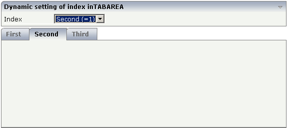
The user selects the value of the property
index using the combo control. The
index property controls also which tab is
displayed inside the ROWTABAREA control.
The layout definition is as follows:
<pagebody>
    <rowarea name="Dynamic setting of index in TABAREA">
        <itr>
            <label name="Index" width="100">
            </label>
            <combofix valueprop="index" size="1" flush="server">
                <combooption name="First  (=0)" value="0">
                </combooption>
                <combooption name="Second  (=1)" value="1">
                </combooption>
                <combooption name="Third (=2)" value="2">
                </combooption>
            </combofix>
        </itr>
    </rowarea>
    <rowtabarea height="200" openedindexprop="index"
                name1="First" page1="FIRST"
                name2="Second" page2="SECOND"
                name3="Third" page3="THIRD">
        <tabpage id="FIRST">
        </tabpage>
        <tabpage id="SECOND">
        </tabpage>
        <tabpage id="THIRD">
        </tabpage>
    </rowtabarea>
</pagebody>
For each individual tab page, you can control at runtime whether it is visible or not. The following example allows the user to control the visibility of tabs using check boxes:
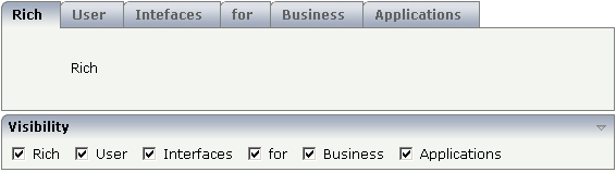
The XML layout is:
<rowtabarea height="100" name1="Rich" page1="RICH" visibleprop1="page1Visibility"
                         name2="User" page2="USER" visibleprop2="page2Visibility"
                         name3="Intefaces" page3="INTERFACES" visibleprop3="page3Visibility"
                         name4="for" page4="FOR" visibleprop4="page4Visibility"
                         name5="Business" page5="BUSINESS" visibleprop5="page5Visibility"
                         name6="Applications" page6="APPLICATIONS"
                                              visibleprop6="page6Visibility">
    <tabpage id="RICH">
        <vdist height="20">
        </vdist>
        <itr>
            <hdist width="60">
            </hdist>
            <label name="Rich" asplaintext="true" textalign="center">
            </label>
        </itr>
    </tabpage>
    <tabpage id="USER">
        ...
    </tabpage>
    ...
    ...
    ...
<rowarea name="Visibility">
    <itr>
        <checkbox valueprop="page1Visibility" flush="server">
        </checkbox>
        <hdist>
        </hdist>
        <label name="Rich" asplaintext="true">
        </label>
        <hdist width="10">
        </hdist>
        <checkbox valueprop="page2Visibility" flush="server">
        </checkbox>
        <hdist>
        </hdist>
        <label name="User" asplaintext="true">
        </label>
        <hdist width="10">
        </hdist>
        <checkbox valueprop="page3Visibility" flush="server">
        </checkbox>
        <hdist>
        </hdist>
        <label name="Interfaces" asplaintext="true">
        </label>
        <hdist width="10">
        </hdist>
        <checkbox valueprop="page4Visibility" flush="server">
        </checkbox>
        <hdist>
        </hdist>
        <label name="for" asplaintext="true">
        </label>
        <hdist width="10">
        </hdist>
        <checkbox valueprop="page5Visibility" flush="server">
        </checkbox>
        <hdist>
        </hdist>
        <label name="Business" asplaintext="true">
        </label>
        <hdist width="10">
        </hdist>
        <checkbox valueprop="page6Visibility" flush="server">
        </checkbox>
        <hdist>
        </hdist>
        <label name="Applications" asplaintext="true">
        </label>
        <hdist width="10">
        </hdist>
    </itr>
</rowarea>
You see that the definition of the properties that control the visibility of tab pages is done in the ROWTABAREA (not on TABPAGE level). The check boxes reference the same adapter properties as used on ROWTABAREA level.
Note:
In the previous example, the
openedindexprop property of the ROWTABAREA was
used. Be aware of the fact that each tab page still keeps its stable index
position - no matter whether it is displayed or not.