
The ROWDIV container represents an area with a defined size. Inside this area you can arrange INNERDIV containers. The INNERDIV containers have a defined x-, y- and z-position inside the ROWDIV area, and they have a defined width and height. INNDERDIV containers can overlap; by using the z-position, you can define which INNERDIV container is on top of which other INNERDIV container. Inside an INNERDIV container, you can arrange any other container or control - just as with normal containers.
Have a look at the following example:
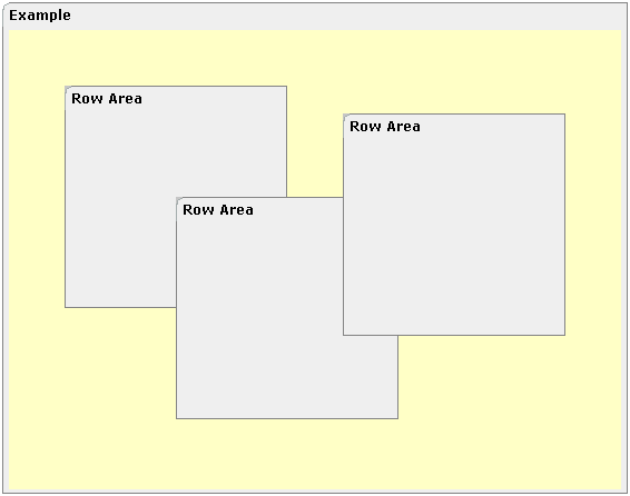
Inside a ROWAREA container, a ROWDIV container is arranged. Inside the ROWDIV container, three INNERDIV containers are arranged - each one holding a ROWAREA.
The XML layout definition looks as follows:
<rowarea name="Example" height="100%">
    <rowdiv height="100%" style="background-color: #FFFFC0">
        <innerdiv width="200" height="200" zindex="99" left="150" top="150"
                  style="background-color: #C0C0C0">
            <rowarea name="Row Area" height="100%" withtoppadding="false">
            </rowarea>
        </innerdiv>
        <innerdiv width="200" height="200" zindex="98" left="50" top="50"
                  style="background-color: #C0C0C0">
            <rowarea name="Row Area" height="100%" withleftborder="true" withtopborder="true"
                     withrightborder="true" withbottomborder="true" withtoppadding="false">
            </rowarea>
        </innerdiv>
        <innerdiv width="200" height="200" zindex="100" left="300" top="75"
                  style="background-color: #C0C0C0">
            <rowarea name="Row Area" height="100%" withtoppadding="false">
            </rowarea>
        </innerdiv>
    </rowdiv>
</rowarea>
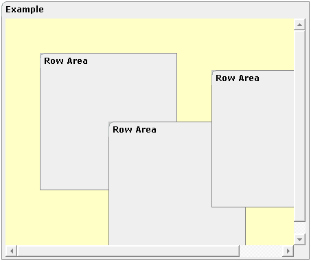
If the ROWDIV area is too small to hold the INNERDIV containers, then the ROWDIV area starts scrolling:
The following topics are covered below:
The typical usage scenarios of ROWDIV and INNERDIV containers is:
when you want to place a certain area at a certain position on the screen - without wanting to explicitly define VDIST/HDIST elements;
when you want to explicitly work with overlapping areas.
Note that the parallel usage of pixel and percentage sizing is not supported with ROWDIV and INNERDIV in the same way as supported with normal containers (for example, ROWAREA and COLAREA). With normal containers, you can specify scenarios like the following: the left container occupies 200 pixels, the right container occupies 100%. The table rendering is clever enough to render the result accordingly. With INNERDIV containers, the percentage definitions are always in relation to the height and width of the surrounding ROWDIV control.
Consequence: Do not use ROWDIV and INNERDIV for the basic structuring of containers inside your page, but only use them for the two usage aspects mentioned before.
| Basic | |||
| height |
Height of the control. There are three possibilities to define the height: (A) You do not define a height at all. As consequence the control will be rendered with its default height. If the control is a container control (containing) other controls then the height of the control will follow the height of its content. (B) Pixel sizing: just input a number value (e.g. "20"). (C) Percentage sizing: input a percentage value (e.g. "50%"). Pay attention: percentage sizing will only bring up correct results if the parent element of the control properly defines a height this control can reference. If you specify this control to have a height of 50% then the parent element (e.g. an ITR-row) may itself define a height of "100%". If the parent element does not specify a width then the rendering result may not represent what you expect. |
Obligatory |
100 150 200 250 300 250 400 50% 100% |
| style |
CSS style definition that is directly passed into this control. With the style you can individually influence the rendering of the control. You can specify any style sheet expressions. Examples are: border: 1px solid #FF0000 background-color: #808080 You can combine expressions by appending and separating them with a semicolon. Sometimes it is useful to have a look into the generated HTML code in order to know where direct style definitions are applied. Press right mouse-button in your browser and select the "View source" or "View frame's source" function. |
Optional | |
| divclass |
CSS style class definition that is directly passed into this control. The style class can be either one which is part of the "normal" CIS style sheet files (i.e. the ones that you maintain with the style sheet editor) - or it can be one of an other style sheet file that you may reference via the ADDSTYLESHEET property of the PAGE tag. |
Optional | |
| comment |
Comment without any effect on rendering and behaviour. The comment is shown in the layout editor's tree view. |
Optional | |
| Basic | |||
| width |
Width of the control. There are three possibilities to define the width: (A) You do not define a width at all. In this case the width of the control will either be a default width or - in case of container controls - it will follow the width that is occupied by its content. (B) Pixel sizing: just input a number value (e.g. "100"). (C) Percentage sizing: input a percantage value (e.g. "50%"). Pay attention: percentage sizing will only bring up correct results if the parent element of the control properly defines a width this control can reference. If you specify this control to have a width of 50% then the parent element (e.g. an ITR-row) may itself define a width of "100%". If the parent element does not specify a width then the rendering result may not represent what you expect. |
Obligatory |
100 120 140 160 180 200 50% 100% |
| height |
Height of the control. There are three possibilities to define the height: (A) You do not define a height at all. As consequence the control will be rendered with its default height. If the control is a container control (containing) other controls then the height of the control will follow the height of its content. (B) Pixel sizing: just input a number value (e.g. "20"). (C) Percentage sizing: input a percentage value (e.g. "50%"). Pay attention: percentage sizing will only bring up correct results if the parent element of the control properly defines a height this control can reference. If you specify this control to have a height of 50% then the parent element (e.g. an ITR-row) may itself define a height of "100%". If the parent element does not specify a width then the rendering result may not represent what you expect. |
Obligatory |
100 150 200 250 300 250 400 50% 100% |
| left |
Left position of control. Either define a pixel value ("100") or a percentatge value ("30%"). |
Obligatory | |
| top |
Top position of control. Either define a pixel value ("100") or a percentatge value ("30%"). |
Obligatory | |
| zindex |
Z-index of the control. If two controls overlap then the one with the higher z-index is drawn in front of the other one. |
Optional |
1 2 3 int-value |
| comment |
Comment without any effect on rendering and behaviour. The comment is shown in the layout editor's tree view. |
Optional | |
| Appearance | |||
| leftdistance |
If set to "true" then a small distance (3px) is kept between the left border of the control and its content. Default is "false". |
Optional |
true false |
| rightdistance |
If set to "true" then a small distance (3px) is kept between the right border of the control and its content. Default is "false". |
Optional |
true false |
| style |
CSS style definition that is directly passed into this control. With the style you can individually influence the rendering of the control. You can specify any style sheet expressions. Examples are: border: 1px solid #FF0000 background-color: #808080 You can combine expressions by appending and separating them with a semicolon. Sometimes it is useful to have a look into the generated HTML code in order to know where direct style definitions are applied. Press right mouse-button in your browser and select the "View source" or "View frame's source" function. |
Optional | |
| Binding | |||
| widthprop |
Name of adapter parameter that dynamically prvides the width of the control. Must return a valid width. |
Optional | |
| leftprop |
Name of adapter parameter that dynamically provides the left position of the control. Must return a valid value for 'left position'. |
Optional | |
| dropwidthprop |
Name of the adapter parameter that dynamically provides the width of the drop target. |
Optional | |
| dropoffsetprop |
Name of the adapter parameter that dynamically provides the offset used for the drop target. |
Optional | |
| dropmethod |
Event which is triggerd in the Natural program when the drop operation is finished. |
Optional | |