
Containers internally build an HTML table in which you place rows. Inside each row you place the controls - or again container(s).
This document covers the following topics:
There are two types of rows:
The TR row is a normal table row. If you place more table rows - one under the other - inside one container, the columns inside the table row are all synchronized. See the example below in order to understand what "synchronized" means.
Since controls are placed into columns, all controls are positioned in a synchronized way.
The ITR row is a special table row. If you place more ITR table rows - one under the other - inside one container, each row has an independent set of columns; i.e. columns are not synchronized.
Have a look at the following XML layout description:
<rowarea name="With TR">
    <tr>
        <label name="First Name" width="100">
        </label>
        <field valueprop="fname" width="200">
        </field>
    </tr>
    <tr>
        <label name="Last Name" width="200">
        </label>
        <field valueprop="lname" width="200">
        </field>
    </tr>
</rowarea>
<rowarea name="With ITR">
    <itr takefullwidth="true">
        <label name="First Name" width="100px">
        </label>
        <field valueprop="fname" width="200">
        </field>
    </itr>
    <itr takefullwidth="true">
        <label name="Last Name" width="200">
        </label>
        <field valueprop="lname" width="200" length="20">
        </field>
    </itr>
</rowarea>
Note that each control (label, button, fields, etc.) is placed into one column of its own. If you have many controls inside one row - and have several rows one below the other - synchronized columns (using TR rows) sometimes cause funny results.
What is better, TR or ITR? Of course, it depends. The recommendation is:
Use ITR as default. Using ITR, each row is defined independently from other rows that are positioned in the same container. You can change the number of controls (i.e. you internally change the number of managed columns) in one row without interdependencies to other rows.
Only use TR if you really want to synchronize columns. A typical area of usage is inside the grid management (ROWTABLEAREA2 control): in a grid you explicitly desire to have synchronized columns inside the grid's table.
There are two ROWAREA containers. The first one uses TR rows, the second one uses ITR rows. The label for First Name has a width of 100 pixels, the label for Last Name has a width of 200 pixels. Now look at the result:
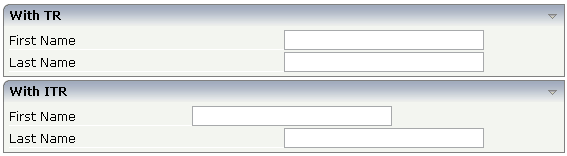
Inside the TR rows, all columns are synchronized - while in the ITR rows, each row is individually arranged.
How does the ITR control work internally? For each row, an individual table is opened with one row. Example: you define the following area in the XML layout definition:
<area>
  <itr>
    ...
    ...
  </itr>
  <itr>
    ...
    ...
  </itr>
</area>
The generated HTML looks like this:
<table>
  <tr>
    <td colspan="100">
      <table>
        <tr>
          ...
          ...
        </tr>
      </table>
    </td>
  </tr>
  <tr>
    <td colspan="100">
      <table>
        <tr>
          ...
          ...
        </tr>
      </table>
    </td>
  </tr>
</table>
Inside each row there is a table definition of its own, holding exactly one row.
You can define a takefullwidth property
with the ITR definition, defining the width of the internal table of an ITR
tag. If the takefullwidth property is set to
"true", this means that the internal table that is
kept per row is internally opened to use 100% of the available width. Without
any definition, the table will be as big as it is required by its content.
When using pixel sizing for controls in ITRs you may see rounding issues when zooming the page in Google Chrome and Edge Chromium. See the example "Inline rendering" in the NaturalAjaxDemos.
In case your ITR only contains the following controls: FIELD, LABEL, HDIST, ICON, BUTTON and/or XCIDATADEF, you can set the inline property to true. This will force the browser to use a different rendering style, which avoids the rounding issues while zooming. Instead of setting the inline property directly in the ITR you can specify this inline rendering for the whole page or the whole application.
To render this kind of ITRs of the whole page inline, set
<natpage itrinlinedisplay='true' ...
To render this kind of ITRs in the whole application inline, in cisconfig.xml, set
<cisconfig itrinlinedisplay='true' ...
| Basic | |||
| visibleprop |
Name of the adapter parameter that provides the information if this control is displayed or not. As consequence you can control the visibility of the control dynamically. |
Optional | |
| height |
Height of the control. There are three possibilities to define the height: (A) You do not define a height at all. As consequence the height of the control will follow the height of its content. (B) Pixel sizing: just input a number value (e.g. "20"). Please note: the row content may overrule this setting. The height setting "100px" of an embedded textbox will beat a row height of "50px". (C) Percentage sizing: input a percantage value (e.g. "50%"). Pay attention: percentage sizing will only bring up correct results if the parent element of the control properly defines a height this control can reference. If you specify this control to have a height of 50% then the parent element may itself define a height of "100%". If the parent element does not specify a width then the rendering result may not represent what you expect. |
Optional |
100 150 200 250 300 250 400 50% 100% |
| withalterbackground |
Flag that indicates if the grid line shows alternating background color (like rows within a textgrids). Default is false. Please note: controls inside the row must have transparent background. In case of the FIELD control simply set property TRANSPARENTBACKGROUND to true. |
Optional |
true false |
| trstyle |
CSS style definition that is directly passed into this control. With the style you can individually influence the rendering of the control. You can specify any style sheet expressions. Examples are: border: 1px solid #FF0000 background-color: #808080 You can combine expressions by appending and separating them with a semicolon. Sometimes it is useful to have a look into the generated HTML code in order to know where direct style definitions are applied. Press right mouse-button in your browser and select the "View source" or "View frame's source" function. |
Optional |
background-color: #FF0000 color: #0000FF font-weight: bold |
| trstyleprop |
Name of the adapter parameter that dynamically provides explicit style information for the control. |
Optional | |
| comment |
Comment without any effect on rendering and behaviour. The comment is shown in the layout editor's tree view. |
Optional | |
| Basic | |||
| takefullwidth |
If set to "true" then the control takes all available horizontal width as its width. If set to "false" then the control does not have a predefined width but grows with its content. |
Optional |
true false |
| height |
Height of the control. There are three possibilities to define the height: (A) You do not define a height at all. As consequence the control will be rendered with its default height. If the control is a container control (containing) other controls then the height of the control will follow the height of its content. (B) Pixel sizing: just input a number value (e.g. "20"). (C) Percentage sizing: input a percentage value (e.g. "50%"). Pay attention: percentage sizing will only bring up correct results if the parent element of the control properly defines a height this control can reference. If you specify this control to have a height of 50% then the parent element (e.g. an ITR-row) may itself define a height of "100%". If the parent element does not specify a width then the rendering result may not represent what you expect. |
Optional |
100 150 200 250 300 250 400 50% 100% |
| align |
Alignment of the content of the ITR row. Background: the ITR as independent table row renders a table into its content area. Inside this table a row is opened in which the controls are placed. This table normally is starting on the left of the ITR row. With this ALIGN property you can explicitly define the alignement of the table. |
Optional |
left center right |
| valign |
Vertical alignment of control in its column. Each control is "packaged" into a column. The column itself is part of a row (e.g. ITR or TR). Sometimtes the size of the column is bigger than the size of the control. In this case the "align" property specify the position of the control inside the column. |
Optional |
top middle bottom |
| fixlayout |
The fixlayout property is important for saving rendering performance inside your browser. To become effective it requires to have specified the height and the width (if available as property) of the control. If setting fixlayout to "true" then the control's area is defined as area which is not sized dependent on its content (as normally done with table rendering). Instead the size is predefined from outside without letting the browser "look" into the content of the area. If the content is not fitting into the area then it is cut. You typically use this control if the content of the control's area is flexibly sizable. E.g. if the content (e.g. a TEXTGRID control) is following the size of the container. When using vertical percentage based sizing you should pay attention to set the fixlayout-property to "true" as often as possible. - The browser as consequence will be much faster in doing its rendering because a screen consists out of "building blocks" with simple to calculate sizes. |
Optional |
true false |
| inline |
Only set this property to true if you see rounding issues when zooming your page in Google Chrome or Edge Chromium browser. The property will force the browser to use a different rendering style for this itr. Use this property only if your ITR only contains the following controls: FIELD, LABEL, HDIST, ICON, BUTTON and/or XCIDATADEF and you are using pixel sizing. |
Optional |
true false |
| comment |
Comment without any effect on rendering and behaviour. The comment is shown in the layout editor's tree view. |
Optional | |
| Visibility | |||
| visibleprop |
Name of the adapter parameter that provides the information if this control is displayed or not. As consequence you can control the visibility of the control dynamically. |
Optional | |
| Appearance | |||
| itrstyle |
CSS style definition that is directly passed into this control. With the style you can individually influence the rendering of the control. You can specify any style sheet expressions. Examples are: border: 1px solid #FF0000 background-color: #808080 You can combine expressions by appending and separating them with a semicolon. Sometimes it is useful to have a look into the generated HTML code in order to know where direct style definitions are applied. Press right mouse-button in your browser and select the "View source" or "View frame's source" function. |
Optional |
background-color: #FF0000 color: #0000FF font-weight: bold |
| itrclass |
CSS style class definition that is directly passed into this control. The style class can be either one which is part of the "normal" CIS style sheet files (i.e. the ones that you maintain with the style sheet editor) - or it can be one of an other style sheet file that you may reference via the ADDSTYLESHEET property of the PAGE tag. |
Optional | |
| tablestyle |
CSS style definition that is directly passed into this control. With the style you can individually influence the rendering of the control. You can specify any style sheet expressions. Examples are: border: 1px solid #FF0000 background-color: #808080 You can combine expressions by appending and separating them with a semicolon. Sometimes it is useful to have a look into the generated HTML code in order to know where direct style definitions are applied. Press right mouse-button in your browser and select the "View source" or "View frame's source" function. |
Optional |
background-color: #FF0000 color: #0000FF font-weight: bold |
| Binding | |||
| itrstyleprop |
Name of the adapter parameter that dynamically provides the style of the control. |
Optional | |