
A set of controls and containers for building responsive applications is available. The controls and containers support responsiveness, which means that the pages automatically adapt to various screen sizes. The controls are built with Bootstrap (http://getbootstrap.com/). You will find running samples built with these controls and containers in the Natural Ajax Demos.
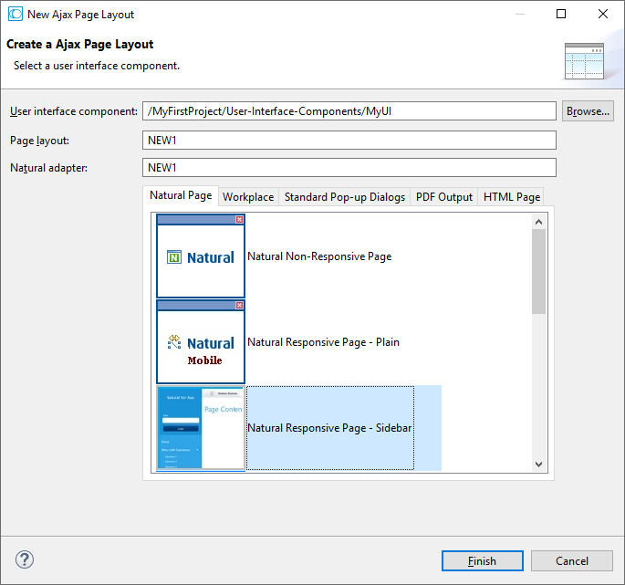
To create layout pages for responsive applications use one of the Natural Responsive Page templates. If you want your application to have a sidebar with navigation menu choose the Natural Responsive Page - Sidebar template.
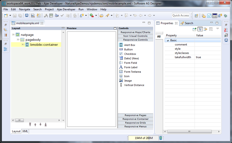
The wizard will create a page layout with responsive containers. The palette shows exactly the controls, which are supported in responsive pages. You can add controls from the palette to your layout in the usual way.
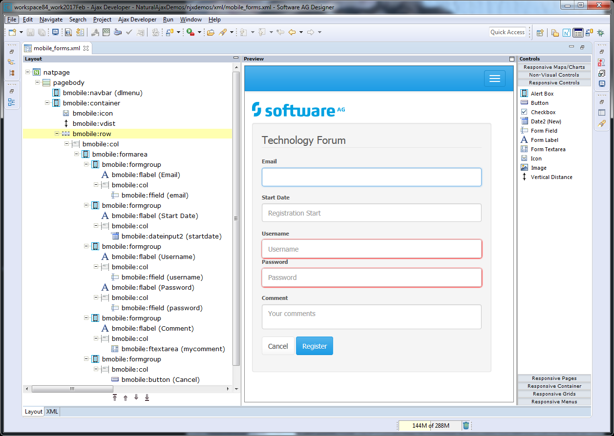
To see the rendering in the preview area set HTML as Layout display mode in the Ajax Developer properties of your project. The following shows the mobile_forms.xml example layout of the Natural Ajax Demos in the Layout Painter.
The responsiveness of a layout is based on style classes. For controls and containers the major responsive style classes are applied automatically, which defines the basic functionality for this control/container in a responsive way. You can add your own additional style classes or style classes supported by the Bootstrap framework to the controls to customize the rendering.
You could add the style classes .
.img-rounded or . .img-circle to an IMAGEOUT
control to add rounded corners to the image or to shape the image to a circle.
Here you can find the major style classes supported by the Bootstrap framework:
https://www.w3schools.com/bootstrap/.
The responsive sizing of rows and columns in a page is also based on style classes. The basis for this is the grid system of Bootstrap. This system allows up to 12 columns across the page. You can specify different dimensions for your rows and columns depending on the devices. This means: Instead of directly applying pixel or percentage width to your controls, you specify style classes defining the number of columns this control is supposed to occupy on a device.
Check out the running examples in the Natural Ajax Demos to get an impression.
A responsive control to render a page header.
| Basic | |||
| name |
Text that is displayed inside the control. Please do not specify the name when using the multi language management - but specify a "textid" instead. |
Sometimes obligatory | |
| textid |
Multi language dependent text that is displayed inside the control. The "textid" is translated into a corresponding string at runtime. Do not specify a "name" inside the control if specifying a "textid". |
Sometimes obligatory | |
| nameprop |
Name of adapter parameter which dynamically provides the text that is shown inside the control. |
Optional | |
| htmlheading |
The rendering of the heading: H1-H6 |
Optional |
h1 h2 h3 h4 h5 h6 |
| comment |
Comment without any effect on rendering and behaviour. The comment is shown in the layout editor's tree view. |
Optional | |
| styleclasses |
CSS style classes separated by a blank. |
Optional | |
| style |
CSS style definition that is directly passed into this control. With the style you can individually influence the rendering of the control. You can specify any style sheet expressions. Examples are: border: 1px solid #FF0000 background-color: #808080 You can combine expressions by appending and separating them with a semicolon. Sometimes it is useful to have a look into the generated HTML code in order to know where direct style definitions are applied. Press right mouse-button in your browser and select the "View source" or "View frame's source" function. |
Optional | |
A responsive control to render a page footer.
Note:
The properties for the BMOBILE:FOOTER control are the same as
for the BMOBILE:PAGEHEADER control but are implemented using different style
sheet classes.
| Basic | |||
| name |
Text that is displayed inside the control. Please do not specify the name when using the multi language management - but specify a "textid" instead. |
Sometimes obligatory | |
| textid |
Multi language dependent text that is displayed inside the control. The "textid" is translated into a corresponding string at runtime. Do not specify a "name" inside the control if specifying a "textid". |
Sometimes obligatory | |
| nameprop |
Name of adapter parameter which dynamically provides the text that is shown inside the control. |
Optional | |
| htmlheading |
The rendering of the heading: H1-H6 |
Optional |
h1 h2 h3 h4 h5 h6 |
| comment |
Comment without any effect on rendering and behaviour. The comment is shown in the layout editor's tree view. |
Optional | |
| styleclasses |
CSS style classes separated by a blank. |
Optional | |
| style |
CSS style definition that is directly passed into this control. With the style you can individually influence the rendering of the control. You can specify any style sheet expressions. Examples are: border: 1px solid #FF0000 background-color: #808080 You can combine expressions by appending and separating them with a semicolon. Sometimes it is useful to have a look into the generated HTML code in order to know where direct style definitions are applied. Press right mouse-button in your browser and select the "View source" or "View frame's source" function. |
Optional | |
| Miscellaneous | |||
| testtoolid |
Use this attribute to assign a fixed control identifier that can be later on used within your test tool in order to do the object identification |
Optional | |
A control for responsive embedding of non-Ajax pages or other media.
| Basic | |||
| valueprop |
Name of the adapter parameter that provides the content of the control. |
Optional | |
| style |
CSS style definition that is directly passed into this control. With the style you can individually influence the rendering of the control. You can specify any style sheet expressions. Examples are: border: 1px solid #FF0000 background-color: #808080 You can combine expressions by appending and separating them with a semicolon. Sometimes it is useful to have a look into the generated HTML code in order to know where direct style definitions are applied. Press right mouse-button in your browser and select the "View source" or "View frame's source" function. |
Optional | |
| styleclasses |
CSS style classes separated by a blank. |
Optional | |
| comment |
Comment without any effect on rendering and behaviour. The comment is shown in the layout editor's tree view. |
Optional | |
| alwaysreload |
When setting to false, the subpage is not reloaded when a page switch is executed, default is true. |
Optional |
true false |
| aspectratio |
Defines the proportional relationship between width and height of the control. Example: 4by3 |
Optional | |
| width |
Width of the control. There are three possibilities to define the width: (A) You do not define a width at all. In this case the width of the control will either be a default width or - in case of container controls - it will follow the width that is occupied by its content. (B) Pixel sizing: just input a number value (e.g. "100"). (C) Percentage sizing: input a percantage value (e.g. "50%"). Pay attention: percentage sizing will only bring up correct results if the parent element of the control properly defines a width this control can reference. If you specify this control to have a width of 50% then the parent element (e.g. an ITR-row) may itself define a width of "100%". If the parent element does not specify a width then the rendering result may not represent what you expect. |
Optional |
100 120 140 160 180 200 50% 100% |
| height |
Height of the control. There are three possibilities to define the height: (A) You do not define a height at all. As consequence the control will be rendered with its default height. If the control is a container control (containing) other controls then the height of the control will follow the height of its content. (B) Pixel sizing: just input a number value (e.g. "20"). (C) Percentage sizing: input a percentage value (e.g. "50%"). Pay attention: percentage sizing will only bring up correct results if the parent element of the control properly defines a height this control can reference. If you specify this control to have a height of 50% then the parent element (e.g. an ITR-row) may itself define a height of "100%". If the parent element does not specify a width then the rendering result may not represent what you expect. |
Optional |
100 150 200 250 300 250 400 50% 100% |
| Natural | |||
| njx:natname |
If a Natural variable with a name not valid for Application Designer (for instance #FIELD1) shall be bound to the control, a different name (for instance HFIELD1) can be bound instead. If the original name (in this case #FIELD1) is then specified in this attribute, the original name is generated into the parameter data area of the Natural adapter and a mapping between the two names is generated into the PROCESS PAGE statement of the Natural adapter. This mapping must not break a once defined group structure. If for instance a grid control that is bound to a name of GRID1 contains fields that are bound to FIELD1 and FIELD2 respectively, the corresponding njx:natname values may be #GRID1.#FIELD1 and #GRID1.#FIELD2, but not #GRID1.#FIELD1 and #MYGRID1.#FIELD2. |
Optional | |
| njx:natstringtype |
If the control shall be bound to a Natural system variable of string format with the attribute njx:natsysvar, this attribute indicates the format of the string, A (code page) or U (Unicode). The default is A. |
Optional | |
| njx:natcomment |
The value of this attribute is generated as comment line into the parameter data area of the Natural adapter, before the field name. The Map Converter, for instance, uses this attributes to indicate for a generated statusprop variable to which field the statusprop belongs. |
Optional | |
A control for responsive embedding of Ajax subpages.
| Basic | |||
| valueprop |
Name of the adapter parameter that provides the content of the control. |
Optional | |
| style |
CSS style definition that is directly passed into this control. With the style you can individually influence the rendering of the control. You can specify any style sheet expressions. Examples are: border: 1px solid #FF0000 background-color: #808080 You can combine expressions by appending and separating them with a semicolon. Sometimes it is useful to have a look into the generated HTML code in order to know where direct style definitions are applied. Press right mouse-button in your browser and select the "View source" or "View frame's source" function. |
Optional | |
| width |
Width of the control. There are three possibilities to define the width: (A) You do not define a width at all. In this case the width of the control will either be a default width or - in case of container controls - it will follow the width that is occupied by its content. (B) Pixel sizing: just input a number value (e.g. "100"). (C) Percentage sizing: input a percantage value (e.g. "50%"). Pay attention: percentage sizing will only bring up correct results if the parent element of the control properly defines a width this control can reference. If you specify this control to have a width of 50% then the parent element (e.g. an ITR-row) may itself define a width of "100%". If the parent element does not specify a width then the rendering result may not represent what you expect. |
Optional |
100 120 140 160 180 200 50% 100% |
| height |
Height of the control. There are three possibilities to define the height: (A) You do not define a height at all. As consequence the control will be rendered with its default height. If the control is a container control (containing) other controls then the height of the control will follow the height of its content. (B) Pixel sizing: just input a number value (e.g. "20"). (C) Percentage sizing: input a percentage value (e.g. "50%"). Pay attention: percentage sizing will only bring up correct results if the parent element of the control properly defines a height this control can reference. If you specify this control to have a height of 50% then the parent element (e.g. an ITR-row) may itself define a height of "100%". If the parent element does not specify a width then the rendering result may not represent what you expect. |
Optional |
100 150 200 250 300 250 400 50% 100% |
| aspectratio |
Defines the proportional relationship between width and height of the control. Example: 4by3 |
Optional |
1by1 16by9 21by9 4by3 |
| styleclasses |
CSS style classes separated by a blank. |
Optional | |
| comment |
Comment without any effect on rendering and behaviour. The comment is shown in the layout editor's tree view. |
Optional | |
| Natural | |||
| njx:natname |
If a Natural variable with a name not valid for Application Designer (for instance #FIELD1) shall be bound to the control, a different name (for instance HFIELD1) can be bound instead. If the original name (in this case #FIELD1) is then specified in this attribute, the original name is generated into the parameter data area of the Natural adapter and a mapping between the two names is generated into the PROCESS PAGE statement of the Natural adapter. This mapping must not break a once defined group structure. If for instance a grid control that is bound to a name of GRID1 contains fields that are bound to FIELD1 and FIELD2 respectively, the corresponding njx:natname values may be #GRID1.#FIELD1 and #GRID1.#FIELD2, but not #GRID1.#FIELD1 and #MYGRID1.#FIELD2. |
Optional | |
| njx:natstringtype |
If the control shall be bound to a Natural system variable of string format with the attribute njx:natsysvar, this attribute indicates the format of the string, A (code page) or U (Unicode). The default is A. |
Optional | |
| njx:natcomment |
The value of this attribute is generated as comment line into the parameter data area of the Natural adapter, before the field name. The Map Converter, for instance, uses this attributes to indicate for a generated statusprop variable to which field the statusprop belongs. |
Optional | |
A control for responsive embedding of modals. The content of
this modal can be any content reachable via a URL. To integrate Natural
content, use the BMOBILE:INTMODAL* controls. To open a modal via BMOBILE:BUTTON
and BMOBILE:ICON controls apply
"modalid:<mymodalid>" as method.
<bmobile:button method="modal:mymodalid" ....></bmobile:button>
<bmobile:modal modalid="mymodalid"...></bmobile:modal>
| Basic | |||
| comment |
Comment without any effect on rendering and behaviour. The comment is shown in the layout editor's tree view. |
Optional | |
| titlename |
Text that is displayed inside the control. Please do not specify the name when using the multi language management - but specify a "textid" instead. |
Optional | |
| modalid |
An id string for the modal. You can use this id in buttons to open the modal. For a modalid mymodalid the methodname in a button is modal:mymodalid. |
Optional | |
| pageurl |
The url of an html page. |
Optional | |
| pageurlprop |
Name of the adapter parameter that dynamically defines the url of an html page. |
Optional | |
| modalbodystyle |
CSS style definition that is directly passed into this control. With the style you can individually influence the rendering of the control. You can specify any style sheet expressions. Examples are: border: 1px solid #FF0000 background-color: #808080 You can combine expressions by appending and separating them with a semicolon. Sometimes it is useful to have a look into the generated HTML code in order to know where direct style definitions are applied. Press right mouse-button in your browser and select the "View source" or "View frame's source" function. |
Optional | |
| Natural | |||
| njx:natname |
If a Natural variable with a name not valid for Application Designer (for instance #FIELD1) shall be bound to the control, a different name (for instance HFIELD1) can be bound instead. If the original name (in this case #FIELD1) is then specified in this attribute, the original name is generated into the parameter data area of the Natural adapter and a mapping between the two names is generated into the PROCESS PAGE statement of the Natural adapter. This mapping must not break a once defined group structure. If for instance a grid control that is bound to a name of GRID1 contains fields that are bound to FIELD1 and FIELD2 respectively, the corresponding njx:natname values may be #GRID1.#FIELD1 and #GRID1.#FIELD2, but not #GRID1.#FIELD1 and #MYGRID1.#FIELD2. |
Optional | |
| njx:natstringtype |
If the control shall be bound to a Natural system variable of string format with the attribute njx:natsysvar, this attribute indicates the format of the string, A (code page) or U (Unicode). The default is A. |
Optional | |
| njx:natcomment |
The value of this attribute is generated as comment line into the parameter data area of the Natural adapter, before the field name. The Map Converter, for instance, uses this attributes to indicate for a generated statusprop variable to which field the statusprop belongs. |
Optional | |
| Miscellaneous | |||
| testtoolid |
Use this attribute to assign a fixed control identifier that can be later on used within your test tool in order to do the object identification |
Optional | |
Use these controls to implement responsive modals. The modals are designed and rendered page internal. You can have any container and control inside the BMOBILE:INTMODALBODY. No separate Adapter is generated for the internal modals. The corresponding fields and events are generated into the Adapter of the page containing the BMOBILE:INTMODAL control. This simplifies data exchange between the parent page and the modal.
To open a modal via BMOBILE:BUTTON and BMOBILE:ICON controls
apply "modalid:<mymodalid>" as
method.
<bmobile:button method="modal:mymodalid" ....></bmobile:button>
<bmobile:modal modalid="mymodalid"...></bmobile:modal>
| Basic | |||
| comment |
Comment without any effect on rendering and behaviour. The comment is shown in the layout editor's tree view. |
Optional | |
| valueprop |
Name of the adapter parameter that provides the content of the control. |
Obligatory | |
| modalid |
An id string for the modal. You can use this id in buttons to open the modal. For a modalid mymodalid the methodname in a button is modal:mymodalid. |
Optional | |
| modalsize |
Per default modals have medium size. Set this if you want for instance small size modal-sm, or large size modal-lg. |
Optional |
modal-sm modal-lg |
| styleclasses |
CSS style classes separated by a blank. |
Optional | |
| style |
CSS style definition that is directly passed into this control. With the style you can individually influence the rendering of the control. You can specify any style sheet expressions. Examples are: border: 1px solid #FF0000 background-color: #808080 You can combine expressions by appending and separating them with a semicolon. Sometimes it is useful to have a look into the generated HTML code in order to know where direct style definitions are applied. Press right mouse-button in your browser and select the "View source" or "View frame's source" function. |
Optional | |
| Natural | |||
| njx:natname |
If a Natural variable with a name not valid for Application Designer (for instance #FIELD1) shall be bound to the control, a different name (for instance HFIELD1) can be bound instead. If the original name (in this case #FIELD1) is then specified in this attribute, the original name is generated into the parameter data area of the Natural adapter and a mapping between the two names is generated into the PROCESS PAGE statement of the Natural adapter. This mapping must not break a once defined group structure. If for instance a grid control that is bound to a name of GRID1 contains fields that are bound to FIELD1 and FIELD2 respectively, the corresponding njx:natname values may be #GRID1.#FIELD1 and #GRID1.#FIELD2, but not #GRID1.#FIELD1 and #MYGRID1.#FIELD2. |
Optional | |
| njx:natstringtype |
If the control shall be bound to a Natural system variable of string format with the attribute njx:natsysvar, this attribute indicates the format of the string, A (code page) or U (Unicode). The default is A. |
Optional | |
| njx:natcomment |
The value of this attribute is generated as comment line into the parameter data area of the Natural adapter, before the field name. The Map Converter, for instance, uses this attributes to indicate for a generated statusprop variable to which field the statusprop belongs. |
Optional | |
| Miscellaneous | |||
| testtoolid |
Use this attribute to assign a fixed control identifier that can be later on used within your test tool in order to do the object identification |
Optional | |
This modal is used for showing online help. It is added
automatically to pages in which helpid
attributes have been set for controls. The modal is opened automatically on
help requests.
| Basic | |||
| comment |
Comment without any effect on rendering and behaviour. The comment is shown in the layout editor's tree view. |
Optional | |
| styleclasses |
CSS style classes separated by a blank. |
Optional | |
| style |
CSS style definition that is directly passed into this control. With the style you can individually influence the rendering of the control. You can specify any style sheet expressions. Examples are: border: 1px solid #FF0000 background-color: #808080 You can combine expressions by appending and separating them with a semicolon. Sometimes it is useful to have a look into the generated HTML code in order to know where direct style definitions are applied. Press right mouse-button in your browser and select the "View source" or "View frame's source" function. |
Optional | |
| name |
Text that is displayed inside the control. Please do not specify the name when using the multi language management - but specify a "textid" instead. |
Optional | |
| textid |
Multi language dependent text that is displayed inside the control. The "textid" is translated into a corresponding string at runtime. Do not specify a "name" inside the control if specifying a "textid". |
Optional | |
| nameprop |
Name of adapter parameter which dynamically provides the text that is shown inside the control. |
Optional | |
| htmlheading |
The rendering of the heading: H1-H6 |
Optional |
h1 h2 h3 h4 h5 h6 |
| Natural | |||
| njx:natname |
If a Natural variable with a name not valid for Application Designer (for instance #FIELD1) shall be bound to the control, a different name (for instance HFIELD1) can be bound instead. If the original name (in this case #FIELD1) is then specified in this attribute, the original name is generated into the parameter data area of the Natural adapter and a mapping between the two names is generated into the PROCESS PAGE statement of the Natural adapter. This mapping must not break a once defined group structure. If for instance a grid control that is bound to a name of GRID1 contains fields that are bound to FIELD1 and FIELD2 respectively, the corresponding njx:natname values may be #GRID1.#FIELD1 and #GRID1.#FIELD2, but not #GRID1.#FIELD1 and #MYGRID1.#FIELD2. |
Optional | |
| njx:natstringtype |
If the control shall be bound to a Natural system variable of string format with the attribute njx:natsysvar, this attribute indicates the format of the string, A (code page) or U (Unicode). The default is A. |
Optional | |
| njx:natcomment |
The value of this attribute is generated as comment line into the parameter data area of the Natural adapter, before the field name. The Map Converter, for instance, uses this attributes to indicate for a generated statusprop variable to which field the statusprop belongs. |
Optional | |
| Miscellaneous | |||
| testtoolid |
Use this attribute to assign a fixed control identifier that can be later on used within your test tool in order to do the object identification |
Optional | |
| Basic | |||
| comment |
Comment without any effect on rendering and behaviour. The comment is shown in the layout editor's tree view. |
Optional | |
| styleclasses |
CSS style classes separated by a blank. |
Optional | |
| style |
CSS style definition that is directly passed into this control. With the style you can individually influence the rendering of the control. You can specify any style sheet expressions. Examples are: border: 1px solid #FF0000 background-color: #808080 You can combine expressions by appending and separating them with a semicolon. Sometimes it is useful to have a look into the generated HTML code in order to know where direct style definitions are applied. Press right mouse-button in your browser and select the "View source" or "View frame's source" function. |
Optional | |
| Miscellaneous | |||
| testtoolid |
Use this attribute to assign a fixed control identifier that can be later on used within your test tool in order to do the object identification |
Optional | |
This control is similar to the STATUSBAR control but more
flexible. Use this control to show success or failure of an action.
| Basic | |||
| typeprop |
Name of the adapter parameter that provides as value the type of the alert message. The type defines the style in which the alert box is rendered. |
Obligatory | |
| shorttextprop |
Name of the adapter parameter that provides as value the message text that is visible inside the alert box. |
Obligatory | |
| longtextprop |
Name of the adapter parameter that provides as value the message text that is visible inside the alert box. |
Optional | |
| duration |
The duration of the animation in milliseconds. |
Optional |
500 1000 2000 6000 |
| comment |
Comment without any effect on rendering and behaviour. The comment is shown in the layout editor's tree view. |
Optional | |
Supports text like headlines in containers like the
BMOBILE:HORIZONTALBAR and
the BMOBILE:SIDEBAR.
| Basic | |||
| comment |
Comment without any effect on rendering and behaviour. The comment is shown in the layout editor's tree view. |
Optional | |
| name |
Text that is displayed inside the control. Please do not specify the name when using the multi language management - but specify a "textid" instead. |
Optional | |
| nameprop |
Name of adapter parameter which dynamically provides the text that is shown inside the control. |
Optional | |
| textid |
Multi language dependent text that is displayed inside the control. The "textid" is translated into a corresponding string at runtime. Do not specify a "name" inside the control if specifying a "textid". |
Optional | |
| styleclasses |
CSS style classes separated by a blank. |
Optional | |
| style |
CSS style definition that is directly passed into this control. With the style you can individually influence the rendering of the control. You can specify any style sheet expressions. Examples are: border: 1px solid #FF0000 background-color: #808080 You can combine expressions by appending and separating them with a semicolon. Sometimes it is useful to have a look into the generated HTML code in order to know where direct style definitions are applied. Press right mouse-button in your browser and select the "View source" or "View frame's source" function. |
Optional | |
| Natural | |||
| njx:natname |
If a Natural variable with a name not valid for Application Designer (for instance #FIELD1) shall be bound to the control, a different name (for instance HFIELD1) can be bound instead. If the original name (in this case #FIELD1) is then specified in this attribute, the original name is generated into the parameter data area of the Natural adapter and a mapping between the two names is generated into the PROCESS PAGE statement of the Natural adapter. This mapping must not break a once defined group structure. If for instance a grid control that is bound to a name of GRID1 contains fields that are bound to FIELD1 and FIELD2 respectively, the corresponding njx:natname values may be #GRID1.#FIELD1 and #GRID1.#FIELD2, but not #GRID1.#FIELD1 and #MYGRID1.#FIELD2. |
Optional | |
| njx:natsysvar |
If the control shall be bound to a Natural system variable, this attribute specifies the name of the system variable. |
Optional | |
| njx:natsysio |
If the control shall be bound to a Natural system variable with the attribute njx:natsysvar, this attribute indicates if the system variable is modifiable. The default is false. |
Optional | |
| njx:natstringtype |
If the control shall be bound to a Natural system variable of string format with the attribute njx:natsysvar, this attribute indicates the format of the string, A (code page) or U (Unicode). The default is A. |
Optional | |
| njx:natcv |
Name of a Natural control variable that shall be assigned to the control. |
Optional | |
| njx:natcomment |
The value of this attribute is generated as comment line into the parameter data area of the Natural adapter, before the field name. The Map Converter, for instance, uses this attributes to indicate for a generated statusprop variable to which field the statusprop belongs. |
Optional | |
| Miscellaneous | |||
| testtoolid |
Use this attribute to assign a fixed control identifier that can be later on used within your test tool in order to do the object identification |
Optional | |
A responsive button.
| Basic | |||
| name |
Text that is displayed inside the control. Please do not specify the name when using the multi language management - but specify a "textid" instead. |
Optional | |
| textid |
Multi language dependent text that is displayed inside the control. The "textid" is translated into a corresponding string at runtime. Do not specify a "name" inside the control if specifying a "textid". |
Optional | |
| comment |
Comment without any effect on rendering and behaviour. The comment is shown in the layout editor's tree view. |
Optional | |
| type |
The type of the button like reset or submit. |
Optional |
button submit file reset |
| renderaslink |
If set to "TRUE" the control is rendered as a link. |
Optional |
true false |
| title |
Text that is shown as tooltip for the control. Either specify the text "hard" by using this TITLE property - or use the TITLETEXTID in order to define a language dependent literal. |
Optional | |
| Appearance | |||
| styleclasses |
CSS style classes separated by a blank. |
Optional |
btn-default btn-primary btn-sm btn-lg btn-responsive close |
| style |
CSS style definition that is directly passed into this control. With the style you can individually influence the rendering of the control. You can specify any style sheet expressions. Examples are: border: 1px solid #FF0000 background-color: #808080 You can combine expressions by appending and separating them with a semicolon. Sometimes it is useful to have a look into the generated HTML code in order to know where direct style definitions are applied. Press right mouse-button in your browser and select the "View source" or "View frame's source" function. |
Optional | |
| invisiblemode |
This property has three possible values: (1) "invisible": the control is not visible without occupying any space. (2) "disabled": the control is deactivated: it is "grayed" and does not show any roll over effects any more. (3)"cleared": the control is not visible but it still occupies space. |
Optional |
invisible disabled cleared |
| helpid |
Help ID that is passed to the online help management in case the user presses F1 on the control. |
Optional | |
| Binding | |||
| method |
Name of the event that is sent to the adapter when the user presses the button. If no method is specified, a default event is sent. If the method starts with javascript: the corresponding javascript method is called. |
Optional | |
| visibleprop |
Name of the adapter parameter that provides the information if this control is displayed or not. As consequence you can control the visibility of the control dynamically. |
Optional | |
| nameprop |
Name of adapter parameter which dynamically provides the text that is shown inside the control. |
Optional | |
| titleprop |
Name of the adapter parameter that dynamically defines the title of the control. The title is displayed as tool tip when ther user moves the mouse onto the control. |
Optional | |
| Miscellaneous | |||
| testtoolid |
Use this attribute to assign a fixed control identifier that can be later on used within your test tool in order to do the object identification |
Optional | |
A responsive checkbox control.
| Basic | |||
| valueprop |
Name of the adapter parameter that represents the control in the adapter. |
Obligatory | |
| name |
Text that is displayed inside the control. Please do not specify the name when using the multi language management - but specify a "textid" instead. |
Optional | |
| textid |
Multi language dependent text that is displayed inside the control. The "textid" is translated into a corresponding string at runtime. Do not specify a "name" inside the control if specifying a "textid". |
Optional | |
| comment |
Comment without any effect on rendering and behaviour. The comment is shown in the layout editor's tree view. |
Optional | |
| Appearance | |||
| displayonly |
If set to true, the FIELD will not be accessible for input. It is just used as an output field. |
Optional |
true false |
| invisiblemode |
This property has three possible values: (1) "invisible": the control is not visible without occupying any space. (2) "disabled": the control is deactivated: it is "grayed" and does not show any roll over effects any more. (3)"cleared": the control is not visible but it still occupies space. |
Optional |
invisible disabled cleared |
| styleclasses |
CSS style classes separated by a blank. |
Optional | |
| style |
CSS style definition that is directly passed into this control. With the style you can individually influence the rendering of the control. You can specify any style sheet expressions. Examples are: border: 1px solid #FF0000 background-color: #808080 You can combine expressions by appending and separating them with a semicolon. Sometimes it is useful to have a look into the generated HTML code in order to know where direct style definitions are applied. Press right mouse-button in your browser and select the "View source" or "View frame's source" function. |
Optional | |
| title |
Text that is shown as tooltip for the control. Either specify the text "hard" by using this TITLE property - or use the TITLETEXTID in order to define a language dependent literal. |
Optional | |
| helpid |
Help ID that is passed to the online help management in case the user presses F1 on the control. |
Optional | |
| inline |
Set this property to true if you want the controls to appear in the same line. |
Optional |
true false |
| Binding | |||
| valueprop | (already explained above) | ||
| flush |
Flushing behaviour of the input control. By default an input into the control is registered within the browser client - and communicated to the server adapter object when a user e.g. presses a button. By using the FLUSH property you can change this behaviour. Setting FLUSH to "server" means that directly after changing the input a synchronization with the server adapter is triggered. As consequence you directly can react inside your adapter logic onto the change of the corresponding value. - Please be aware of that during the synchronization always all changed properties - also the ones that were changed before - are transferred to the adapter object, not only the one that triggered the synchonization. Setting FLUSH to "screen" means that the changed value is populated inside the page. You use this option if you have redundant usage of the same property inside one page and if you want to pass one changed value to all its representaion directly after changing the value. |
Optional |
screen server |
| flushmethod |
When the data synchronization of the control is set to FLUSH="server" then you can specify an explicit event to be sent when the user updates the content of the control. By doing so you can distinguish on the server side from which control the flush of data was triggered. |
Optional | |
| visibleprop |
Name of the adapter parameter that provides the information if this control is displayed or not. As consequence you can control the visibility of the control dynamically. |
Optional | |
| nameprop |
Name of adapter parameter which dynamically provides the text that is shown inside the control. |
Optional | |
| titleprop |
Name of the adapter parameter that dynamically defines the title of the control. The title is displayed as tool tip when ther user moves the mouse onto the control. |
Optional | |
| statusprop |
Name of the adapter parameter that dynamically passes information how the control should be rendered and how it should act. Valid parameter values at runtime: "INVISIBLE", "FOCUS", "FOCUS_NO_SELECT", "ERROR", "ERROR_NO_FOCUS". Use DISPLAYPROP to dynamically define whether the field is displayonly. |
Optional | |
| Natural | |||
| njx:natname |
If a Natural variable with a name not valid for Application Designer (for instance #FIELD1) shall be bound to the control, a different name (for instance HFIELD1) can be bound instead. If the original name (in this case #FIELD1) is then specified in this attribute, the original name is generated into the parameter data area of the Natural adapter and a mapping between the two names is generated into the PROCESS PAGE statement of the Natural adapter. This mapping must not break a once defined group structure. If for instance a grid control that is bound to a name of GRID1 contains fields that are bound to FIELD1 and FIELD2 respectively, the corresponding njx:natname values may be #GRID1.#FIELD1 and #GRID1.#FIELD2, but not #GRID1.#FIELD1 and #MYGRID1.#FIELD2. |
Optional | |
| njx:natsysvar |
If the control shall be bound to a Natural system variable, this attribute specifies the name of the system variable. |
Optional | |
| njx:natsysio |
If the control shall be bound to a Natural system variable with the attribute njx:natsysvar, this attribute indicates if the system variable is modifiable. The default is false. |
Optional | |
| njx:natcv |
Name of a Natural control variable that shall be assigned to the control. |
Optional | |
| njx:natcomment |
The value of this attribute is generated as comment line into the parameter data area of the Natural adapter, before the field name. The Map Converter, for instance, uses this attributes to indicate for a generated statusprop variable to which field the statusprop belongs. |
Optional | |
| Miscellaneous | |||
| testtoolid |
Use this attribute to assign a fixed control identifier that can be later on used within your test tool in order to do the object identification |
Optional | |
A responsive form of the DATEINPUT2 control.
| Basic | |||
| comment |
Comment without any effect on rendering and behaviour. The comment is shown in the layout editor's tree view. |
Optional | |
| valueprop |
Name of the adapter parameter that provides the content of the control. |
Obligatory | |
| datatype |
By default, the DATEINPUT control is managing a day. By explicitly setting a datatype you can define that the control is managing a day and time. In the first use type CDATE within your adapter program - in the second case use type CTIMESTAMP. |
Optional |
date datetime ------------------------ xs:date xs:dateTime |
| Binding | |||
| valueprop | (already explained above) | ||
| fromprop |
Name of the adapter parameter that provides a lower limit for the value of the control. The value is used for client side validation of user input. |
Optional | |
| toprop |
Name of the adapter parameter that provides an upper limit for the value of the control. The value is used for client side validation of user input. |
Optional | |
| statusprop |
Name of the adapter parameter that dynamically passes information how the control should be rendered and how it should act. Valid parameter values at runtime: "INVISIBLE", "FOCUS", "FOCUS_NO_SELECT", "ERROR", "ERROR_NO_FOCUS". Use DISPLAYPROP to dynamically define whether the field is displayonly. |
Optional | |
| flush |
Flushing behaviour of the input control. By default an input into the control is registered within the browser client - and communicated to the server adapter object when a user e.g. presses a button. By using the FLUSH property you can change this behaviour. Setting FLUSH to "server" means that directly after changing the input a synchronization with the server adapter is triggered. As consequence you directly can react inside your adapter logic onto the change of the corresponding value. - Please be aware of that during the synchronization always all changed properties - also the ones that were changed before - are transferred to the adapter object, not only the one that triggered the synchonization. Setting FLUSH to "screen" means that the changed value is populated inside the page. You use this option if you have redundant usage of the same property inside one page and if you want to pass one changed value to all its representaion directly after changing the value. |
Optional |
screen server |
| flushmethod |
When the data synchronization of the control is set to FLUSH="server" then you can specify an explicit event to be sent when the user updates the content of the control. By doing so you can distinguish on the server side from which control the flush of data was triggered. |
Optional | |
| holidaysurlprop |
Name of the Adapter paramter which provides the URL for a json file with custom holidays dynamically at runtime. |
Optional | |
| Appearance | |||
| displayonly |
If set to true, the FIELD will not be accessible for input. It is just used as an output field. |
Optional |
true false |
| styleclasses |
CSS style classes separated by a blank. |
Optional | |
| style |
CSS style definition that is directly passed into this control. With the style you can individually influence the rendering of the control. You can specify any style sheet expressions. Examples are: border: 1px solid #FF0000 background-color: #808080 You can combine expressions by appending and separating them with a semicolon. Sometimes it is useful to have a look into the generated HTML code in order to know where direct style definitions are applied. Press right mouse-button in your browser and select the "View source" or "View frame's source" function. |
Optional | |
| numberofmonths |
Number of months shown for selection. Default is 1 |
Optional | |
| popuponalt40 |
Value help in a field is triggered either by clicking with the mouse or by pressing a certain key inside the field. The "traditional" keys are "cusrsor-down", "F7" or "F4". Sometimes you do not want to mix other "cursor-down" behaviour (e.g. scrolling in lists) with the value help behaviour. In this case switch this property to "true" - and the value help will only come up anymore when "alt-cursor-down" is pressed. |
Optional |
true false |
| popuponF4F7 |
Per default the calendar is opened on F4 and F7. Set this property to false if you want to use F4 or F7 for other purpose. |
Optional |
true false |
| title |
Text that is shown as tooltip for the control. Either specify the text "hard" by using this TITLE property - or use the TITLETEXTID in order to define a language dependent literal. |
Optional | |
| titleprop |
Name of the adapter parameter that dynamically defines the title of the control. The title is displayed as tool tip when ther user moves the mouse onto the control. |
Optional | |
| helpid |
Help ID that is passed to the online help management in case the user presses F1 on the control. |
Optional | |
| popupicon |
URL of image that is displayed inside the right corner of the field to indicate to the user that there is some value help available.. Any image type (.gif, .jpg, ...) that your browser does understand is valid. Use the following options to specify the URL: (A) Define the URL relative to your page. Your page is generated directly into your project's folder. Specifiying "images/xyz.gif" will point into a directory parallel to your page. Specifying "../HTMLBasedGUI/images/new.gif" will point to an image of a neighbour project. (B) Define a complete URL, like "http://www.softwareag.com/images/logo.gif". |
Optional |
gif jpg jpeg |
| placeholder |
The text for the HTML placeholder attribute. The placeholder attribute specifies a short hint that describes the expected value. |
Optional | |
| holidaysurl |
URL for json file, which contains custom holidays. |
Optional | |
| holidaysstyleclass |
Name of the css style class, which is used for the rendering of custom holidays. Default is DATEINPUT2Holidays |
Optional | |
| holidaysdescriptionastooltip |
Set this property to true if you want to show descriptions in the json file as tool tips. |
Optional |
true false |
| Natural | |||
| njx:natname |
If a Natural variable with a name not valid for Application Designer (for instance #FIELD1) shall be bound to the control, a different name (for instance HFIELD1) can be bound instead. If the original name (in this case #FIELD1) is then specified in this attribute, the original name is generated into the parameter data area of the Natural adapter and a mapping between the two names is generated into the PROCESS PAGE statement of the Natural adapter. This mapping must not break a once defined group structure. If for instance a grid control that is bound to a name of GRID1 contains fields that are bound to FIELD1 and FIELD2 respectively, the corresponding njx:natname values may be #GRID1.#FIELD1 and #GRID1.#FIELD2, but not #GRID1.#FIELD1 and #MYGRID1.#FIELD2. |
Optional | |
| njx:natsysvar |
If the control shall be bound to a Natural system variable, this attribute specifies the name of the system variable. |
Optional | |
| njx:natsysio |
If the control shall be bound to a Natural system variable with the attribute njx:natsysvar, this attribute indicates if the system variable is modifiable. The default is false. |
Optional | |
| njx:natcv |
Name of a Natural control variable that shall be assigned to the control. |
Optional | |
| njx:natcomment |
The value of this attribute is generated as comment line into the parameter data area of the Natural adapter, before the field name. The Map Converter, for instance, uses this attributes to indicate for a generated statusprop variable to which field the statusprop belongs. |
Optional | |
| Miscellaneous | |||
| testtoolid |
Use this attribute to assign a fixed control identifier that can be later on used within your test tool in order to do the object identification |
Optional | |
A responsive form of the FIELD control.
| Basic | |||
| comment |
Comment without any effect on rendering and behaviour. The comment is shown in the layout editor's tree view. |
Optional | |
| valueprop |
Name of the adapter parameter that provides the content of the control. |
Obligatory | |
| password |
If set to "true", each entered character is displayed as a '*'. |
Optional |
true false |
| Appearance | |||
| title |
Text that is shown as tooltip for the control. Either specify the text "hard" by using this TITLE property - or use the TITLETEXTID in order to define a language dependent literal. |
Optional | |
| styleclasses |
CSS style classes separated by a blank. |
Optional | |
| style |
CSS style definition that is directly passed into this control. With the style you can individually influence the rendering of the control. You can specify any style sheet expressions. Examples are: border: 1px solid #FF0000 background-color: #808080 You can combine expressions by appending and separating them with a semicolon. Sometimes it is useful to have a look into the generated HTML code in order to know where direct style definitions are applied. Press right mouse-button in your browser and select the "View source" or "View frame's source" function. |
Optional | |
| placeholder |
The text for the HTML placeholder attribute. The placeholder attribute specifies a short hint that describes the expected value. |
Optional | |
| helpid |
Help ID that is passed to the online help management in case the user presses F1 on the control. |
Optional | |
| maxlength |
Maximum number of characters that a user may enter. This property is not depending on the LENGTH property - please do not get confused by the similar naming. MAXLENGTH has nothing to do with the optical sizing of the control but only with the number of characters you may input. |
Optional |
5 10 15 20 int-value |
| autotab |
If set to true, an automatic tab is executed for fields with a specified MAXLENGTH when the maxlength value is reached. For fields without a MAXLENGTH specified it has no effect. Default is true. |
Optional |
true false |
| uppercase |
If "true" then all input is automatically transferred to upper case characters. |
Optional |
true false |
| formautocomplete |
This property only has effects if the withformtag property in the PAGEBODY is activated. In this case you can switch on and off the browser's autocomplete behavior for HTML form tags in single FIELD controls. Default is TRUE. |
Optional |
true false |
|
If set to true E-Mail validation is done by the browser. |
Optional |
true false |
|
| displayonly |
If set to true, the FIELD will not be accessible for input. It is just used as an output field. |
Optional |
true false |
| invisiblemode |
If the visibility of the control is determined dynamically by an adapter property then there are two rendering modes if the visibility is "false": (1) "invisible": the control is not visible. (2)"cleared": the control is not visible but it still occupies space. |
Optional |
invisible disabled cleared |
| datatype |
By default, the FIELD control is managing its content as string. By explicitly setting a datatype you can define that the control... ...will check the user input if it reflects the datatype. E.g. if the user inputs "abc" into a field with datatype "int" then a corresponding error message will popup when the user leaves the field. ...will format the data coming from the server or coming form the user input: if the field has datatype "date" and the user inputs "010304" then the input will be translated into "01.03.2004" (or other representation, dependent on date format settings). In addition valeu popups are offered for the user automatically for some datatypes: e.g. when specifying datatype "date" the automatically the field provides a calendar input popup. Please note: the datatype "float" is named a bit misleading - it represents any decimal format number. The server side representation may be a float value, but also can be a double or a BigDecimal property. |
Optional |
date float int long time timestamp color xs:decimal xs:double xs:date xs:dateTime xs:time ------------------------ N n.n P n.n string n L xs:boolean xs:byte xs:short |
| editmask |
NATPAGE only: Natural edit mask. |
Optional | |
| required |
If set to true a value is required. |
Optional |
true false |
| validation |
The HTML validation attribute for input controls. |
Optional |
[a-zA-Z0-9_.-] {1,}\\@[a-zA-Z0-9_.-] {1,}\\.\\w{2,}\\d{5} [0-9 )(-/+]+ |
| validationmessage |
The message which is shown when the validation is not successful. |
Optional | |
| validationmessagetextid |
Multi language dependent text that is displayed inside the control. The "textid" is translated into a corresponding string at runtime. Do not specify a "name" inside the control if specifying a "textid". |
Optional | |
| Binding | |||
| hotkeys |
Comma separated list of hot keys. A hotkey consists of a list of keys and a method name. Separate the keys by "-" and the method name again with a comma Example: ctrl-alt-65;onCtrlAltA;13;onEnter ...defines two hot keys. Method onCtrlAltA is invoked if the user presses Ctrl-Alt-A. Method "onEnter" is called if the user presses the ENTER key. Use the popup help within the Layout Painter to input hot keys. |
Optional | |
| alwaysflush |
If set to TRUE then a specified server flushmethod is also called in case the value has not changed. The default is FALSE, meaning that a server flushmethod is only called for a changed value. |
Optional |
true false |
| flush |
Flushing behaviour of the input control. By default an input into the control is registered within the browser client - and communicated to the server adapter object when a user e.g. presses a button. By using the FLUSH property you can change this behaviour. Setting FLUSH to "server" means that directly after changing the input a synchronization with the server adapter is triggered. As consequence you directly can react inside your adapter logic onto the change of the corresponding value. - Please be aware of that during the synchronization always all changed properties - also the ones that were changed before - are transferred to the adapter object, not only the one that triggered the synchonization. Setting FLUSH to "screen" means that the changed value is populated inside the page. You use this option if you have redundant usage of the same property inside one page and if you want to pass one changed value to all its representaion directly after changing the value. |
Optional |
screen server |
| flushmethod |
When the data synchronization of the control is set to FLUSH="server" then you can specify an explicit event to be sent when the user updates the content of the control. By doing so you can distinguish on the server side from which control the flush of data was triggered. |
Optional | |
| flushindexprop |
Name of a changeindexprop property of another control. On flush='screen" the value of the specified property is automatically increased so that the controls is automatically refreshed. This property is ignored for flush="server" |
Optional | |
| visibleprop |
Name of the adapter parameter that provides the information if this control is displayed or not. As consequence you can control the visibility of the control dynamically. |
Optional | |
| statusprop |
Name of the adapter parameter that dynamically passes information how the control should be rendered and how it should act. Valid parameter values at runtime: "INVISIBLE", "FOCUS", "FOCUS_NO_SELECT", "ERROR", "ERROR_NO_FOCUS". Use DISPLAYPROP to dynamically define whether the field is displayonly. |
Optional | |
| titleprop |
Name of the adapter parameter that dynamically defines the title of the control. The title is displayed as tool tip when ther user moves the mouse onto the control. |
Optional | |
| Add-ons | |||
| autocompleteref |
Adds autocomplete functionality to the FIELD control. As value set the id of the AUTOCOMPLETE control. |
Optional | |
| autocompletedisplayname |
Name of the value to be displayed in an additional control. |
Optional | |
| autocompletedisplayref |
Sets a reference to an additional control to display additional informaton on selection. As value set the valueprop of the control in which you would like to display the information. |
Optional | |
| autocompleteresultsref |
Sets a reference to an additional control to display the total number of results. Use this when the number of matching items can be very high and you limited the number of displayed items in the dropdown for performance reasons. As value set the valueprop of the control in which you would like to display the total number. |
Optional | |
| autocompletewithdropdown |
If set to "TRUE" a dropdown button/icon will be appended to the field. When it is clicked, all items are shown. |
Optional |
true false |
| Natural | |||
| njx:natname |
If a Natural variable with a name not valid for Application Designer (for instance #FIELD1) shall be bound to the control, a different name (for instance HFIELD1) can be bound instead. If the original name (in this case #FIELD1) is then specified in this attribute, the original name is generated into the parameter data area of the Natural adapter and a mapping between the two names is generated into the PROCESS PAGE statement of the Natural adapter. This mapping must not break a once defined group structure. If for instance a grid control that is bound to a name of GRID1 contains fields that are bound to FIELD1 and FIELD2 respectively, the corresponding njx:natname values may be #GRID1.#FIELD1 and #GRID1.#FIELD2, but not #GRID1.#FIELD1 and #MYGRID1.#FIELD2. |
Optional | |
| njx:natsysvar |
If the control shall be bound to a Natural system variable, this attribute specifies the name of the system variable. |
Optional | |
| njx:natsysio |
If the control shall be bound to a Natural system variable with the attribute njx:natsysvar, this attribute indicates if the system variable is modifiable. The default is false. |
Optional | |
| njx:natstringtype |
If the control shall be bound to a Natural system variable of string format with the attribute njx:natsysvar, this attribute indicates the format of the string, A (code page) or U (Unicode). The default is A. |
Optional | |
| njx:natcv |
Name of a Natural control variable that shall be assigned to the control. |
Optional | |
| njx:natcomment |
The value of this attribute is generated as comment line into the parameter data area of the Natural adapter, before the field name. The Map Converter, for instance, uses this attributes to indicate for a generated statusprop variable to which field the statusprop belongs. |
Optional | |
| Miscellaneous | |||
| testtoolid |
Use this attribute to assign a fixed control identifier that can be later on used within your test tool in order to do the object identification |
Optional | |
A responsive form of the LABEL control.
| Basic | |||
| name |
Text that is displayed inside the control. Please do not specify the name when using the multi language management - but specify a "textid" instead. |
Sometimes obligatory | |
| textid |
Multi language dependent text that is displayed inside the control. The "textid" is translated into a corresponding string at runtime. Do not specify a "name" inside the control if specifying a "textid". |
Sometimes obligatory | |
| comment |
Comment without any effect on rendering and behaviour. The comment is shown in the layout editor's tree view. |
Optional | |
| Appearance | |||
| invisiblemode |
If the visibility of the control is determined dynamically by an adapter property then there are two rendering modes if the visibility is "false": (1) "invisible": the control is not visible. (2)"cleared": the control is not visible but it still occupies space. |
Optional |
invisible cleared |
| title |
Text that is shown as tooltip for the control. Either specify the text "hard" by using this TITLE property - or use the TITLETEXTID in order to define a language dependent literal. |
Optional | |
| styleclasses |
CSS style classes separated by a blank. |
Optional | |
| style |
CSS style definition that is directly passed into this control. With the style you can individually influence the rendering of the control. You can specify any style sheet expressions. Examples are: border: 1px solid #FF0000 background-color: #808080 You can combine expressions by appending and separating them with a semicolon. Sometimes it is useful to have a look into the generated HTML code in order to know where direct style definitions are applied. Press right mouse-button in your browser and select the "View source" or "View frame's source" function. |
Optional | |
| Binding | |||
| visibleprop |
Name of the adapter parameter that provides the information if this control is displayed or not. As consequence you can control the visibility of the control dynamically. |
Optional | |
| nameprop |
Name of adapter parameter which dynamically provides the text that is shown inside the control. |
Optional | |
| titleprop |
Name of the adapter parameter that dynamically defines the title of the control. The title is displayed as tool tip when ther user moves the mouse onto the control. |
Optional | |
| Miscellaneous | |||
| testtoolid |
Use this attribute to assign a fixed control identifier that can be later on used within your test tool in order to do the object identification |
Optional | |
A responsive form of the TEXTAREA control.
| Basic | |||
| comment |
Comment without any effect on rendering and behaviour. The comment is shown in the layout editor's tree view. |
Optional | |
| rows |
Height of control specified by number of rows. Either define the height by the HEIGHT property or by the ROWS property. Do not specify both! When specifying the height by ROWS then be aware of that the height depends from the font size used inside the control (that is defined in the styles sheet definition). |
Optional |
1 2 3 int-value |
| cols |
Width of control specified by number of characters. Either define the width by the WIDTH property or by the COLS property. Do not specify both! When specifying the width by COLS then be aware of that the width depends from the font size used inside the control (that is defined in the styles sheet definition). |
Optional |
1 2 3 int-value |
| styleclasses |
CSS style classes separated by a blank. |
Optional | |
| style |
CSS style definition that is directly passed into this control. With the style you can individually influence the rendering of the control. You can specify any style sheet expressions. Examples are: border: 1px solid #FF0000 background-color: #808080 You can combine expressions by appending and separating them with a semicolon. Sometimes it is useful to have a look into the generated HTML code in order to know where direct style definitions are applied. Press right mouse-button in your browser and select the "View source" or "View frame's source" function. |
Optional | |
| placeholder |
The text for the HTML placeholder attribute. The placeholder attribute specifies a short hint that describes the expected value. |
Optional | |
| valueprop |
Name of the adapter parameter that provides the content of the control. |
Obligatory | |
| visibleprop |
Name of the adapter parameter that provides the information if this control is displayed or not. As consequence you can control the visibility of the control dynamically. |
Optional | |
| invisiblemode |
This property has three possible values: (1) "invisible": the control is not visible without occupying any space. (2) "disabled": the control is deactivated: it is "grayed" and does not show any roll over effects any more. (3)"cleared": the control is not visible but it still occupies space. |
Optional |
invisible disabled cleared |
| title |
Text that is shown as tooltip for the control. Either specify the text "hard" by using this TITLE property - or use the TITLETEXTID in order to define a language dependent literal. |
Optional | |
| titleprop |
Name of the adapter parameter that dynamically defines the title of the control. The title is displayed as tool tip when ther user moves the mouse onto the control. |
Optional | |
| helpid |
Help ID that is passed to the online help management in case the user presses F1 on the control. |
Optional | |
| maxlength |
Maximum number of characters that a user may enter. This property is not depending on the LENGTH property - please do not get confused by the similar naming. MAXLENGTH has nothing to do with the optical sizing of the control but only with the number of characters you may input. |
Optional |
5 10 15 20 int-value |
| displayonly |
If set to true, the FIELD will not be accessible for input. It is just used as an output field. |
Optional |
true false |
| hotkeys |
Comma separated list of hot keys. A hotkey consists of a list of keys and a method name. Separate the keys by "-" and the method name again with a comma Example: ctrl-alt-65;onCtrlAltA;13;onEnter ...defines two hot keys. Method onCtrlAltA is invoked if the user presses Ctrl-Alt-A. Method "onEnter" is called if the user presses the ENTER key. Use the popup help within the Layout Painter to input hot keys. |
Optional | |
| required |
If set to true a value is required. |
Optional |
true false |
| wrap |
Specifies the line wrapping inside the control. By default a line that exceeds the width of the control is broken automatically. You may define this property to not wrap at all ("off") - in this case the text control offers horizontal scroll bars to scroll the text. There are two styles of wrapping "soft" and "hard". The difference between "soft" and "hard" is the way the text is - if changed by the user - passed back to the adapter property: when specifying "soft" then line breaks which are caused by wrapping are not sent to the server, when specifying "hard" then line breaks caused by wrapping are sent as carriage return/ line feed. - Be carefule when specifying "hard" as consequence! The wrap attribute is not part of the HTML standard. It depends on the browser if wrap=hard/soft are supported. |
Optional | |
| Natural | |||
| njx:natname |
If a Natural variable with a name not valid for Application Designer (for instance #FIELD1) shall be bound to the control, a different name (for instance HFIELD1) can be bound instead. If the original name (in this case #FIELD1) is then specified in this attribute, the original name is generated into the parameter data area of the Natural adapter and a mapping between the two names is generated into the PROCESS PAGE statement of the Natural adapter. This mapping must not break a once defined group structure. If for instance a grid control that is bound to a name of GRID1 contains fields that are bound to FIELD1 and FIELD2 respectively, the corresponding njx:natname values may be #GRID1.#FIELD1 and #GRID1.#FIELD2, but not #GRID1.#FIELD1 and #MYGRID1.#FIELD2. |
Optional | |
| njx:natsysvar |
If the control shall be bound to a Natural system variable, this attribute specifies the name of the system variable. |
Optional | |
| njx:natsysio |
If the control shall be bound to a Natural system variable with the attribute njx:natsysvar, this attribute indicates if the system variable is modifiable. The default is false. |
Optional | |
| njx:natstringtype |
If the control shall be bound to a Natural system variable of string format with the attribute njx:natsysvar, this attribute indicates the format of the string, A (code page) or U (Unicode). The default is A. |
Optional | |
| njx:natcv |
Name of a Natural control variable that shall be assigned to the control. |
Optional | |
| njx:natcomment |
The value of this attribute is generated as comment line into the parameter data area of the Natural adapter, before the field name. The Map Converter, for instance, uses this attributes to indicate for a generated statusprop variable to which field the statusprop belongs. |
Optional | |
| Miscellaneous | |||
| testtoolid |
Use this attribute to assign a fixed control identifier that can be later on used within your test tool in order to do the object identification |
Optional | |
Supports plain read-only text in forms.
| Basic | |||
| valueprop |
Name of the adapter parameter that provides the content of the control. |
Obligatory | |
| datatype |
By default, the FIELD control is managing its content as string. By explicitly setting a datatype you can define that the control... ...will check the user input if it reflects the datatype. E.g. if the user inputs "abc" into a field with datatype "int" then a corresponding error message will popup when the user leaves the field. ...will format the data coming from the server or coming form the user input: if the field has datatype "date" and the user inputs "010304" then the input will be translated into "01.03.2004" (or other representation, dependent on date format settings). In addition valeu popups are offered for the user automatically for some datatypes: e.g. when specifying datatype "date" the automatically the field provides a calendar input popup. Please note: the datatype "float" is named a bit misleading - it represents any decimal format number. The server side representation may be a float value, but also can be a double or a BigDecimal property. |
Optional |
date float int long time timestamp color xs:decimal xs:double xs:date xs:dateTime xs:time ------------------------ N n.n P n.n string n L xs:boolean xs:byte xs:short |
| comment |
Comment without any effect on rendering and behaviour. The comment is shown in the layout editor's tree view. |
Optional | |
| visibleprop |
Name of the adapter parameter that provides the information if this control is displayed or not. As consequence you can control the visibility of the control dynamically. |
Optional | |
| invisiblemode |
This property has three possible values: (1) "invisible": the control is not visible without occupying any space. (2) "disabled": the control is deactivated: it is "grayed" and does not show any roll over effects any more. (3)"cleared": the control is not visible but it still occupies space. |
Optional |
invisible cleared |
| titleprop |
Name of the adapter parameter that dynamically defines the title of the control. The title is displayed as tool tip when ther user moves the mouse onto the control. |
Optional | |
| styleclasses |
CSS style classes separated by a blank. |
Optional | |
| style |
CSS style definition that is directly passed into this control. With the style you can individually influence the rendering of the control. You can specify any style sheet expressions. Examples are: border: 1px solid #FF0000 background-color: #808080 You can combine expressions by appending and separating them with a semicolon. Sometimes it is useful to have a look into the generated HTML code in order to know where direct style definitions are applied. Press right mouse-button in your browser and select the "View source" or "View frame's source" function. |
Optional | |
| Natural | |||
| njx:natname |
If a Natural variable with a name not valid for Application Designer (for instance #FIELD1) shall be bound to the control, a different name (for instance HFIELD1) can be bound instead. If the original name (in this case #FIELD1) is then specified in this attribute, the original name is generated into the parameter data area of the Natural adapter and a mapping between the two names is generated into the PROCESS PAGE statement of the Natural adapter. This mapping must not break a once defined group structure. If for instance a grid control that is bound to a name of GRID1 contains fields that are bound to FIELD1 and FIELD2 respectively, the corresponding njx:natname values may be #GRID1.#FIELD1 and #GRID1.#FIELD2, but not #GRID1.#FIELD1 and #MYGRID1.#FIELD2. |
Optional | |
| njx:natsysvar |
If the control shall be bound to a Natural system variable, this attribute specifies the name of the system variable. |
Optional | |
| njx:natsysio |
If the control shall be bound to a Natural system variable with the attribute njx:natsysvar, this attribute indicates if the system variable is modifiable. The default is false. |
Optional | |
| njx:natstringtype |
If the control shall be bound to a Natural system variable of string format with the attribute njx:natsysvar, this attribute indicates the format of the string, A (code page) or U (Unicode). The default is A. |
Optional | |
| njx:natcv |
Name of a Natural control variable that shall be assigned to the control. |
Optional | |
| njx:natcomment |
The value of this attribute is generated as comment line into the parameter data area of the Natural adapter, before the field name. The Map Converter, for instance, uses this attributes to indicate for a generated statusprop variable to which field the statusprop belongs. |
Optional | |
| Miscellaneous | |||
| testtoolid |
Use this attribute to assign a fixed control identifier that can be later on used within your test tool in order to do the object identification |
Optional | |
A responsive Google map control.
| Basic | |||
| apikeypagename |
Name of the Maps API Key page. Example: mygooglemapsapikey.html. Keep this file within the project directory (directory within the CIS HTML pages are kept). The GOOGLEMAP-control expects this file within certain Javascript includes and content. Have look into chapter "Google Map - Before You Start" within the Developers Guide |
Optional | |
| styleclasses |
CSS style classes separated by a blank. |
Optional | |
| style |
CSS style definition that is directly passed into this control. With the style you can individually influence the rendering of the control. You can specify any style sheet expressions. Examples are: border: 1px solid #FF0000 background-color: #808080 You can combine expressions by appending and separating them with a semicolon. Sometimes it is useful to have a look into the generated HTML code in order to know where direct style definitions are applied. Press right mouse-button in your browser and select the "View source" or "View frame's source" function. |
Optional | |
| comment |
Comment without any effect on rendering and behaviour. The comment is shown in the layout editor's tree view. |
Optional | |
| Appearance | |||
| mapmode |
Lets you toggle between map types (e.g., Map and Satellite) |
Optional |
1 2 |
| controltype |
Lets you toggle between a small and large pan/zoom control |
Optional |
small large |
A responsive form of the ICON control.
| Basic | |||
| iconurl |
URL of image that is displayed inside the control. Any image type (.gif, .jpg, ...) that your browser does understand is valid. Use the following options to specify the URL: (A) Define the URL relative to your page. Your page is generated directly into your project's folder. Specifiying "images/xyz.gif" will point into a directory parallel to your page. Specifying "../HTMLBasedGUI/images/new.gif" will point to an image of a neighbour project. (B) Define a complete URL, like "http://www.softwareag.com/images/logo.gif". |
Optional | |
| iconurlprop |
Name of adapter parameter that provides as value the URL of the image that is shown inside the control. |
Optional | |
| method |
Name of the event that is sent to the adapter when clicking on the control. |
Optional | |
| comment |
Comment without any effect on rendering and behaviour. The comment is shown in the layout editor's tree view. |
Optional | |
| visibleprop |
Name of the adapter parameter that provides the information if this control is displayed or not. As consequence you can control the visibility of the control dynamically. |
Optional | |
| invisiblemode |
This property has three possible values: (1) "invisible": the control is not visible without occupying any space. (2) "disabled": the control is deactivated: it is "grayed" and does not show any roll over effects any more. (3)"cleared": the control is not visible but it still occupies space. |
Optional |
invisible disabled cleared |
| title |
Text that is shown as tooltip for the control. Either specify the text "hard" by using this TITLE property - or use the TITLETEXTID in order to define a language dependent literal. |
Optional | |
| titletextid |
Text ID that is passed to the multi lanaguage management - representing the tooltip text that is used for the control. |
Optional | |
| titleprop |
Name of the adapter parameter that dynamically defines the title of the control. The title is displayed as tool tip when ther user moves the mouse onto the control. |
Optional | |
| styleclasses |
CSS style classes separated by a blank. |
Optional | |
| style |
CSS style definition that is directly passed into this control. With the style you can individually influence the rendering of the control. You can specify any style sheet expressions. Examples are: border: 1px solid #FF0000 background-color: #808080 You can combine expressions by appending and separating them with a semicolon. Sometimes it is useful to have a look into the generated HTML code in order to know where direct style definitions are applied. Press right mouse-button in your browser and select the "View source" or "View frame's source" function. |
Optional | |
| helpid |
Help ID that is passed to the online help management in case the user presses F1 on the control. |
Optional | |
| Natural | |||
| njx:natname |
If a Natural variable with a name not valid for Application Designer (for instance #FIELD1) shall be bound to the control, a different name (for instance HFIELD1) can be bound instead. If the original name (in this case #FIELD1) is then specified in this attribute, the original name is generated into the parameter data area of the Natural adapter and a mapping between the two names is generated into the PROCESS PAGE statement of the Natural adapter. This mapping must not break a once defined group structure. If for instance a grid control that is bound to a name of GRID1 contains fields that are bound to FIELD1 and FIELD2 respectively, the corresponding njx:natname values may be #GRID1.#FIELD1 and #GRID1.#FIELD2, but not #GRID1.#FIELD1 and #MYGRID1.#FIELD2. |
Optional | |
| njx:natstringtype |
If the control shall be bound to a Natural system variable of string format with the attribute njx:natsysvar, this attribute indicates the format of the string, A (code page) or U (Unicode). The default is A. |
Optional | |
| njx:natcomment |
The value of this attribute is generated as comment line into the parameter data area of the Natural adapter, before the field name. The Map Converter, for instance, uses this attributes to indicate for a generated statusprop variable to which field the statusprop belongs. |
Optional | |
| Miscellaneous | |||
| testtoolid |
Use this attribute to assign a fixed control identifier that can be later on used within your test tool in order to do the object identification |
Optional | |
A responsive image control.
| Basic | |||
| valueprop |
Name of the adapter parameter that provides the content of the control. |
Obligatory | |
| titleprop |
Name of the adapter parameter that dynamically defines the title of the control. The title is displayed as tool tip when ther user moves the mouse onto the control. |
Optional | |
| width |
Width of the control. There are three possibilities to define the width: (A) You do not define a width at all. In this case the width of the control will either be a default width or - in case of container controls - it will follow the width that is occupied by its content. (B) Pixel sizing: just input a number value (e.g. "100"). (C) Percentage sizing: input a percantage value (e.g. "50%"). Pay attention: percentage sizing will only bring up correct results if the parent element of the control properly defines a width this control can reference. If you specify this control to have a width of 50% then the parent element (e.g. an ITR-row) may itself define a width of "100%". If the parent element does not specify a width then the rendering result may not represent what you expect. |
Optional |
100 120 140 160 180 200 50% 100% |
| height |
Height of the control. There are three possibilities to define the height: (A) You do not define a height at all. As consequence the control will be rendered with its default height. If the control is a container control (containing) other controls then the height of the control will follow the height of its content. (B) Pixel sizing: just input a number value (e.g. "20"). (C) Percentage sizing: input a percentage value (e.g. "50%"). Pay attention: percentage sizing will only bring up correct results if the parent element of the control properly defines a height this control can reference. If you specify this control to have a height of 50% then the parent element (e.g. an ITR-row) may itself define a height of "100%". If the parent element does not specify a width then the rendering result may not represent what you expect. |
Optional |
100 150 200 250 300 250 400 50% 100% |
| comment |
Comment without any effect on rendering and behaviour. The comment is shown in the layout editor's tree view. |
Optional | |
| styleclasses |
CSS style classes separated by a blank. |
Optional |
img-circle img-rounded img-thumbnail |
| style |
CSS style definition that is directly passed into this control. With the style you can individually influence the rendering of the control. You can specify any style sheet expressions. Examples are: border: 1px solid #FF0000 background-color: #808080 You can combine expressions by appending and separating them with a semicolon. Sometimes it is useful to have a look into the generated HTML code in order to know where direct style definitions are applied. Press right mouse-button in your browser and select the "View source" or "View frame's source" function. |
Optional | |
| Natural | |||
| njx:natname |
If a Natural variable with a name not valid for Application Designer (for instance #FIELD1) shall be bound to the control, a different name (for instance HFIELD1) can be bound instead. If the original name (in this case #FIELD1) is then specified in this attribute, the original name is generated into the parameter data area of the Natural adapter and a mapping between the two names is generated into the PROCESS PAGE statement of the Natural adapter. This mapping must not break a once defined group structure. If for instance a grid control that is bound to a name of GRID1 contains fields that are bound to FIELD1 and FIELD2 respectively, the corresponding njx:natname values may be #GRID1.#FIELD1 and #GRID1.#FIELD2, but not #GRID1.#FIELD1 and #MYGRID1.#FIELD2. |
Optional | |
| njx:natstringtype |
If the control shall be bound to a Natural system variable of string format with the attribute njx:natsysvar, this attribute indicates the format of the string, A (code page) or U (Unicode). The default is A. |
Optional | |
| njx:natcomment |
The value of this attribute is generated as comment line into the parameter data area of the Natural adapter, before the field name. The Map Converter, for instance, uses this attributes to indicate for a generated statusprop variable to which field the statusprop belongs. |
Optional | |
| Miscellaneous | |||
| testtoolid |
Use this attribute to assign a fixed control identifier that can be later on used within your test tool in order to do the object identification |
Optional | |
A responsive radio button control.
| Basic | |||
| valueprop |
Name of the adapter parameter that provides the content of the control. |
Obligatory | |
| value |
Value that represents this instance of the RADIOBUTTON control. The value is set into the adapter property that is defined by the VALUEPROP property when the user clicks onto the control. - Vice versa: the control is switched to "marked" when the adapter property holds the value defined. |
Optional | |
| comment |
Comment without any effect on rendering and behaviour. The comment is shown in the layout editor's tree view. |
Optional | |
| Appearance | |||
| styleclasses |
CSS style classes separated by a blank. |
Optional | |
| style |
CSS style definition that is directly passed into this control. With the style you can individually influence the rendering of the control. You can specify any style sheet expressions. Examples are: border: 1px solid #FF0000 background-color: #808080 You can combine expressions by appending and separating them with a semicolon. Sometimes it is useful to have a look into the generated HTML code in order to know where direct style definitions are applied. Press right mouse-button in your browser and select the "View source" or "View frame's source" function. |
Optional | |
| title |
Text that is shown as tooltip for the control. Either specify the text "hard" by using this TITLE property - or use the TITLETEXTID in order to define a language dependent literal. |
Optional | |
| helpid |
Help ID that is passed to the online help management in case the user presses F1 on the control. |
Optional | |
| inline |
Set this property to true if you want the controls to appear in the same line. |
Optional |
true false |
| displayonly |
If set to true, the FIELD will not be accessible for input. It is just used as an output field. |
Optional |
true false |
| invisiblemode |
This property has three possible values: (1) "invisible": the control is not visible without occupying any space. (2) "disabled": the control is deactivated: it is "grayed" and does not show any roll over effects any more. (3)"cleared": the control is not visible but it still occupies space. |
Optional |
invisible disabled cleared |
| datatype |
By default, the control is managing its content as string. By explicitly setting a datatype you can define that the control will format the data coming from the server: if the field has datatype "date" and the user inputs "010304" then the input will be translated into "01.03.2004" (or other representation, dependent on date format settings). Please note: the datatype "float" is named a bit misleading - it represents any decimal format number. The server side representation may be a float value, but also can be a double or a BigDecimal property. |
Optional |
xs:string ------------------------ N n.n P n.n string n |
| Binding | |||
| valueprop | (already explained above) | ||
| visibleprop |
Name of the adapter parameter that provides the information if this control is displayed or not. As consequence you can control the visibility of the control dynamically. |
Optional | |
| statusprop |
Name of the adapter parameter that dynamically passes information how the control should be rendered and how it should act. Valid parameter values at runtime: "INVISIBLE", "FOCUS", "FOCUS_NO_SELECT", "ERROR", "ERROR_NO_FOCUS". Use DISPLAYPROP to dynamically define whether the field is displayonly. |
Optional | |
| titleprop |
Name of the adapter parameter that dynamically defines the title of the control. The title is displayed as tool tip when ther user moves the mouse onto the control. |
Optional | |
| flush |
Flushing behaviour of the input control. By default an input into the control is registered within the browser client - and communicated to the server adapter object when a user e.g. presses a button. By using the FLUSH property you can change this behaviour. Setting FLUSH to "server" means that directly after changing the input a synchronization with the server adapter is triggered. As consequence you directly can react inside your adapter logic onto the change of the corresponding value. - Please be aware of that during the synchronization always all changed properties - also the ones that were changed before - are transferred to the adapter object, not only the one that triggered the synchonization. Setting FLUSH to "screen" means that the changed value is populated inside the page. You use this option if you have redundant usage of the same property inside one page and if you want to pass one changed value to all its representaion directly after changing the value. |
Optional |
screen server |
| flushmethod |
When the data synchronization of the control is set to FLUSH="server" then you can specify an explicit event to be sent when the user updates the content of the control. By doing so you can distinguish on the server side from which control the flush of data was triggered. |
Optional | |
| Natural | |||
| njx:natname |
If a Natural variable with a name not valid for Application Designer (for instance #FIELD1) shall be bound to the control, a different name (for instance HFIELD1) can be bound instead. If the original name (in this case #FIELD1) is then specified in this attribute, the original name is generated into the parameter data area of the Natural adapter and a mapping between the two names is generated into the PROCESS PAGE statement of the Natural adapter. This mapping must not break a once defined group structure. If for instance a grid control that is bound to a name of GRID1 contains fields that are bound to FIELD1 and FIELD2 respectively, the corresponding njx:natname values may be #GRID1.#FIELD1 and #GRID1.#FIELD2, but not #GRID1.#FIELD1 and #MYGRID1.#FIELD2. |
Optional | |
| njx:natcomment |
The value of this attribute is generated as comment line into the parameter data area of the Natural adapter, before the field name. The Map Converter, for instance, uses this attributes to indicate for a generated statusprop variable to which field the statusprop belongs. |
Optional | |
| Miscellaneous | |||
| testtoolid |
Use this attribute to assign a fixed control identifier that can be later on used within your test tool in order to do the object identification |
Optional | |
A toggle button you can use in bars to toggle the visibility of
containers like the BMOBILE:SIDEBAR.
| Basic | |||
| comment |
Comment without any effect on rendering and behaviour. The comment is shown in the layout editor's tree view. |
Optional | |
| title |
Text that is shown as tooltip for the control. Either specify the text "hard" by using this TITLE property - or use the TITLETEXTID in order to define a language dependent literal. |
Optional | |
| titleprop |
Name of the adapter parameter that dynamically defines the title of the control. The title is displayed as tool tip when ther user moves the mouse onto the control. |
Optional | |
| toggleref |
The value of the toggleid property of the control for which visibility should be toggled. |
Optional | |
| style |
CSS style definition that is directly passed into this control. With the style you can individually influence the rendering of the control. You can specify any style sheet expressions. Examples are: border: 1px solid #FF0000 background-color: #808080 You can combine expressions by appending and separating them with a semicolon. Sometimes it is useful to have a look into the generated HTML code in order to know where direct style definitions are applied. Press right mouse-button in your browser and select the "View source" or "View frame's source" function. |
Optional | |
| styleclasses |
CSS style classes separated by a blank. |
Optional | |
BMOBILE: COL supports the responsive grid system of Bootstrap.
| Basic | |||
| comment |
Comment without any effect on rendering and behaviour. The comment is shown in the layout editor's tree view. |
Optional | |
| invisiblemode |
This property has three possible values: (1) "invisible": the control is not visible without occupying any space. (2) "disabled": the control is deactivated: it is "grayed" and does not show any roll over effects any more. (3)"cleared": the control is not visible but it still occupies space. |
Optional |
invisible disabled cleared |
| visibleprop |
Name of the adapter parameter that provides the information if this control is displayed or not. As consequence you can control the visibility of the control dynamically. |
Optional | |
| styleclasses |
CSS style classes separated by a blank. |
Optional |
col-xs-6 col-sm-4 col-md-3 col-lg-2 col-md-offset-1 col-lg-offset-2 btn-group btn-group-vertical |
| style |
CSS style definition that is directly passed into this control. With the style you can individually influence the rendering of the control. You can specify any style sheet expressions. Examples are: border: 1px solid #FF0000 background-color: #808080 You can combine expressions by appending and separating them with a semicolon. Sometimes it is useful to have a look into the generated HTML code in order to know where direct style definitions are applied. Press right mouse-button in your browser and select the "View source" or "View frame's source" function. |
Optional | |
BMOBILE:PANEL supports the responsive grid system of Bootstrap.
| Basic | |||
| comment |
Comment without any effect on rendering and behaviour. The comment is shown in the layout editor's tree view. |
Optional | |
| styleclasses |
CSS style classes separated by a blank. |
Optional |
panel-warning panel-success panel-danger panel-info |
| style |
CSS style definition that is directly passed into this control. With the style you can individually influence the rendering of the control. You can specify any style sheet expressions. Examples are: border: 1px solid #FF0000 background-color: #808080 You can combine expressions by appending and separating them with a semicolon. Sometimes it is useful to have a look into the generated HTML code in order to know where direct style definitions are applied. Press right mouse-button in your browser and select the "View source" or "View frame's source" function. |
Optional | |
| foldable |
The "folding"-function that is available by clicking on the title of the area can be switched off ("false"). "True" is the default. |
Optional |
true false |
| foldedprop |
Name of adapter parameter which controls whether the content of the ROWAREA is folded (true) or displayed (false). By using this property you can dynamically control the "folded"-status of the control at runtime. |
Optional | |
| visibleprop |
Name of the adapter parameter that provides the information if this control is displayed or not. As consequence you can control the visibility of the control dynamically. |
Optional | |
| invisiblemode |
If the visibility of the control is determined dynamically by an adapter property then there are two rendering modes if the visibility is "false": (1) "invisible": the control is not visible. (2)"cleared": the control is not visible but it still occupies space. |
Optional |
invisible disabled cleared |
BMOBILE:ROW supports the responsive grid system of Bootstrap.
| Basic | |||
| comment |
Comment without any effect on rendering and behaviour. The comment is shown in the layout editor's tree view. |
Optional | |
| invisiblemode |
This property has three possible values: (1) "invisible": the control is not visible without occupying any space. (2) "disabled": the control is deactivated: it is "grayed" and does not show any roll over effects any more. (3)"cleared": the control is not visible but it still occupies space. |
Optional |
invisible disabled cleared |
| visibleprop |
Name of the adapter parameter that provides the information if this control is displayed or not. As consequence you can control the visibility of the control dynamically. |
Optional | |
| styleclasses |
CSS style classes separated by a blank. |
Optional | |
| style |
CSS style definition that is directly passed into this control. With the style you can individually influence the rendering of the control. You can specify any style sheet expressions. Examples are: border: 1px solid #FF0000 background-color: #808080 You can combine expressions by appending and separating them with a semicolon. Sometimes it is useful to have a look into the generated HTML code in order to know where direct style definitions are applied. Press right mouse-button in your browser and select the "View source" or "View frame's source" function. |
Optional | |
A responsive container into which you add your controls, grids and other containers. You usually have exactly one BMOBILE:CONTAINER per page.
| Basic | |||
| takefullwidth |
If set to "true" then the control takes all available horizontal width as its width. If set to "false" then the control does not have a predefined width but grows with its content. |
Optional |
true false |
| takefullheight |
Indicates if the content of the control's area gets the full available height. If you use percentage sizing inside the control's area then this property must be switched to 'true'. If you use no explicit vertical sizing at all - or you use vertical pixel sizing for your controls - the property must be switched to 'false'. Background information: container control's internally open up a table in which you place rows (ITR/TR) which then hold controls (e.g. LABEL/FIELD). The table that is opened up normally has no explicit height and grows with its content as consequence. By specifying "takefullheight=true" the table itself is sized to fill the maximum height of the available area. |
Optional |
true false |
| comment |
Comment without any effect on rendering and behaviour. The comment is shown in the layout editor's tree view. |
Optional | |
| styleclasses |
CSS style classes separated by a blank. |
Optional | |
| style |
CSS style definition that is directly passed into this control. With the style you can individually influence the rendering of the control. You can specify any style sheet expressions. Examples are: border: 1px solid #FF0000 background-color: #808080 You can combine expressions by appending and separating them with a semicolon. Sometimes it is useful to have a look into the generated HTML code in order to know where direct style definitions are applied. Press right mouse-button in your browser and select the "View source" or "View frame's source" function. |
Optional | |
These forms are more light-weight and flexible than
BMOBILE:FORMAREA.
Use the BMOBILE:FORMINLINE to add forms to bars like the
BMOBILE:HORIZONTALBAR and
the BMOBILE:SIDEBAR.
These forms are not supported for Bootstrap 3.
| Basic | |||
| displayonly |
If set to true, the FIELD will not be accessible for input. It is just used as an output field. |
Optional |
true false |
| invisiblemode |
If the visibility of the control is determined dynamically by an adapter property then there are two rendering modes if the visibility is "false": (1) "invisible": the control is not visible. (2)"cleared": the control is not visible but it still occupies space. |
Optional |
invisible disabled cleared |
| visibleprop |
Name of the adapter parameter that provides the information if this control is displayed or not. As consequence you can control the visibility of the control dynamically. |
Optional | |
| comment |
Comment without any effect on rendering and behaviour. The comment is shown in the layout editor's tree view. |
Optional | |
| styleclasses |
CSS style classes separated by a blank. |
Optional | |
| style |
CSS style definition that is directly passed into this control. With the style you can individually influence the rendering of the control. You can specify any style sheet expressions. Examples are: border: 1px solid #FF0000 background-color: #808080 You can combine expressions by appending and separating them with a semicolon. Sometimes it is useful to have a look into the generated HTML code in order to know where direct style definitions are applied. Press right mouse-button in your browser and select the "View source" or "View frame's source" function. |
Optional | |
| Miscellaneous | |||
| testtoolid |
Use this attribute to assign a fixed control identifier that can be later on used within your test tool in order to do the object identification |
Optional | |
The surrounding container for forms. Within a BMOBILE:FORMAREA you can have several BMOBILE:FORMGROUP containers.
| Basic | |||
| legend |
A caption shown for the formarea. |
Optional | |
| legendprop |
The name of the adapter parameter which dynamically defines the caption of the formarea at runtime. |
Optional | |
| textid |
Multi language dependent text that is displayed inside the control. The "textid" is translated into a corresponding string at runtime. Do not specify a "name" inside the control if specifying a "textid". |
Optional | |
| invisiblemode |
If the visibility of the control is determined dynamically by an adapter property then there are two rendering modes if the visibility is "false": (1) "invisible": the control is not visible. (2)"cleared": the control is not visible but it still occupies space. |
Optional |
invisible disabled cleared |
| visibleprop |
Name of the adapter parameter that provides the information if this control is displayed or not. As consequence you can control the visibility of the control dynamically. |
Optional | |
| comment |
Comment without any effect on rendering and behaviour. The comment is shown in the layout editor's tree view. |
Optional | |
| styleclasses |
CSS style classes separated by a blank. |
Optional | |
| style |
CSS style definition that is directly passed into this control. With the style you can individually influence the rendering of the control. You can specify any style sheet expressions. Examples are: border: 1px solid #FF0000 background-color: #808080 You can combine expressions by appending and separating them with a semicolon. Sometimes it is useful to have a look into the generated HTML code in order to know where direct style definitions are applied. Press right mouse-button in your browser and select the "View source" or "View frame's source" function. |
Optional | |
| Miscellaneous | |||
| testtoolid |
Use this attribute to assign a fixed control identifier that can be later on used within your test tool in order to do the object identification |
Optional | |
Use this container to group several BMOBILE:FLABEL and input controls like BMOBILE:FFIELD within a form.
| Basic | |||
| comment |
Comment without any effect on rendering and behaviour. The comment is shown in the layout editor's tree view. |
Optional | |
| styleclasses |
CSS style classes separated by a blank. |
Optional | |
| style |
CSS style definition that is directly passed into this control. With the style you can individually influence the rendering of the control. You can specify any style sheet expressions. Examples are: border: 1px solid #FF0000 background-color: #808080 You can combine expressions by appending and separating them with a semicolon. Sometimes it is useful to have a look into the generated HTML code in order to know where direct style definitions are applied. Press right mouse-button in your browser and select the "View source" or "View frame's source" function. |
Optional | |
| invisiblemode |
If the visibility of the control is determined dynamically by an adapter property then there are two rendering modes if the visibility is "false": (1) "invisible": the control is not visible. (2)"cleared": the control is not visible but it still occupies space. |
Optional |
invisible disabled cleared |
| renderasrow |
If set to TRUE FLABEL and corresponding FFIELD will be rendered horizontally in a row. If set to false they will be stacked vertically. Only supported for Bootstrap 4 and higher. Default is TRUE. |
Optional |
true false |
| visibleprop |
Name of the adapter parameter that provides the information if this control is displayed or not. As consequence you can control the visibility of the control dynamically. |
Optional | |
| Miscellaneous | |||
| testtoolid |
Use this attribute to assign a fixed control identifier that can be later on used within your test tool in order to do the object identification |
Optional | |
These containers support frequently used patterns for modern
responsive pages. Additional controls like BMOBILE:TOGGLER,
BMOBILE:SIDEBARGROUP, BMOBILE:BARTEXT support
corresponding functionality for flexible rendering of bars and arbitrary menus
and controls inside the bars. You can put all kinds of containers like rows,
panels or complete pages into the BMOBILE:CONTENT container.
When dragging the BMOBILE:SIDEBARCONTAINER control
from the palette to your page layout, several controls are arranged as
sub-controls under the BMOBILE:SIDEBARCONTAINER. You can arrange
the controls differently, replace, add, remove containers and style them. You
can add all kind of content as child nodes of the BMOBILE:CONTENT.
You can also use the BMOBILE:HORIZONTALBAR without
BMOBILE:SIDEBARCONTAINER.
The NaturalAjaxDemos contain a running example. These containers are not supported for Bootstrap 3.
The responsive view of the Natural Ajax Demos itself is an example for a usage of the side navigation controls.
| Basic | |||
| comment |
Comment without any effect on rendering and behaviour. The comment is shown in the layout editor's tree view. |
Optional | |
| styleclasses |
CSS style classes separated by a blank. |
Optional | |
| style |
CSS style definition that is directly passed into this control. With the style you can individually influence the rendering of the control. You can specify any style sheet expressions. Examples are: border: 1px solid #FF0000 background-color: #808080 You can combine expressions by appending and separating them with a semicolon. Sometimes it is useful to have a look into the generated HTML code in order to know where direct style definitions are applied. Press right mouse-button in your browser and select the "View source" or "View frame's source" function. |
Optional | |
| Basic | |||
| comment |
Comment without any effect on rendering and behaviour. The comment is shown in the layout editor's tree view. |
Optional | |
| toggleid |
A string value which can be used in the BMOBILE:TOGGLER to toggle the visibility. The specified id must be unique within this layout. |
Optional | |
| styleclasses |
CSS style classes separated by a blank. |
Optional | |
| style |
CSS style definition that is directly passed into this control. With the style you can individually influence the rendering of the control. You can specify any style sheet expressions. Examples are: border: 1px solid #FF0000 background-color: #808080 You can combine expressions by appending and separating them with a semicolon. Sometimes it is useful to have a look into the generated HTML code in order to know where direct style definitions are applied. Press right mouse-button in your browser and select the "View source" or "View frame's source" function. |
Optional | |
| Basic | |||
| comment |
Comment without any effect on rendering and behaviour. The comment is shown in the layout editor's tree view. |
Optional | |
| styleclasses |
CSS style classes separated by a blank. |
Optional | |
| style |
CSS style definition that is directly passed into this control. With the style you can individually influence the rendering of the control. You can specify any style sheet expressions. Examples are: border: 1px solid #FF0000 background-color: #808080 You can combine expressions by appending and separating them with a semicolon. Sometimes it is useful to have a look into the generated HTML code in order to know where direct style definitions are applied. Press right mouse-button in your browser and select the "View source" or "View frame's source" function. |
Optional | |
Use these controls to implement responsive tab controls. Inside a BMOBILE:TABPANE and a BMOBILE:VERTICALTABPANE you can define BMOBILE:TAB containers representing the individual tab pages between which you can navigate. All HTML code for all tabs will be generated into one HTML page.
| Basic | |||
| navmode |
There are several rendering modes. For example set this property to nav-pills if you want the tabs to be rendered as pills. |
Optional |
nav-tabs nav-pills |
| style |
CSS style definition that is directly passed into this control. With the style you can individually influence the rendering of the control. You can specify any style sheet expressions. Examples are: border: 1px solid #FF0000 background-color: #808080 You can combine expressions by appending and separating them with a semicolon. Sometimes it is useful to have a look into the generated HTML code in order to know where direct style definitions are applied. Press right mouse-button in your browser and select the "View source" or "View frame's source" function. |
Optional | |
| styleclasses |
CSS style classes separated by a blank. |
Optional | |
| comment |
Comment without any effect on rendering and behaviour. The comment is shown in the layout editor's tree view. |
Optional | |
| aspectratio |
Defines the proportional relationship between width and height of the control. Example: 4by3 |
Optional |
1by1 16by9 21by9 4by3 |
| width |
Width of the control. There are three possibilities to define the width: (A) You do not define a width at all. In this case the width of the control will either be a default width or - in case of container controls - it will follow the width that is occupied by its content. (B) Pixel sizing: just input a number value (e.g. "100"). (C) Percentage sizing: input a percantage value (e.g. "50%"). Pay attention: percentage sizing will only bring up correct results if the parent element of the control properly defines a width this control can reference. If you specify this control to have a width of 50% then the parent element (e.g. an ITR-row) may itself define a width of "100%". If the parent element does not specify a width then the rendering result may not represent what you expect. |
Optional |
100 120 140 160 180 200 50% 100% |
| height |
Height of the control. There are three possibilities to define the height: (A) You do not define a height at all. As consequence the control will be rendered with its default height. If the control is a container control (containing) other controls then the height of the control will follow the height of its content. (B) Pixel sizing: just input a number value (e.g. "20"). (C) Percentage sizing: input a percentage value (e.g. "50%"). Pay attention: percentage sizing will only bring up correct results if the parent element of the control properly defines a height this control can reference. If you specify this control to have a height of 50% then the parent element (e.g. an ITR-row) may itself define a height of "100%". If the parent element does not specify a width then the rendering result may not represent what you expect. |
Optional |
100 150 200 250 300 250 400 50% 100% |
| withcollapse |
If set to true a small button is added to hide and show the navigation tabs. |
Optional |
true false |
| Basic | |||
| navmode |
There are several rendering modes. For example set this property to nav-pills if you want the tabs to be rendered as pills. |
Optional |
nav-tabs nav-pills |
| style |
CSS style definition that is directly passed into this control. With the style you can individually influence the rendering of the control. You can specify any style sheet expressions. Examples are: border: 1px solid #FF0000 background-color: #808080 You can combine expressions by appending and separating them with a semicolon. Sometimes it is useful to have a look into the generated HTML code in order to know where direct style definitions are applied. Press right mouse-button in your browser and select the "View source" or "View frame's source" function. |
Optional | |
| styleclasses |
CSS style classes separated by a blank. |
Optional | |
| panecolstyle |
Inline CSS style settings applied to the pane. |
Optional | |
| panecolstyleclasses |
CSS style classes separated by a blank applied to the pane. For responsive pages it is recommended to apply one of the col-* classes to define the width. |
Optional | |
| navcolstyle |
Inline CSS style settings applied to the navigation tabs. |
Optional | |
| navcolstyleclasses |
CSS style classes separated by a blank applied to the navigation tabs. For responsive pages it is recommended to apply one of the col-* classes to define the width. |
Optional | |
| comment |
Comment without any effect on rendering and behaviour. The comment is shown in the layout editor's tree view. |
Optional | |
| aspectratio |
Defines the proportional relationship between width and height of the control. Example: 4by3 |
Optional |
1by1 16by9 21by9 4by3 |
| width |
Width of the control. There are three possibilities to define the width: (A) You do not define a width at all. In this case the width of the control will either be a default width or - in case of container controls - it will follow the width that is occupied by its content. (B) Pixel sizing: just input a number value (e.g. "100"). (C) Percentage sizing: input a percantage value (e.g. "50%"). Pay attention: percentage sizing will only bring up correct results if the parent element of the control properly defines a width this control can reference. If you specify this control to have a width of 50% then the parent element (e.g. an ITR-row) may itself define a width of "100%". If the parent element does not specify a width then the rendering result may not represent what you expect. |
Optional |
100 120 140 160 180 200 50% 100% |
| height |
Height of the control. There are three possibilities to define the height: (A) You do not define a height at all. As consequence the control will be rendered with its default height. If the control is a container control (containing) other controls then the height of the control will follow the height of its content. (B) Pixel sizing: just input a number value (e.g. "20"). (C) Percentage sizing: input a percentage value (e.g. "50%"). Pay attention: percentage sizing will only bring up correct results if the parent element of the control properly defines a height this control can reference. If you specify this control to have a height of 50% then the parent element (e.g. an ITR-row) may itself define a height of "100%". If the parent element does not specify a width then the rendering result may not represent what you expect. |
Optional |
100 150 200 250 300 250 400 50% 100% |
| withcollapse |
If set to true a small button is added to hide and show the navigation tabs. |
Optional |
true false |
| Basic | |||
| name |
Text that is displayed inside the control. Please do not specify the name when using the multi language management - but specify a "textid" instead. |
Optional | |
| nameprop |
Name of adapter parameter which dynamically provides the text that is shown inside the control. |
Optional | |
| textid |
Multi language dependent text that is displayed inside the control. The "textid" is translated into a corresponding string at runtime. Do not specify a "name" inside the control if specifying a "textid". |
Optional | |
| invisiblemode |
This property has three possible values: (1) "invisible": the control is not visible without occupying any space. (2) "disabled": the control is deactivated: it is "grayed" and does not show any roll over effects any more. (3)"cleared": the control is not visible but it still occupies space. |
Optional |
invisible disabled |
| visibleprop |
Name of the adapter parameter that provides the information if this control is displayed or not. As consequence you can control the visibility of the control dynamically. |
Optional | |
| openmethod |
Name of the event that is sent to the adapter when the user does a "tab" selection. The index of the "tab" that is opened can be transferred to the adapter by using the property OPENEDINDEXPROP. |
Optional | |
| style |
CSS style definition that is directly passed into this control. With the style you can individually influence the rendering of the control. You can specify any style sheet expressions. Examples are: border: 1px solid #FF0000 background-color: #808080 You can combine expressions by appending and separating them with a semicolon. Sometimes it is useful to have a look into the generated HTML code in order to know where direct style definitions are applied. Press right mouse-button in your browser and select the "View source" or "View frame's source" function. |
Optional | |
| styleclasses |
CSS style classes separated by a blank. |
Optional | |
| comment |
Comment without any effect on rendering and behaviour. The comment is shown in the layout editor's tree view. |
Optional | |
The controls implement responsive tab controls. A BMOBILE:TABSUBPAGES control and a BMOBILE:VERTICALTABSUBPAGES control can have static tabs and dynamically defined tabs. The static tabs are added via BMOBILE:STRAIGHTTAB controls at design time. The HTML code is generated into the page holding the BMOBILE:TABSUBPAGES/BMOBILE:VERTICALSUBPAGES control.
For the Adapter Interface and Built-In Events see the corresponding sections in ROWTABSUBPAGES and STRAIGHTTABPAGE.
In addition, the adapter interface may optionally contain a STRAIGHTTABCOUNT and/or a level field:
2 STRAIGHTTABCOUNT (I4)
2 TABITEMS (1:*)
3 LEVEL (I4)
The count of static tabs. This is useful to conveniently calculate the index in the array of the dynamically defined tabs.
Drop down menus are supported. The level defines whether it is a sub item in a dropdown menu or a root item. By adding an optional BMOBILE:PAGER, short cut links for the previous clicked tabs will be added.
For more information see the corresponding samples in the NaturalAjaxDemos.
| Basic | |||
| valueprop |
Name of the adapter parameter that provides the content of the control. |
Obligatory | |
| navmode |
There are several rendering modes. For example set this property to nav-pills if you want the tabs to be rendered as pills. |
Optional |
nav-tabs nav-pills |
| style |
CSS style definition that is directly passed into this control. With the style you can individually influence the rendering of the control. You can specify any style sheet expressions. Examples are: border: 1px solid #FF0000 background-color: #808080 You can combine expressions by appending and separating them with a semicolon. Sometimes it is useful to have a look into the generated HTML code in order to know where direct style definitions are applied. Press right mouse-button in your browser and select the "View source" or "View frame's source" function. |
Optional | |
| styleclasses |
CSS style classes separated by a blank. |
Optional | |
| comment |
Comment without any effect on rendering and behaviour. The comment is shown in the layout editor's tree view. |
Optional | |
| aspectratio |
Defines the proportional relationship between width and height of the control. Example: 4by3 |
Optional |
1by1 16by9 21by9 4by3 |
| width |
Width of the control. There are three possibilities to define the width: (A) You do not define a width at all. In this case the width of the control will either be a default width or - in case of container controls - it will follow the width that is occupied by its content. (B) Pixel sizing: just input a number value (e.g. "100"). (C) Percentage sizing: input a percantage value (e.g. "50%"). Pay attention: percentage sizing will only bring up correct results if the parent element of the control properly defines a width this control can reference. If you specify this control to have a width of 50% then the parent element (e.g. an ITR-row) may itself define a width of "100%". If the parent element does not specify a width then the rendering result may not represent what you expect. |
Optional |
100 120 140 160 180 200 50% 100% |
| height |
Height of the control. There are three possibilities to define the height: (A) You do not define a height at all. As consequence the control will be rendered with its default height. If the control is a container control (containing) other controls then the height of the control will follow the height of its content. (B) Pixel sizing: just input a number value (e.g. "20"). (C) Percentage sizing: input a percentage value (e.g. "50%"). Pay attention: percentage sizing will only bring up correct results if the parent element of the control properly defines a height this control can reference. If you specify this control to have a height of 50% then the parent element (e.g. an ITR-row) may itself define a height of "100%". If the parent element does not specify a width then the rendering result may not represent what you expect. |
Optional |
100 150 200 250 300 250 400 50% 100% |
| triggerserver |
Flag indicating whether the adapter should be triggered if the user switches between pages. If set to true, method trigger() inside the TABSUBPAGESInfo object is called - before switching the page. Therefore the adapter can abort a page switch - maybe a user has to enter some data first on the current page before switching to another one. |
Optional |
true false |
| withcollapse |
If set to true a small button is added to hide and show the navigation tabs. |
Optional |
true false |
| withdropdown |
If set to true tabs can have drop-down menus. An additional Natural field level is generated. |
Optional |
true false |
| Basic | |||
| navmode |
There are several rendering modes. For example set this property to nav-pills if you want the tabs to be rendered as pills. |
Optional |
nav-tabs nav-pills |
| style |
CSS style definition that is directly passed into this control. With the style you can individually influence the rendering of the control. You can specify any style sheet expressions. Examples are: border: 1px solid #FF0000 background-color: #808080 You can combine expressions by appending and separating them with a semicolon. Sometimes it is useful to have a look into the generated HTML code in order to know where direct style definitions are applied. Press right mouse-button in your browser and select the "View source" or "View frame's source" function. |
Optional | |
| styleclasses |
CSS style classes separated by a blank. |
Optional | |
| panecolstyle |
Inline CSS style settings applied to the pane. |
Optional | |
| panecolstyleclasses |
CSS style classes separated by a blank applied to the pane. For responsive pages it is recommended to apply one of the col-* classes to define the width. |
Optional | |
| navcolstyle |
Inline CSS style settings applied to the navigation tabs. |
Optional | |
| navcolstyleclasses |
CSS style classes separated by a blank applied to the navigation tabs. For responsive pages it is recommended to apply one of the col-* classes to define the width. |
Optional | |
| comment |
Comment without any effect on rendering and behaviour. The comment is shown in the layout editor's tree view. |
Optional | |
| aspectratio |
Defines the proportional relationship between width and height of the control. Example: 4by3 |
Optional |
1by1 16by9 21by9 4by3 |
| width |
Width of the control. There are three possibilities to define the width: (A) You do not define a width at all. In this case the width of the control will either be a default width or - in case of container controls - it will follow the width that is occupied by its content. (B) Pixel sizing: just input a number value (e.g. "100"). (C) Percentage sizing: input a percantage value (e.g. "50%"). Pay attention: percentage sizing will only bring up correct results if the parent element of the control properly defines a width this control can reference. If you specify this control to have a width of 50% then the parent element (e.g. an ITR-row) may itself define a width of "100%". If the parent element does not specify a width then the rendering result may not represent what you expect. |
Optional |
100 120 140 160 180 200 50% 100% |
| height |
Height of the control. There are three possibilities to define the height: (A) You do not define a height at all. As consequence the control will be rendered with its default height. If the control is a container control (containing) other controls then the height of the control will follow the height of its content. (B) Pixel sizing: just input a number value (e.g. "20"). (C) Percentage sizing: input a percentage value (e.g. "50%"). Pay attention: percentage sizing will only bring up correct results if the parent element of the control properly defines a height this control can reference. If you specify this control to have a height of 50% then the parent element (e.g. an ITR-row) may itself define a height of "100%". If the parent element does not specify a width then the rendering result may not represent what you expect. |
Optional |
100 150 200 250 300 250 400 50% 100% |
| withcollapse |
If set to true a small button is added to hide and show the navigation tabs. |
Optional |
true false |
| withdropdown |
If set to true tabs can have drop-down menus. An additional Natural field level is generated. |
Optional |
true false |
| Basic | |||
| name |
Text that is displayed inside the control. Please do not specify the name when using the multi language management - but specify a "textid" instead. |
Optional | |
| nameprop |
Name of adapter parameter which dynamically provides the text that is shown inside the control. |
Optional | |
| textid |
Multi language dependent text that is displayed inside the control. The "textid" is translated into a corresponding string at runtime. Do not specify a "name" inside the control if specifying a "textid". |
Optional | |
| invisiblemode |
This property has three possible values: (1) "invisible": the control is not visible without occupying any space. (2) "disabled": the control is deactivated: it is "grayed" and does not show any roll over effects any more. (3)"cleared": the control is not visible but it still occupies space. |
Optional |
invisible disabled |
| visibleprop |
Name of the adapter parameter that provides the information if this control is displayed or not. As consequence you can control the visibility of the control dynamically. |
Optional | |
| style |
CSS style definition that is directly passed into this control. With the style you can individually influence the rendering of the control. You can specify any style sheet expressions. Examples are: border: 1px solid #FF0000 background-color: #808080 You can combine expressions by appending and separating them with a semicolon. Sometimes it is useful to have a look into the generated HTML code in order to know where direct style definitions are applied. Press right mouse-button in your browser and select the "View source" or "View frame's source" function. |
Optional | |
| styleclasses |
CSS style classes separated by a blank. |
Optional | |
| comment |
Comment without any effect on rendering and behaviour. The comment is shown in the layout editor's tree view. |
Optional | |
| Basic | |||
| styleclasses |
CSS style classes separated by a blank. |
Optional | |
| style |
CSS style definition that is directly passed into this control. With the style you can individually influence the rendering of the control. You can specify any style sheet expressions. Examples are: border: 1px solid #FF0000 background-color: #808080 You can combine expressions by appending and separating them with a semicolon. Sometimes it is useful to have a look into the generated HTML code in order to know where direct style definitions are applied. Press right mouse-button in your browser and select the "View source" or "View frame's source" function. |
Optional | |
| comment |
Comment without any effect on rendering and behaviour. The comment is shown in the layout editor's tree view. |
Optional | |
| maxcount |
Maximum number of pager buttons. Each pager button holds a link for the last clicked tab. |
Optional | |
An icon column in a responsive grid.
| Basic | |||
| iconurl |
URL of image that is displayed inside the control. Any image type (.gif, .jpg, ...) that your browser does understand is valid. Use the following options to specify the URL: (A) Define the URL relative to your page. Your page is generated directly into your project's folder. Specifiying "images/xyz.gif" will point into a directory parallel to your page. Specifying "../HTMLBasedGUI/images/new.gif" will point to an image of a neighbour project. (B) Define a complete URL, like "http://www.softwareag.com/images/logo.gif". |
Optional | |
| iconurlprop |
Name of adapter parameter that provides as value the URL of the image that is shown inside the control. |
Optional | |
| method |
Name of the event that is sent to the adapter when clicking on the control. |
Optional | |
| comment |
Comment without any effect on rendering and behaviour. The comment is shown in the layout editor's tree view. |
Optional | |
| visibleprop |
Name of the adapter parameter that provides the information if this control is displayed or not. As consequence you can control the visibility of the control dynamically. |
Optional | |
| invisiblemode |
This property has three possible values: (1) "invisible": the control is not visible without occupying any space. (2) "disabled": the control is deactivated: it is "grayed" and does not show any roll over effects any more. (3)"cleared": the control is not visible but it still occupies space. |
Optional |
invisible disabled |
| title |
Text that is shown as tooltip for the control. Either specify the text "hard" by using this TITLE property - or use the TITLETEXTID in order to define a language dependent literal. |
Optional | |
| titleprop |
Name of the adapter parameter that dynamically defines the title of the control. The title is displayed as tool tip when ther user moves the mouse onto the control. |
Optional | |
| styleclasses |
CSS style classes separated by a blank. |
Optional | |
| style |
CSS style definition that is directly passed into this control. With the style you can individually influence the rendering of the control. You can specify any style sheet expressions. Examples are: border: 1px solid #FF0000 background-color: #808080 You can combine expressions by appending and separating them with a semicolon. Sometimes it is useful to have a look into the generated HTML code in order to know where direct style definitions are applied. Press right mouse-button in your browser and select the "View source" or "View frame's source" function. |
Optional | |
| Natural | |||
| njx:natname |
If a Natural variable with a name not valid for Application Designer (for instance #FIELD1) shall be bound to the control, a different name (for instance HFIELD1) can be bound instead. If the original name (in this case #FIELD1) is then specified in this attribute, the original name is generated into the parameter data area of the Natural adapter and a mapping between the two names is generated into the PROCESS PAGE statement of the Natural adapter. This mapping must not break a once defined group structure. If for instance a grid control that is bound to a name of GRID1 contains fields that are bound to FIELD1 and FIELD2 respectively, the corresponding njx:natname values may be #GRID1.#FIELD1 and #GRID1.#FIELD2, but not #GRID1.#FIELD1 and #MYGRID1.#FIELD2. |
Optional | |
| njx:natstringtype |
If the control shall be bound to a Natural system variable of string format with the attribute njx:natsysvar, this attribute indicates the format of the string, A (code page) or U (Unicode). The default is A. |
Optional | |
| njx:natcomment |
The value of this attribute is generated as comment line into the parameter data area of the Natural adapter, before the field name. The Map Converter, for instance, uses this attributes to indicate for a generated statusprop variable to which field the statusprop belongs. |
Optional | |
A column in a responsive grid.
| Basic | |||
| name |
Text that is displayed inside the control. Please do not specify the name when using the multi language management - but specify a "textid" instead. |
Optional | |
| comment |
Comment without any effect on rendering and behaviour. The comment is shown in the layout editor's tree view. |
Optional | |
| visible |
If set to FALSE the column is not visible in the browser but the corresponding data is still accessable from within the Natural application. Example usage is an "id column". |
Optional |
true false |
| displayonly |
If set to true, the FIELD will not be accessible for input. It is just used as an output field. |
Optional |
true false |
| colprop |
Name of the adapter parameter that dynamically defines the grid column value. |
Obligatory | |
| flush |
Flushing behaviour of the input control. By default an input into the control is registered within the browser client - and communicated to the server adapter object when a user e.g. presses a button. By using the FLUSH property you can change this behaviour. Setting FLUSH to "server" means that directly after changing the input a synchronization with the server adapter is triggered. As consequence you directly can react inside your adapter logic onto the change of the corresponding value. - Please be aware of that during the synchronization always all changed properties - also the ones that were changed before - are transferred to the adapter object, not only the one that triggered the synchonization. Setting FLUSH to "screen" means that the changed value is populated inside the page. You use this option if you have redundant usage of the same property inside one page and if you want to pass one changed value to all its representaion directly after changing the value. |
Optional |
screen server |
| flushmethod |
When the data synchronization of the control is set to FLUSH="server" then you can specify an explicit event to be sent when the user updates the content of the control. By doing so you can distinguish on the server side from which control the flush of data was triggered. |
Optional | |
| datatype |
By default, the control is managing its content as string. By explicitly setting a datatype you can define that the control will format the data coming from the server: if the field has datatype "date" and the user inputs "010304" then the input will be translated into "01.03.2004" (or other representation, dependent on date format settings). Please note: the datatype "float" is named a bit misleading - it represents any decimal format number. The server side representation may be a float value, but also can be a double or a BigDecimal property. |
Optional |
date float int long time timestamp color xs:decimal xs:double xs:date xs:dateTime xs:time ------------------------ N n.n P n.n string n L xs:boolean xs:byte xs:short |
| Natural | |||
| njx:natname |
If a Natural variable with a name not valid for Application Designer (for instance #FIELD1) shall be bound to the control, a different name (for instance HFIELD1) can be bound instead. If the original name (in this case #FIELD1) is then specified in this attribute, the original name is generated into the parameter data area of the Natural adapter and a mapping between the two names is generated into the PROCESS PAGE statement of the Natural adapter. This mapping must not break a once defined group structure. If for instance a grid control that is bound to a name of GRID1 contains fields that are bound to FIELD1 and FIELD2 respectively, the corresponding njx:natname values may be #GRID1.#FIELD1 and #GRID1.#FIELD2, but not #GRID1.#FIELD1 and #MYGRID1.#FIELD2. |
Optional | |
| njx:natcomment |
The value of this attribute is generated as comment line into the parameter data area of the Natural adapter, before the field name. The Map Converter, for instance, uses this attributes to indicate for a generated statusprop variable to which field the statusprop belongs. |
Optional | |
A responsive grid.
| Basic | |||
| gridprop |
Name of the adapter parameter that represents the control in the adapter. |
Optional | |
| width |
Width of the control. There are three possibilities to define the width: (A) You do not define a width at all. In this case the width of the control will either be a default width or - in case of container controls - it will follow the width that is occupied by its content. (B) Pixel sizing: just input a number value (e.g. "100"). (C) Percentage sizing: input a percantage value (e.g. "50%"). Pay attention: percentage sizing will only bring up correct results if the parent element of the control properly defines a width this control can reference. If you specify this control to have a width of 50% then the parent element (e.g. an ITR-row) may itself define a width of "100%". If the parent element does not specify a width then the rendering result may not represent what you expect. |
Optional |
100 120 140 160 180 200 50% 100% |
| comment |
Comment without any effect on rendering and behaviour. The comment is shown in the layout editor's tree view. |
Optional | |
| styleclasses |
CSS style classes separated by a blank. |
Optional |
table-striped |
| style |
CSS style definition that is directly passed into this control. With the style you can individually influence the rendering of the control. You can specify any style sheet expressions. Examples are: border: 1px solid #FF0000 background-color: #808080 You can combine expressions by appending and separating them with a semicolon. Sometimes it is useful to have a look into the generated HTML code in order to know where direct style definitions are applied. Press right mouse-button in your browser and select the "View source" or "View frame's source" function. |
Optional | |
| source |
The kind of data source like string, file, url. |
Optional |
prop file url |
| sourcelocation |
The source location. Depends on the kind of source. Examples: ./autocomplete/myfile, http://myremotedatasource... |
Optional | |
| sourcelocationprop |
Name of the adapter parameter that specifies the sourcelocation dynamically at runtime. |
Optional | |
| sortcol |
Index of the initial sorted column. Index starts with 0. |
Optional | |
| sortorder |
Sort order (asc or desc) of the initial sorted column. |
Optional | |
| changeindexprop |
Name of the adapter parameter providing a value which indicates whether the control should be refreshed with new data on the client or not. A different value than the previous triggers the refresh. It does not need to be a higher value. |
Optional | |
| selectprop |
Name of the adapter parameter representing the selected item |
Optional | |
| features |
Customize the rendering of the grid. Example: "autoWidth:false |
Optional |
lengthChange: false ordering: false paging: false searching: false info: false |
| Natural | |||
| njx:natname |
If a Natural variable with a name not valid for Application Designer (for instance #FIELD1) shall be bound to the control, a different name (for instance HFIELD1) can be bound instead. If the original name (in this case #FIELD1) is then specified in this attribute, the original name is generated into the parameter data area of the Natural adapter and a mapping between the two names is generated into the PROCESS PAGE statement of the Natural adapter. This mapping must not break a once defined group structure. If for instance a grid control that is bound to a name of GRID1 contains fields that are bound to FIELD1 and FIELD2 respectively, the corresponding njx:natname values may be #GRID1.#FIELD1 and #GRID1.#FIELD2, but not #GRID1.#FIELD1 and #MYGRID1.#FIELD2. |
Optional | |
| njx:natstringtype |
If the control shall be bound to a Natural system variable of string format with the attribute njx:natsysvar, this attribute indicates the format of the string, A (code page) or U (Unicode). The default is A. |
Optional | |
| njx:natcomment |
The value of this attribute is generated as comment line into the parameter data area of the Natural adapter, before the field name. The Map Converter, for instance, uses this attributes to indicate for a generated statusprop variable to which field the statusprop belongs. |
Optional | |
| Miscellaneous | |||
| testtoolid |
Use this attribute to assign a fixed control identifier that can be later on used within your test tool in order to do the object identification |
Optional | |
A header column in a responsive grid.
| Basic | |||
| name |
Text that is displayed inside the control. Please do not specify the name when using the multi language management - but specify a "textid" instead. |
Optional | |
| textid |
Multi language dependent text that is displayed inside the control. The "textid" is translated into a corresponding string at runtime. Do not specify a "name" inside the control if specifying a "textid". |
Optional | |
| title |
Text that is shown as tooltip for the control. Either specify the text "hard" by using this TITLE property - or use the TITLETEXTID in order to define a language dependent literal. |
Optional | |
| titletextid |
Multi language dependent text that is displayed inside the control. The "textid" is translated into a corresponding string at runtime. Do not specify a "name" inside the control if specifying a "textid". |
Optional | |
| style |
CSS style definition that is directly passed into this control. With the style you can individually influence the rendering of the control. You can specify any style sheet expressions. Examples are: border: 1px solid #FF0000 background-color: #808080 You can combine expressions by appending and separating them with a semicolon. Sometimes it is useful to have a look into the generated HTML code in order to know where direct style definitions are applied. Press right mouse-button in your browser and select the "View source" or "View frame's source" function. |
Optional | |
| styleclasses |
CSS style classes separated by a blank. |
Optional | |
| comment |
Comment without any effect on rendering and behaviour. The comment is shown in the layout editor's tree view. |
Optional | |
A row container which contains the header columns in a responsive grid.
| Basic | |||
| styleclasses |
CSS style classes separated by a blank. |
Optional | |
| style |
CSS style definition that is directly passed into this control. With the style you can individually influence the rendering of the control. You can specify any style sheet expressions. Examples are: border: 1px solid #FF0000 background-color: #808080 You can combine expressions by appending and separating them with a semicolon. Sometimes it is useful to have a look into the generated HTML code in order to know where direct style definitions are applied. Press right mouse-button in your browser and select the "View source" or "View frame's source" function. |
Optional | |
| comment |
Comment without any effect on rendering and behaviour. The comment is shown in the layout editor's tree view. |
Optional | |
A row container which contains the columns in a responsive grid.
| Basic | |||
| onclickmethod |
Name of the event that is sent to the adapter when the user clicks. |
Optional | |
| ondblclickmethod |
Name of the event that is sent to the adapter when the user double clicks. |
Optional | |
| comment |
Comment without any effect on rendering and behaviour. The comment is shown in the layout editor's tree view. |
Optional | |
A responsive navigation bar.
| Basic | |||
| menuprop |
Name of the adapter parameter that represents the control in the adapter. |
Obligatory | |
| comment |
Comment without any effect on rendering and behaviour. The comment is shown in the layout editor's tree view. |
Optional | |
| styleclasses |
CSS style classes separated by a blank. |
Optional | |
| style |
CSS style definition that is directly passed into this control. With the style you can individually influence the rendering of the control. You can specify any style sheet expressions. Examples are: border: 1px solid #FF0000 background-color: #808080 You can combine expressions by appending and separating them with a semicolon. Sometimes it is useful to have a look into the generated HTML code in order to know where direct style definitions are applied. Press right mouse-button in your browser and select the "View source" or "View frame's source" function. |
Optional | |
| brandprop |
Name of the adapter parameter that dynamically defines a brand image. |
Optional | |
| brandstraighttext |
If the text of the control contains HTML tags then these are by default interpreted by the browser. Specifiying STRAIGHTTEXT as "true" means that the browser will directly render the characters without HTML interpretation. Example: if you want to output the source of an HTML text then STRAIGHTTEXT should be set to "true". |
Optional |
true false |
| Natural | |||
| njx:natname |
If a Natural variable with a name not valid for Application Designer (for instance #FIELD1) shall be bound to the control, a different name (for instance HFIELD1) can be bound instead. If the original name (in this case #FIELD1) is then specified in this attribute, the original name is generated into the parameter data area of the Natural adapter and a mapping between the two names is generated into the PROCESS PAGE statement of the Natural adapter. This mapping must not break a once defined group structure. If for instance a grid control that is bound to a name of GRID1 contains fields that are bound to FIELD1 and FIELD2 respectively, the corresponding njx:natname values may be #GRID1.#FIELD1 and #GRID1.#FIELD2, but not #GRID1.#FIELD1 and #MYGRID1.#FIELD2. |
Optional | |
| njx:natstringtype |
If the control shall be bound to a Natural system variable of string format with the attribute njx:natsysvar, this attribute indicates the format of the string, A (code page) or U (Unicode). The default is A. |
Optional | |
| njx:natcomment |
The value of this attribute is generated as comment line into the parameter data area of the Natural adapter, before the field name. The Map Converter, for instance, uses this attributes to indicate for a generated statusprop variable to which field the statusprop belongs. |
Optional | |
A menu container you can add to the
BMOBILE:SIDEBAR or
BMOBILE:HORIZONTALBAR
container. It replaces the deprecated BMOBILE:NAVTREE control. The
generated Natural Adapter Interface is identical to the Adapter Interface of
the BMOBILE:NAVTREE:
For a BMOBILE:NAVMENU control with
valueprop="mymenu" the following adapter
interface is generated:
1 NAVMENU (1:*)
  2 LEVEL (I4)
  2 OPENED (I4)
  2 SELECTED (L)
  2 TEXT (A) DYNAMIC
| Basic | |||
| comment |
Comment without any effect on rendering and behaviour. The comment is shown in the layout editor's tree view. |
Optional | |
| valueprop |
Name of the adapter parameter that provides the content of the control. |
Obligatory | |
| styleclasses |
CSS style classes separated by a blank. |
Optional | |
| style |
CSS style definition that is directly passed into this control. With the style you can individually influence the rendering of the control. You can specify any style sheet expressions. Examples are: border: 1px solid #FF0000 background-color: #808080 You can combine expressions by appending and separating them with a semicolon. Sometimes it is useful to have a look into the generated HTML code in order to know where direct style definitions are applied. Press right mouse-button in your browser and select the "View source" or "View frame's source" function. |
Optional | |
| Natural | |||
| njx:natname |
If a Natural variable with a name not valid for Application Designer (for instance #FIELD1) shall be bound to the control, a different name (for instance HFIELD1) can be bound instead. If the original name (in this case #FIELD1) is then specified in this attribute, the original name is generated into the parameter data area of the Natural adapter and a mapping between the two names is generated into the PROCESS PAGE statement of the Natural adapter. This mapping must not break a once defined group structure. If for instance a grid control that is bound to a name of GRID1 contains fields that are bound to FIELD1 and FIELD2 respectively, the corresponding njx:natname values may be #GRID1.#FIELD1 and #GRID1.#FIELD2, but not #GRID1.#FIELD1 and #MYGRID1.#FIELD2. |
Optional | |
| njx:natstringtype |
If the control shall be bound to a Natural system variable of string format with the attribute njx:natsysvar, this attribute indicates the format of the string, A (code page) or U (Unicode). The default is A. |
Optional | |
| njx:natcomment |
The value of this attribute is generated as comment line into the parameter data area of the Natural adapter, before the field name. The Map Converter, for instance, uses this attributes to indicate for a generated statusprop variable to which field the statusprop belongs. |
Optional | |
| Miscellaneous | |||
| testtoolid |
Use this attribute to assign a fixed control identifier that can be later on used within your test tool in order to do the object identification |
Optional | |
Note:
For Bootstrap 4, these containers are deprecated. Use
BMOBILE:SIDEBAR*,
BMOBILE:HORIZONTALBAR and
BMOBILE:CONTENT
containers and corresponding sub controls instead.
The side navigation controls implement a responsive tree control for navigation with a content control under which you can put all kind of sub controls and containers.
When dragging the BMOBILE:SIDENAV control from the
palette to your page layout, several controls are arranged as sub-controls
under the BMOBILE:SIDENAV. You can arrange the controls
differently, replace containers and style them. You can add all kind of content
as child nodes of the BMOBILE:SIDENAVCONTENT. You have to keep the
following controls as sub-controls:
BMOBILE:NAVTREE
BMOBILE:SIDENAVCONTENT
For a BMOBILE:NAVTREE control with
valueprop="navtree" the following adapter
interface is generated:
1 NAVTREE (1:*)
  2 LEVEL (I4)
  2 OPENED (I4)
  2 SELECTED (L)
  2 TEXT (A) DYNAMIC
For a BMOBILE:NAVTREE control with
valueprop="navtree" the event
navtree.onSelectTreeNode is triggered when selecting an end
node.
The responsive view of the Natural Ajax Demos itself is an example for a usage of the side navigation controls.
| Basic | |||
| comment |
Comment without any effect on rendering and behaviour. The comment is shown in the layout editor's tree view. |
Optional | |
| height |
Height of the control. There are three possibilities to define the height: (A) You do not define a height at all. As consequence the control will be rendered with its default height. If the control is a container control (containing) other controls then the height of the control will follow the height of its content. (B) Pixel sizing: just input a number value (e.g. "20"). (C) Percentage sizing: input a percentage value (e.g. "50%"). Pay attention: percentage sizing will only bring up correct results if the parent element of the control properly defines a height this control can reference. If you specify this control to have a height of 50% then the parent element (e.g. an ITR-row) may itself define a height of "100%". If the parent element does not specify a width then the rendering result may not represent what you expect. |
Optional |
100 150 200 250 300 250 400 50% 100% |
| Basic | |||
| valueprop |
Name of the adapter parameter that provides the content of the control. |
Obligatory | |
| comment |
Comment without any effect on rendering and behaviour. The comment is shown in the layout editor's tree view. |
Optional | |
| styleclasses |
CSS style classes separated by a blank. |
Optional | |
| style |
CSS style definition that is directly passed into this control. With the style you can individually influence the rendering of the control. You can specify any style sheet expressions. Examples are: border: 1px solid #FF0000 background-color: #808080 You can combine expressions by appending and separating them with a semicolon. Sometimes it is useful to have a look into the generated HTML code in order to know where direct style definitions are applied. Press right mouse-button in your browser and select the "View source" or "View frame's source" function. |
Optional | |
| Natural | |||
| njx:natname |
If a Natural variable with a name not valid for Application Designer (for instance #FIELD1) shall be bound to the control, a different name (for instance HFIELD1) can be bound instead. If the original name (in this case #FIELD1) is then specified in this attribute, the original name is generated into the parameter data area of the Natural adapter and a mapping between the two names is generated into the PROCESS PAGE statement of the Natural adapter. This mapping must not break a once defined group structure. If for instance a grid control that is bound to a name of GRID1 contains fields that are bound to FIELD1 and FIELD2 respectively, the corresponding njx:natname values may be #GRID1.#FIELD1 and #GRID1.#FIELD2, but not #GRID1.#FIELD1 and #MYGRID1.#FIELD2. |
Optional | |
| njx:natstringtype |
If the control shall be bound to a Natural system variable of string format with the attribute njx:natsysvar, this attribute indicates the format of the string, A (code page) or U (Unicode). The default is A. |
Optional | |
| njx:natcomment |
The value of this attribute is generated as comment line into the parameter data area of the Natural adapter, before the field name. The Map Converter, for instance, uses this attributes to indicate for a generated statusprop variable to which field the statusprop belongs. |
Optional | |
| Basic | |||
| comment |
Comment without any effect on rendering and behaviour. The comment is shown in the layout editor's tree view. |
Optional | |
| styleclasses |
CSS style classes separated by a blank. |
Optional | |
| style |
CSS style definition that is directly passed into this control. With the style you can individually influence the rendering of the control. You can specify any style sheet expressions. Examples are: border: 1px solid #FF0000 background-color: #808080 You can combine expressions by appending and separating them with a semicolon. Sometimes it is useful to have a look into the generated HTML code in order to know where direct style definitions are applied. Press right mouse-button in your browser and select the "View source" or "View frame's source" function. |
Optional | |
The controls can be integrated into mobile pages and into other pages. The charts are built using the tool chart.js, see http://www.chartjs.org/
The RCHART control supports rendering the following charts:
line charts
bar charts
horizontal bar charts
An RCHART control can have several RCHARTDATA controls as sub controls. Each RCHARTDATA control describes rendering and data for the datasets shown in the chart.
Several examples and corresponding description are provided in the Natural for Ajax demos.
| Basic | |||
| rcharttype |
Type of the chart. Examples: bar,horizontalBar,line. |
Optional |
bar horizontalBar line |
| rcharttypeprop |
Name of the adapter parameter that provides as value the type of the chart. Valid values are line, bar, horizontalBar |
Optional | |
| labels |
Comma separated list. Example: 2015 |
Optional | |
| labelstextid |
Multi language dependent text that is displayed inside the control. The "textid" is translated into a corresponding string at runtime. Do not specify a "name" inside the control if specifying a "textid". |
Optional | |
| labelsprop |
Name of the adapter parameter, which contains the label values. The field is generated as child of the valueprop field. |
Optional |
label1;label2;label3 |
| valueprop |
Name of the adapter parameter that provides the content of the control. |
Obligatory | |
| style |
CSS style definition that is directly passed into this control. With the style you can individually influence the rendering of the control. You can specify any style sheet expressions. Examples are: border: 1px solid #FF0000 background-color: #808080 You can combine expressions by appending and separating them with a semicolon. Sometimes it is useful to have a look into the generated HTML code in order to know where direct style definitions are applied. Press right mouse-button in your browser and select the "View source" or "View frame's source" function. |
Optional | |
| styleclasses |
CSS style classes separated by a blank. |
Optional | |
| stackedxaxis |
If set to true the bars or lines of the chart are stacked on the x-axis. |
Optional |
true false |
| stackedyaxis |
If set to true the bars or lines of the chart are stacked on the y-axis. |
Optional |
true false |
| selectedlabelprop |
Name of the adapter parameter to which the value of the selected label is set on click. |
Optional | |
| changeindexprop |
Name of the adapter parameter providing a value which indicates whether the control should be refreshed with new data on the client or not. A different value than the previous triggers the refresh. It does not need to be a higher value. |
Optional | |
| showvalueinchart |
Show the values in the chart. Per default the values are shown as tooltip. |
Optional |
true false |
| showvaluepos |
If set to inside the values are shown inside the chart. If set to outside the values are set outside the chart. Default is inside. |
Optional |
inside outside |
| showtooltip |
If set to false tooltips are disabled. Default is true. |
Optional |
true false |
| showvaluefontfamily |
The font family which is used to show the value. |
Optional | |
| showvaluefontstyle |
The font style which is used to show the value. |
Optional | |
| showvaluefontsize |
The font size which is used to show the value. |
Optional |
1 2 3 int-value |
| showvaluefontcolor |
Color of the control. Value must follow format "#rrggbb", e.g. #000000 for black. |
Optional |
#FF0000 #00FF00 #0000FF #FFFFFF #808080 #000000 |
| comment |
Comment without any effect on rendering and behaviour. The comment is shown in the layout editor's tree view. |
Optional | |
| BarOptions | |||
| xaxisscalelabel |
The text for the label of the scale for this axis. |
Optional | |
| xaxisscaletextid |
Multi language dependent text that is displayed inside the control. The "textid" is translated into a corresponding string at runtime. Do not specify a "name" inside the control if specifying a "textid". |
Optional | |
| yaxisscalelabel |
The text for the label of the scale for this axis. |
Optional | |
| yaxisscaletextid |
Multi language dependent text that is displayed inside the control. The "textid" is translated into a corresponding string at runtime. Do not specify a "name" inside the control if specifying a "textid". |
Optional | |
| xaxisbarthickness |
Width of the bars in pixels. If not set, the bars are sized automatically. |
Optional |
20 30 40 50 60 |
| xaxisbarpercentage |
Percent (0-1) of the available width each bar should be within the category percentage. 1.0 will take the whole category width and put the bars right next to each other. |
Optional |
0.4 0.5 0.7 0.8 0.9 1.0 |
| xaxiscategorypercentage |
Percent (0-1) of the available width (the space between the gridlines for small datasets) for each data-point to use for the bars. |
Optional |
0.5 0.6 0.7 0.8 0.9 1.0 |
| yaxisbarthickness |
Height of the bar in pixels. If not set, the bars are sized automatically. |
Optional |
20 30 40 50 60 |
| LineOptions | |||
| showlines |
If set to false the line is not drawn for this dataset. |
Optional |
true false |
| Miscellaneous | |||
| testtoolid |
Use this attribute to assign a fixed control identifier that can be later on used within your test tool in order to do the object identification |
Optional | |
| Basic | |||
| valueprop |
Name of the adapter parameter that provides the content of the control. |
Obligatory | |
| comment |
Comment without any effect on rendering and behaviour. The comment is shown in the layout editor's tree view. |
Optional | |
| label |
The text for the label of this dataset. |
Optional | |
| labeltextid |
Multi language dependent text that is displayed inside the control. The "textid" is translated into a corresponding string at runtime. Do not specify a "name" inside the control if specifying a "textid". |
Optional | |
| datatype |
By default, the control is managing its content as string. By explicitly setting a datatype you can define that the control will format the data coming from the server: if the field has datatype "date" and the user inputs "010304" then the input will be translated into "01.03.2004" (or other representation, dependent on date format settings). Please note: the datatype "float" is named a bit misleading - it represents any decimal format number. The server side representation may be a float value, but also can be a double or a BigDecimal property. |
Optional |
date float int long time timestamp color xs:decimal xs:double xs:date xs:dateTime xs:time ------------------------ N n.n P n.n string n L xs:boolean xs:byte xs:short |
| backgroundcolor |
The fill color of the bars or the fill color under the lines or the fill color of the arcs depending on the chart type. |
Optional |
#ffff00 rgb(255, 255, 0) hsl(60, 100%, 50%) |
| borderwidth |
Border width in pixels. |
Optional |
2 4 6 |
| bordercolor |
Border color. |
Optional |
#ffff00 rgb(255, 255, 0) hsl(60, 100%, 50%) |
| onclickmethod |
The event which is triggered in the Natural program when for instance a bar of a bar chart is clicked. |
Optional | |
| legendclickmethod |
Name of the event which is triggered when clicking on a legend. |
Optional | |
| Bar | |||
| hoverbackgroundcolor |
Background color when hovered. |
Optional |
#ffff00 rgb(255, 255, 0) hsl(60, 100%, 50%) |
| hoverborderwidth |
Border width in pixel when hovered. |
Optional |
2 4 6 |
| hoverbordercolor |
Border color when hovered. |
Optional |
#ffff00 rgb(255, 255, 0) hsl(60, 100%, 50%) |
| Line | |||
| borderdash |
Length and spacing of dashes separated by comma. Example: 10 |
Optional |
10;2 |
| pointbordercolor |
The border color for points. |
Optional |
#ffff00 rgb(255, 255, 0) hsl(60, 100%, 50%) |
| pointbackgroundcolor |
The fill color for points |
Optional |
#ffff00 rgb(255, 255, 0) hsl(60, 100%, 50%) |
| pointborderwidth |
The width of the point border in pixels |
Optional |
2 4 6 |
| pointradius |
The radius of the point shape. If set to 0, nothing is rendered. |
Optional |
7 15 |
| pointhoverradius |
The radius of the point when hovered. |
Optional |
7 15 |
| pointhitradius |
The pixel size of the non-displayed point that reacts to mouse events. |
Optional |
7 15 |
| pointhoverbackgroundcolor |
Point background color when hovered. |
Optional |
#ffff00 rgb(255, 255, 0) hsl(60, 100%, 50%) |
| pointhoverbordercolor |
Point border color when hovered. |
Optional |
#ffff00 rgb(255, 255, 0) hsl(60, 100%, 50%) |
| pointhoverborderwidth |
Border width of point when hovered |
Optional |
2 4 6 |
| pointstyle |
The style of point. Options are : circle, triangle, rect, rectRounded, rectRot, cross, crossRot, star, line, and dash. |
Optional |
circle triangle rect rectRounded rectRot cross crossRot star line dash |
| steppedline |
If true, the line is shown as a stepped line. |
Optional |
true false |
| Binding Bar | |||
| labelprop |
Name of the adapter parameter, which contains the label value. The field is generated as child of the valueprop field of the RCHART control. |
Optional | |
| backgroundcolorprop |
The name of the adapter parameter which provides the backgroundcolor value. |
Optional | |
| borderwidthprop |
The name of the adapter parameter which provides the borderwidth value |
Optional | |
| bordercolorprop |
The name of the adapter parameter which provides the bordercolor value |
Optional | |
| hoverbackgroundcolorprop |
The name of the adapter parameter which provides the hoverbackgroundcolor value. |
Optional | |
| hoverborderwidthprop |
The name of the adapter parameter which provides the hoverborderwidth value. |
Optional | |
| hoverbordercolorprop |
The name of the adapter parameter which provides the hoverbordercolor value. |
Optional | |
| Binding Line | |||
| labelprop | (already explained above) | ||
| backgroundcolorprop | (already explained above) | ||
| borderwidthprop | (already explained above) | ||
| bordercolorprop | (already explained above) | ||
| borderdashprop |
The name of the adapter parameter which provides the borderdash value |
Optional | |
| pointbordercolorprop |
The name of the adapter parameter which provides the pointbordercolor value |
Optional | |
| pointbackgroundcolorprop |
The name of the adapter parameter which provides the pointbackgroundcolor value |
Optional | |
| pointborderwidthprop |
The name of the adapter parameter which provides the pointborderwidth value |
Optional | |
| pointradiusprop |
The name of the adapter parameter which provides the pointradius value |
Optional | |
| pointhoverradiusprop |
The name of the adapter parameter which provides the pointhoverradius value. |
Optional | |
| pointhitradiusprop |
The name of the adapter parameter which provides the pointhitradius value |
Optional | |
| pointhoverbackgroundcolorprop |
The name of the adapter parameter which provides the pointhoverbackgroundcolor value |
Optional | |
| pointhoverbordercolorprop |
The name of the adapter parameter which provides the pointhoverbordercolor value |
Optional | |
| pointhoverborderwidthprop |
The name of the adapter parameter which provides the pointhoverborderwidth value |
Optional | |
| pointstyleprop |
The name of the adapter parameter which provides the pointstyle value |
Optional | |
| steppedlineprop |
The name of the adapter parameter which provides the steppedline value |
Optional | |
The RPIECHART control supports rendering the following charts:
pie charts
doughnut charts
Several examples and corresponding description are provided in the Natural for Ajax demos.
| Basic | |||
| rcharttype |
Type of the chart. Examples: bar,horizontalBar,line. |
Optional |
pie doughnut |
| comment |
Comment without any effect on rendering and behaviour. The comment is shown in the layout editor's tree view. |
Optional | |
| data |
A comma separated list with the data for the arcs. Example: 10 |
Optional | |
| labels |
Comma separated list. Example: 2015 |
Optional |
label1;label2;label3 |
| labelstextid |
Multi language dependent text that is displayed inside the control. The "textid" is translated into a corresponding string at runtime. Do not specify a "name" inside the control if specifying a "textid". |
Optional | |
| showvalueinchart |
Show the values in the chart. Per default the values are shown as tooltip. |
Optional |
true false |
| showvaluefontfamily |
The font family which is used to show the value. |
Optional | |
| showvaluefontstyle |
The font style which is used to show the value. |
Optional | |
| showvaluefontsize |
The font size which is used to show the value. |
Optional |
1 2 3 int-value |
| showvaluefontcolor |
Color of the control. Value must follow format "#rrggbb", e.g. #000000 for black. |
Optional |
#FF0000 #00FF00 #0000FF #FFFFFF #808080 #000000 |
| showtooltip |
If set to false tooltips are disabled. Default is true. |
Optional |
true false |
| showpercentage |
If set to true the value is shown in percentage. Default is false. |
Optional |
true false |
| backgroundcolor |
The fill color of the bars or the fill color under the lines or the fill color of the arcs depending on the chart type. |
Optional |
#ffff00 rgb(255, 255, 0) hsl(60, 100%, 50%) |
| borderwidth |
Border width in pixels. |
Optional |
2 4 6 |
| bordercolor |
Border color. |
Optional |
#ffff00 rgb(255, 255, 0) hsl(60, 100%, 50%) |
| hoverbackgroundcolor |
Background color when hovered. |
Optional |
#ffff00 rgb(255, 255, 0) hsl(60, 100%, 50%) |
| hoverborderwidth |
Border width in pixel when hovered. |
Optional |
2 4 6 |
| hoverbordercolor |
Border color when hovered. |
Optional |
#ffff00 rgb(255, 255, 0) hsl(60, 100%, 50%) |
| rotation |
Starting angle to draw arcs from. Default is -0.5 * Math.PI. |
Optional |
-0.5 -2 |
| circumference |
Sweep to allow arcs to cover. Default is 2 * Math.PI. |
Optional |
2 6 |
| animaterotate |
If true, will animate the rotation of the chart. |
Optional |
true false |
| animatescale |
If true, will animate scaling the Doughnut from the centre. |
Optional |
true false |
| animateselection |
Set this to an integer value > 0 if you want the selected slice to have a different radius. Example: A value of 10 means that the selected slice has a 10% bigger radius than the unselected slices. |
Optional |
5 10 |
| style |
CSS style definition that is directly passed into this control. With the style you can individually influence the rendering of the control. You can specify any style sheet expressions. Examples are: border: 1px solid #FF0000 background-color: #808080 You can combine expressions by appending and separating them with a semicolon. Sometimes it is useful to have a look into the generated HTML code in order to know where direct style definitions are applied. Press right mouse-button in your browser and select the "View source" or "View frame's source" function. |
Optional | |
| styleclasses |
CSS style classes separated by a blank. |
Optional | |
| onclickmethod |
The event which is triggered in the Natural program when for instance a bar of a bar chart is clicked. |
Optional | |
| legendclickmethod |
Name of the event which is triggered when clicking on a legend. |
Optional | |
| Binding | |||
| rcharttypeprop |
Name of the adapter parameter that provides as value the type of the chart. Valid values are line, bar, horizontalBar |
Optional | |
| dataprop |
The name of the adapter parameter which provides the data for the arcs at runtime. The value must be a comma separated list. Example: 10 |
Optional | |
| labelsprop |
Name of the adapter parameter, which contains the label values. The field is generated as child of the valueprop field. |
Optional | |
| backgroundcolorprop |
The name of the adapter parameter which provides the backgroundcolor value. |
Optional | |
| borderwidthprop |
The name of the adapter parameter which provides the borderwidth value |
Optional | |
| bordercolorprop |
The name of the adapter parameter which provides the bordercolor value |
Optional | |
| hoverbackgroundcolorprop |
The name of the adapter parameter which provides the hoverbackgroundcolor value. |
Optional | |
| hoverborderwidthprop |
The name of the adapter parameter which provides the hoverborderwidth value. |
Optional | |
| hoverbordercolorprop |
The name of the adapter parameter which provides the hoverbordercolor value. |
Optional | |
| rotationprop |
The name of the adapter parameter which provides the rotation value |
Optional | |
| circumferenceprop |
The name of the adapter parameter which provides the circumference value |
Optional | |
| animaterotateprop |
The name of the adapter parameter which provides the animaterotate value |
Optional | |
| animatescaleprop |
The name of the adapter parameter which provides the animatescale value |
Optional | |
| selectedlabelprop |
Name of the adapter parameter to which the value of the selected label is set on click. |
Optional | |
| changeindexprop |
Name of the adapter parameter providing a value which indicates whether the control should be refreshed with new data on the client or not. A different value than the previous triggers the refresh. It does not need to be a higher value. |
Optional | |
| Miscellaneous | |||
| testtoolid |
Use this attribute to assign a fixed control identifier that can be later on used within your test tool in order to do the object identification |
Optional | |
The BMOBILE:VIDEO control supports the integration
of a video, a web cam or a camera into a responsive container.
Several examples and corresponding description are provided in the Natural for Ajax demos.
| Basic | |||
| valueprop |
Name of the adapter parameter that provides the content of the control. |
Obligatory | |
| videourl |
URL of the video file |
Optional | |
| videotype |
Type of the video format. Default is video/mp4. |
Optional |
video/mp4 video/ogg video/webm |
| videotypeprop |
Name of the adapter parameter that dynamically defines the video format at runtime. Default value of the video format is video/mp4. |
Optional | |
| videocontrols |
Set this property to true if you want the controls for starting, pausing, resuming...of the video to be shown. |
Optional |
true false |
| autoplay |
If set to true the video automatically starts playing when the page is loaded. |
Optional |
true false |
| autoplayprop |
Name of the adapter parameter that dynamically defines if a video automatically starts playing. Default is FALSE. |
Optional | |
| aspectratio |
Defines the proportional relationship between width and height of the control. Example: 4by3 |
Optional |
1by1 16by9 21by9 4by3 |
| playsinline |
Some mobile browsers enter fullscreen mode for videos. Set this to TRUE to not enter fullscreen mode. This is not supported in all browsers. |
Optional |
true false |
| comment |
Comment without any effect on rendering and behaviour. The comment is shown in the layout editor's tree view. |
Optional | |
| Natural | |||
| njx:natname |
If a Natural variable with a name not valid for Application Designer (for instance #FIELD1) shall be bound to the control, a different name (for instance HFIELD1) can be bound instead. If the original name (in this case #FIELD1) is then specified in this attribute, the original name is generated into the parameter data area of the Natural adapter and a mapping between the two names is generated into the PROCESS PAGE statement of the Natural adapter. This mapping must not break a once defined group structure. If for instance a grid control that is bound to a name of GRID1 contains fields that are bound to FIELD1 and FIELD2 respectively, the corresponding njx:natname values may be #GRID1.#FIELD1 and #GRID1.#FIELD2, but not #GRID1.#FIELD1 and #MYGRID1.#FIELD2. |
Optional | |
| njx:natstringtype |
If the control shall be bound to a Natural system variable of string format with the attribute njx:natsysvar, this attribute indicates the format of the string, A (code page) or U (Unicode). The default is A. |
Optional | |
| njx:natcomment |
The value of this attribute is generated as comment line into the parameter data area of the Natural adapter, before the field name. The Map Converter, for instance, uses this attributes to indicate for a generated statusprop variable to which field the statusprop belongs. |
Optional | |
These controls implement the upload of a picture or image taken
from a BMOBILE:VIDEO control (video, web cam, camera). The picture
or image is uploaded as a BLOB via the XCIOBJECT control.
When dragging the BMOBILE:MEDIAUPLOAD control from
the palette to your page layout, several controls are arranged as sub-controls
under the BMOBILE:MEDIAUPLOAD. You can arrange the controls
differently, change the text for panes and buttons, replace the panes by other
controls and style them according to your needs. You have to keep the following
controls as sub-controls:
BMOBILE:MEDIAPREVIEWBUTTON
BMOBILE:MEDIAUPLOADBUTTON
BMOBILE:MEDIAPREVIEW
BMOBILE:VIDEO
You also need to add an NJX:OBJECT control to your
page. The Adapter Interface and Built-in Events are described below for the
following layout definition:
<bmobile:mediaupload valueprop="mediaupload" >
1 MEDIAUPLOAD
  2 CONTENTID (A) DYNAMIC
1 XCIOBJECTS (1:*)
  2 CONTENT (B) DYNAMIC
  2 CONTENTID (A) DYNAMIC
  2 CONTENTTYPE (A) DYNAMIC
The MEDIAUPLOAD.CONTENTID field contains the
content ID of the uploaded image in the XCIOBJECTS data
structure
For the example definition above, the event
mediaupload.onUpload is triggered when the upload button is
pressed.
Several examples and corresponding description are provided in the Natural for Ajax demos.
| Basic | |||
| valueprop |
Name of the adapter parameter that provides the content of the control. |
Obligatory | |
| comment |
Comment without any effect on rendering and behaviour. The comment is shown in the layout editor's tree view. |
Optional | |
| mediatype |
Default is camera. If you want the picture to be taken from a video file instead of the camera device, set video. |
Optional |
video camera |
| Natural | |||
| njx:natname |
If a Natural variable with a name not valid for Application Designer (for instance #FIELD1) shall be bound to the control, a different name (for instance HFIELD1) can be bound instead. If the original name (in this case #FIELD1) is then specified in this attribute, the original name is generated into the parameter data area of the Natural adapter and a mapping between the two names is generated into the PROCESS PAGE statement of the Natural adapter. This mapping must not break a once defined group structure. If for instance a grid control that is bound to a name of GRID1 contains fields that are bound to FIELD1 and FIELD2 respectively, the corresponding njx:natname values may be #GRID1.#FIELD1 and #GRID1.#FIELD2, but not #GRID1.#FIELD1 and #MYGRID1.#FIELD2. |
Optional | |
| njx:natstringtype |
If the control shall be bound to a Natural system variable of string format with the attribute njx:natsysvar, this attribute indicates the format of the string, A (code page) or U (Unicode). The default is A. |
Optional | |
| njx:natcomment |
The value of this attribute is generated as comment line into the parameter data area of the Natural adapter, before the field name. The Map Converter, for instance, uses this attributes to indicate for a generated statusprop variable to which field the statusprop belongs. |
Optional | |
| Basic | |||
| comment |
Comment without any effect on rendering and behaviour. The comment is shown in the layout editor's tree view. |
Optional | |
| previewstyle |
CSS style definition that is directly passed into this control. With the style you can individually influence the rendering of the control. You can specify any style sheet expressions. Examples are: border: 1px solid #FF0000 background-color: #808080 You can combine expressions by appending and separating them with a semicolon. Sometimes it is useful to have a look into the generated HTML code in order to know where direct style definitions are applied. Press right mouse-button in your browser and select the "View source" or "View frame's source" function. |
Optional | |
| previewstyleclasses |
CSS style classes separated by a blank. |
Optional | |
| aspectratio |
Defines the proportional relationship between width and height of the control. Example: 4by3 |
Optional |
1by1 16by9 21by9 4by3 |
| Basic | |||
| name |
Text that is displayed inside the control. Please do not specify the name when using the multi language management - but specify a "textid" instead. |
Optional | |
| textid |
Multi language dependent text that is displayed inside the control. The "textid" is translated into a corresponding string at runtime. Do not specify a "name" inside the control if specifying a "textid". |
Optional | |
| comment |
Comment without any effect on rendering and behaviour. The comment is shown in the layout editor's tree view. |
Optional | |
| type |
The type of the button like reset or submit. |
Optional |
button submit file reset |
| renderaslink |
If set to "TRUE" the control is rendered as a link. |
Optional |
true false |
| title |
Text that is shown as tooltip for the control. Either specify the text "hard" by using this TITLE property - or use the TITLETEXTID in order to define a language dependent literal. |
Optional | |
| Appearance | |||
| styleclasses |
CSS style classes separated by a blank. |
Optional | |
| style |
CSS style definition that is directly passed into this control. With the style you can individually influence the rendering of the control. You can specify any style sheet expressions. Examples are: border: 1px solid #FF0000 background-color: #808080 You can combine expressions by appending and separating them with a semicolon. Sometimes it is useful to have a look into the generated HTML code in order to know where direct style definitions are applied. Press right mouse-button in your browser and select the "View source" or "View frame's source" function. |
Optional | |
| invisiblemode |
This property has three possible values: (1) "invisible": the control is not visible without occupying any space. (2) "disabled": the control is deactivated: it is "grayed" and does not show any roll over effects any more. (3)"cleared": the control is not visible but it still occupies space. |
Optional |
invisible disabled cleared |
| Binding | |||
| visibleprop |
Name of the adapter parameter that provides the information if this control is displayed or not. As consequence you can control the visibility of the control dynamically. |
Optional | |
| nameprop |
Name of adapter parameter which dynamically provides the text that is shown inside the control. |
Optional | |
| titleprop |
Name of the adapter parameter that dynamically defines the title of the control. The title is displayed as tool tip when ther user moves the mouse onto the control. |
Optional | |
| Miscellaneous | |||
| testtoolid |
Use this attribute to assign a fixed control identifier that can be later on used within your test tool in order to do the object identification |
Optional | |
When dragging the BMOBILE:IMAGEFILEUPLOAD control
from the palette to your page layout, several controls are arranged as
sub-controls under the BMOBILE:IMAGEFILEUPLOAD control. You can
arrange the controls differently, change the text, replace the container
controls by other containers and style them according to your needs. You must
keep the following controls as sub-controls:
BMOBILE:IMAGEPREVIEWBUTTON
BMOBILE:IMAGEUPLOADBUTTON
BMOBILE:IMAGEPREVIEW
You also need to add an NJX:OBJECT control to your
page. When pressing the Upload button, an event is triggered in the
Natural program.
The Adapter Interface and Built-in Events are described below for the following layout definition:
<bmobile:imagefileupload valueprop="imagefileupload" fileinfoprop="myfileinfo" >
DEFINE DATA LOCAL
1 IMAGEFILEUPLOAD
  2 CONTENTID (A) DYNAMIC
1 MYFILEINFO (A) DYNAMIC
1 XCIOBJECTS (1:*)
  2 CONTENT (B) DYNAMIC
  2 CONTENTID (A) DYNAMIC
  2 CONTENTTYPE (A) DYNAMIC
The IMAGEFILEUPLOAD.CONTENTID field contains the
content ID of the uploaded image in the XCIOBJECTS data structure.
The client side filename is used as content ID. In this example, a
fileinfoprop property is defined. The
corresponding IMAGEFILEUPLOAD.MYFILEINFO field will contain
information such as the file name and the file size.
The maximum allowed size for upload depends on the configuration of your application server. In a Tomcat installation per default only files less than 2 MB are allowed for upload. You can change this limit in your application server. If you want to upload big files to Natural you also need to increase the Natural configuration parameter Buffer Sizes/Work Area Size correspondingly.
For the example definition above, the event
imagefileupload.onUpload is triggered when the upload button is
pressed.
Several examples and corresponding description are provided in the Natural for Ajax demos.
| Basic | |||
| valueprop |
Name of the adapter parameter that provides the content of the control. |
Obligatory | |
| comment |
Comment without any effect on rendering and behaviour. The comment is shown in the layout editor's tree view. |
Optional | |
| fileinfoprop |
Name of the adapter parameter that contains information of the file like name and size. |
Optional | |
| Natural | |||
| njx:natname |
If a Natural variable with a name not valid for Application Designer (for instance #FIELD1) shall be bound to the control, a different name (for instance HFIELD1) can be bound instead. If the original name (in this case #FIELD1) is then specified in this attribute, the original name is generated into the parameter data area of the Natural adapter and a mapping between the two names is generated into the PROCESS PAGE statement of the Natural adapter. This mapping must not break a once defined group structure. If for instance a grid control that is bound to a name of GRID1 contains fields that are bound to FIELD1 and FIELD2 respectively, the corresponding njx:natname values may be #GRID1.#FIELD1 and #GRID1.#FIELD2, but not #GRID1.#FIELD1 and #MYGRID1.#FIELD2. |
Optional | |
| njx:natstringtype |
If the control shall be bound to a Natural system variable of string format with the attribute njx:natsysvar, this attribute indicates the format of the string, A (code page) or U (Unicode). The default is A. |
Optional | |
| njx:natcomment |
The value of this attribute is generated as comment line into the parameter data area of the Natural adapter, before the field name. The Map Converter, for instance, uses this attributes to indicate for a generated statusprop variable to which field the statusprop belongs. |
Optional | |
| Basic | |||
| previewstyle |
CSS style definition that is directly passed into this control. With the style you can individually influence the rendering of the control. You can specify any style sheet expressions. Examples are: border: 1px solid #FF0000 background-color: #808080 You can combine expressions by appending and separating them with a semicolon. Sometimes it is useful to have a look into the generated HTML code in order to know where direct style definitions are applied. Press right mouse-button in your browser and select the "View source" or "View frame's source" function. |
Optional | |
| previewstyleclasses |
CSS style classes separated by a blank. |
Optional | |
| comment |
Comment without any effect on rendering and behaviour. The comment is shown in the layout editor's tree view. |
Optional | |
| Basic | |||
| name |
Text that is displayed inside the control. Please do not specify the name when using the multi language management - but specify a "textid" instead. |
Optional | |
| textid |
Multi language dependent text that is displayed inside the control. The "textid" is translated into a corresponding string at runtime. Do not specify a "name" inside the control if specifying a "textid". |
Optional | |
| comment |
Comment without any effect on rendering and behaviour. The comment is shown in the layout editor's tree view. |
Optional | |
| type |
The type of the button like reset or submit. |
Optional |
button submit file reset |
| renderaslink |
If set to "TRUE" the control is rendered as a link. |
Optional |
true false |
| title |
Text that is shown as tooltip for the control. Either specify the text "hard" by using this TITLE property - or use the TITLETEXTID in order to define a language dependent literal. |
Optional | |
| Appearance | |||
| styleclasses |
CSS style classes separated by a blank. |
Optional | |
| style |
CSS style definition that is directly passed into this control. With the style you can individually influence the rendering of the control. You can specify any style sheet expressions. Examples are: border: 1px solid #FF0000 background-color: #808080 You can combine expressions by appending and separating them with a semicolon. Sometimes it is useful to have a look into the generated HTML code in order to know where direct style definitions are applied. Press right mouse-button in your browser and select the "View source" or "View frame's source" function. |
Optional | |
| invisiblemode |
This property has three possible values: (1) "invisible": the control is not visible without occupying any space. (2) "disabled": the control is deactivated: it is "grayed" and does not show any roll over effects any more. (3)"cleared": the control is not visible but it still occupies space. |
Optional |
invisible disabled cleared |
| Binding | |||
| visibleprop |
Name of the adapter parameter that provides the information if this control is displayed or not. As consequence you can control the visibility of the control dynamically. |
Optional | |
| nameprop |
Name of adapter parameter which dynamically provides the text that is shown inside the control. |
Optional | |
| titleprop |
Name of the adapter parameter that dynamically defines the title of the control. The title is displayed as tool tip when ther user moves the mouse onto the control. |
Optional | |
| Miscellaneous | |||
| testtoolid |
Use this attribute to assign a fixed control identifier that can be later on used within your test tool in order to do the object identification |
Optional | |
The following controls and hot keys can be used in responsive as well as in non-responsive scenarios:
| AUTOCOMPLETE |
| OPENSTREETMAP |
| REPORT2 |
| TIMER |
| XCIDATADEF - Data Definition |
| XCICONTEXT |
| Extended Hot Key Management |
| Function Key Handling |
| NJX:OBJECTS |
| NJX:SESSIONPARAMS |
| NJX:REQUESTCONTEXT |
| NJX:TRIGGEREVENT |
Refer to the "Styling Guide" in the Natural Ajax Demos.