
The SCHEDULELINE control is used to define screens like the following:
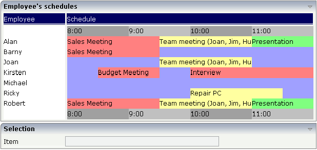
You can display a certain sequence of items, each item holding a text, a color value, a size and an identifier. When clicking on an item, a certain event is sent to your adapter and the ID of the selected item is returned to perform activities in your program.
The following topics are covered below:
| Basic | |||
| valueprop |
Name of the adapter parameter that represents the control in the adapter. It returns a semicolon separated list of schedule items. Each item is represented by a color, a width, a text and a selection id. The width is not a pixel width but represents a "portion" that this schedule item represents. Example: #FF0000\:1000;Text 1;1;#00FF00;500;Text 2;2 The total "logical width" is 1500. The first item occupies 2/3 of the width, the right item occupies 1/3 of the width. The selection is required in case you want to react on user selections. If a user clicks onto one schedule item then the adapter is notified by a certain event - the id of the schedule item is passed as reference. Please have a look into the corresponding property descriptions. |
Obligatory | |
| width |
Width of the control. There are three possibilities to define the width: (A) You do not define a width at all. In this case the width of the control will either be a default width or - in case of container controls - it will follow the width that is occupied by its content. (B) Pixel sizing: just input a number value (e.g. "100"). (C) Percentage sizing: input a percantage value (e.g. "50%"). Pay attention: percentage sizing will only bring up correct results if the parent element of the control properly defines a width this control can reference. If you specify this control to have a width of 50% then the parent element (e.g. an ITR-row) may itself define a width of "100%". If the parent element does not specify a width then the rendering result may not represent what you expect. |
Obligatory |
100 120 140 160 180 200 50% 100% |
| pixelheight |
Height of the control in pixels. |
Optional | |
| comment |
Comment without any effect on rendering and behaviour. The comment is shown in the layout editor's tree view. |
Optional | |
| Appearance | |||
| width | (already explained above) | ||
| pixelheight | (already explained above) | ||
| pixelsizemode |
A schedule line consists of sections, each one rendered with a certain width. By default the width does not represent a pixel value but represents a logical size. The width of the section depends on the logical size of one section compared with the logical size of the other sections. When switching this property to "true" then the size of the sections are interpreted as real pixel values. |
Optional |
true false |
| cellalign |
Horizontal alignment of the text inside the control's schedule items. |
Optional |
left center right |
| cellvalign |
Vertical alignement of the text inside the control's schedule items. |
Optional |
top middle bottom |
| cellstyle |
Style that is used inside the schedule item cells. Can be any CSS style. |
Optional |
background-color: #FF0000 color: #0000FF font-weight: bold |
| cellnowrap |
If switched to "true" then the text inside the schedule item cells is not broken if exceeding the size of the control - the text is cut instead. Default is "false". |
Optional |
true false |
| valign |
Vertical alignment of control in its column. Each control is "packaged" into a column. The column itself is part of a row (e.g. ITR or TR). Sometimtes the size of the column is bigger than the size of the control. In this case the "align" property specify the position of the control inside the column. |
Optional |
top middle bottom |
| colspan |
Column spanning of control. If you use TR table rows then you may sometimes want to control the number of columns your control occupies. By default it is "1" - but you may want to define the control to span over more than one columns. The property only makes sense in table rows that are snychronized within one container (i.e. TR, STR table rows). It does not make sense in ITR rows, because these rows are explicitly not synched. |
Optional |
1 2 3 4 5 50 int-value |
| rowspan |
Row spanning of control. If you use TR table rows then you may sometimes want to control the number of rows your control occupies. By default it is "1" - but you may want to define the control to span over more than one columns. The property only makes sense in table rows that are snychronized within one container (i.e. TR, STR table rows). It does not make sense in ITR rows, because these rows are explicitly not synched. |
Optional |
1 2 3 4 5 50 int-value |
| crosslineids |
Flag (true | false) that indicates that cells of different lines (within ROWTABLEAREA2) does not have same ids. If set to false the control is able to detect and skip unnecessary re-draws (performance). |
Optional |
true false |
| tablestyle |
CSS style definition that is directly passed into this control. With the style you can individually influence the rendering of the control. You can specify any style sheet expressions. Examples are: border: 1px solid #FF0000 background-color: #808080 You can combine expressions by appending and separating them with a semicolon. Sometimes it is useful to have a look into the generated HTML code in order to know where direct style definitions are applied. Press right mouse-button in your browser and select the "View source" or "View frame's source" function. |
Optional |
background-color: #FF0000 color: #0000FF font-weight: bold |
| Binding | |||
| valueprop | (already explained above) | ||
| selectmethod |
Name of the event that is sent to the adapter when the user selects one schedule item with the mouse. |
Optional | |
| selscheduleprop |
Name of an adapter parameter in which the id of the selected schedule item is passed. |
Optional | |
| seltypeprop |
Name of an adapter parameter that is used in the following way: If the user selects an item it can also be determined, if the item is selected by the left or by the right mouse button. In case the user uses the left mouse button, the value LEFT is passed into the property, which is referenced by the SELTYPEPROP property. In case the user uses the right mouse button, the value RIGHT is passed. |
Optional | |
| preselectmode |
If set to "true" then schedule items holding an id can be "preselected": the user can click on a schedule item and it is "grayed" as consequence - without directly calling the selection method. The selection method is called when double clicking onto the schedule item. Default is "false". The reaction of the control when clicking with the right mouse button remains untouched: still the selection method is called by a single right mouse button click. |
Optional |
true false |
| Vertical | |||
| verticalschedule |
Flag that indicates if the line is rendered vertically. Default is false. |
Optional |
true false |
| tooltipprop |
Name of an adapter parameter that contains the comma separated list of help texts that are displayed on mouse over (tooltip). |
Optional | |
| imageprop |
Name of an adapter parameter that returns a comma separated string of image URLs. An URL either is an absolute URL or a relative URL. If using a relative URL then be aware of that the generated page is located directly inside your project's directory. Example: "images/green.gif;;red.gif" |
Optional | |
| imageorientation |
Flag that indicates to render the image at the left or right hand of the text. |
Optional |
left right |
| dropinfoprop |
Name of the adapter parameter to that the id of the dragged cell is set. Do not use this property if you do not want to support drag and drop within the SCHEDULELINE. The server side property needs to be of type "String". |
Optional | |
| onmovemethod |
Name of the event that is sent to the adapter on drop of one cell (source) over another cell (target). Use property DROPINFOPROP to get the id of the dragged cell (source). Use SELSCHEDULEPROP to get the id of the cell that got the drop (target). |
Optional | |
| controlkeyprop |
Name of an adapter parameter to that the information is set whether the user pressed the CTRL key when selecting a cell. |
Optional | |
| Natural | |||
| njx:natname |
If a Natural variable with a name not valid for Application Designer (for instance #FIELD1) shall be bound to the control, a different name (for instance HFIELD1) can be bound instead. If the original name (in this case #FIELD1) is then specified in this attribute, the original name is generated into the parameter data area of the Natural adapter and a mapping between the two names is generated into the PROCESS PAGE statement of the Natural adapter. This mapping must not break a once defined group structure. If for instance a grid control that is bound to a name of GRID1 contains fields that are bound to FIELD1 and FIELD2 respectively, the corresponding njx:natname values may be #GRID1.#FIELD1 and #GRID1.#FIELD2, but not #GRID1.#FIELD1 and #MYGRID1.#FIELD2. |
Optional | |
| njx:natcomment |
The value of this attribute is generated as comment line into the parameter data area of the Natural adapter, before the field name. The Map Converter, for instance, uses this attributes to indicate for a generated statusprop variable to which field the statusprop belongs. |
Optional | |