
The ROWSCROLLAREA represents a container area with a certain size. The container is not visible. If the contents of the container area exceed the size of the container area, then scroll bars are added accordingly.
Have a look at the following example:
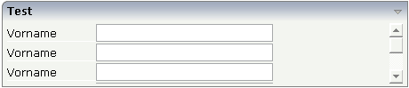
Inside a normal ROWAREA with the title "Test", a ROWSCROLLAREA is positioned. Inside the ROWSCROLLAREA, a number of lines is arranged so that the total height of the lines exceeds the height of the ROWSCROLLAREA. Consequently, a vertical scroll bar is shown on the right.
The XML layout looks as follows:
<rowarea name="Test" height="100">
    <rowscrollarea height="100%">
        <itr>
            <label name="Vorname" width="100">
            </label>
            <field valueprop="firstname" width="200">
            </field>
        </itr>
        <itr>
            <label name="Vorname" width="100">
            </label>
            <field valueprop="firstname" width="200">
            </field>
        </itr>
        <itr>
            <label name="Vorname" width="100">
            </label>
            <field valueprop="firstname" width="200">
            </field>
        </itr>
        <itr>
            <label name="Vorname" width="100">
            </label>
            <field valueprop="firstname" width="200">
            </field>
        </itr>
        <itr>
            <label name="Vorname" width="100">
            </label>
            <field valueprop="firstname" width="200">
            </field>
        </itr>
        <itr>
            <label name="Vorname" width="100">
            </label>
            <field valueprop="firstname" width="200">
            </field>
        </itr>
    </rowscrollarea>
</rowarea>
| Basic | |||
| height |
Height of the control. There are three possibilities to define the height: (A) You do not define a height at all. As consequence the control will be rendered with its default height. If the control is a container control (containing) other controls then the height of the control will follow the height of its content. (B) Pixel sizing: just input a number value (e.g. "20"). (C) Percentage sizing: input a percentage value (e.g. "50%"). Pay attention: percentage sizing will only bring up correct results if the parent element of the control properly defines a height this control can reference. If you specify this control to have a height of 50% then the parent element (e.g. an ITR-row) may itself define a height of "100%". If the parent element does not specify a width then the rendering result may not represent what you expect. |
Obligatory |
100 150 200 250 300 250 400 50% 100% |
| takefullheight |
Indicates if the content of the control's area gets the full available height. If you use percentage sizing inside the control's area then this property must be switched to 'true'. If you use no explicit vertical sizing at all - or you use vertical pixel sizing for your controls - the property must be switched to 'false'. Background information: container control's internally open up a table in which you place rows (ITR/TR) which then hold controls (e.g. LABEL/FIELD). The table that is opened up normally has no explicit height and grows with its content as consequence. By specifying "takefullheight=true" the table itself is sized to fill the maximum height of the available area. |
Optional |
true false |
| takefullwidth |
If set to "true" then the control takes all available horizontal width as its width. If set to "false" then the control does not have a predefined width but grows with its content. |
Optional |
true false |
| areastyle |
CSS style definition that is directly passed into this control. With the style you can individually influence the rendering of the control. You can specify any style sheet expressions. Examples are: border: 1px solid #FF0000 background-color: #808080 You can combine expressions by appending and separating them with a semicolon. Sometimes it is useful to have a look into the generated HTML code in order to know where direct style definitions are applied. Press right mouse-button in your browser and select the "View source" or "View frame's source" function. |
Optional |
background-color: #FF0000 color: #0000FF font-weight: bold |
| areaclass |
CSS style class definition that is directly passed into this control. The style class can be either one which is part of the "normal" CIS style sheet files (i.e. the ones that you maintain with the style sheet editor) - or it can be one of an other style sheet file that you may reference via the ADDSTYLESHEET property of the PAGE tag. |
Optional | |
| fixlayout |
The fixlayout property is important for saving rendering performance inside your browser. To become effective it requires to have specified the height and the width (if available as property) of the control. If setting fixlayout to "true" then the control's area is defined as area which is not sized dependent on its content (as normally done with table rendering). Instead the size is predefined from outside without letting the browser "look" into the content of the area. If the content is not fitting into the area then it is cut. You typically use this control if the content of the control's area is flexibly sizable. E.g. if the content (e.g. a TEXTGRID control) is following the size of the container. When using vertical percentage based sizing you should pay attention to set the fixlayout-property to "true" as often as possible. - The browser as consequence will be much faster in doing its rendering because a screen consists out of "building blocks" with simple to calculate sizes. |
Optional |
true false |
| vscrollposprop |
Name of adapter property that dynamically sets the position of the vertical scrollbar. The value top will scroll up to the top, the value bottom will scroll down to the bottom of the container. |
Optional | |
| comment |
Comment without any effect on rendering and behaviour. The comment is shown in the layout editor's tree view. |
Optional | |
| hscroll |
Definition of the horizontal scrollbar's appearance. You can define that the scrollbars only are shown if the content is exceeding the control's area ("auto"). Or scrollbars can be shown always ("scroll"). Or scrollbars are never shown - and the content is cut ("hidden"). Default is "hidden". |
Optional |
auto scroll hidden |