
The NJX:NJXFILEUPLOAD2 control is used to upload files from the client to the Natural server. The rendering is identical to the FILEUPLOAD2 control.
To use the NJX:NJXFILEUPLOAD2 control, you must also add an
NJX:OBJECTS control to your page
layout because the uploaded file will be added to the NJX:OBJECTS data
structure. Once a file is uploaded, the Natural application can refer to the
file via the CONTENTID of the uploaded object.
The following topics are covered below:
Note:
See also Documents in
Some Common Rules for all Controls.
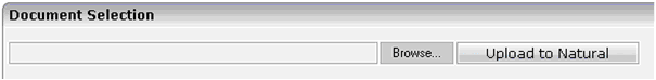
The XML layout definition is:
<itr>
   <njx:njxfileupload2 width="400" valueprop="myupload"
        withsubmitbutton="true" submitbuttonname="Upload to Natural">
   </njx:njxfileupload2>
</itr>
1 MYUPLOAD
2 CEXT (A) DYNAMIC
2 CNAME (A) DYNAMIC
2 CONTENTID (A) DYNAMIC
2 CPATH (A) DYNAMIC
When uploading a file, the client-side file name, extension and path
are provided in the CNAME, CEXT and
CPATH fields, respectively. The Natural application can optionally
specify a CONTENTID for the NJX:OBJECTS data structure. If
CONTENTID is not specified, a concatenation of file name and
extension is automatically set as the CONTENTID value.
When you choose the button
in the above example, the
value-of-valueprop.onUploadFinished
event is triggered in the Natural application. When this event is triggered,
the CNAME, CEXT, CPATH and
CONTENTID fields are filled, and the file content is provided in
the data structure of the NJX:OBJECTS control.
| Basic | |||
| width |
Width of the control. There are three possibilities to define the width: (A) You do not define a width at all. In this case the width of the control will either be a default width or - in case of container controls - it will follow the width that is occupied by its content. (B) Pixel sizing: just input a number value (e.g. "100"). (C) Percentage sizing: input a percantage value (e.g. "50%"). Pay attention: percentage sizing will only bring up correct results if the parent element of the control properly defines a width this control can reference. If you specify this control to have a width of 50% then the parent element (e.g. an ITR-row) may itself define a width of "100%". If the parent element does not specify a width then the rendering result may not represent what you expect. |
Optional |
100 120 140 160 180 200 50% 100% |
| valueprop |
Name of the adapter parameter that provides the content of the control. |
Optional | |
| withsubmitbutton |
If set to "TRUE" adds an additional button to the control to start the file upload. |
Optional |
true false |
| submitbuttonname |
The name of the submit button in case WITSUBMITBUTTON is set to "true". |
Optional | |
| submitbuttontextid |
"Textid" for the name of the submitbutton if WITHSUBMITBUTTON is set to "true". |
Optional | |
| comment |
Comment without any effect on rendering and behaviour. The comment is shown in the layout editor's tree view. |
Optional | |
| Binding | |||
| valueprop | (already explained above) | ||
| visibleprop |
Name of the adapter parameter that provides the information if this control is displayed or not. As consequence you can control the visibility of the control dynamically. |
Optional | |
| invisiblemode |
If the visibility of the control is determined dynamically by an adapter property then there are two rendering modes if the visibility is "false": (1) "invisible": the control is not visible. (2)"cleared": the control is not visible but it still occupies space. |
Optional |
invisible disabled cleared |
| Appearance | |||
| invisiblemode | (already explained above) | ||
| rowspan |
Row spanning of control. If you use TR table rows then you may sometimes want to control the number of rows your control occupies. By default it is "1" - but you may want to define the control to span over more than one columns. The property only makes sense in table rows that are snychronized within one container (i.e. TR, STR table rows). It does not make sense in ITR rows, because these rows are explicitly not synched. |
Optional |
1 2 3 4 5 50 int-value |
| colspan |
Column spanning of control. If you use TR table rows then you may sometimes want to control the number of columns your control occupies. By default it is "1" - but you may want to define the control to span over more than one columns. The property only makes sense in table rows that are snychronized within one container (i.e. TR, STR table rows). It does not make sense in ITR rows, because these rows are explicitly not synched. |
Optional |
1 2 3 4 5 50 int-value |
| darkbackground |
Normally the background is in light colour but the CIS style sheets also have a dark(er) grey colour to be used. If DARKBACKGROUND is set to true then the darker background colour is chosen. This property typically is used to integrate light coloured controls into darker container areas. |
Optional |
true false |