
The LINECHART control allows you to build line charts. This control requires that Adobe Flash Player is installed.
For each line chart, you can define a time range and render multiple series within this time range. For each series, you specify name, measures and the values you would like to see for the series.
The following topics are covered below:
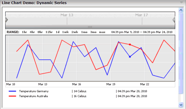
The above example shows two series in the time range of March 9th through March 24th.
Note:
The ctrllinechart example in the
Natural for Ajax demos contains a complete working example including layout and
Natural source code.
You can define series statically at design time, using the LINECHARTSERIES control. The ID, name and measure of the series is defined at design time. Only the values of this series over time are provided dynamically at runtime.
<rowarea name="Line Chart Demo: Static Series" height="100%">
  <itr takefullwidth="true" height="100%">
    <linechart linechartinfoprop="lineChartInfo"
       arrayprop="lineChartValues" startdateprop="myStartDate"
       enddateprop="myEndDate" width="100%" height="350px">
      <linechartseries id="temp" name="Temperature" measure="Celsius" color="FF6060">
      </linechartseries>
    </linechart>
  </itr>
</rowarea>
Alternatively, you can define the series themselves dynamically at runtime, using the CSVLINECHARTSERIES control.
<rowarea name="Line Chart Demo: Dynamic Series" height="100%">
  <itr takefullwidth="true" height="100%">
    <linechart linechartinfoprop="dynLineChartInfo"
       arrayprop="lineChartValues" startdateprop="myStartDate"
       enddateprop="myEndDate" width="100%" height="350px">
      <csvlinechartseries idsprop="ids" namesprop="names" measuresprop="measures" colorsprop="colors">
      </csvlinechartseries>
    </linechart>
  </itr>
</rowarea>
| Basic | |||
| linechartinfoprop |
Name of the adapter parameter that represents the line chart in the adapter. |
Obligatory | |
| arrayprop |
The line chart renders a set of items. Each item represents a point in the line chart. The ARRAYPROP attribute defines the name of the adapter parameter that represents these items. |
Obligatory | |
| startdateprop |
The line chart renders the values for a specific time range. The STARTDATEPROP attribute defines the name of the adapter parameter that provides the value for the start date. |
Obligatory | |
| enddateprop |
The line chart renders the values for a specific time range. The ENDDATEPROP attribute defines the name of the adapter parameter that provides the value for the end date. |
Obligatory | |
| width |
Width of the control. There are three possibilities to define the width: (A) You do not define a width at all. In this case the width of the control will either be a default width or - in case of container controls - it will follow the width that is occupied by its content. (B) Pixel sizing: just input a number value (e.g. "100"). (C) Percentage sizing: input a percantage value (e.g. "50%"). Pay attention: percentage sizing will only bring up correct results if the parent element of the control properly defines a width this control can reference. If you specify this control to have a width of 50% then the parent element (e.g. an ITR-row) may itself define a width of "100%". If the parent element does not specify a width then the rendering result may not represent what you expect. |
Optional |
100 120 140 160 180 200 50% 100% |
| height |
Height of the control. There are three possibilities to define the height: (A) You do not define a height at all. As consequence the control will be rendered with its default height. If the control is a container control (containing) other controls then the height of the control will follow the height of its content. (B) Pixel sizing: just input a number value (e.g. "20"). (C) Percentage sizing: input a percentage value (e.g. "50%"). Pay attention: percentage sizing will only bring up correct results if the parent element of the control properly defines a height this control can reference. If you specify this control to have a height of 50% then the parent element (e.g. an ITR-row) may itself define a height of "100%". If the parent element does not specify a width then the rendering result may not represent what you expect. |
Optional |
100 150 200 250 300 250 400 50% 100% |
| align |
Horizontal alignment of control in its column. Each control is "packaged" into a column. The column itself is part of a row (e.g. ITR or TR). Sometimes the size of the column is bigger than the size of the control itself. In this case the "align" property specifies the position of the control inside the column. In most cases you do not require the align control to be explicitly defined because the size of the column around the controls exactly is sized in the same way as the contained control. If you want to directly control the alignment of text: in most text based controls there is an explicit property "textalign" in which you align the control's contained text. |
Optional |
left center right |
| valign |
Vertical alignment of control in its column. Each control is "packaged" into a column. The column itself is part of a row (e.g. ITR or TR). Sometimtes the size of the column is bigger than the size of the control. In this case the "align" property specify the position of the control inside the column. |
Optional |
top middle bottom |
| colspan |
Column spanning of control. If you use TR table rows then you may sometimes want to control the number of columns your control occupies. By default it is "1" - but you may want to define the control to span over more than one columns. The property only makes sense in table rows that are snychronized within one container (i.e. TR, STR table rows). It does not make sense in ITR rows, because these rows are explicitly not synched. |
Optional |
1 2 3 4 5 50 int-value |
| rowspan |
Row spanning of control. If you use TR table rows then you may sometimes want to control the number of rows your control occupies. By default it is "1" - but you may want to define the control to span over more than one columns. The property only makes sense in table rows that are snychronized within one container (i.e. TR, STR table rows). It does not make sense in ITR rows, because these rows are explicitly not synched. |
Optional |
1 2 3 4 5 50 int-value |
| Basic | |||
| id |
An id which is used to identify single items or a series of items rendered from this control. |
Obligatory | |
| name |
Text that is displayed inside of this controls for a single series. |
Optional | |
| measure |
Text that is displayed inside of this control for the measure of this series. |
Optional | |
| color |
Color of the control. Value must follow format "#rrggbb", e.g. #000000 for black. |
Optional | |
| Basic | |||
| idsprop |
Name of the adapter parameter that dynamically provides a comma separated list of series ids. |
Obligatory | |
| namesprop |
Name of the adapter parameter that dynamically provides a comma separate list of series names. |
Optional | |
| measuresprop |
Name of the adapter parameter that dynamically provides a comma separate list of measure names for the series rendered in the line chart. |
Optional | |
| colorsprop |
Name of the adapter parameter that dynamically provides a comma separated list of colors used by this control. |
Optional | |