
The LABEL control is a static text. The tag has different properties to control the design of the label. It can be used to display plain text or as a headline of a grid.
By default, the label is rendered with a white line under the text. The default is suitable if a FIELD control follows the label.
The following topics are covered below:
The XML layout definition is:
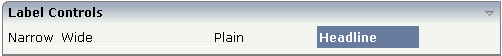
<rowarea name="Label Controls">
    <itr>
        <label name="Narrow" width="50">
        </label>
        <hdist>
        </hdist>
        <label name="Wide" width="150">
        </label>
        <hdist>
        </hdist>
        <label name="Plain" width="100" asplaintext="true">
        </label>
        <hdist>
        </hdist>
        <label name="Headline" width="100" asheadline="true">
        </label>
    </itr>
    <vdist>
    </vdist>
</rowarea>
For a better separation between the LABEL controls, horizontal distances (HDIST) were added.
Use the property textalign in order to
align the label's text. Do not use the align
property. textalign refers to the text inside the
control, align refers to the position of the
control inside the surrounding cell - if the cell is larger than the
control.
| Basic | |||
| name |
Text that is displayed inside the control. Please do not specify the name when using the multi language management - but specify a "textid" instead. |
Sometimes obligatory | |
| textid |
Multi language dependent text that is displayed inside the control. The "textid" is translated into a corresponding string at runtime. Do not specify a "name" inside the control if specifying a "textid". |
Sometimes obligatory | |
| width |
Width of the control. There are three possibilities to define the width: (A) You do not define a width at all. In this case the width of the control will either be a default width or - in case of container controls - it will follow the width that is occupied by its content. (B) Pixel sizing: just input a number value (e.g. "100"). (C) Percentage sizing: input a percantage value (e.g. "50%"). Pay attention: percentage sizing will only bring up correct results if the parent element of the control properly defines a width this control can reference. If you specify this control to have a width of 50% then the parent element (e.g. an ITR-row) may itself define a width of "100%". If the parent element does not specify a width then the rendering result may not represent what you expect. |
Sometimes obligatory |
100 120 140 160 180 200 50% 100% |
| comment |
Comment without any effect on rendering and behaviour. The comment is shown in the layout editor's tree view. |
Optional | |
| Appearance | |||
| nowrap |
If the textual content of the control exceeds the size of the control then the browser automatically breaks the line and arranges the text accordingly. You can avoid this behaviour by setting NOWRAP to "true". No line break will be performed by the browser. |
Optional |
true false |
| width | (already explained above) | ||
| height |
Height of the control. There are three possibilities to define the height: (A) You do not define a height at all. As consequence the control will be rendered with its default height. If the control is a container control (containing) other controls then the height of the control will follow the height of its content. (B) Pixel sizing: just input a number value (e.g. "20"). (C) Percentage sizing: input a percentage value (e.g. "50%"). Pay attention: percentage sizing will only bring up correct results if the parent element of the control properly defines a height this control can reference. If you specify this control to have a height of 50% then the parent element (e.g. an ITR-row) may itself define a height of "100%". If the parent element does not specify a width then the rendering result may not represent what you expect. |
Optional |
100 150 200 250 300 250 400 50% 100% |
| asheadline |
If set to true, the label has a dark background and the text is written in white (if using the standard style sheet). You may use this rendering style is you use labels as headlines of control grids (ROWTABLEAREA2 control). |
Optional |
true false |
| asplaintext |
If set to true, no white line is drawn under the label text (if using the standard style sheet). You may use this rendering style if the label is used to name a RADIOBUTTON control or a CHECKBOX control. |
Optional |
true false |
| textalign |
Horizontal alignment of the text that is shown. |
Optional |
left center right |
| cuttext |
Boolean property defining the rendering if the text of the label does not fit into the defined width. If "true" then the text is cut - the part that does not fit is hidden. If "false" then the browser opens a second line. Default is "false". |
Optional |
true false |
| labelstyle |
CSS style definition that is directly passed into this control. With the style you can individually influence the rendering of the control. You can specify any style sheet expressions. Examples are: border: 1px solid #FF0000 background-color: #808080 You can combine expressions by appending and separating them with a semicolon. Sometimes it is useful to have a look into the generated HTML code in order to know where direct style definitions are applied. Press right mouse-button in your browser and select the "View source" or "View frame's source" function. |
Optional |
background-color: #FF0000 color: #0000FF font-weight: bold |
| labelstyleclass |
CSS style class used for rendering. |
Optional | |
| stylevariant |
Some controls offer the possibility to define style variants. By this style variant you can address different styles inside your style sheet definition file (.css). If not defined "normal" styles are chosen, if defined (e.g. "VAR1") then other style definitions (xxxVAR1xxx) are chosen. Purpose: you can set up style variants in the style sheet defintion and use them multiple times by addressing them via the "stylevariant" property. CIS currently offerst two variants "VAR1" and "VAR2" but does not predefine any semantics behind - this is up to you! |
Optional |
VAR1 VAR2 VAR3 VAR4 |
| align |
Horizontal alignment of control in its column. Each control is "packaged" into a column. The column itself is part of a row (e.g. ITR or TR). Sometimes the size of the column is bigger than the size of the control itself. In this case the "align" property specifies the position of the control inside the column. In most cases you do not require the align control to be explicitly defined because the size of the column around the controls exactly is sized in the same way as the contained control. If you want to directly control the alignment of text: in most text based controls there is an explicit property "textalign" in which you align the control's contained text. |
Optional |
left center right |
| valign |
Vertical alignment of control in its column. Each control is "packaged" into a column. The column itself is part of a row (e.g. ITR or TR). Sometimtes the size of the column is bigger than the size of the control. In this case the "align" property specify the position of the control inside the column. |
Optional |
top middle bottom |
| colspan |
Column spanning of control. If you use TR table rows then you may sometimes want to control the number of columns your control occupies. By default it is "1" - but you may want to define the control to span over more than one columns. The property only makes sense in table rows that are snychronized within one container (i.e. TR, STR table rows). It does not make sense in ITR rows, because these rows are explicitly not synched. |
Optional |
1 2 3 4 5 50 int-value |
| rowspan |
Row spanning of control. If you use TR table rows then you may sometimes want to control the number of rows your control occupies. By default it is "1" - but you may want to define the control to span over more than one columns. The property only makes sense in table rows that are snychronized within one container (i.e. TR, STR table rows). It does not make sense in ITR rows, because these rows are explicitly not synched. |
Optional |
1 2 3 4 5 50 int-value |
| invisiblemode |
If the visibility of the control is determined dynamically by an adapter property then there are two rendering modes if the visibility is "false": (1) "invisible": the control is not visible. (2)"cleared": the control is not visible but it still occupies space. |
Optional |
invisible cleared |
| Binding | |||
| visibleprop |
Name of the adapter parameter that provides the information if this control is displayed or not. As consequence you can control the visibility of the control dynamically. |
Optional | |
| nameprop |
Name of adapter parameter which dynamically provides the text that is shown inside the control. |
Optional | |
| Online Help | |||
| title |
Text that is shown as tooltip for the control. Either specify the text "hard" by using this TITLE property - or use the TITLETEXTID in order to define a language dependent literal. |
Optional | |
| titletextid |
Text ID that is passed to the multi lanaguage management - representing the tooltip text that is used for the control. |
Optional | |