
The GOOGLEMAP control is used to provide for Google Maps support within Application Designer pages.
The following topics are covered below:
The GOOGLEMAP control internally makes use of the Google Maps JavaScript API v3. In order to use the GOOGLEMAP control in production, you should obtain an API key from Google. This key is not necessarily required during development. For information on how to obtain an API key, see https://developers.google.com/maps/documentation/javascript/tutorial#api_key.
When using the GOOGLEMAP control, a Google API subpage is needed. Store this page in the registered project directory. You are free in naming the file. The file extension, however, must be .html.
The Google API subpage must have the following minimum structure:
<html>
  <head>
    <script type="text/javascript" src="//maps.googleapis.com/maps/api/js?sensor=false"></script>
    <script src="../../HTMLBasedGUI/general/googlemapsscript.js"></script>
  </head>
  <body>
    <div id="map"></div>
  </body>
</html>
You can add the API key to the Google API subpage in the following way:
<script type="text/javascript" src="//maps.googleapis.com/maps/api/js?key=YOUR_API_KEY&sensor=false"></script>
where the placeholder YOUR_API_KEY stands for your API key.
In your Natural program, you can set the address (or latitude and longitude) and optionally the zoom level.
Note:
The usage of address or longitude/latitude is mutually
exclusive.
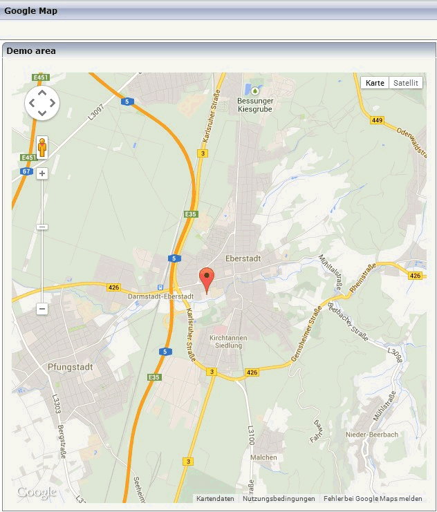
For example, when you specify "Uhlandstrasse 12, 64297 Darmstadt, Germany" as the address value, the following map is shown.
If you use longitude and latitude for placing the marker on the map, their values may exceed the map top (or bottom) border. If you are able to find the map by scrolling down (or up), then this is the case. Check the values for longitude and latitude in this case.
| Basic | |||
| addressprop |
Name of adapter parameter that returns the address to be displayed - e.g. "New York" or "1600 Amphitheatre Pky, Mountain View, CA" |
Optional | |
| longitudeprop |
Name of the adapter parameter that returns the longitude in decimal format. Example: in order to display Palo Alto (United States) return "-122.1419". Return "1000.0" in order to hide the map. |
Optional | |
| latitudeprop |
Name of the adapter parameter that returns the latitude in decimal format. Example: in order to display Palo Alto (United States) return "34.4419". Return "1000.0" in order to hide the map. |
Optional | |
| apikeypagename |
Name of the Maps API Key page. Example: mygooglemapsapikey.html. Keep this file within the project directory (directory within the CIS HTML pages are kept). The GOOGLEMAP-control expects this file within certain Javascript includes and content. Have look into chapter "Google Map - Before You Start" within the Developers Guide |
Optional | |
| width |
Width of the control. There are three possibilities to define the width: (A) You do not define a width at all. In this case the width of the control will either be a default width or - in case of container controls - it will follow the width that is occupied by its content. (B) Pixel sizing: just input a number value (e.g. "100"). (C) Percentage sizing: input a percantage value (e.g. "50%"). Pay attention: percentage sizing will only bring up correct results if the parent element of the control properly defines a width this control can reference. If you specify this control to have a width of 50% then the parent element (e.g. an ITR-row) may itself define a width of "100%". If the parent element does not specify a width then the rendering result may not represent what you expect. |
Optional |
100 120 140 160 180 200 50% 100% |
| height |
Height of the control. There are three possibilities to define the height: (A) You do not define a height at all. As consequence the control will be rendered with its default height. If the control is a container control (containing) other controls then the height of the control will follow the height of its content. (B) Pixel sizing: just input a number value (e.g. "20"). (C) Percentage sizing: input a percentage value (e.g. "50%"). Pay attention: percentage sizing will only bring up correct results if the parent element of the control properly defines a height this control can reference. If you specify this control to have a height of 50% then the parent element (e.g. an ITR-row) may itself define a height of "100%". If the parent element does not specify a width then the rendering result may not represent what you expect. |
Optional |
100 150 200 250 300 250 400 50% 100% |
| comment |
Comment without any effect on rendering and behaviour. The comment is shown in the layout editor's tree view. |
Optional | |
| Appearance | |||
| width | (already explained above) | ||
| height | (already explained above) | ||
| mapmode |
Lets you toggle between map types (e.g., Map and Satellite) |
Optional |
1 2 |
| controltype |
Lets you toggle between a small and large pan/zoom control |
Optional |
small large |
| infotextprop |
Name of the adapter parameter that provides for an additional help text. If used the text is displayed within an info window that points to the center of the map. |
Optional | |
| pagestyle |
CSS style definition that is directly passed into this control. With the style you can individually influence the rendering of the control. You can specify any style sheet expressions. Examples are: border: 1px solid #FF0000 background-color: #808080 You can combine expressions by appending and separating them with a semicolon. Sometimes it is useful to have a look into the generated HTML code in order to know where direct style definitions are applied. Press right mouse-button in your browser and select the "View source" or "View frame's source" function. |
Optional | |
| colspan |
Column spanning of control. If you use TR table rows then you may sometimes want to control the number of columns your control occupies. By default it is "1" - but you may want to define the control to span over more than one columns. The property only makes sense in table rows that are snychronized within one container (i.e. TR, STR table rows). It does not make sense in ITR rows, because these rows are explicitly not synched. |
Optional |
1 2 3 4 5 50 int-value |
| rowspan |
Row spanning of control. If you use TR table rows then you may sometimes want to control the number of rows your control occupies. By default it is "1" - but you may want to define the control to span over more than one columns. The property only makes sense in table rows that are snychronized within one container (i.e. TR, STR table rows). It does not make sense in ITR rows, because these rows are explicitly not synched. |
Optional |
1 2 3 4 5 50 int-value |
| Binding | |||
| latitudeprop | (already explained above) | ||
| longitudeprop | (already explained above) | ||
| zoomlevelprop |
Name of the adapter parameter that provides for the zoom level (integer). Default value is 4. |
Optional | |
| infotextprop | (already explained above) | ||