
As mentioned in the previous section, each control is automatically embedded into a column. Consequently, the width of the control is, on the one hand, determined by the size of the control itself - on the other hand, the column is part of a table row and also follows the table row's sizing.
This document covers the following topics:
Every control that allows width sizing offers a corresponding
width property. In this property, you put either
an absolute pixel value (width="100") or a percentage value
(width="50%"). The rendering follows the strategy:
If the width of a control is specified as a pixel value, the width is
fixed: if the browser screen is too small to display all controls, the controls
will not be reduced but keep their pixel size. Depending on your settings in
the PAGEBODY tag (hscroll property), the displayed
elements will be cut off or will be accessible by a scroll bar.
If the width of a control is defined as a percentage value
(width="50%"), HTML renders the control accordingly. If the screen
is too small to show all controls, the browser will try to reduce elements
according to the table rendering rules.
If you define the width of a control as a percentage value, the width relates to
the width of the area in case of using TR rows, or to
the width definition of the ITR row if using ITR rows. This width definition can either be absolute or percentage-based.
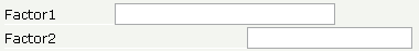
The following example shows a page in which controls hold percentages values for the width:
<itr takefullwidth="true">
    <label name="Factor1" width="20%">
    </label>
    <field valueprop="factor1" width="80%">
    </field>
</itr>
<itr takefullwidth="true">
    <label name="Factor2" width="20%">
    </label>
    <field valueprop="factor2" width="60%">
    </field>
    <hdist width="20%">
    </hdist>
The HTML page looks as follows - the size of the controls changes according to their percentage definition:
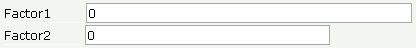
A similar screen is now built using absolutely defined pixel sizes:
<itr takefullwidth="false">
    <label name="Factor1" width="100">
    </label>
    <field valueprop="factor1" width="200">
    </field>
</itr>
<itr takefullwidth="true">
    <label name="Factor2" width="100">
    </label>
    <field valueprop="factor2" width="150">
    </field>
</itr>
In the ITR definition, there is no width
specification - therefore, the controls will occupy exactly the space they
require. The result looks as follows - the size of the controls will not change
when changing the screen size:
Pay attention to what was said previously: Controls are placed into
columns; columns are placed into table rows; and table rows are placed into
containers. If you place a control into a row and define this control to have a
width of 100%, then the elements "above" have to take care of
providing the space to which the control relates its
"100%". More concrete: If you place a FIELD control
with a width of 100% into an ITR row that does not provide for a width of 100%
itself (using the property takefullwidth), then
the result will be a minimum-width field (100% of nothing).
Pixel sizing represents a bottom-up sizing approach: a control defines its width - all the other controls around (e.g. the container in which the control is placed) have as a consequence to adapt to the control's size: if the control is defined to occupy more space, then the container has to follow and provide for the space.
Percentage sizing represents a top-down sizing approach: the inner control tells how many percentages of the space that is granted from the outer control is occupied. As a consequence the outer control needs to define its size properly. Either the outer control itself defines a pixel size or it itself defines a percentage size - thus passig the respsonsibility to the next higher level. This might end up in a casacading defintion of "percentage sizing" - up to the PAGEBODY control, which is the outer-most container of a page.
There are four commonly used properties for sizing:
width/height
- this is the quite obvious definition as explained in this section.
takefullwidth/takefullheight
- this is an equivalent to width="100%" and
height="100%".
HDIST means "horizontal distance". VDIST means "vertical distance".
The HDIST control represents a distance to be placed between controls. The distance itself holds a certain width that again can either be a pixel width or a percentage width.
The following example shows a table row into which a town and a zip code is put:
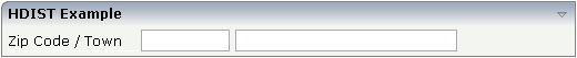
Between the two FIELD controls, you see a small distance that separates the fields from one another. The corresponding XML layout definition is:
<rowarea name="HDIST Example">
    <itr>
        <label name="Zip Code / Town" width="120">
        </label>
        <field valueprop="zipcode" width="80">
        </field>
        <hdist width="5">
        </hdist>
        <field valueprop="town" width="200">
        </field>
    </itr>
</rowarea>
The HDIST control is also very useful for percentage-based sizing of widths. If you want a control to occupy 50% of the available width, you have to "fill the gap" in the following way:
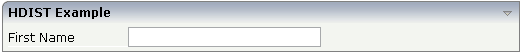
The corresponding XML layout definition is:
<rowarea name="HDIST Example">
    <itr height="100%">
        <label name="First Name" width="120">
        </label>
        <field valueprop="fname" width="50%">
        </field>
        <hdist width="50%">
        </hdist>
    </itr>
</rowarea>
Pay attention: when using percentage sizing, then you should take care of filling the "100%" by the controls inside the row. Otherwise, the browser will distribute the remaining space to its columns - i.e. the controls will not be positioned the way you expect.
The VDIST control is the counterpart of the HDIST control - in vertical direction. The following example shows a scenario in which the line containing the BUTTON control keeps a vertical distance of 10 pixels from the lines containing the FIELD controls:
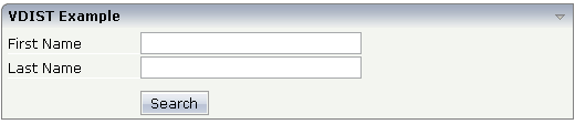
The layout definition is:
<rowarea name="VDIST Example">
    <itr height="100%">
        <label name="First Name" width="120">
        </label>
        <field valueprop="fname" width="200">
        </field>
    </itr>
    <itr height="100%">
        <label name="Last Name" width="120">
        </label>
        <field valueprop="lname" width="200">
        </field>
    </itr>
    <vdist height="10">
    </vdist>
    <itr>
        <hdist width="120">
        </hdist>
        <button name="Search" method="onSearch">
        </button>
    </itr>
</rowarea>
Note that an HDIST control is used in the line containing the BUTTON control to align the button to the fields.
| Basic | |||
| width |
Width of the HDIST control, either in pixels or as percentage value. If no width is defined then a default width of 2 pixels is assigned. |
Optional |
100 120 140 160 180 200 50% 100% |
| comment |
Comment without any effect on rendering and behaviour. The comment is shown in the layout editor's tree view. |
Optional | |
| Binding | |||
| visibleprop |
Name of the adapter parameter that provides the information if this control is displayed or not. As consequence you can control the visibility of the control dynamically. |
Optional | |
| Basic | |||
| height |
Height of the VDIST control, either in pixels or as percentage value. If no width is defined then a default width of 3 pixels is assigned. |
Optional |
100 150 200 250 300 250 400 50% 100% |
| backgroundstyle |
CSS style definition that is directly passed into this control. With the style you can individually influence the rendering of the control. You can specify any style sheet expressions. Examples are: border: 1px solid #FF0000 background-color: #808080 You can combine expressions by appending and separating them with a semicolon. Sometimes it is useful to have a look into the generated HTML code in order to know where direct style definitions are applied. Press right mouse-button in your browser and select the "View source" or "View frame's source" function. |
Optional |
background-color: #FF0000 color: #0000FF font-weight: bold |
| comment |
Comment without any effect on rendering and behaviour. The comment is shown in the layout editor's tree view. |
Optional | |
Each control has a colspan and
rowspan property that is
"1" by default. This definition is directly
transferred to the column definition that is placed around the control.
Example:
<tr>
  <control colspan="2">
  </control>
</tr>
If you specify the above definition, the created HTML code looks like this:
<tr>
  <td colspan="2" rowspan="1">
    ... control-specific HTML code ...
  </td>
</tr>
The usage of rowspan and
colspan only makes sense in scenarios in which you
define multiple rows inside one container and if you use TR rows at the same
time. You do not have to pay attention to them if working in ITR rows.
Again: first check if the TR way of arranging controls is really the
best approach - compared to the ITR approach. Using TR means you have to
"fight" with colspan and
rowspan definitions in order to properly lay out
your controls. With ITR, each row is independently defined from its neighbor
rows.
Inside one row, you can place controls or nested containers. Containers again allow you to specify new rows inside the container.
There is a special control, the CELLSPAN control. With the CELLSPAN
control, you can quickly define one cell inside a row of a container to place
other controls. The CELLSPAN control has a width
property to specify the width of its inner content.
Have a look at the following example:
<rowarea name="Cellspan Example">
    <tr>
        <label name="Factor 1" width="25%">
        </label>
        <field valueprop="factor1" width="25%">
        </field>
        <hdist></hdist>
        <cellspan width="50%">
            <label name="Factor 1" width="50%">
            </label>
            <field valueprop="factor1" width="50%">
            </field>
        </cellspan>
    </tr>
    <tr>
        <label name="Factor 2" width="25%">
        </label>
        <field valueprop="factor2" width="25%">
        </field>
        <hdist></hdist>
        <cellspan width="50%">
            <checkbox valueprop="activated" width="10%">
            </checkbox>
            <label name="Activated" width="40%" asplaintext="true">
            </label>
            <checkbox valueprop="generated" width="10%">
            </checkbox>
            <label name="Generated" width="40%" asplaintext="true">
           </label>
        </cellspan>
    </tr>
</rowarea>
Each TR row contains one CELLSPAN definition with a width of 50%. The inner content of the CELLSPAN definitions is completely different between the rows:
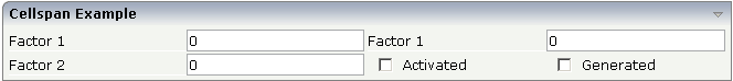
You could add controls to the CELLSPAN definition in the first row without any implications inside the second row. The CELLSPAN control internally operates similar to the ITR control: it builds a table on its own and decouples its content from the surrounding table rendering.
| Basic | |||
| width |
Width of the control. There are three possibilities to define the width: (A) You do not define a width at all. In this case the width of the control will either be a default width or - in case of container controls - it will follow the width that is occupied by its content. (B) Pixel sizing: just input a number value (e.g. "100"). (C) Percentage sizing: input a percantage value (e.g. "50%"). Pay attention: percentage sizing will only bring up correct results if the parent element of the control properly defines a width this control can reference. If you specify this control to have a width of 50% then the parent element (e.g. an ITR-row) may itself define a width of "100%". If the parent element does not specify a width then the rendering result may not represent what you expect. |
Optional |
100 120 140 160 180 200 50% 100% |
| height |
Height of the control. There are three possibilities to define the height: (A) You do not define a height at all. As consequence the control will be rendered with its default height. If the control is a container control (containing) other controls then the height of the control will follow the height of its content. (B) Pixel sizing: just input a number value (e.g. "20"). (C) Percentage sizing: input a percentage value (e.g. "50%"). Pay attention: percentage sizing will only bring up correct results if the parent element of the control properly defines a height this control can reference. If you specify this control to have a height of 50% then the parent element (e.g. an ITR-row) may itself define a height of "100%". If the parent element does not specify a width then the rendering result may not represent what you expect. |
Optional |
100 150 200 250 300 250 400 50% 100% |
| title |
Text that is shown as tooltip for the control. Either specify the text "hard" by using this TITLE property - or use the TITLETEXTID in order to define a language dependent literal. |
Optional | |
| titletextid |
Text ID that is passed to the multi lanaguage management - representing the tooltip text that is used for the control. |
Optional | |
| colspan |
Column spanning of control. If you use TR table rows then you may sometimes want to control the number of columns your control occupies. By default it is "1" - but you may want to define the control to span over more than one columns. The property only makes sense in table rows that are snychronized within one container (i.e. TR, STR table rows). It does not make sense in ITR rows, because these rows are explicitly not synched. |
Optional |
1 2 3 4 5 50 int-value |
| colspanprop |
Name of the adapter parameter which dynamically provides a colspan value at runtime. |
Optional | |
| rowspan |
Row spanning of control. If you use TR table rows then you may sometimes want to control the number of rows your control occupies. By default it is "1" - but you may want to define the control to span over more than one columns. The property only makes sense in table rows that are snychronized within one container (i.e. TR, STR table rows). It does not make sense in ITR rows, because these rows are explicitly not synched. |
Optional |
1 2 3 4 5 50 int-value |
| cellstyle |
CSS style definition that is directly passed into this control. With the style you can individually influence the rendering of the control. You can specify any style sheet expressions. Examples are: border: 1px solid #FF0000 background-color: #808080 You can combine expressions by appending and separating them with a semicolon. Sometimes it is useful to have a look into the generated HTML code in order to know where direct style definitions are applied. Press right mouse-button in your browser and select the "View source" or "View frame's source" function. |
Optional |
background-color: #FF0000 color: #0000FF font-weight: bold |
| comment |
Comment without any effect on rendering and behaviour. The comment is shown in the layout editor's tree view. |
Optional | |
| backgroundclass |
CSS style class definition that is directly passed into this control. The style class can be either one which is part of the "normal" CIS style sheet files (i.e. the ones that you maintain with the style sheet editor) - or it can be one of an other style sheet file that you may reference via the ADDSTYLESHEET property of the PAGE tag. |
Optional | |
This is a collection of rules you should consider when positioning controls inside containers:
Make up your mind where to use relative percentage values or absolute pixel definitions.
Do not mix percentage and pixel values inside one container.
Internally, Application Designer controls are mapped to the HTML tags
TABLE, TR and
TD. When developing, you should have in mind the
normal HTML table management.
Structure your container not as one big container holding one complex table, each row holding a lot of controls. Instead, use the possibility to define nested containers or CELLSPAN controls in order to structure your layout.