
This document covers the following topics:
The following example shows a simple client tree:
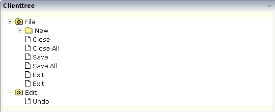
The XML layout definition is:
<rowarea name="Clienttree">
    <clienttree treecollectionprop="tree" height="200" withplusminus="true"
                treestyle="background-color:#FEFEEE">
    </clienttree>
</rowarea>
In this example, the client tree is directly put as row into the ROWAREA
container. The property treecollectionprop
contains a reference to the property tree which
contains the net data of the tree. With the property
treestyle, an explicit background color is
set.
In the parameter data area of the adapter, the tree data is represented by the following data structure:
1 TREE (1:*)
2 LEVEL (I4)
2 OPENED (I4)
2 SELECTED (L)
2 TEXT (U) DYNAMIC
value-of-treecollectionprop.reactOnContextMenuRequest
value-of-treecollectionprop.reactOnSelect
value-of-treecollectionprop.reactOnToggle
| Basic | |||
| treecollectionprop |
Name of the adapter parameter that represents the control in the adapter. |
Optional | |
| height |
Height of the control. There are three possibilities to define the height: (A) You do not define a height at all. As consequence the control will be rendered with its default height. If the control is a container control (containing) other controls then the height of the control will follow the height of its content. (B) Pixel sizing: just input a number value (e.g. "20"). (C) Percentage sizing: input a percentage value (e.g. "50%"). Pay attention: percentage sizing will only bring up correct results if the parent element of the control properly defines a height this control can reference. If you specify this control to have a height of 50% then the parent element (e.g. an ITR-row) may itself define a height of "100%". If the parent element does not specify a width then the rendering result may not represent what you expect. |
Optional |
100 150 200 250 300 250 400 50% 100% |
| comment |
Comment without any effect on rendering and behaviour. The comment is shown in the layout editor's tree view. |
Optional | |
| Appearance | |||
| withplusminus |
If set to "true" then +/- Icons will be rendered in front of the tree items. |
Optional |
true false |
| withtooltip |
If set to "true" then the text of an item is also available as tool tip. Use this option in case you expect that the horizontal space of the item will not be sufficient to display the whole text of the item. |
Optional |
true false |
| selectionvisible |
If set to "true" then the clicked item will also marked with a certain background color. The background color is defined by the style sheet settings. |
Optional |
true false |
| singleselect |
If set to "true" then only one item can be selected. If set to "false" then multiple icons can be selected. |
Optional |
true false |
| imageopened |
Image of a tree node that has subnodes and that is currently showing its nodes. The image either is defined statically by this property or also may be defined dynamically - see the corresponding properties defined with this control. |
Optional | |
| imageclosed |
Image of a tree node that has subnodes and that is currently not showing its nodes. The image either is defined statically by this property or also may be defined dynamically - see the corresponding properties defined with this control. |
Optional | |
| imageendnode |
Image of a tree node that is an end node (leaf node). The image either is defined statically by this property or also may be defined dynamically - see the corresponding properties defined with this control. |
Optional | |
| treestyle |
Style (following cascading style sheet definitions) that is directly passed to the background area of the client tree. You can manipulate e.g. the colour of the tree's background. The style can also be set dynamically by specifying the property TREESTYLEPROP. |
Optional | |
| selectionstylevariant |
Some controls offer the possibility to define style variants. By this style variant you can address different styles inside your style sheet definition file (.css). If not defined "normal" styles are chosen, if defined (e.g. "VAR1") then other style definitions (xxxVAR1xxx) are chosen. Purpose: you can set up style variants in the style sheet defintion and use them multiple times by addressing them via the "stylevariant" property. CIS currently offerst two variants "VAR1" and "VAR2" but does not predefine any semantics behind - this is up to you! |
Optional |
VAR1 VAR2 |
| hscroll |
Definition of the horizontal scrollbar's appearance. You can define that the scrollbars only are shown if the content is exceeding the control's area ("auto"). Or scrollbars can be shown always ("scroll"). Or scrollbars are never shown - and the content is cut ("hidden"). Default is "auto". |
Optional |
auto scroll hidden |
| pixelshift |
Number of pixels that each hierarchy level is indented. If not defined then a standard is used. |
Optional |
1 2 3 int-value |
| pixelshiftendnode |
Number of pixels that end nodes are indented. If not defined then a standard is used. |
Optional |
1 2 3 int-value |
| tabindex |
Index that defines the tab order of the control. Controls are selected in increasing index order and in source order to resolve duplicates. |
Optional |
-1 0 1 2 5 10 32767 |
| withleftpadding |
Flag that indicates if the control has a 10 pixel padding on left side. Default is true. |
Optional |
true false |
| Binding | |||
| treecollectionprop | (already explained above) | ||
| dynamicloading |
If set to "true" then you indicate to the tree control that not all tree information may be loaded when initializing the tree (i.e. the tree collection on server side). As consequence the tree control will pass the "toggle-event" to the server - in case the subnodes of a certain nodes are not yet loaded. In the case the toggle event is passed to the server, the method onToggle() is called inside the tree item. |
Optional |
true false |
| imageopenedprop |
Name of the adapter parameter that provides the image URL which is shown for opened tree nodes or end tree nodes. The value may be different from tree node to tree node. Each tree node may have an own image. |
Optional | |
| imageclosedprop |
Name of the adapter parameter that provides for the image URL which is shown for closed tree nodes. The value may be different from tree node to tree node. Each tree node may have an own image. |
Optional | |
| treestyleprop |
name of the adapter parameter that dynamically provides for a style value that is passed to the control's area (background of the client tree). You can as consequence e.g. define the background-colour of the tree dependent on your server side logic. |
Optional | |
| treeclassprop |
Name of the adapter parameter that passes back the name of a style sheet class that is taken to render the client tree's background area. - Similar to the property TREESTYLEPROP, but now a style class is passed, not the style itself. |
Optional | |
| tooltipprop |
Name of the adapter parameter that provides for a text that is shown if the user moves the mouse over the tree item (tooltip). |
Optional | |
| oncontextmenumethod |
Name of the event that is sent to the adapter when the user presses the right mouse button in an empty area of the client tree. |
Optional | |
| directselectevent |
Event that represents a tree node selection. A tree node selection is done when the user clicks/doubleclicks on the tree node text. In this case the select() method is called in the corresponding node object on server side. |
Optional |
ondblclick onclick |
| focusedprop |
Name of the adapter parameter that indicates if the row receives the keyboard focus. If more than one lines are returning "true", the first of them is receiving the focus. |
Optional | |
| Drag and Drop | |||
| enabledrag |
If set to true then drag and drop is enabled within the tree. |
Optional |
true false |