
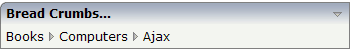
The BREADCRUMB control represents a horizontal list of links. The number of links and the name of each link is dynamically controlled by the application.
The control always occupies 100% of the given width.
The following topics are covered below:
The XML layout definition is:
<rowarea name="Bread Crumbs...">
    <breadcrumb breadcrumbprop="items">
    </breadcrumb>
</rowarea>
1 ITEMS (1:*)
2 STYLE (U) DYNAMIC
2 TEXT (U) DYNAMIC
2 TOOLTIP (U) DYNAMIC
1 ITEMSINFO
2 SELECTEDITEM (I4)
value-of-breadcrumbprop.onSelect
| Basic | |||
| breadcrumbprop |
Name of the adapter parameter that represents the control in the adapter. |
Obligatory | |
| breadcrumbstyle |
CSS style definition that is directly passed into this control. With the style you can individually influence the rendering of the control. You can specify any style sheet expressions. Examples are: border: 1px solid #FF0000 background-color: #808080 You can combine expressions by appending and separating them with a semicolon. Sometimes it is useful to have a look into the generated HTML code in order to know where direct style definitions are applied. Press right mouse-button in your browser and select the "View source" or "View frame's source" function. |
Optional |
background-color: #FF0000 color: #0000FF font-weight: bold |
| pixeldistance |
Pixel distance between the links that are rendered. |
Optional |
1 2 3 int-value |
| comment |
Comment without any effect on rendering and behaviour. The comment is shown in the layout editor's tree view. |
Optional | |