Mobile Controls
A set of controls and containers for building mobile applications is available. The controls and containers support responsiveness, which means that the pages automatically adapt to various screen sizes. The controls are built with Bootstrap (http://getbootstrap.com/). You will find running samples built with these controls and containers in the Natural Ajax Demos.
Creating Mobile Pages
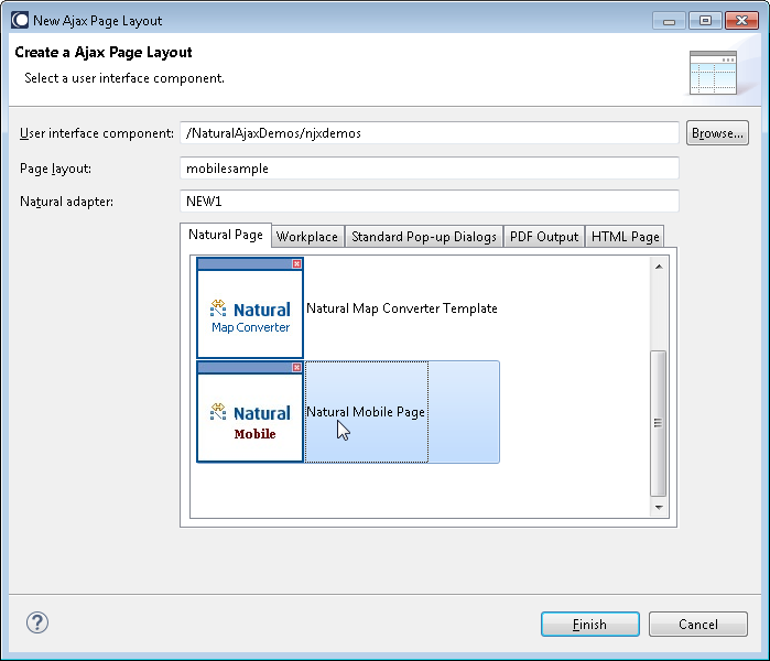
To create layout pages for mobile applications use the Natural Mobile Page template.
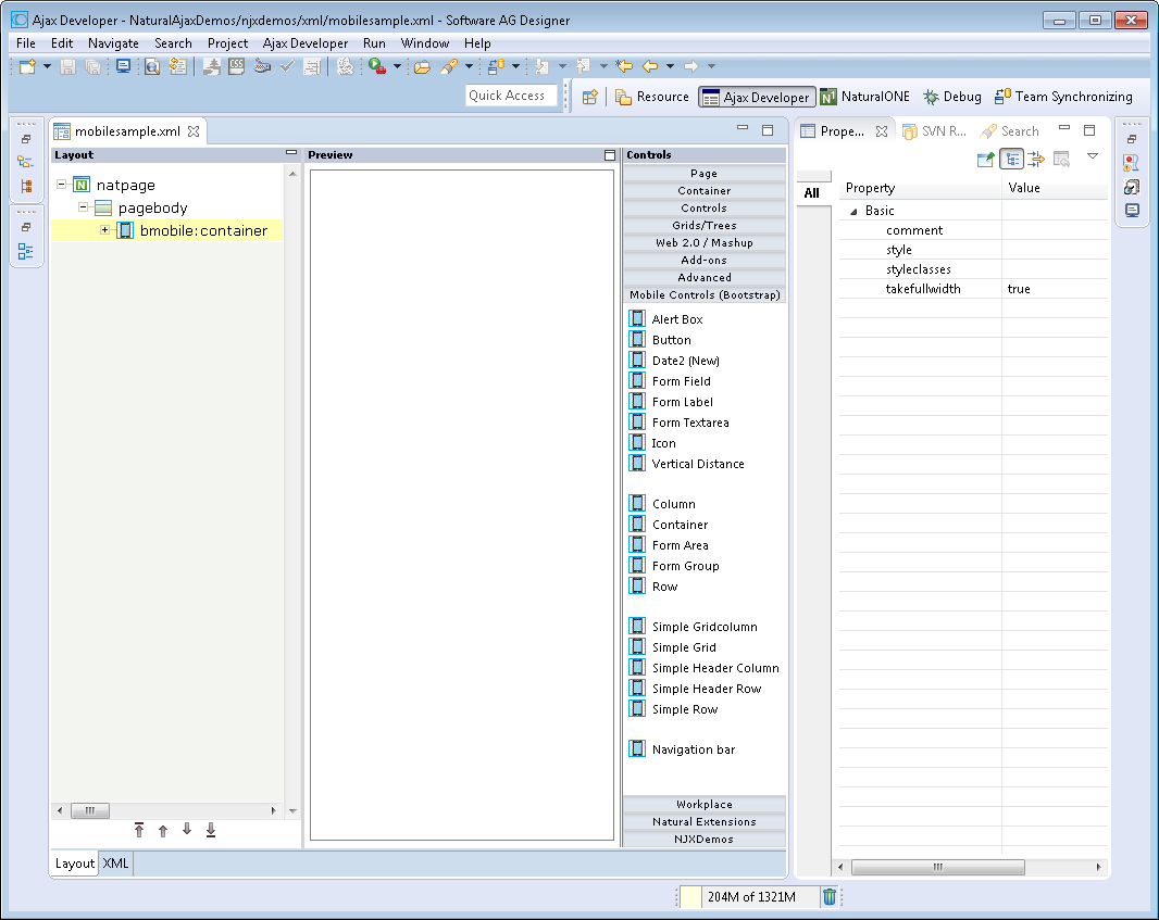
The wizard will create a page layout with responsive containers. You can now add controls from the Mobile Controls (Bootstrap) group of the palette to your layout in the usual way.
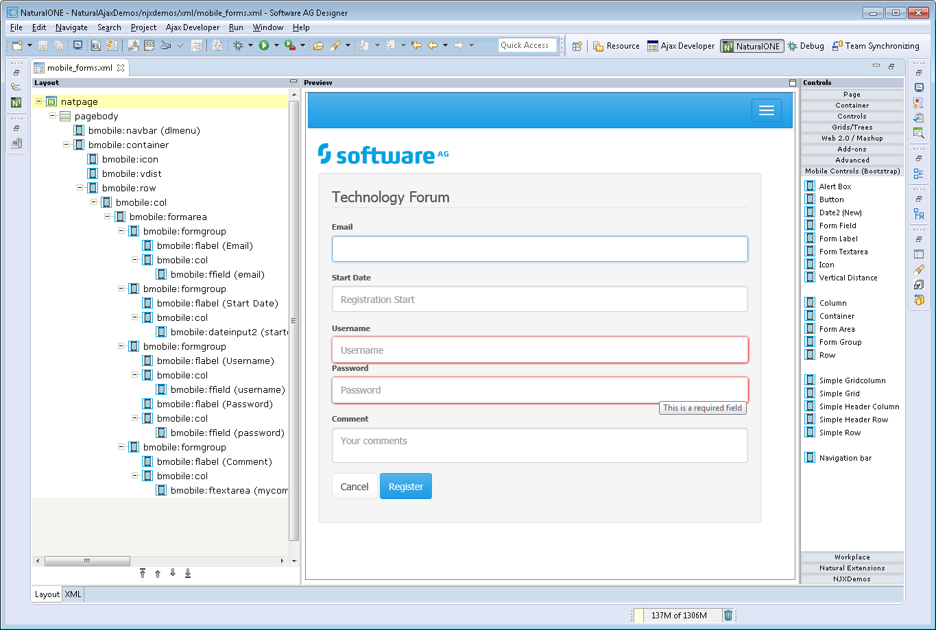
To see the rendering in the preview area set HTML as Layout display mode in the Ajax Developer properties of your project. The following shows the mobile_forms.xml example layout of the Natural Ajax Demos in the Layout Painter.
First Steps towards Responsiveness
The responsiveness of a layout is based on style classes. For controls and containers the major responsive style classes are applied automatically, which defines the basic functionality for this control/container in a responsive way. You can add your own additional style classes or style classes supported by the Bootstrap framework to the controls to customize the rendering.
Example
You could add the style classes .
.img-rounded or . .img-circle to an IMAGEOUT
control to add rounded corners to the image or to shape the image to a circle.
Here you can find the major style classes supported by the Bootstrap framework:
http://www.w3schools.com/bootstrap/.
The responsive sizing of rows and columns in a page is also based on style classes. The basis for this is the grid system of Bootstrap. This system allows up to 12 columns across the page. You can specify different dimensions for your rows and columns depending on the devices. This means: Instead of directly applying pixel or percentage width to your controls, you specify style classes defining the number of columns this control is supposed to occupy on a device.
Example
Check out the running examples in the Natural Ajax Demos to get an impression.
Responsive Controls
BMOBILE:ALERT
This control is similar to the STATUSBAR control but more flexible. Use this control to show success or failure of an action.
Properties
| Basic | |||
| typeprop |
Name of the adapter parameter that provides as value the type of the alert message. The type defines the style in which the alert box is rendered. |
Obligatory | |
| shorttextprop |
Name of the adapter parameter that provides as value the message text that is visible inside the alert box. |
Obligatory | |
| longtextprop |
Name of the adapter parameter that provides as value the message text that is visible inside the alert box. |
Optional | |
| comment |
Comment without any effect on rendering and behaviour. The comment is shown in the layout editor's tree view. |
Optional | |
BMOBILE:BUTTON
A responsive button.
Properties
| Basic | |||
| name |
Text that is displayed inside the control. Please do not specify the name when using the multi language management - but specify a "textid" instead. |
Optional | |
| comment |
Comment without any effect on rendering and behaviour. The comment is shown in the layout editor's tree view. |
Optional | |
| type |
The type of the button like reset or submit. |
Optional |
submit reset |
| title |
Text that is shown as tooltip for the control. Either specify the text "hard" by using this TITLE property - or use the TITLETEXTID in order to define a language dependent literal. |
Optional | |
| Appearance | |||
| styleclasses |
CSS style classes separated by a blank. |
Optional | |
| style |
CSS style definition that is directly passed into this control. With the style you can individually influence the rendering of the control. You can specify any style sheet expressions. Examples are: border: 1px solid #FF0000 background-color: #808080 You can combine expressions by appending and separating them with a semicolon. Sometimes it is useful to have a look into the generated HTML code in order to know where direct style definitions are applied. Press right mouse-button in your browser and select the "View source" or "View frame's source" function. |
Optional | |
| invisiblemode |
This property has three possible values: (1) "invisible": the button is not visible without occupying any space. (2) "disabled": the button is deactivated: it is "grayed" and does not show any roll over effects any more. (3)"cleared": the button is not visible but it still occupies space. |
Optional |
invisible disabled cleared |
| Binding | |||
| method |
Name of the event that is sent to the adapter when the user presses the button. |
Obligatory | |
| visibleprop |
Name of the adapter parameter that provides the information if this control is displayed or not. As consequence you can control the visibility of the control dynamically. |
Optional | |
| Miscellaneous | |||
| testtoolid |
Use this attribute to assign a fixed control identifier that can be later on used within your test tool in order to do the object identification |
Optional | |
BMOBILE:DATEINPUT2
A responsive form of the DATEINPUT2 control.
Properties
| Basic | |||
| comment |
Comment without any effect on rendering and behaviour. The comment is shown in the layout editor's tree view. |
Optional | |
| styleclasses |
CSS style classes separated by a blank. |
Optional | |
| valueprop |
Name of the adapter parameter that provides the content of the control. |
Optional | |
| datatype |
By default, the DATEINPUT control is managing a day. By explicitly setting a datatype you can define that the control is managing a day and time. In the first use type CDATE within your adapter program - in the second case use type CTIMESTAMP. |
Optional |
date datetime ------------------------ xs:date xs:dateTime |
| Binding | |||
| valueprop | (already explained above) | ||
| fromprop |
Name of the adapter parameter that provides a lower limit for the value of the control. The value is used for client side validation of user input. |
Optional | |
| toprop |
Name of the adapter parameter that provides an upper limit for the value of the control. The value is used for client side validation of user input. |
Optional | |
| statusprop |
Name of the adapter parameter that dynamically passes information how the control should be rendered and how it should act. Valid parameter values at runtime: "INVISIBLE", "FOCUS", "FOCUS_NO_SELECT", "ERROR", "ERROR_NO_FOCUS". Use DISPLAYPROP to dynamically define whether the field is displayonly. |
Optional | |
| flush |
Flushing behaviour of the input control. By default an input into the control is registered within the browser client - and communicated to the server adapter object when a user e.g. presses a button. By using the FLUSH property you can change this behaviour. Setting FLUSH to "server" means that directly after changing the input a synchronization with the server adapter is triggered. As consequence you directly can react inside your adapter logic onto the change of the corresponding value. - Please be aware of that during the synchronization always all changed properties - also the ones that were changed before - are transferred to the adapter object, not only the one that triggered the synchonization. Setting FLUSH to "screen" means that the changed value is populated inside the page. You use this option if you have redundant usage of the same property inside one page and if you want to pass one changed value to all its representaion directly after changing the value. |
Optional |
screen server |
| flushmethod |
When the data synchronization of the control is set to FLUSH="server" then you can specify an explicit event to be sent when the user updates the content of the control. By doing so you can distinguish on the server side from which control the flush of data was triggered. |
Optional | |
| Appearance | |||
| displayonly |
If set to true, the FIELD will not be accessible for input. It is just used as an output field. |
Optional |
true false |
| numberofmonths |
Number of months shown for selection. Default is 1 |
Optional | |
| popuponalt40 |
Value help in a field is triggered either by clicking with the mouse or by pressing a certain key inside the field. The "traditional" keys are "cusrsor-down", "F7" or "F4". Sometimes you do not want to mix other "cursor-down" behaviour (e.g. scrolling in lists) with the value help behaviour. In this case switch this property to "true" - and the value help will only come up anymore when "alt-cursor-down" is pressed. |
Optional |
true false |
| title |
Text that is shown as tooltip for the control. Either specify the text "hard" by using this TITLE property - or use the TITLETEXTID in order to define a language dependent literal. |
Optional | |
| titleprop |
Name of the adapter parameter that dynamically defines the title of the control. The title is displayed as tool tip when ther user moves the mouse onto the control. |
Optional | |
| popupicon |
URL of image that is displayed inside the right corner of the field to indicate to the user that there is some value help available.. Any image type (.gif, .jpg, ...) that your browser does understand is valid. Use the following options to specify the URL: (A) Define the URL relative to your page. Your page is generated directly into your project's folder. Specifiying "images/xyz.gif" will point into a directory parallel to your page. Specifying "../HTMLBasedGUI/images/new.gif" will point to an image of a neighbour project. (B) Define a complete URL, like "http://www.softwareag.com/images/logo.gif". |
Optional |
gif jpg jpeg |
| placeholder |
The text for the HTML placeholder attribute. The placeholder attribute specifies a short hint that describes the expected value. |
Optional | |
| inputstyleclasses |
CSS style classes separated by a blank. |
Optional | |
| inputstyle |
CSS style definition that is directly passed into this control. With the style you can individually influence the rendering of the control. You can specify any style sheet expressions. Examples are: border: 1px solid #FF0000 background-color: #808080 You can combine expressions by appending and separating them with a semicolon. Sometimes it is useful to have a look into the generated HTML code in order to know where direct style definitions are applied. Press right mouse-button in your browser and select the "View source" or "View frame's source" function. |
Optional | |
| Miscellaneous | |||
| testtoolid |
Use this attribute to assign a fixed control identifier that can be later on used within your test tool in order to do the object identification |
Optional | |
BMOBILE:FFIELD
A responsive form of the FIELD control.
Properties
| Basic | |||
| comment |
Comment without any effect on rendering and behaviour. The comment is shown in the layout editor's tree view. |
Optional | |
| valueprop |
Name of the adapter parameter that provides the content of the control. |
Optional | |
| password |
If set to "true", each entered character is displayed as a '*'. |
Optional |
true false |
| Appearance | |||
| title |
Text that is shown as tooltip for the control. Either specify the text "hard" by using this TITLE property - or use the TITLETEXTID in order to define a language dependent literal. |
Optional | |
| placeholder |
The text for the HTML placeholder attribute. The placeholder attribute specifies a short hint that describes the expected value. |
Optional | |
| maxlength |
Maximum number of characters that a user may enter. This property is not depending on the LENGTH property - please do not get confused by the similar naming. MAXLENGTH has nothing to do with the optical sizing of the control but only with the number of characters you may input. |
Optional |
5 10 15 20 int-value |
| autotab |
If set to true, an automatic tab is executed for fields with a specified MAXLENGTH when the maxlength value is reached. For fields without a MAXLENGTH specified it has no effect. Default is true. |
Optional |
true false |
| uppercase |
If "true" then all input is automatically transferred to upper case characters. |
Optional |
true false |
| formautocomplete |
This property only has effects if the withformtag property in the PAGEBODY is activated. In this case you can switch on and off the browser's autocomplete behavior for HTML form tags in single FIELD controls. Default is TRUE. |
Optional |
true false |
|
If set to true E-Mail validation is done by the browser. |
Optional |
true false |
|
| displayonly |
If set to true, the FIELD will not be accessible for input. It is just used as an output field. |
Optional |
true false |
| invisiblemode |
If the visibility of the control is determined dynamically by an adapter property then there are two rendering modes if the visibility is "false": (1) "invisible": the control is not visible. (2)"cleared": the control is not visible but it still occupies space. |
Optional |
invisible disabled cleared |
| required |
If set to true a value is required. |
Optional |
true false |
| validation |
The HTML validation attribute for input controls. |
Optional |
[a-zA-Z0-9_.-] {1,}\\@[a-zA-Z0-9_.-] {1,}\\.\\w{2,}\\d{5} [0-9 )(-/+]+ |
| validationmessage |
The message which is shown when the validation is not successful. |
Optional | |
| validationmessagetextid |
Multi language dependent text that is displayed inside the control. The "textid" is translated into a corresponding string at runtime. Do not specify a "name" inside the control if specifying a "textid". |
Optional | |
| Binding | |||
| hotkeys |
Comma separated list of hot keys. A hotkey consists of a list of keys and a method name. Separate the keys by "-" and the method name again with a comma Example: ctrl-alt-65;onCtrlAltA;13;onEnter ...defines two hot keys. Method onCtrlAltA is invoked if the user presses Ctrl-Alt-A. Method "onEnter" is called if the user presses the ENTER key. Use the popup help within the Layout Painter to input hot keys. |
Optional | |
| alwaysflush |
$en/popupwizard/_attr_alwaysflush$ |
Optional |
true false |
| flush |
Flushing behaviour of the input control. By default an input into the control is registered within the browser client - and communicated to the server adapter object when a user e.g. presses a button. By using the FLUSH property you can change this behaviour. Setting FLUSH to "server" means that directly after changing the input a synchronization with the server adapter is triggered. As consequence you directly can react inside your adapter logic onto the change of the corresponding value. - Please be aware of that during the synchronization always all changed properties - also the ones that were changed before - are transferred to the adapter object, not only the one that triggered the synchonization. Setting FLUSH to "screen" means that the changed value is populated inside the page. You use this option if you have redundant usage of the same property inside one page and if you want to pass one changed value to all its representaion directly after changing the value. |
Optional |
screen server |
| flushmethod |
When the data synchronization of the control is set to FLUSH="server" then you can specify an explicit event to be sent when the user updates the content of the control. By doing so you can distinguish on the server side from which control the flush of data was triggered. |
Optional | |
| visibleprop |
Name of the adapter parameter that provides the information if this control is displayed or not. As consequence you can control the visibility of the control dynamically. |
Optional | |
| titleprop |
Name of the adapter parameter that dynamically defines the title of the control. The title is displayed as tool tip when ther user moves the mouse onto the control. |
Optional | |
| Add-ons | |||
| autocompleteref |
Adds autocomplete functionality to the FIELD control. As value set the id of the AUTOCOMPLETE control. |
Optional | |
| autocompletedisplayname |
Name of the value to be displayed in an additional control. |
Optional | |
| autocompletedisplayref |
Sets a reference to an additional control to display additional informaton on selection. As value set the valueprop of the control in which you would like to display the information. |
Optional | |
| Natural | |||
| njx:natname |
If a Natural variable with a name not valid for Application Designer (for instance #FIELD1) shall be bound to the control, a different name (for instance HFIELD1) can be bound instead. If the original name (in this case #FIELD1) is then specified in this attribute, the original name is generated into the parameter data area of the Natural adapter and a mapping between the two names is generated into the PROCESS PAGE statement of the Natural adapter. This mapping must not break a once defined group structure. If for instance a grid control that is bound to a name of GRID1 contains fields that are bound to FIELD1 and FIELD2 respectively, the corresponding njx:natname values may be #GRID1.#FIELD1 and #GRID1.#FIELD2, but not #GRID1.#FIELD1 and #MYGRID1.#FIELD2. |
Optional | |
| njx:natstringtype |
If the control shall be bound to a Natural system variable of string format with the attribute njx:natsysvar, this attribute indicates the format of the string, A (code page) or U (Unicode). The default is A. |
Optional | |
| njx:natcomment |
The value of this attribute is generated as comment line into the parameter data area of the Natural adapter, before the field name. The Map Converter, for instance, uses this attributes to indicate for a generated statusprop variable to which field the statusprop belongs. |
Optional | |
| Miscellaneous | |||
| testtoolid |
Use this attribute to assign a fixed control identifier that can be later on used within your test tool in order to do the object identification |
Optional | |
BMOBILE:FLABEL
A responsive form of the LABEL control.
Properties
| Basic | |||
| name |
Text that is displayed inside the control. Please do not specify the name when using the multi language management - but specify a "textid" instead. |
Sometimes obligatory | |
| textid |
Multi language dependent text that is displayed inside the control. The "textid" is translated into a corresponding string at runtime. Do not specify a "name" inside the control if specifying a "textid". |
Sometimes obligatory | |
| comment |
Comment without any effect on rendering and behaviour. The comment is shown in the layout editor's tree view. |
Optional | |
| Appearance | |||
| invisiblemode |
If the visibility of the control is determined dynamically by an adapter property then there are two rendering modes if the visibility is "false": (1) "invisible": the control is not visible. (2)"cleared": the control is not visible but it still occupies space. |
Optional |
invisible cleared |
| title |
Text that is shown as tooltip for the control. Either specify the text "hard" by using this TITLE property - or use the TITLETEXTID in order to define a language dependent literal. |
Optional | |
| styleclasses |
CSS style classes separated by a blank. |
Optional | |
| style |
CSS style definition that is directly passed into this control. With the style you can individually influence the rendering of the control. You can specify any style sheet expressions. Examples are: border: 1px solid #FF0000 background-color: #808080 You can combine expressions by appending and separating them with a semicolon. Sometimes it is useful to have a look into the generated HTML code in order to know where direct style definitions are applied. Press right mouse-button in your browser and select the "View source" or "View frame's source" function. |
Optional | |
| Binding | |||
| visibleprop |
Name of the adapter parameter that provides the information if this control is displayed or not. As consequence you can control the visibility of the control dynamically. |
Optional | |
| nameprop |
Name of adapter parameter which dynamically provides the text that is shown inside the control. |
Optional | |
| Miscellaneous | |||
| testtoolid |
Use this attribute to assign a fixed control identifier that can be later on used within your test tool in order to do the object identification |
Optional | |
BMOBILE:FTEXTAREA
A responsive form of the TEXTAREA control.
Properties
| Basic | |||
| comment |
Comment without any effect on rendering and behaviour. The comment is shown in the layout editor's tree view. |
Optional | |
| rows |
Height of control specified by number of rows. Either define the height by the HEIGHT property or by the ROWS property. Do not specify both! When specifying the height by ROWS then be aware of that the height depends from the font size used inside the control (that is defined in the styles sheet definition). |
Optional |
1 2 3 int-value |
| cols |
Width of control specified by number of characters. Either define the width by the WIDTH property or by the COLS property. Do not specify both! When specifying the width by COLS then be aware of that the width depends from the font size used inside the control (that is defined in the styles sheet definition). |
Optional |
1 2 3 int-value |
| styleclasses |
CSS style classes separated by a blank. |
Optional | |
| style |
CSS style definition that is directly passed into this control. With the style you can individually influence the rendering of the control. You can specify any style sheet expressions. Examples are: border: 1px solid #FF0000 background-color: #808080 You can combine expressions by appending and separating them with a semicolon. Sometimes it is useful to have a look into the generated HTML code in order to know where direct style definitions are applied. Press right mouse-button in your browser and select the "View source" or "View frame's source" function. |
Optional | |
| placeholder |
The text for the HTML placeholder attribute. The placeholder attribute specifies a short hint that describes the expected value. |
Optional | |
| valueprop |
Name of the adapter parameter that provides the content of the control. |
Optional | |
| visibleprop |
Name of the adapter parameter that provides the information if this control is displayed or not. As consequence you can control the visibility of the control dynamically. |
Optional | |
| invisiblemode |
This property has three possible values: (1) "invisible": the button is not visible without occupying any space. (2) "disabled": the button is deactivated: it is "grayed" and does not show any roll over effects any more. (3)"cleared": the button is not visible but it still occupies space. |
Optional |
invisible cleared |
| title |
Text that is shown as tooltip for the control. Either specify the text "hard" by using this TITLE property - or use the TITLETEXTID in order to define a language dependent literal. |
Optional | |
| titleprop |
Name of the adapter parameter that dynamically defines the title of the control. The title is displayed as tool tip when ther user moves the mouse onto the control. |
Optional | |
| maxlength |
Maximum number of characters that a user may enter. This property is not depending on the LENGTH property - please do not get confused by the similar naming. MAXLENGTH has nothing to do with the optical sizing of the control but only with the number of characters you may input. |
Optional |
5 10 15 20 int-value |
| displayonly |
If set to true, the FIELD will not be accessible for input. It is just used as an output field. |
Optional |
true false |
| hotkeys |
Comma separated list of hot keys. A hotkey consists of a list of keys and a method name. Separate the keys by "-" and the method name again with a comma Example: ctrl-alt-65;onCtrlAltA;13;onEnter ...defines two hot keys. Method onCtrlAltA is invoked if the user presses Ctrl-Alt-A. Method "onEnter" is called if the user presses the ENTER key. Use the popup help within the Layout Painter to input hot keys. |
Optional | |
| validation |
The HTML validation attribute for input controls. |
Optional |
[a-zA-Z0-9_.-] {1,}\\@[a-zA-Z0-9_.-] {1,}\\.\\w{2,}\\d{5} [0-9 )(-/+]+ |
| validationmessage |
The message which is shown when the validation is not successful. |
Optional | |
| validationmessagetextid |
Multi language dependent text that is displayed inside the control. The "textid" is translated into a corresponding string at runtime. Do not specify a "name" inside the control if specifying a "textid". |
Optional | |
| required |
If set to true a value is required. |
Optional |
true false |
| wrap |
Specifies the line wrapping inside the control. By default a line that exceeds the width of the control is broken automatically. You may define this property to not wrap at all ("off") - in this case the text control offers horizontal scroll bars to scroll the text. There are two styles of wrapping "soft" and "hard". The difference between "soft" and "hard" is the way the text is - if changed by the user - passed back to the adapter property: when specifying "soft" then line breaks which are caused by wrapping are not sent to the server, when specifying "hard" then line breaks caused by wrapping are sent as carriage return/ line feed. - Be carefule when specifying "hard" as consequence! The wrap attribute is not part of the HTML standard. It depends on the browser if wrap=hard/soft are supported. |
Optional | |
| Natural | |||
| njx:natname |
If a Natural variable with a name not valid for Application Designer (for instance #FIELD1) shall be bound to the control, a different name (for instance HFIELD1) can be bound instead. If the original name (in this case #FIELD1) is then specified in this attribute, the original name is generated into the parameter data area of the Natural adapter and a mapping between the two names is generated into the PROCESS PAGE statement of the Natural adapter. This mapping must not break a once defined group structure. If for instance a grid control that is bound to a name of GRID1 contains fields that are bound to FIELD1 and FIELD2 respectively, the corresponding njx:natname values may be #GRID1.#FIELD1 and #GRID1.#FIELD2, but not #GRID1.#FIELD1 and #MYGRID1.#FIELD2. |
Optional | |
| njx:natstringtype |
If the control shall be bound to a Natural system variable of string format with the attribute njx:natsysvar, this attribute indicates the format of the string, A (code page) or U (Unicode). The default is A. |
Optional | |
| njx:natcomment |
The value of this attribute is generated as comment line into the parameter data area of the Natural adapter, before the field name. The Map Converter, for instance, uses this attributes to indicate for a generated statusprop variable to which field the statusprop belongs. |
Optional | |
| Miscellaneous | |||
| testtoolid |
Use this attribute to assign a fixed control identifier that can be later on used within your test tool in order to do the object identification |
Optional | |
BMOBILE:ICON
A responsive form of the ICON control.
Properties
| Basic | |||
| iconurl |
URL of image that is displayed inside the control. Any image type (.gif, .jpg, ...) that your browser does understand is valid. Use the following options to specify the URL: (A) Define the URL relative to your page. Your page is generated directly into your project's folder. Specifiying "images/xyz.gif" will point into a directory parallel to your page. Specifying "../HTMLBasedGUI/images/new.gif" will point to an image of a neighbour project. (B) Define a complete URL, like "http://www.softwareag.com/images/logo.gif". |
Optional | |
| method |
Name of the event that is sent to the adapter when clicking on the control. |
Optional | |
| comment |
Comment without any effect on rendering and behaviour. The comment is shown in the layout editor's tree view. |
Optional | |
| visibleprop |
Name of the adapter parameter that provides the information if this control is displayed or not. As consequence you can control the visibility of the control dynamically. |
Optional | |
| invisiblemode |
This property has three possible values: (1) "invisible": the button is not visible without occupying any space. (2) "disabled": the button is deactivated: it is "grayed" and does not show any roll over effects any more. (3)"cleared": the button is not visible but it still occupies space. |
Optional |
invisible cleared |
| title |
Text that is shown as tooltip for the control. Either specify the text "hard" by using this TITLE property - or use the TITLETEXTID in order to define a language dependent literal. |
Optional | |
| styleclasses |
CSS style classes separated by a blank. |
Optional | |
| style |
CSS style definition that is directly passed into this control. With the style you can individually influence the rendering of the control. You can specify any style sheet expressions. Examples are: border: 1px solid #FF0000 background-color: #808080 You can combine expressions by appending and separating them with a semicolon. Sometimes it is useful to have a look into the generated HTML code in order to know where direct style definitions are applied. Press right mouse-button in your browser and select the "View source" or "View frame's source" function. |
Optional | |
| Miscellaneous | |||
| testtoolid |
Use this attribute to assign a fixed control identifier that can be later on used within your test tool in order to do the object identification |
Optional | |
Responsive Containers
BMOBILE:COL
BMOBILE: COL supports the responsive grid system of Bootstrap.
Properties
| Basic | |||
| comment |
Comment without any effect on rendering and behaviour. The comment is shown in the layout editor's tree view. |
Optional | |
| styleclasses |
CSS style classes separated by a blank. |
Optional | |
| style |
CSS style definition that is directly passed into this control. With the style you can individually influence the rendering of the control. You can specify any style sheet expressions. Examples are: border: 1px solid #FF0000 background-color: #808080 You can combine expressions by appending and separating them with a semicolon. Sometimes it is useful to have a look into the generated HTML code in order to know where direct style definitions are applied. Press right mouse-button in your browser and select the "View source" or "View frame's source" function. |
Optional | |
BMOBILE:ROW
BMOBILE:ROW supports the responsive grid system of Bootstrap.
Properties
| Basic | |||
| comment |
Comment without any effect on rendering and behaviour. The comment is shown in the layout editor's tree view. |
Optional | |
| styleclasses |
CSS style classes separated by a blank. |
Optional | |
| style |
CSS style definition that is directly passed into this control. With the style you can individually influence the rendering of the control. You can specify any style sheet expressions. Examples are: border: 1px solid #FF0000 background-color: #808080 You can combine expressions by appending and separating them with a semicolon. Sometimes it is useful to have a look into the generated HTML code in order to know where direct style definitions are applied. Press right mouse-button in your browser and select the "View source" or "View frame's source" function. |
Optional | |
BMOBILE:CONTAINER
A responsive container into which you add your controls, grids and other containers. You usually have exactly one BMOBILE:CONTAINER per page.
Properties
| Basic | |||
| takefullwidth |
If set to "true" then the control takes all available horizontal width as its width. If set to "false" then the control does not have a predefined width but grows with its content. |
Optional |
true false |
| comment |
Comment without any effect on rendering and behaviour. The comment is shown in the layout editor's tree view. |
Optional | |
| styleclasses |
CSS style classes separated by a blank. |
Optional | |
| style |
CSS style definition that is directly passed into this control. With the style you can individually influence the rendering of the control. You can specify any style sheet expressions. Examples are: border: 1px solid #FF0000 background-color: #808080 You can combine expressions by appending and separating them with a semicolon. Sometimes it is useful to have a look into the generated HTML code in order to know where direct style definitions are applied. Press right mouse-button in your browser and select the "View source" or "View frame's source" function. |
Optional | |
BMOBILE:FORMAREA
The surrounding container for forms. Within a BMOBILE:FORMAREA you can have several BMOBILE:FORMGROUP containers.
Properties
| Basic | |||
| legend |
A caption shown for the formarea. |
Optional | |
| comment |
Comment without any effect on rendering and behaviour. The comment is shown in the layout editor's tree view. |
Optional | |
| styleclasses |
CSS style classes separated by a blank. |
Optional | |
| style |
CSS style definition that is directly passed into this control. With the style you can individually influence the rendering of the control. You can specify any style sheet expressions. Examples are: border: 1px solid #FF0000 background-color: #808080 You can combine expressions by appending and separating them with a semicolon. Sometimes it is useful to have a look into the generated HTML code in order to know where direct style definitions are applied. Press right mouse-button in your browser and select the "View source" or "View frame's source" function. |
Optional | |
BMOBILE:FORMGROUP
Use this container to group several BMOBILE:FLABEL and input controls like BMOBILE:FFIELD within a form.
Properties
| Basic | |||
| comment |
Comment without any effect on rendering and behaviour. The comment is shown in the layout editor's tree view. |
Optional | |
| styleclasses |
CSS style classes separated by a blank. |
Optional | |
| style |
CSS style definition that is directly passed into this control. With the style you can individually influence the rendering of the control. You can specify any style sheet expressions. Examples are: border: 1px solid #FF0000 background-color: #808080 You can combine expressions by appending and separating them with a semicolon. Sometimes it is useful to have a look into the generated HTML code in order to know where direct style definitions are applied. Press right mouse-button in your browser and select the "View source" or "View frame's source" function. |
Optional | |
Responsive Grids
BMOBILE:SIMPLECOL
A column in a responsive grid.
Properties
| Basic | |||
| name |
Text that is displayed inside the control. Please do not specify the name when using the multi language management - but specify a "textid" instead. |
Optional | |
| comment |
Comment without any effect on rendering and behaviour. The comment is shown in the layout editor's tree view. |
Optional | |
| colprop |
Name of the adapter parameter that dynamically defines the grid column value. |
Optional | |
| width |
Width of the control. There are three possibilities to define the width: (A) You do not define a width at all. In this case the width of the control will either be a default width or - in case of container controls - it will follow the width that is occupied by its content. (B) Pixel sizing: just input a number value (e.g. "100"). (C) Percentage sizing: input a percantage value (e.g. "50%"). Pay attention: percentage sizing will only bring up correct results if the parent element of the control properly defines a width this control can reference. If you specify this control to have a width of 50% then the parent element (e.g. an ITR-row) may itself define a width of "100%". If the parent element does not specify a width then the rendering result may not represent what you expect. |
Optional |
100 120 140 160 180 200 50% 100% |
| styleclasses |
CSS style classes separated by a blank. |
Optional | |
| style |
CSS style definition that is directly passed into this control. With the style you can individually influence the rendering of the control. You can specify any style sheet expressions. Examples are: border: 1px solid #FF0000 background-color: #808080 You can combine expressions by appending and separating them with a semicolon. Sometimes it is useful to have a look into the generated HTML code in order to know where direct style definitions are applied. Press right mouse-button in your browser and select the "View source" or "View frame's source" function. |
Optional | |
BMOBILE:SIMPLEGRID
A responsive grid.
Properties
| Basic | |||
| gridprop |
Name of the adapter parameter that represents the control in the adapter. |
Optional | |
| width |
Width of the control. There are three possibilities to define the width: (A) You do not define a width at all. In this case the width of the control will either be a default width or - in case of container controls - it will follow the width that is occupied by its content. (B) Pixel sizing: just input a number value (e.g. "100"). (C) Percentage sizing: input a percantage value (e.g. "50%"). Pay attention: percentage sizing will only bring up correct results if the parent element of the control properly defines a width this control can reference. If you specify this control to have a width of 50% then the parent element (e.g. an ITR-row) may itself define a width of "100%". If the parent element does not specify a width then the rendering result may not represent what you expect. |
Optional |
100 120 140 160 180 200 50% 100% |
| comment |
Comment without any effect on rendering and behaviour. The comment is shown in the layout editor's tree view. |
Optional | |
| styleclasses |
CSS style classes separated by a blank. |
Optional | |
| style |
CSS style definition that is directly passed into this control. With the style you can individually influence the rendering of the control. You can specify any style sheet expressions. Examples are: border: 1px solid #FF0000 background-color: #808080 You can combine expressions by appending and separating them with a semicolon. Sometimes it is useful to have a look into the generated HTML code in order to know where direct style definitions are applied. Press right mouse-button in your browser and select the "View source" or "View frame's source" function. |
Optional | |
| source |
The kind of data source like string, file, url. |
Optional |
prop file url |
| sourcelocation |
The source location. Depends on the kind of source. Examples: ./autocomplete/myfile, http://myremotedatasource... |
Optional | |
| sourcelocationprop |
Name of the adapter parameter that specifies the sourcelocation dynamically at runtime. |
Optional | |
| sortcol |
Index of the initial sorted column. Index starts with 0. |
Optional | |
| sortorder |
Sort order (asc or desc) of the initial sorted column. |
Optional | |
| changeindexprop |
Name of the adapter parameter providing a value which indicates whether the grid should be reloaded on the client or not. The grid will be reloaded if a changed value ist set. |
Optional | |
| selectprop |
Name of the adapter parameter representing the selected item |
Optional | |
BMOBILE:SIMPLEHEADERCOL
A header column in a responsive grid.
Properties
| Basic | |||
| name |
Text that is displayed inside the control. Please do not specify the name when using the multi language management - but specify a "textid" instead. |
Optional | |
| title |
Text that is shown as tooltip for the control. Either specify the text "hard" by using this TITLE property - or use the TITLETEXTID in order to define a language dependent literal. |
Optional | |
| style |
CSS style definition that is directly passed into this control. With the style you can individually influence the rendering of the control. You can specify any style sheet expressions. Examples are: border: 1px solid #FF0000 background-color: #808080 You can combine expressions by appending and separating them with a semicolon. Sometimes it is useful to have a look into the generated HTML code in order to know where direct style definitions are applied. Press right mouse-button in your browser and select the "View source" or "View frame's source" function. |
Optional | |
| styleclasses |
CSS style classes separated by a blank. |
Optional | |
| comment |
Comment without any effect on rendering and behaviour. The comment is shown in the layout editor's tree view. |
Optional | |
BMOBILE:SIMPLEHEADERROW
A row container which contains the header columns in a responsive grid.
Properties
| Basic | |||
| styleclasses |
CSS style classes separated by a blank. |
Optional | |
| style |
CSS style definition that is directly passed into this control. With the style you can individually influence the rendering of the control. You can specify any style sheet expressions. Examples are: border: 1px solid #FF0000 background-color: #808080 You can combine expressions by appending and separating them with a semicolon. Sometimes it is useful to have a look into the generated HTML code in order to know where direct style definitions are applied. Press right mouse-button in your browser and select the "View source" or "View frame's source" function. |
Optional | |
| comment |
Comment without any effect on rendering and behaviour. The comment is shown in the layout editor's tree view. |
Optional | |
BMOBILE:SIMPLEROW
A row container which contains the columns in a responsive grid.
Properties
| Basic | |||
| styleclasses |
CSS style classes separated by a blank. |
Optional | |
| style |
CSS style definition that is directly passed into this control. With the style you can individually influence the rendering of the control. You can specify any style sheet expressions. Examples are: border: 1px solid #FF0000 background-color: #808080 You can combine expressions by appending and separating them with a semicolon. Sometimes it is useful to have a look into the generated HTML code in order to know where direct style definitions are applied. Press right mouse-button in your browser and select the "View source" or "View frame's source" function. |
Optional | |
| comment |
Comment without any effect on rendering and behaviour. The comment is shown in the layout editor's tree view. |
Optional | |
Responsive Menus
BMOBILE:NAVBAR
A responsive navigation bar.
Properties
| Basic | |||
| menuprop |
Name of the adapter parameter that represents the control in the adapter. |
Optional | |
| comment |
Comment without any effect on rendering and behaviour. The comment is shown in the layout editor's tree view. |
Optional | |
| styleclasses |
CSS style classes separated by a blank. |
Optional | |
| style |
CSS style definition that is directly passed into this control. With the style you can individually influence the rendering of the control. You can specify any style sheet expressions. Examples are: border: 1px solid #FF0000 background-color: #808080 You can combine expressions by appending and separating them with a semicolon. Sometimes it is useful to have a look into the generated HTML code in order to know where direct style definitions are applied. Press right mouse-button in your browser and select the "View source" or "View frame's source" function. |
Optional | |
| brandprop |
Name of the adapter parameter that dynamically defines a brand image. |
Optional | |
Styling a Mobile Page
As default a Bootstrap theme with blue rendering is used. There are many free other Bootstrap themes available for download.
 To add your own Bootstrap theme
-
Copy your bootstrap.min.css to cisnatural\HTMLBasedGUI\bootstrap\css.
The layouts in the Natural Ajax Demos additionally set the
property
addstylesheetfile="../HTMLBasedGUI/bootstrap/njxmobiledemo.css".
Using the njxmobiledemo.css you can overwrite single settings of the Bootstrap theme.
Additional Controls as Preview
BMOBILE:CHECKBOX
A responsive checkbox control.
BMOBILE:IMAGEOUT
A responsive image control.
BMOBILE:SUBCISPAGE
A control for responsive embedding of Ajax subpages.
BMOBILE:SUBPAGE
A control for responsive embedding of non-Ajax pages or other media.
BMOBILE:PAGEHEADER
A responsive control to render a page header.
BMOBILE:PANEL
A container to structure your page in panels.