The AUTOCOMPLETE control adds additional functionality to a FIELD control. It supports the selection of a value from a pre-populated list of values while typing. The list of values can be populated from different data sources. On selection, additional values can be displayed in other controls.
The following topics are covered below:
General Information
To add autocomplete functionality to a FIELD control, you drag an
AUTOCOMPLETE control to your layout page. This AUTOCOMPLETE control can be
referenced as data source from within multiple FIELD controls. Adding a
reference to an AUTOCOMPLETE data source for a FIELD control is done via the
id property of the AUTOCOMPLETE control and the
autocompleteref property of the FIELD control.
<autocomplete id="myautocompleteid" ...></autocomplete>
<field valueprop="myinputcontrol" autocompleteref=" myautocompleteid">
</field>
In the AUTOCOMPLETE control, you define from which data source the value
list will be populated. The source property
specifies the kind of data source and the
sourcelocation property a concrete source
depending on the kind of data source. You can specify values for the source and
source location either at design time or dynamically at runtime. For the
latter, the properties sourceprop and
sourcelocationprop are supported.
Populating the value list is done while typing into the FIELD control.
With the property minlength, you can specify the
number of characters after which the value list is to be populated. With the
property delay, you can specify a delay between a
keystroke and the population of the list.
In the example below, the value list is not populated unless at least three characters have been inserted. The population of the list with the values from the data source starts 20 milliseconds after the third character has been inserted.
<autocomplete id="myautocompleteid" minlength="3" delay="20" ...></autocomplete>
The size of the drop-down box which renders the value list can be
customized with the property rows. For example, if
rows=”5” is specified, the corresponding drop-down box will have a
height of 5 rows. If the value list contains more values, a scrollbar is
shown.
Example
Examples which show the usage of the AUTOCOMPLETE control are provided in
the Natural for Ajax demos: program FDAUTO-P.
Data Sources for Populating the Values
The kind of data source you are using highly depends on the number of total values, whether the values are static or change dynamically on your application context and whether the application is showing internal application data or data from an external service. Also in some applications it is sufficient to populate a simple value list, other applications need to show additional data for each value. The range of supported data sources is from simple static string values to services which deal with thousands of values.
The following kinds of data sources are available:
String
Choose this data source if you simply want to show a small list of
simple values. The values can either be defined at design time or at runtime
via the sourcelocation property or the
sourcelocationprop property. In the example below,
the total number of values is four. The possible values are defined at design
time.
<autocomplete id="mycitiesid" source="string"
sourcelocation="Bielefeld;Darmstadt;Frankfurt;Karlsruhe"></autocomplete>
When the user types the character "D", all
values for which the first character matches "D" are
offered by default. In the above example, the value list will contain the item
"Darmstadt". We are calling this "match
mode". In addition to this default match mode called
"start", another match mode called
"all" is supported. When the match mode is
"all" and the user types the character
"D", the value list will be populated with all items
containing a "D". In the above example, these are
"Darmstadt" and
"Bielefeld". The match mode can be specified via the
property matchmode. For example:
<autocomplete id="mycitiesid" source="string"
sourcelocation="Bielefeld;Darmstadt;Frankfurt;Karlsruhe" matchmode="all"></autocomplete>
File
Choose this data source if you have a medium number of total values and either the offered values are fixed or you have a small number of variations of the total list. The "file" data source is more powerful than the "string" data source because you can show additional data for the offered values.
The data must be stored in a file with simple JSON format (see also http://www.w3schools.com/json/default.asp) and must be accessible from within the web application. The following formats are supported:
- Simple
Example:
[
"Bielefeld",
"Darmstadt",
"Frankfurt",
"Karlsruhe"
]
The offered functionality is the same as for String (see above). The advantage is that the values are neither in the page layout nor in the Natural code. This allows for simple replacement of the files when the offered values change without touching any application code.
- Value
Example:
[
{ "code": "33729", "value": "Bielefeld" },
{ "code": "64397", "value": "Darmstadt" },
{ "code": "60329", "value": "Frankfurt" },
{ "code": "76135", "value": "Karlsruhe" }
]
Each offered item has a "value" for populating the value list and can have additional data like "code" as in the above example. The same match modes are supported as for String (see above). Choose this format if you want to show additional data for the offered values.
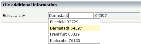
Showing additional data is done by using the properties
autocompletedisplaynameandautocompletedisplayrefin the FIELD control. The following example shows how to use "code" as an additional value in a second FIELD control:<autocomplete id="mycity" source="file" sourcelocation="./autocomplete/mycities.txt"></autocomplete> <itr> <label name="Select a city"></label> <field valueprop="fldcity" autocompleteref="mycity" autocompletedisplayname="code" autocompletedisplayref="fldcode"></field> <hdist></hdist> <field valueprop="fldcode" displayonly="true"></field> </itr>The additional data will automatically be shown in the drop-down box.
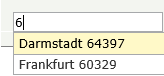
The check for matching items is done on both "value" and "code". This means, when the user types "6", the list will be populated in the following way:
If you do not like this special handling for the additional data, choose the "Value and Label" format described below.
- Value and Label
Example:
[
{ "label":"33729 Bielefeld", "value":"Bielefeld", "code":"33729" },
{ "label":"64397 Darmstadt", "value":"Darmstadt", "code":"64397" },
{ "label":"60329 Frankfurt", "value":"Frankfurt", "code":"60329" },
{ "label":"76135 Karlsruhe", "value":"Karlsruhe", "code":"76135" }
]
The "label" is shown in the drop-down box and the "value" is taken over to the FIELD control. The check for matching items is done on the "label" as a whole. Typing "D" with
matchmode="start"will result in no items.Additional data can be specified in the FIELD control using the properties
autocompleterefandautocompletedisplaynameas described above for the "Value" format.
Url
Choose this data source if the data is provided by a service. This is
usually the case when the number of total values is very high and/or the values
are read from databases like Adabas. This is the most flexible data source.
Other than with the data sources String and File, the service is in charge of
finding the matching values. The service will only return the values which
match the characters typed in by the end-user. The service is free to implement
any match mode it likes; therefore, the matchmode
property is not supported.
The service must return the data in a simple JSON format. The same formats as described for the data source File are supported. The characters that the user types in are passed as request parameter "q" to the service.
Example: When the user types the characters "Da", the service http://myhost/MyService will be called as follows: http://myhost/MyService?q=Da.
A service can be implemented as a simple Java Servlet. With Natural RPC and EntireX, a service can also be written in Natural. The NJXDEMOS contain an example Natural subprogram, corresponding EntireX wrapper classes and configuration settings. See the document NaturalAutocompleteRPCService.pdf in the subfolder njxdemos\autocomplete of the NaturalAjaxDemos example project.
Properties
| Basic | |||
| id |
The id of the autocomplete data source. This id can be referenced from FIELD controls. |
Obligatory | |
| source |
The kind of data source like string, file, url. |
Optional |
string file url |
| sourcelocation |
The source location. Depends on the kind of source. Examples: ./autocomplete/myfile, http://myremotedatasource... |
Optional | |
| minlength |
The drop down selection box is not opened before a minlength number of characters is inserted into the FIELD control. |
Optional |
1 2 3 int-value |
| delay |
The delay in milliseconds between when a keystroke occurs and when a search is performed |
Optional |
1 2 3 int-value |
| matchmode |
Specify "start" to find all items which start with the typed in characters. Specify "all" to find all items which contain the typed in charachters. Default is "start". For source="url", the matchmode is ignored. |
Optional |
all start |
| rows |
Height of the drop down box in rows. If more items are found, a scrollbar is shown. |
Optional |
1 2 3 int-value |
| Binding | |||
| sourcelocationprop |
Name of the adapter parameter that specifies the sourcelocation dynamically at runtime. |
Optional | |
| sourceprop |
Name of the adapter parameter that specifies the kind of source dynamically at runtime. |
Optional | |
| Natural | |||
| njx:natname |
If a Natural variable with a name not valid for Application Designer (for instance #FIELD1) shall be bound to the control, a different name (for instance HFIELD1) can be bound instead. If the original name (in this case #FIELD1) is then specified in this attribute, the original name is generated into the parameter data area of the Natural adapter and a mapping between the two names is generated into the PROCESS PAGE statement of the Natural adapter. This mapping must not break a once defined group structure. If for instance a grid control that is bound to a name of GRID1 contains fields that are bound to FIELD1 and FIELD2 respectively, the corresponding njx:natname values may be #GRID1.#FIELD1 and #GRID1.#FIELD2, but not #GRID1.#FIELD1 and #MYGRID1.#FIELD2. |
Optional | |
| njx:natcomment |
The value of this attribute is generated as comment line into the parameter data area of the Natural adapter, before the field name. The Map Converter, for instance, uses this attributes to indicate for a generated statusprop variable to which field the statusprop belongs. |
Optional | |