As preview a set of controls and containers for building mobile applications is included in this version. The controls and containers support responsiveness, which means that the pages automatically adapt to various screen sizes. The controls are built with Bootstrap (http://getbootstrap.com/). You will find a running sample built with these controls and containers in the Natural Ajax Demos.
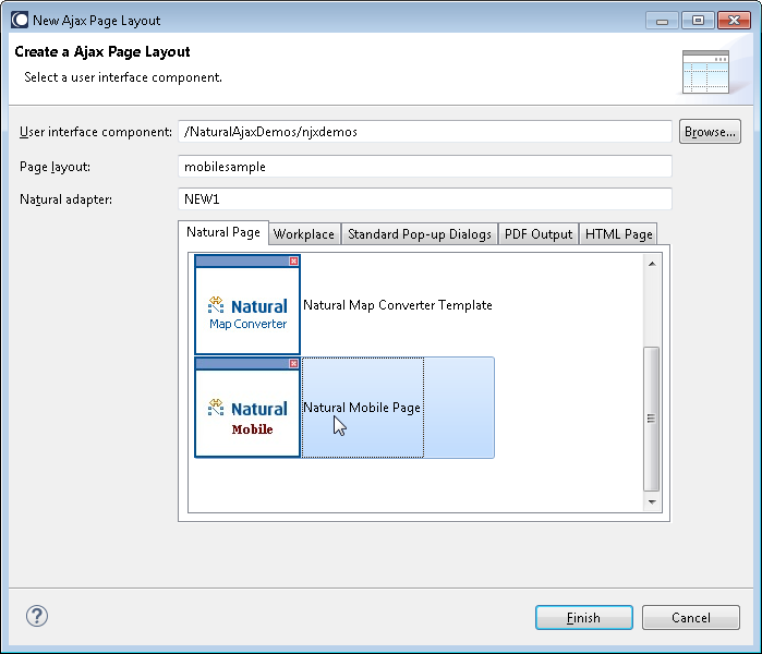
To create layout pages for mobile applications use the Natural Mobile Page template.

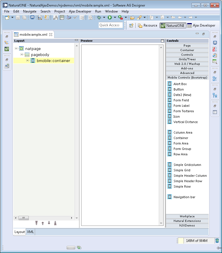
The wizard will create a page layout with responsive containers. You can now add controls from the Mobile Controls (Bootstrap) group of the palette to your layout in the usual way.

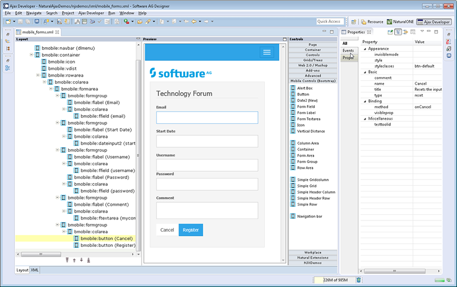
To see the rendering in the preview area set HTML as Layout display mode in the Ajax Developer properties of your project. The following shows the mobile_forms.xml example layout of the Natural Ajax Demos in the Layout Painter.

This control is similar to the STATUSBAR control but more flexible. Use this control to show success or failure of an action.
A responsive button.
A responsive form of the DATEINPUT2 control.
A responsive form of the FIELD control.
A responsive form of the LABEL control.
A responsive form of the TEXTAREA control.
A responsive form of the ICON control.
BMOBILE: COLEAREA and BMOBILE:ROWAREA support the responsive grid system of Bootstrap.
A responsive container into which you add your controls, grids and other containers. You usually have exactly one BMOBILE:CONTAINER per page.
The surrounding container for forms. Within a BMOBILE:FORMAREA you can have several BMOBILE:FORMGROUP containers.
Use this container to group several BMOBILE:FLABEL and input controls like BMOBILE:FFIELD within a form.
A column in a responsive grid.
A responsive grid.
A header column in a responsive grid.
A row container which contains the header columns in a responsive grid.
A row container which contains the columns in a responsive grid.
A responsive navigation bar.
In this preview a Bootstrap theme with blue rendering is used. There are many free other Bootstrap themes available for download.
![]() To add your own Bootstrap theme
To add your own Bootstrap theme
Copy your bootstrap.min.css to cisnatural\HTMLBasedGUI\bootstrap\css.
The layouts in the Natural Ajax Demos additionally set the property
addstylesheetfile="../HTMLBasedGUI/bootstrap/njxmobiledemo.css".
Using the njxmobiledemo.css you can overwrite single settings of the Bootstrap theme.