This document covers the following topics:
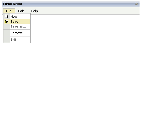
The example looks as follows:

When clicking on a menu item for which a function has been defined, then the name of the function is displayed in the status bar.
The XML layout definition is:
<page model="Menue_01_Adapter">
    <titlebar name="Menu Demo">
    </titlebar>
    <header align="left" withdistance="false">
        <menu menucollectionprop="menuData" width="100">
        </menu>
    </header>
    <pagebody>
    </pagebody>
    <statusbar withdistance="false">
    </statusbar>
</page>
In this example, the menu is embedded in the header. By the property
menucollectionprop, it is bound to the adapter
property menuData.
1 MENUDATA (1:*)
2 ID (U) DYNAMIC
2 IMAGEURL (U) DYNAMIC
2 LEVEL (I4)
2 METHOD (U) DYNAMIC
2 OPENED (I4)
2 TEXT (U) DYNAMIC
1 SELMENUITEM (U) DYNAMIC
items.reactOnSelect
| Basic | |||
| menucollectionprop |
Name of the adapter parameter that represents the control in the adapter. |
Obligatory | |
| comment |
Comment without any effect on rendering and behaviour. The comment is shown in the layout editor's tree view. |
Optional | |
| Appearance | |||
| width |
Width of the control. There are three possibilities to define the width: (A) You do not define a width at all. In this case the width of the control will either be a default width or - in case of container controls - it will follow the width that is occupied by its content. (B) Pixel sizing: just input a number value (e.g. "100"). (C) Percentage sizing: input a percantage value (e.g. "50%"). Pay attention: percentage sizing will only bring up correct results if the parent element of the control properly defines a width this control can reference. If you specify this control to have a width of 50% then the parent element (e.g. an ITR-row) may itself define a width of "100%". If the parent element does not specify a width then the rendering result may not represent what you expect. |
Optional |
100 120 140 160 180 200 50% 100% |
| height |
Height of the control. There are three possibilities to define the height: (A) You do not define a height at all. As consequence the control will be rendered with its default height. If the control is a container control (containing) other controls then the height of the control will follow the height of its content. (B) Pixel sizing: just input a number value (e.g. "20"). (C) Percentage sizing: input a percantage value (e.g. "50%"). Pay attention: percentage sizing will only bring up correct results if the parent element of the control properly defines a height this control can reference. If you specify this control to have a height of 50% then the parent element (e.g. an ITR-row) may itself define a height of "100%". If the parent element does not specify a width then the rendering result may not represent what you expect. |
Optional | |
| toggleimage |
URL of the image that is shown on the right end of a menu item, if this item contains subitems. If not explicitly defined then a default icon is used. |
Optional | |
| toggleimageprop |
Name of the adapter parameter that provides a URL that defines the toggle image. The toggle icon is shown on the right end of a menu item that has subitems. |
Optional | |
| menustyle |
CSS style definition that is directly passed into this control. With the style you can individually influence the rendering of the control. You can specify any style sheet expressions. Examples are: border: 1px solid #FF0000 background-color: #808080 You can combine expressions by appending and separating them with a semicolon. Sometimes it is useful to have a look into the generated HTML code in order to know where direct style definitions are applied. Press right mouse-button in your browser and select the "View source" or "View frame's source" function. |
Optional | |
| menustyleprop |
Name of the adapter parameter that dynamically provides explicit style information for the control. |
Optional | |