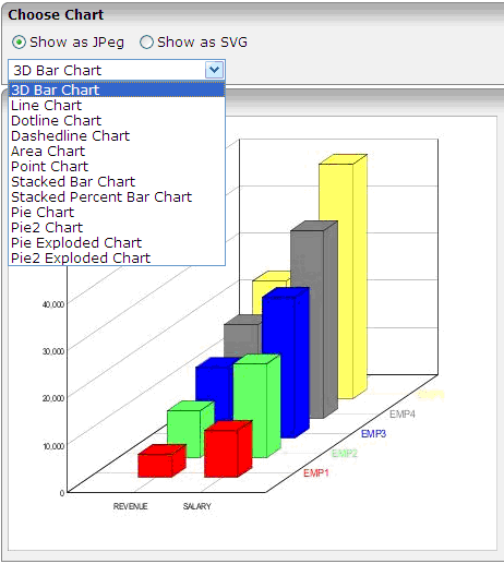
The CHART control allows you to present statistics information in a graph. You can choose among several different chart types. Additionally, you can choose the rendering format: SVG or JPEG.
The following topics are covered below:
When to use which format?
SVG
SVG is a vector format. You can use it in printable documents because
the quality of rendering is scalable.
JPEG
JPEG is a format for pixel images. It has limited printing quality.
The appearance of the chart can be customized statically at design time or dynamically at runtime. The njxdemos project contains the following examples, including layouts and corresponding Natural source code:
ctrlgraph
Shows the settings for the static appearance.
ctrlgraph2
Shows the settings for the dynamic appearance.

| Basic | |||
| arrayprop |
The chart control renders a set of items. Each item represents a line (or corresponding chart visualization, e.g. a set of bars). The ARRAYPROP attribute defines the name of the adapter parameter that represents this lines-structure. |
Obligatory | |
| height |
Height of the chart. Use pixel definitions only, not percentage definitions. |
Optional |
1 2 3 int-value |
| width |
Width of chart. Use pixel definitions only, not percentage definitions. |
Optional |
1 2 3 int-value |
| charttype |
Type of chart - i.e. whether the output should be rendered as a set of lines, a set of bars, etc. |
Optional |
bar 3dbar line dotline dashedline area point stacked stacked100 pie pie2 pieexploded pie2exploded |
| outputformat |
Output format: SVG as default. Creation of various image types is supprted as well - please open valid values for seeing the list of supported types. |
Optional |
svg jpeg |
| colors |
Comma seperated list of colors. Example: #FF6060 |
Optional | |
| comment |
Comment without any effect on rendering and behaviour. The comment is shown in the layout editor's tree view. |
Optional | |
| Binding | |||
| charttypeprop |
The name of the adapter parameter which provides the charttype. |
Optional | |
| outputformatprop |
The name of the adapter parameter which provides the outputformat. |
Optional | |
| colorsprop |
The name of the adapter parameter which provides the colors to be used in the chart as comma separated list. |
Optional | |
| Basic | |||
| property |
Each item of a chart represents one line. Each line holds as information (1) the text of the line and (2) multiple key figures that are the values to be rendered as line. E.g. a line may have the values "region,revenue,cost,profit". In this case the "region" is the element passing the text of the line, whereas the other elements are passing the key figure information. For each element you maintain one CHARTCOLUMN item, each one pointing to the data element that passes the value at runtime. |
Obligatory | |
| xaxisproperty |
This is an indicator of the attribute "PROPERTY" is holding a text value (then "true") or a key figure value (then "false"). In the example of a line "region,revenue,cost,profit" the corresponding XAXISPROPERTY would be "true,false,false,false". |
Optional |
true false |
| title |
The text shown for this item as corresponding title on the xaxis. If no title is specified then the property name (see property above) is used as xaxis title. |
Optional | |
| titleprop |
The name of the adapter parameter which provides the title. |
Optional | |
| comment |
Comment without any effect on rendering and behaviour. The comment is shown in the layout editor's tree view. |
Optional | |