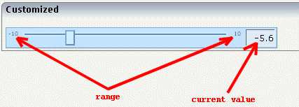
The SLIDER control represents a slider. The main use of the slider is to limit the user input to specific values. It uses a number representation for its values, but the numbers can also be used to express string values.
The following topics are covered below:
![]()
The XML layout definition is:
<rowarea name="Number Output">
    <itr>
        <slider valueprop="slider1" from="13" to="60" showrange="true"
                                              showcurrentvalue="false">
        </slider>
    </itr>
</rowarea>
The control can be customized by setting its start value, end value and a step. The start and end values form a closed interval. The step defines the distance between two valid values represented by the slider in this interval.

In the above example, the value for the step is the default value
"1". The possible values represented by the slider
are the integers from "13" to
"60". It is possible to specify a floating-point
number as a step, for example "0,25". The slider can
be further customized by setting the properties
showrange and
showcurrentvalue which show the range (start and
end value) and the current value of the slider while the user is moving it. The
width and height of the slider point is adjustable. The slider point is the
element which the user drags and drops. The colors, the borders of the slider,
the point, the line, the range and the current value can also be
customized.

DEFINE DATA PARAMETER
1 SLIDER
2 DISPLAYONLY (L)
2 FROM (F4)
2 SLIDERVALUE (F4)
2 STEP (F4)
2 TO (F4)
END-DEFINE
| Basic | |||
| valueprop |
Name of the adapter parameter that provides the content of the control. |
Obligatory | |
| Appearance | |||
| width |
Width of the slider. Can be given in pixels or percentage. |
Optional |
100 120 140 160 180 200 50% 100% |
| displayonly |
If set to true, the SLIDER will not be accessible for input. It is just used as an output. |
Optional |
true false |
| showrange |
Boolean value. Whether to show the range of the slider. The range is the "from" and "to" values. |
Optional |
true false |
| showcurrentvalue |
Boolean value. Whether to show the current value of the slider while it is moving. |
Optional |
true false |
| mainbgcolor |
Background color of the slider container. This should be a valid CSS color value. For example a name(blue, red), a hexadecimal value(#99CCFF) or others. |
Optional |
#FF0000 #00FF00 #0000FF #FFFFFF #808080 #000000 |
| mainbordercolor |
Border color of the slider container. This should be a valid CSS border-color value. You can specify a different color for the top, right, bottom and left border in this sequence. For example: #BBBBBB #666666 #666666 #BBBBBB |
Optional |
#bbb #666 #666 #bbb #BFCFFF #00248F #00248F #BFCFFF |
| mainborderwidth |
Border width of the slider container. |
Optional |
thin medium thick 1px 2px 5px 10px |
| pointbgcolor |
Background color of the slider point. This should be a valid CSS color value. For example a name(blue, red), a hexadecimal value(#99CCFF) or others. |
Optional |
#FF0000 #00FF00 #0000FF #FFFFFF #808080 #000000 |
| pointbordercolor |
Border color of the slider point. This should be a valid CSS border-color value. You can specify a different color for the top, right, bottom and left border in this sequence. For example: #BBBBBB #666666 #666666 #BBBBBB |
Optional |
#bbb #666 #666 #bbb #BFCFFF #00248F #00248F #BFCFFF |
| pointborderwidth |
Border width of the slider point. |
Optional |
thin medium thick 1px 2px 5px 10px |
| pointwidth |
Width of the slider point in pixels. The value must be an integer value. |
Optional |
10 20 40 100 300 |
| pointheight |
Height of the slider point in pixels. The value must be an integer value. |
Optional |
10 20 40 100 300 |
| linebgcolor |
Background color of the slider line. This should be a valid CSS color value. For example a name(blue, red), a hexadecimal value(#99CCFF) or others. |
Optional |
#FF0000 #00FF00 #0000FF #FFFFFF #808080 #000000 |
| linebordercolor |
Border color of the slider line. This should be a valid CSS border-color value. You can specify a different color for the top, right, bottom and left border in this sequence. For example: #BBBBBB #666666 #666666 #BBBBBB |
Optional |
#bbb #666 #666 #bbb #BFCFFF #00248F #00248F #BFCFFF |
| lineborderwidth |
Border width of the slider line. |
Optional |
thin medium thick 1px 2px 5px 10px |
| rangefontsize |
Font size of the slider range. |
Optional |
xx-small x-small small medium large x-large xx-large smaller larger 150% |
| valuebgcolor |
Background color of the slider current value which is shown if the "showcurrentvalue" property is set to true. This should be a valid CSS color value. For example a name(blue, red), a hexadecimal value(#99CCFF) or others. |
Optional |
#FF0000 #00FF00 #0000FF #FFFFFF #808080 #000000 |
| valuebordercolor |
Background color of the slider current value which is shown if the "showcurrentvalue" property is set to true. This should be a valid CSS border-color value. You can specify a different color for the top, right, bottom and left border in this sequence. For example: #bbb #666 #666 #bbb |
Optional |
#bbb #666 #666 #bbb #BFCFFF #00248F #00248F #BFCFFF |
| valueborderwidth |
Border width of the slider current value which is shown if the "showcurrentvalue" property is set to true. |
Optional |
thin medium thick 1px 2px 5px 10px |
| valuefontsize |
Font size of the slider current value which is shown if the "showcurrentvalue" property is set to true. |
Optional |
xx-small x-small small medium large x-large xx-large smaller larger 150% |