This document covers the following topics:
The following image shows an example for a tree management:
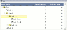
The grid contains three columns: the first column shows the tree node, the other two columns display some text information.
The XML layout definition is:
<rowarea name="Tree">
    <rowtablearea2 griddataprop="treeGridInfo" rowcount="8" width="500" withborder="false">
        <tr>
            <label name="Tree Node" width="200" asheadline="true">
            </label>
            <label name="Toggle Count" width="100" asheadline="true"
                   labelstyle="text-align:right">
            </label>
            <label name="Select Count" width="100" asheadline="true"
                   labelstyle="text-align:right">
            </label>
        </tr>
        <repeat>
            <tr>
                <treenode3 width="200" withplusminus="true"
                           imageopened="images/fileopened.gif"
                           imageclosed="images/fileclosed.gif"
                           imageendnode="images/fileendnode.gif">
                </treenode3>
                <textout valueprop="toggleCount" width="100" align="right">
                </textout>
                <textout valueprop="selectCount" width="100" align="right">
                </textout>
            </tr>
        </repeat>
    </rowtablearea2>
</rowarea>
You see that the TREENODE3 control is placed inside the control grid
just as a normal control. There are certain properties available which
influence the rendering: in the example, the name of the tree node images is
statically overwritten. The flag withplusminus is
set to true - consequently, small
"+"/"-" icons are placed
in front of the node.
In the parameter data area of the adapter, the tree data is represented by the following data structure:
DEFINE DATA PARAMETER
1 TREEGRIDINFO (1:*)
2 DRAGINFO (U) DYNAMIC
2 DROPINFO (U) DYNAMIC
2 LEVEL (I4)
2 OPENED (I4)
2 SELECTCOUNT (U) DYNAMIC
2 TEXT (U) DYNAMIC
2 TOGGLECOUNT (U) DYNAMIC
END-DEFINE
value-of-griddataprop.reactOnSelect
value-of-griddataprop.reactOnToggle
| Basic | |||
| width |
Width of the control. There are three possibilities to define the width: (A) You do not define a width at all. In this case the width of the control will either be a default width or - in case of container controls - it will follow the width that is occupied by its content. (B) Pixel sizing: just input a number value (e.g. "100"). (C) Percentage sizing: input a percantage value (e.g. "50%"). Pay attention: percentage sizing will only bring up correct results if the parent element of the control properly defines a width this control can reference. If you specify this control to have a width of 50% then the parent element (e.g. an ITR-row) may itself define a width of "100%". If the parent element does not specify a width then the rendering result may not represent what you expect. |
Optional |
1 2 3 int-value |
| comment |
Comment without any effect on rendering and behaviour. The comment is shown in the layout editor's tree view. |
Optional | |
| Appearance | |||
| withplusminus |
If set to "true" then +/- Icons will be rendered in front of the tree items. |
Optional |
true false |
| withlines |
If set to "true" then the tree elements are connected with one another by gray lines. Please pay attention: if switching this property to "true" then you have to create the instance of your server side TREECollection object with a special constructor: Example: TREECollection m_tree = new TREECollection(true) |
Optional |
true false |
| withtooltip |
If set to "true" then the text of an item is also available as tool tip. Use this option in case you expect that the horizontal space of the item will not be sufficient to display the whole text of the item. |
Optional |
true false |
| withtextinput |
If set to "true" then the tree node can also be edited. Editing is started when the user double clicks the node. The text that is input is passed into the property "text" which is implemented in the default NODEInfo implementation. |
Optional |
true false |
| imageopened |
Image of a tree node that has subnodes and that is currently showing its nodes. The image either is defined statically by this property or also may be defined dynamically - see the corresponding properties defined with this control. |
Optional | |
| imageclosed |
Image of a tree node that has subnodes and that is currently not showing its nodes. The image either is defined statically by this property or also may be defined dynamically - see the corresponding properties defined with this control. |
Optional | |
| imageendnode |
Image of a tree node that is an end node (leaf node). The image either is defined statically by this property or also may be defined dynamically - see the corresponding properties defined with this control. |
Optional | |
| singleselect |
If set to "true" then only one item can be selected. If set to "false" then multiple icons can be selected. |
Optional |
true false |
| directselectevent |
Event that represents a tree node selection. A tree node selection is done when the user clicks/doubleclicks on the tree node text. In this case the select() method is called in the corresponding node object on server side. |
Optional |
ondblclick onclick |
| pixelshift |
Number of pixels that each hierarchy level is indented. If not defined then a standard is used. |
Optional |
1 2 3 int-value |
| pixelshiftendnode |
Number of pixels that end nodes are indented. If not defined then a standard is used. |
Optional |
1 2 3 int-value |
| colspan |
Column spanning of control. If you use TR table rows then you may sometimes want to control the number of columns your control occupies. By default it is "1" - but you may want to define the control to span over more than one columns. The property only makes sense in table rows that are snychronized within one container (i.e. TR, STR table rows). It does not make sense in ITR rows, because these rows are explicitly not synched. |
Optional |
1 2 3 4 5 50 int-value |
| rowspan |
Row spanning of control. If you use TR table rows then you may sometimes want to control the number of rows your control occupies. By default it is "1" - but you may want to define the control two span over more than one columns. The property only makes sense in table rows that are snychronized within one container (i.e. TR, STR table rows). It does not make sense in ITR rows, because these rows are explicitly not synched. |
Optional |
1 2 3 4 5 50 int-value |
| pixelheight |
Height of the control in pixels. |
Optional |
1 2 3 int-value |
| tabindex |
Index that defines the tab order of the control. Controls are selected in increasing index order and in source order to resolve duplicates. |
Optional |
-1 0 1 2 5 10 32767 |
| Binding | |||
| imageprop |
Name of property of the item objects that provides for a image for the tree node. Each node may provide for its own image, e.g. dependent on the type of node. If the adapter property passes back "null" then the image is taken from the static definitions that you may parallely do by using the properties IMAGEOPENED, IMAGECLOSED and IMAGEENDNODE. |
Optional | |
| imageprop |
Name of an adapter parameter that provides for a image for the tree node. Each node may provide for its own image, e.g. dependent on the type of node. If the adapter property passes back an empty string, then the image is taken from the static definitions that you may parallely do by using the properties IMAGEOPENED, IMAGECLOSED and IMAGEENDNODE. |
Optional | |
| focusedprop |
Name of property of the item objects - representing the individual rows of the collection - that indicates if the row receives the keyboard focus. Must be of type "boolean"/ "Boolean". If more than one lines are returning "true" the first of them is receiving the focus. |
Optional | |
| focusedprop |
Name of an adapter parameter that indicates if the row receives the keyboard focus. If more than one lines are returning "true", the first of them is receiving the focus. |
Optional | |
| flush |
Flush behaviour when using the possibility of having editable tree nodes. If double clicking on the tree node then you can edit its content. The FLUSH property defines how the browser behaves when leaving the tree node's input field: If not defined ("") then nothing happens - the changed tree node text is communicated to the server side adapter object with the next roundtrip. If defined as "server" then immediately when leaving the field a roundtrip to the server is initiated - in case you want your adapter logic to directly react on the item change. If defined as "screen" then the changed tree node text is populated inside the page inside the front end. |
Optional |
screen server |
| tooltipprop |
Name of property of the item objects that provides for a text that is shown if the user moves the mouse over the tree item (tooltip). |
Optional | |
| tooltipprop |
Name of an adapter parameter that provides for a text that is shown if the user moves the mouse over the tree item (tooltip). |
Optional | |
| validdraginfosprop |
Name of a property that contains a 'comma separated list' of valid drag informations. |
Optional | |
| validdraginfosprop |
Name of an adapter parameter that contains a comma separated list of valid drag informations. |
Optional | |
| Drag and Drop | |||
| enabledrag |
If set to true then drag and drop is enabled within the tree. |
Optional |
true false |