In a previous example, the grid was completely defined as part of the layout definition: the sequence of columns was internally defined by defining the controls that are part of an STR row.
This document covers the following topics:
Have a look at the following example:
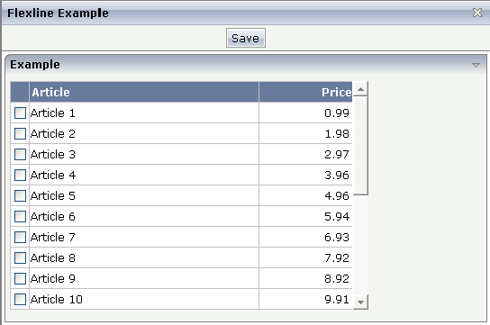
The grid looks like a normal ROWTABLEAREA2 grid, but it is built in a more dynamic way.
The XML layout definition is:
    <pagebody>
        <rowarea name="Example">
            <vdist height="5">
            </vdist>
            <rowtablearea2 griddataprop="lines" rowcount="10" width="395" withborder="true">
                <tr>
                    <label name=" " asheadline="true">
                    </label>
                    <flexline infoprop="headline">
                    </flexline>
                </tr>
                <repeat>
                    <str valueprop="selected">
                        <checkbox valueprop="selected" flush="screen" width="30">
                        </checkbox>
                        <flexline infoprop="/rowline">
                        </flexline>
                        <hdist width="100%">
                        </hdist>
                    </str>
                </repeat>
            </rowtablearea2>
            <vdist height="10">
            </vdist>
        </rowarea>
        <vdist height="5">
        </vdist>
    </pagebody>
You see that there are two FLEXLINE control definitions inside the ROWTABLEAREA2 definition:
One definition represents the headline of the grid.
The other definition is part of each row's content.
Each definition points to a property that passes the configuration at
runtime. Within the second definition, you may see something which is new for
you: the VALUEPROP references to a property
/rowline. The "/"
character at the beginning indicates that this property is
dynamically
controlled by the application through an adapter parameter.
In the parameter data area of the adapter, the grid data is represented by the following data structure:
DEFINE DATA PARAMETER
1 HEADLINE (1:*)
2 ATTRIBUTES (U) DYNAMIC
2 CONTROL (U) DYNAMIC
1 LINES (1:*)
2 SELECTED (L)
1 ROWLINE (1:*)
2 ATTRIBUTES (U) DYNAMIC
2 CONTROL (U) DYNAMIC
END-DEFINE
| Basic | |||
| infoprop |
Name of the adapter parameter that represents the control in the adapter. |
Obligatory | |
| withborder |
Flag that indicates if a border is drawn between the controls that are rendered inside the FLEXLINE control. Default is "false", i.e. no border is drawn. |
Optional |
true false |
| comment |
Comment without any effect on rendering and behaviour. The comment is shown in the layout editor's tree view. |
Optional | |