
This document covers the following topics:
A list view control can be used to display data in icon or column-based form. It is a very powerful control. Nevertheless, if you wish to display your data in tabular form and support direct in-place editing of any column value, you should consider using the table control instead.
List view controls in Natural can display their data in one of four view modes: icon, small icon, list or report.
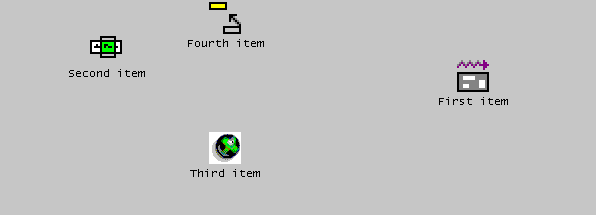
In icon view mode, the data is displayed in large icon form:
In small icon view mode, the item labels are displayed alongside the icons. As for the icon view, the items can optionally be displayed in arbitrary positions:
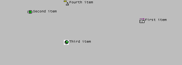
In list view mode, the items are displayed similarly to the small icon view, but cannot be freely positioned. Instead, they are displayed in columns:
In report view mode, each item occupies one row, and other data relating
to the items may be displayed alongside the item in separate columns. A column
header is also usually shown, as in the example below (although this can
optionally be hidden by setting the list view control's "No header
(x)" STYLE flag):
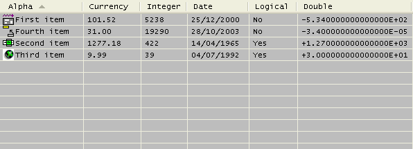
In the report view, the columns can be resized by the user by dragging the column dividers. Alternatively, by double-clicking on the trailing column divider in the column header, the column's width is adjusted to fit the longest text within the column.
Note that the above example consists of eleven dialog elements: The
list view
control itself, four
list view
items and six
list view
columns. Both the list view items and the list view columns have the
list view control as their PARENT, and are thus
stored in the same SUCCESSOR chain.
Although they can be interspersed, it is a good idea from both an organization
and performance point-of-view to ensure that all list view columns precede all
list view items. For example, if you are dynamically inserting a new column
into a non-empty list view control as the last column, explicitly set its
SUCCESSOR attribute to
the handle of the first list view item, rather than not specifying it at all or
setting it to NULL-HANDLE, which would cause the new column to be
placed at the end of the chain, after all list view items.
The first list view column created for a list view control has a special
significance, and is referred to (here) as the primary column. The
primary column always displays the list view item labels (i.e., their
STRING attribute
values). The other columns display what is known as sub-item data. For
example, the phrase "Currency sub-item" refers to the data stored
in the "Currency" column (see above example). To
refer to a particular value within the column, we would have to be more
precise. For example, the value "1277.18" above
could be referred to as the "Currency sub-item" for
the "Second item" item. Sub-items are not
dialog element types in Natural, and will be discussed in more detail
below.
If no list view columns have been created, no information will be
displayed in the list view control when it is in report view mode! However, it
should be noted that the only way to switch between the view modes is
programmatically by explicitly changing the list view control's
VIEW-MODE attribute
value. Therefore, if the application wishes to support multiple view modes, it
must provide a mechanism (e.g., a context menu) for switching between them. So,
in practice, the user should never see a list view control in report view mode
that has no columns, since the application would normally not allow switching
to this view mode in this case.
Images for the list view items may be defined by creating and associating an image list control with the list view control, then (for each item) selecting the required image from the image list via its index and/or image handle, as described in the section Working with Image List Controls.
Please note that you should set the image list control's "Large images (L)" and "Small images (S)" styles according to the view modes that are to be supported. The icon view mode requires the availability of large images, whereas the other view modes require the availability of small images.
In the icon and small icon view modes, the list view items may be
(re-)positioned by setting their
RECTANGLE-X and/or
RECTANGLE-Y attribute
values. If no position is explicitly set on item creation, the items are laid
out on an imaginary grid, with a default grid spacing that can be overridden by
setting the list view control's
SPACING-X and
SPACING-Y attribute
values. The ARRANGE action can be used at any time to
either re-arrange the items to occupy consecutive locations based on this
logical grid, or to snap the items to their nearest aligned logical grid
position.
Note that in either of the two icon view modes, the list view item
positions are interpreted as being in view coordinates, rather than
being relative to the control's client area (as is the case in the other view
modes). Unlike the client coordinates, the view coordinates of the items do not
change when the icon view is scrolled. Conversion between view coordinates and
client coordinates requires the use of the list view control's
OFFSET-X and
OFFSET-Y attributes,
which return the origin of the client area in view coordinates.
Note that two list view control
STYLE flags can
override an explicit postion specified by the program. Firstly, if the
control's "Auto-arrange (a)" style flag is
specified, the items are automatically re-arranged on the imaginary grid each
time an item is added or moved. In this case, an explicitly specified position
merely indirectly determines the item's position in the arranged icon list.
Secondly, if the control's "Snap to grid (r)" style
flag is set, any item position explicitly specified by the program will be
adjusted to the nearest aligned position on the imaginary grid. Note that this
style is superfluous if the "auto-arrange" style is
set.
Since users are often familiar with being able to modify list view item positions via drag and drop, it may be expected that the control automatically provides this capability. However, this is not the case. If the application wishes to support drag and drop, it must explicitly cater for it, as described in the next section.
In the list view mode, the items are always displayed in columns (as
already mentioned above) and are not re-positionable. However, the spacing
between adjacent columns may be set via the
SPACING attribute.
Note that the list view control does not remember item positions when switching between view modes. For example, if you switch away from one of the icon view modes and then back to it again, the icons are always arranged. This behavior can be circumvented by providing explicit program code for saving and restoring item positions, as shown in the following example:
DEFINE SUBROUTINE SAVE-ITEM-POSITIONS
   #ITEM := #CONTROL.FIRST-CHILD
   REPEAT WHILE #ITEM <> NULL-HANDLE
     IF #ITEM.TYPE = LISTVIEWITEM
       #ITEM.CLIENT-KEY := 'RECTANGLE-X'
       #ITEM.CLIENT-VALUE := #ITEM.RECTANGLE-X
       #ITEM.CLIENT-KEY := 'RECTANGLE-Y'
       #ITEM.CLIENT-VALUE := #ITEM.RECTANGLE-Y
     END-IF
     #ITEM := #ITEM.SUCCESSOR
   END-REPEAT
END-SUBROUTINE
*
DEFINE SUBROUTINE RESTORE-ITEM-POSITIONS
   #ITEM := #CONTROL.FIRST-CHILD
   REPEAT WHILE #ITEM <> NULL-HANDLE
     IF #ITEM.TYPE = LISTVIEWITEM
       #ITEM.CLIENT-KEY := 'RECTANGLE-X'
       IF #ITEM.CLIENT-VALUE <> ' '
       #ITEM.RECTANGLE-X := VAL(#ITEM.CLIENT-VALUE)
       END-IF
       #ITEM.CLIENT-KEY := 'RECTANGLE-Y'
       IF #ITEM.CLIENT-VALUE <> ' '
         #ITEM.RECTANGLE-Y := VAL(#ITEM.CLIENT-VALUE)
       END-IF
     END-IF
     #ITEM := #ITEM.SUCCESSOR
   END-REPEAT
END-SUBROUTINE
*
DEFINE SUBROUTINE SWITCH-VIEW-MODE
   IF #VIEW-MODE <> #CONTROL.VIEW-MODE
     IF #CONTROL.VIEW-MODE = VM-ICON OR
        #CONTROL.VIEW-MODE = VM-SMALLICON
       PERFORM SAVE-ITEM-POSITIONS
     END-IF
     #CONTROL.VIEW-MODE := #VIEW-MODE
     IF #VIEW-MODE = VM-ICON OR
        #VIEW-MODE = VM-SMALLICON
       PERFORM RESTORE-ITEM-POSITIONS
     END-IF
   END-IF
END-SUBROUTINE
where the following local data definitions are assumed:
01 #CONTROL HANDLE OF GUI
01 #ITEM HANDLE OF GUI
01 #VIEW-MODE (I4)
The actual view mode switch can then be made by setting
#VIEW-MODE to the desired view mode (one of the VM-*
constants defined in the local data area NGULKEY1), setting
#CONTROL to the handle of the list view control, and then calling
the SWITCH-VIEW-MODE subroutine.
Items may be selected by the user either by clicking on them (optionally
whilst holding down the CTRL key to perform an extended selection),
or by defining a selection region by clicking within the list view control,
holding down the primary mouse button, and dragging. The latter technique is
known as marquee selection, and is only allowed if the control's
"Marquee select (m)"
STYLE flag is set (the
default setting). Note that, if the control's "Hot-track select
(t)" style flag is set, it is not necessary to click an item to
select it. Instead, it is sufficient to simply let the mouse cursor hover over
it briefly.
Alternatively, items may be selected or deselected programmatically by
setting or clearing their SELECTED attribute.
In either case, extended selection is only available if the control's
MULTI-SELECTION
attribute is set to TRUE. Extended selection is the process of
selecting new items, or deselecting old ones, without the existing selection
being cleared first, and thus allows multiple (or no) items to be selected. In
the case of single selection list views, it is only possible for the user to
implicitly deselect an item by selecting a new one. Marquee selection is also
not available in this case.
The first (or only) selected item, if any, may be determined by querying
the list view control's
SELECTED-SUCCESSOR
attribute, which returns NULL-HANDLE if there is no selection. The
next selected item, if any, may be determined by querying a selected item's
SELECTED-SUCCESSOR
attribute. Iterative application of this technique allows complete enumeration
of all selected items, as shown in the section below on drag and drop.
For each item that is selected or deselected, a
CLICK event is raised for the list view
control (if not suppressed), with the handle of the corresponding item
being set in the control's ITEM attribute. Because
many items may be selected in quick succession (e.g., via marquee selection),
this event should not perform any lengthy processing. For example, it may be
better to simply set a logical variable to TRUE in the
CLICK event handler, indicating that more
involved processing is required, and do the actual processing in the dialog's
IDLE event handler in response to this
flag being set. Don't forget to clear the flag after doing the work!
If the list view control's "Check boxes (c)"
style flag is set, check boxes are displayed alongside each item. The item's
CHECKED attribute may
be used to retrieve or set an item's checked status programmatically. The first
checked item, if any, may be determined by querying the list view control's
CHECKED-SUCCESSOR
attribute, and querying this attribute for a checked item returns the handle of
the next checked item, if any, thus allowing complete enumeration of all
checked items, as shown in the following example, which simply counts the
number of checked items:
RESET #COUNT
#ITEM := #LV-1.CHECKED-SUCCESSOR
REPEAT WHILE #ITEM <> NULL-HANDLE
   ADD 1 TO #COUNT
   #ITEM := #ITEM.CHECKED-SUCCESSOR
END-REPEAT
where the following local data definitions are assumed:
01 #LV-1 HANDLE OF LISTVIEW
01 #ITEM HANDLE OF LISTVIEWITEM
01 #COUNT (I4)
Whenever an item is checked or unchecked, a
CHECK event is raised for the list view
control, if not suppressed via the
SUPPRESS-CHECK-EVENT
attribute, with the handle of the corresponding item being set in the control's
ITEM attribute.
When a user double-clicks on an item, an
ACTIVATE event is raised (unless
suppressed) for the list view control. The
application, if it decides to handle this event, normally performs a default
action on each selected control. The default action is user-defined and can be
different for each item. For example, activating an item representing a text
file might cause the file to be opened in an editor, whereas activating an item
representing an audio file might cause the file to be played. Note that there
may be other, non-default, actions applicable to one or more of the selected
items, but these are typically accessed via other mechanisms. For example, they
may be listed (typically along with the default action) in a context menu
displayed by the application.
If multiple selection is allowed (see above) and the CTRL key
is held down whilst double-clicking an item, the selection state of the item is
toggled before the
ACTIVATE event is raised.
If either of the control's "Underline hot
(u)" or "Underline cold (U)"
STYLE flags are set, it is only necessary to
single-click on an item in order to activate it.
The ACTIVATE event can also be triggered via
the keyboard. This can be done in either of two ways:
By pressing the key or key combination defined for the list view
control's ACCELERATOR attribute.
The control need not currently have the focus.
By pressing the ENTER key, if the list view control
currently has the focus. This method only works if the dialog neither contains
a default pushbutton, nor a pushbutton with the "OK Button
(O)" STYLE flag set.
In either case, no
ACTIVATE event is raised if no items are
currently selected.
Each column in a list view (as displayed when the list view control is in report view mode) can contain (at most) one item of data per list view item, which is then (if present) displayed for the item in that column. As already mentioned above, this data is known as sub-item data.
In order to be able to support sorting correctly (see next section), the
sub-item data does not need to be alphanumeric, as it is per default, but can
be one of any of the pre-defined types supported by the column's
FORMAT attribute. In
addition, an edit mask can be applied to the column by setting its
EDIT-MASK attribute.
The values seen in the report view column by the user for a column are the
alphanumeric representations of the sub-item for that column, using the
associated edit mask (if any). The conversion between the sub-item data and the
displayed data is compatible with the MOVE
EDITED statement if an edit mask is supplied. Otherwise, the
conversion between the internal and displayed data, and vice-versa, is
compatible with the conversion involved in copying the data to and from the
Natural stack (see the STACK TOP
DATA and INPUT statements). For example,
numeric values are displayed using the current decimal character (as defined by
the DC
parameter) if necessary, with a leading minus character if negative, date
values are displayed in the format defined by the
DTFORM
parameter setting, logical values are displayed as an
"X" if true and as a blank if false, and so on.
The first column defined for a list view control (the primary
column) has a special significance: It always displays the item's label.
Therefore, any changes to an item's sub-item data for the first coumn
automatically update the item's label, and vice-versa. Otherwise, and for all
other columns, the only means of updating the sub-item data is via the
SET-SUBITEM-DATA action. When calling
this action, the sub-item data must be supplied in a format compatible with the
internal data type, as specified by the column's
FORMAT attribute value
(alphanumeric by default).
For example, suppose we add a column to a list view control as shown below:
PROCESS GUI ACTION ADD WITH
PARAMETERS
   HANDLE-VARIABLE = #LVCOL-DATE
   TYPE = LISTVIEWCOLUMN
   STRING = 'Date'
   PARENT = #LV-1
   RECTANGLE-W = 83
   STYLE = 'l'
   FORMAT = FT-DATE
   EDIT-MASK = 'YYYY/MM/DD'
END-PARAMETERS GIVING *ERROR
The sub-item data for this column for a particular list view item,
#LVITEM-1 (say), can then be set to the current date as
follows:
PROCESS GUI ACTION SET-SUBITEM-DATA WITH
  #LVITEM-1 #LVCOL-DATE *DATX GIVING *ERROR
Note that we could also have used *TIMX
instead of *DATX, because time values in Natural
are automatically convertible to date values. In either case, the value is then
displayed as the current date in YYYY/MM/DD format. For the primary column, the
display string is the item label, which means that the effects of the
modification will be visible even if the list view control is not currently in
report view mode.
Note also that the data is not supplied in display format. For example, the following will not work:
PROCESS GUI ACTION SET-SUBITEM-DATA WITH
  #LVITEM-1 #LVCOL-DATE '2004/11/03' GIVING *ERROR  /* Does NOT work!
However, if the column happens to be the primary column, then it is alternatively possible to update the column data indirectly, by setting the item's label. For example:
#LVITEM-1.STRING := '2004/11/03'
Retrieval of the sub-item data may be achieved by calling the
GET-SUBITEM-DATA action, which takes the
same parameters as the
SET-SUBITEM-DATA action. For example:
PROCESS GUI ACTION GET-SUBITEM-DATA WITH
  #LVITEM-1 #LVCOL-DATE #DATE GIVING *ERROR
where #DATE is defined as follows:
01 #DATE (D)
One fact to bear in mind, however, is that there may be no sub-item data
to be retrieved. For example, the sub-item data may not have been created, or
may have been deleted (see below). Natural, however, does not support null
values. Therefore, by default, Natural resets the receiving fields when a null
value is returned (see the RESET statement). However, if a
default value has been set for a list view column, this default value is
returned instead. Setting a default value for a column is done by calling
SET-SUBITEM-DATA, specifying
NULL-HANDLE in place of a list box item handle. For example, for a
numeric column, #LVCOL-NUM, where only positive values are
allowed, we might choose to set the default value to -1, as shown below:
#NUM := -1
PROCESS GUI ACTION SET-SUBITEM-DATA WITH
  NULL-HANDLE #LVCOL-NUM #NUM GIVING *ERROR
where #NUM can be a field of any signed numeric format
(e.g. I2).
The use of default values allows a value to be chosen by the programmer that does not match any explicit value that can be used in the program. If necessary, the program should be changed to prevent the default value being entered as explicit data.
For both the
SET-SUBITEM-DATA and
GET-SUBITEM-DATA actions, it is possible
to set or get (respectively) the sub-item data (for a specific item) for
multiple columns in a single statement. For example:
PROCESS GUI ACTION SET-SUBITEM-DATA WITH
  #LVITEM-1 #LVCOL-NUM #NUM #LVCOL-DATE #DATE GIVING *ERROR
In other words, multiple [column handle, receiving field] operand pairs may be specified.
To delete the subitem data (causing null values to be stored internally,
as if no data had been set), use the
DELETE-SUBITEM-DATA action. For
example:
PROCESS GUI ACTION DELETE-SUBITEM-DATA WITH
  #LVITEM-1 #LVCOL-DATE GIVING *ERROR
Again, multiple sub-items may be deleted for a specific item in a single statement, by specifying multiple column handles:
PROCESS GUI ACTION DELETE-SUBITEM-DATA WITH
  #LVITEM-1 #LVCOL-DATE #LVCOL-NUM GIVING *ERROR
When list view items are deleted, their associated sub-item data (if
any) is deleted with them. Note that if you wish to delete all items in a list
view control, but leave the list view columns intact, use the
CLEAR action:
PROCESS GUI ACTION CLEAR WITH #LV-1 GIVING *ERROR
where #LV-1 is the list view control handle.
Sorting of the subitem data for a list view column may be achieved
either by the user (if the list view control's "No header
(x)" and "No sort header (y)"
STYLE flags are not
set), by clicking on a column header, or by the program, by calling the
SORT-ITEMS action. In the latter case,
items may be sorted even if no columns are available, by passing the handle of
the list view control itself rather than the list view column. See the
documentation for the
SORT-ITEMS action for more
information.
The sorting on clicking on a column in the column header of a list view
control is normally implicitly performed by Natural. However, before performing
the sort, Natural raises a
CLICK event (if not suppressed) for the
list view column. On returning from this event, Natural checks whether the
column is already sorted in the required direction, and performs no further
action if this is the case. This means that the application can perform the
sort itself instead of Natural, as long as it obeys the rules for the sort
direction (i.e., specifies descending sequence if the column is currently
sorted in ascending sequence, or ascending sequence otherwise). This can be
useful if the sort options (e.g. case-sensitivity) need to be dynamic, or if it
is required to perform application-specific code after the sort. An example of
a column CLICK event handler performing an
explicit sort follows:
#CONTROL := *CONTROL
T1. SETTIME
IF #CONTROL.SORTED AND NOT #CONTROL.DESCENDING
  PROCESS GUI ACTION SORT-ITEMS WITH #CONTROL TRUE
    GIVING *ERROR
ELSE
  PROCESS GUI ACTION SORT-ITEMS WITH #CONTROL
    GIVING *ERROR
END-IF
COMPRESS 'Sort took' *TIMD(T1.) 'tenths of a second'
  INTO #DLG$WINDOW.STATUS-TEXT
However, in most cases, it will probably be sufficient to let Natural perform the sort implicitly.
For alphanumeric data, the sort column's "Case insensitive
(i)" and "word compare (w)"
STYLE flags determine the default way in
which the values are compared. If the sort is done explicitly, the
corresponding optional parameters to the
SORT-ITEMS action, if specified, override
these defaults. See the documentation for this action for more details on these
options.
Missing ("null") values compare low. That is, they appear at the bottom of the column when the column is sorted in descending sequence, or at the top of the column when the column is sorted in ascending sequence. Furthermore, if two column entries are identical, the existing relative position of the two items concerned is preserved.
Note that, if the list view control is in one of the icon view modes, sorting the items causes them to be re-arranged. Therefore, if you are using explicit item positions in either of the icon view modes, it is probably a good idea to disable any sort commands.
List view controls also possess a
SORTED attribute,
implying that new items are inserted in their ascending or descending sort
position, depending on the value of the control's
DESCENDING attribute,
rather than being inserted at the end of the item list. For this to work as
expected, the items must already be sorted in the required direction. For
example, if an item's label (i.e., its
STRING attribute) is
modified, the application itself should, if required, ensure that the list is
maintained in sorted sequence. An example of how to do this is provided in the
next section.
Note that the SORTED attribute does
not influence the position of the items displayed in either of the icon views.
However, if an explicit sort is performed via the
SORT-ITEMS action, the items are
re-arranged in the sorted sequence. If you cannot avoid doing a sort, and you
are using explicit item positions in the icon view(s), then you must explicitly
save the icon positions prior to the sort and restore them afterwards. For
example:
PERFORM SAVE-ITEM-POSITIONS
PROCESS GUI ACTION SORT-ITEMS WITH #CONTROL GIVING *ERROR
IF #CONTROL.VIEW-MODE = VM-ICON OR
   #CONTROL.VIEW-MODE = VM-SMALLICON
  PERFORM RESTORE-ITEM-POSITIONS
END-IF
where #CONTROL is the handle of the list view control, and
where the subroutines defined above for saving and restoring the item positions
are used. Note that the icons are re-drawn (at their old positions), causing
some flicker. Therefore, if possible, try to avoid performing a sort whilst the
list view control is in one of the icon view modes. See the section below on
label editing for an example of how this may be done.
The process of label editing for list view controls is the same as for tree view controls. Therefore, for more information on this subject, please refer to the section Label Editing in Tree View and List View Controls.
Note that even if the
SORTED attribute is
set, the items are not automatically re-sequenced after a label editing
operation has been completed. If this is required, this can be done as shown in
the example below. Firstly, we define some variables for later use:
01 #SORTOBJ HANDLE OF GUI
01 #SORT (L)
01 #AUTO-ARRANGE (I4)
In addition, it is assumed that the list view control is named
#LV-1.
In the list view control's
AFTER-EDIT event, we cannot do the
re-sequencing asynchronously, as this would interfere with the (as yet
incomplete) editing process. Instead, we simply set the #SORT flag
to indicate that the re-sequencing should occur at a later time, after the
editing process has been completed:
#SORT := TRUE
In order to decide whether to perform a re-sequencing of the items, we
will need to check whether the items are already sorted. We will do this by
querying the SORTED and
DESCENDING attributes
of the primary column if the list view has columns, or those of the list view
control itself otherwise. The relevant object handle is set in the dialog's
AFTER-OPEN event:
IF #LV-1.COLUMN-COUNT <> 0
  #SORTOBJ := #LV-1.FIRST-CHILD
ELSE
  #SORTOBJ := #LV-1
END-IF
*
EXAMINE #LV-1.STYLE FOR 'a' GIVING NUMBER #AUTO-ARRANGE
IF #LV-1.SORTED AND #AUTO-ARRANGE <> 0 AND
  (#LV-1.VIEW-MODE = VM-ICON OR
   #LV-1.VIEW-MODE = VM-SMALLICON)
 #SORT := TRUE
END-IF
In addition, we obtain the status of the list view control's
"Auto-arrange (a)"
STYLE flag. If this is
set, we can sort the items even if the control is in an icon mode, as we don't
require the icon positions to be fixed. Furthermore, if the control is sorted,
we indicate that we require the items to be initially re-sequenced. This is due
to the fact (mentioned earlier) that the item positions are not updated on item
insertion in the icon modes if the control's
SORTED flag is set. The
application thus needs to perform an initial sort itself in this case.
The actual work of re-sequencing the items is done asynchronously in the
dialog's IDLE event:
IF #SORT
  IF #AUTO-ARRANGE <> 0 OR
    (#LV-1.VIEW-MODE <> VM-ICON AND
     #LV-1.VIEW-MODE <> VM-SMALLICON)
    IF #SORTOBJ.SORTED
     PROCESS GUI ACTION SORT-ITEMS WITH
       #SORTOBJ #SORTOBJ.DESCENDING GIVING *ERROR
    END-IF
    RESET #SORT
  END-IF
END-IF
Note that the sort is only done for the icon view modes for the list
view control if it is auto-arranged. Otherwise, the #SORT flag is
not reset, causing the re-sequencing to be deferred until the first
IDLE event after the control is switched
to a non-icon view mode.
If you wish to support just a single context menu for a control, you can
simply set the control's CONTEXT-MENU attribute
to the handle of the context menu you wish to display, and leave it set to this
value. However, it is often required to be able to display more than one
context menu for a particular control, whereby this approach is too
inflexible.
To address the above problem, the
CONTEXT-MENU event was introduced (not to
be confused with the attribute of the same name as mentioned above!). This
event (if not suppressed) is raised for the target control immediately before
its CONTEXT-MENU attribute
is evaluated, allowing the application to dynamically set this attribute to the
handle of the appropriate context menu first.
As an example, assume that we have defined two context menus in the
dialog editor: one containing item-related commands,
#CTXMENU-ITEMS, and one containing generic commands (e.g., for
switching the view mode for a list view control),
#CTXMENU-DEFAULT. In this case, the following
CONTEXT-MENU event could be used:
#CONTROL := *CONTROL
IF #CONTROL.SELECTED-SUCCESSOR <> NULL-HANDLE
   #CONTROL.CONTEXT-MENU:= #CTXMENU-ITEMS
ELSE
   #CONTROL.CONTEXT-MENU := #CTXMENU-DEFAULT
END-IF
where the following local data definition is assumed:
01 #CONTROL HANDLE OF GUI
In this example, the context menu #CTXMENU-ITEMS will be
displayed if the user right clicks at a position occupied by an item, or
#CTXMENU-DEFAULT otherwise.
Of course, this technique can be refined further to display context menus specific to the type(s) of the selected item(s).
Drag and drop may be used for re-positioning items within a list view control, as well as for data transfer to and from other windows. There is no difference between the two cases. The re-positioning scenario is merely a special case where the drop is made in the same list view control in which the drag was initiated.
The basic technique for providing drag and drop support is described in the section Using the Clipboard and Drag and Drop. In particular, it should be noted that it is still necessary to place some data on the drag and drop clipboard even if it is only required to support re-positioning of the items within the control, in order to inform Natural that drag and drop should be initiated. Secondly, there is a caveat specific to list view controls, in that the re-positioning of items can change the origin of the list view control, so that the top near corner of the list view control's display area may no longer begin at the default origin of (0, 0).
The following example provides some code for demonstrating the use of drag and drop with the list view control, in order to support the following operations:
Re-positioning of list view items.
Dragging and dropping text from another application (e.g. WordPad) onto a list view item in order to change its label.
The first step is to ensure that the drag and drop modes are set
correctly for the list view control. In the List View
Control Attributes window in the dialog editor, set the
Drag mode selection box to
"Move" and the Drop mode
selection box to "Copy+Move". This causes the
control's DRAG-MODE and
DROP-MODE attributes to
be set to DM-MOVE and DM-COPYMOVE, respectively, in
the generated source code for the dialog.
Next, the required local variables that are going to be used below must be defined:
01 #CONTROL HANDLE OF GUI
01 #DROP-ITEM HANDLE OF GUI
01 #ITEM HANDLE OF GUI
01 #SELECTED (L)
01 #AVAIL (L)
01 #X (I4)
01 #Y (I4)
01 #ORIG-X (I4)
01 #ORIG-Y (I4)
Having done this, we can write the necessary event handlers. The logical
place to start is with the
BEGIN-DRAG event:
#CONTROL := *CONTROL
*
PROCESS GUI ACTION INQ-CLICKPOSITION WITH
  #CONTROL #ORIG-X #ORIG-Y GIVING *ERROR
*
ADD #CONTROL.OFFSET-X TO #ORIG-X
ADD #CONTROL.OFFSET-Y TO #ORIG-Y
*
PROCESS GUI ACTION SET-CLIPBOARD-DATA WITH
  'DUMMYPRIVFMT' 0 GIVING *ERROR
This code consists of three parts:
Getting the click position in client coordinates.
Converting the click position to view coordinates (as mentioned above, the origin of the list view window is not always "(0, 0)").
Putting some dummy data on the drag and drop clipboard, otherwise Natural will not initiate the drag and drop operation. We choose a private clipboard format because, being only dummy data, we deliberately don't want other applications to recognize it.
Next, we provide a handler for the
DRAG-ENTER event:
PROCESS GUI ACTION INQ-DRAG-DROP WITH
  1x #CONTROL GIVING *ERROR
*
IF #CONTROL = *CONTROL
  IF #CONTROL.VIEW-MODE = VM-ICON OR
     #CONTROL.VIEW-MODE = VM-SMALLICON
    #CONTROL.SUPPRESS-DRAG-DROP-EVENT := NOT-SUPPRESSED
  ELSE
    #CONTROL.SUPPRESS-DRAG-DROP-EVENT := SUPPRESSED
  END-IF
ELSE
  #CONTROL := *CONTROL
  PROCESS GUI ACTION INQ-FORMAT-AVAILABLE WITH CF-TEXT #AVAIL GIVING *ERROR
  IF #AVAIL
    #CONTROL.SUPPRESS-DRAG-DROP-EVENT := NOT-SUPPRESSED
  ELSE
    #CONTROL.SUPPRESS-DRAG-DROP-EVENT := SUPPRESSED
  END-IF
END-IF
The above code consists of three parts:
The INQ-DRAG-DROP action is called to
determine the handle of the drag source control.
If the drag source is the current control, then drag source and drop
target are identical. In other words, this is the item re-positioning case.
Because item re-positioning is only allowed in one of the icon views, we
unsuppress the
DRAG-DROP event to allow the drop in this
case. Otherwise, we suppress this event in order to prohibit a drop such that
the "no drop" drag cursor appears. Note that we could have also
prevented a drag from occuring at all by not putting the data on the drag and
drop clipboard in this case. However, although not demonstrated in this
example, it is often desired to drag one or more items from a list view control
to another window, even if the source control is in list or report view mode,
for which the above code provides a better basis.
If the drag source and drop target are different, an attempt is being made to transfer data from another window. In this case, we check to see if data is available in the required format, CF-TEXT, and allow the drop if so. Otherwise the drop is prohibited.
To provide drop emphasis during the dragging of external data across the
list view control, a
DRAG-OVER event handler is supplied:
PROCESS GUI ACTION INQ-DRAG-DROP WITH
  1X #CONTROL 1X #X #Y GIVING *ERROR
*
IF #CONTROL <> *CONTROL
  #CONTROL := *CONTROL
  IF #CONTROL.SUPPRESS-DRAG-DROP-EVENT = NOT-SUPPRESSED
    PROCESS GUI ACTION INQ-ITEM-BY-POSITION WITH
      #CONTROL #X #Y #ITEM GIVING *ERROR
    IF #ITEM <> #DROP-ITEM
      IF #DROP-ITEM <> NULL-HANDLE
        #DROP-ITEM.SELECTED := #SELECTED
      END-IF
      #DROP-ITEM := #ITEM
      IF #DROP-ITEM <> NULL-HANDLE
        #SELECTED := #DROP-ITEM.SELECTED
        #DROP-ITEM.SELECTED := TRUE
      END-IF
    END-IF
  END-IF
END-IF
The above code performs the following:
The INQ-DRAG-DROP action is called to
determine the handle of the drag source control and the current drop
position.
If the drag source and drag target are identical (item
re-positioning), no further action is taken, as no drop emphasis is required in
this case. Otherwise the
INQ-ITEM-BY-POSITION action is used to
find the list view item (if any) at the current drop position.
The current target item ("drop item") is tracked in
#DROP-ITEM. Every time this changes, the current selection state
of the new drop item is first checkpointed in #SELECTED, and then
the item is selected to provide the drop emphasis by setting its
SELECTED attribute to
TRUE. In addition the selection state of the old drop item (if
any) is restored to its previously checkpointed value.
Note that the drop emphasis is not applied if a drop is not possible
(i.e., if the SUPPRESS-DRAG-DROP-EVENT
attribute is set to SUPPRESSED).
To perform the actual drop, a
DRAG-DROP event handler is supplied:
PROCESS GUI ACTION INQ-DRAG-DROP WITH
  1x #CONTROL 1x #X #Y GIVING *ERROR
*
IF #CONTROL = *CONTROL
  ADD #CONTROL.OFFSET-X TO #X
  ADD #CONTROL.OFFSET-Y TO #Y
  SUBTRACT #ORIG-X FROM #X
  SUBTRACT #ORIG-Y FROM #Y
  #ITEM := #CONTROL.SELECTED-SUCCESSOR
  REPEAT WHILE #ITEM <> NULL-HANDLE
    ADD #X TO #ITEM.RECTANGLE-X
    ADD #Y TO #ITEM.RECTANGLE-Y
    #ITEM := #ITEM.SELECTED-SUCCESSOR
  END-REPEAT
ELSE
  IF #DROP-ITEM <> NULL-HANDLE
    PROCESS GUI ACTION GET-CLIPBOARD-DATA WITH CF-TEXT #DROP-ITEM.STRING
      GIVING *ERROR
    #DROP-ITEM.SELECTED := #SELECTED
    RESET #DROP-ITEM
  END-IF
END-IF
The above code performs the following:
The INQ-DRAG-DROP action is called to
determine the handle of the drag source control and the current drop
position.
The event handler differentiates between the case where the drag source and drop target controls are identical (item re-positioning) and the case where they are distinct (drag from external source).
In the item re-positioning case, the drop position is converted to view coordinates to obtain the "(x, y)"-displacement from the original position, which is then applied to each selected item to perform the move.
In the external source case, the text data is retrieved from the
clipboard directly into the STRING attribute of the
current drop item (if any) to update its label. It is not necessary to first
check whether text is available on the drag and drop clipboard, as we did that
in the DRAG-ENTER event, prohibiting a drop and
associated DRAG-DROP event from taking place at all
if this is not the case. After updating the label, the drop item's previous
selection state (prior to the drag) is restored and #DROP-ITEM
reset ready for the next drag operation (if any).
Lastly, in the case that the user cancels the drag operation, or exits
the bounds of the list view control without having performed a drop, a
DRAG-LEAVE event handler is supplied:
IF #DROP-ITEM <> NULL-HANDLE
  #DROP-ITEM.SELECTED := #SELECTED
  RESET #DROP-ITEM
END-IF
The above code simply clears the drop emphasis (if any), by restoring
the old drop item selection state. To satisfy the logic provided for the other
event handlers, #DROP-ITEM is reset, indicating the absence of a
drop item. This is essentially the same code as performed at the end of the
DRAG-DROP event, since the
DRAG-LEAVE event is not called in the
case of a drop. Therefore, any drop emhasis resetting needs to be done in both
places.