
This document covers the following topics:
A control box is is used to enhance the effectiveness of the nested control support. However, control boxes have a number of unique features that merit their separate discussion.
Control boxes are, in themselves, fairly inert controls, belonging to the same category as text constants and group frames in that they cannot receive the focus and do not receive any mouse or keyboard input. Instead, they are intended to act as general-purpose containers for other controls (including, possibly, other control boxes), in order to build up a control hierarchy. In doing so, control boxes support three styles which are worthy of special mention here:
Because it is often desirable to be able to group controls together for convenience, but not desirable that the user actually sees the container itself, control boxes can be marked with the style "transparent". In this case, no parts of the control box are drawn, and any underlying colors and controls show through.
Control boxes can also be marked with the style
"exclusive". When an exclusive control box is made
visible, either in the dialog editor or at runtime, all other sibling control
boxes that are also marked as "exclusive" are
hidden. This applies to edit-time and runtime in a slightly different way. At
runtime, setting the VISIBLE attribute of an
exclusive control box to TRUE hides all its exclusive siblings and
sets their VISIBLE attribute to
FALSE. At edit-time, whenever an exclusive control box or one of
its descendants is selected, the exclusive control box becomes visible and all
other exclusive siblings are hidden. However, in this latter case the
VISIBLE attribute of
the controls concerned is unaffected. This implies that the exclusive control
box that is initially visible when the dialog is run is independent of the
exclusive control box that was visible at the time the dialog was last
saved.
Additionally, control boxes support the "size to parent" style. When a container control, or the dialog itself, is resized, all child control boxes (if any) with this style set are resized to entirely fill the parent's client area. The same applies when this style is first set in the dialog editor. However, it is still possible to resize such control boxes independently of their container.
Exclusive control boxes, as described above, are primarily intended for situations where it is necessary to manage several overlapping "pages" of controls occupying the same region of a dialog. Without the auto-hiding feature which exclusive control boxes provide, it would be very difficult indeed for a user to handle this situation in the dialog editor, as many controls would be partially or completely overlapped by others. Of course, one could move the control to the front of the control sequence during editing, but this would be highly inconvenient, and one would have to remember to move the control back before continuing.
Using exclusive control boxes, editing a control in this situation is as simple as selecting it. For controls that are not currently on display, the selection can be made via the combo box in the dialog editor's status bar or by using the TAB key to walk through the controls sequentially until the target control is reached. When a control that is a descendant of an exclusive control box is selected, that exclusive control box is made visible (if not already so), and the previously visible exclusive control box is hidden. These changes have no impact on the generated dialog source code and the runtime state of the dialog.
Although the design of control boxes was intended to keep them as general as possible, two possible situations where overlapping control pages are desired (and hence where exclusive control boxes become extremely useful) are worthy of special mention here:
Wizard dialogs.
Tabbed dialogs ("Property sheets").
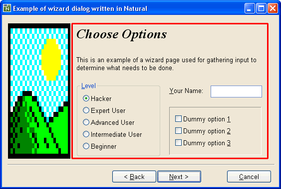
Within the rectangle highlighted in red, the so-called "wizard pages" are displayed. Within this area, we use a 2-level hierarchy of control boxes in order to implement the required functionality:
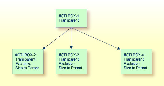
Here, #CTLBOX-1 is used as the "master"
control box, which makes resizing of the pages easier later, should this become
necessary. Because all child control boxes are marked with the style
"size to parent", we can resize the wizard page area
simply by resizing #CTLBOX-1.
The child control boxes are used to implement the actual wizard pages.
#CTLBOX-2 contains the controls used for wizard page 1,
#CTLBOX-3 contains the controls for wizard page 2, and so on.
Creation of the wizard pages typically involves the following steps:
Create the top-level ("master") control box as for any other control.
Via its attributes window, set the "transparent" style.
Create another control box within the first one. The new control box automatically becomes a child of the first one, because control boxes are always containers.
Via the attributes window for the child control box, set the "transparent", "exclusive" and "size to parent" styles. Because the "size to parent" style is set, the child control box expands to fill its container.
Now you can start adding the controls onto the newly-created control box, which becomes wizard page 1.
Adding a new wizard page is most easily achieved by selecting the child control box you wish to immediately precede the new one, then using the clipboard copy and paste commands. Before doing the copy, Natural will prompt you as to whether you want the child controls to be copied, too. Answer this question with .
Because the newly added child control box also has the exclusive flag set, the previously displayed child control box is hidden, and the new blank one is shown, ready for you to start adding a new set of controls as for the first wizard page.
Switching between the pages at edit time can be most simply achieved by selecting the child control box for the appropriate page, or one of the controls on it, from the combo box in the dialog editor's status bar.
The divider line between the push buttons and the wizard pages can be implemented as a very thin group box (2 pixels high) with no caption. The still slightly visible sides of the group box at each end can be masked out by using a transparent control box which comes after the group frame in the control sequence. Make sure the "control clipping" style for the dialog is switched on for this technique to work.
Firstly, define a local variable for the dialog to store the handle of the currently active page. E.g.:
01 #ACTPAGE HANDLE OF CONTROLBOX ...
Secondly, set this variable to the handle of the first wizard page in
the AFTER-OPEN event for the dialog:
#ACTPAGE := #CTLBOX-1.FIRST-CHILD ..
where #CTLBOX-1 is the handle of the top-level control
box. Now we are ready to implement the
CLICK event code for the
push button (#PB-NEXT). This could
look something like this:
IF #ACTPAGE.SUCCESSOR = NULL-HANDLE
  CLOSE DIALOG *DIALOG-ID
ELSE
  REPEAT
    #ACTPAGE := #ACTPAGE.SUCCESSOR
    WHILE #ACTPAGE.ENABLED = FALSE
  END-REPEAT
  #ACTPAGE.VISIBLE := TRUE
  IF #ACTPAGE.SUCCESSOR = NULL-HANDLE
    #PB-NEXT.STRING := 'Finish'
    #PB-BACK.ENABLED := FALSE
    #PB-CANCEL.ENABLED := FALSE
  ELSE
    #PB-BACK.ENABLED := TRUE
  END-IF
END-IF
..
Note that this logic does not be modified if further wizard pages are
added later. Note also that any intermediate wizard pages whose corresponding
control box has been disabled are ignored. This allows certain wizard pages to
be skipped, based on previous input, by simply setting the relevant control box
ENABLED attribute to
FALSE. When the last page is reached, the text for the
push button is changed to
"Finish".
The CLICK event code for the
push button (#PB-BACK) is very
similar:
REPEAT
  #ACTPAGE := #ACTPAGE.PREDECESSOR
  WHILE #ACTPAGE.ENABLED = FALSE
END-REPEAT
IF #ACTPAGE.PREDECESSOR = NULL-HANDLE
  #PB-BACK.ENABLED := FALSE
END-IF
#ACTPAGE.VISIBLE := TRUE
..
Note that the push button should be initially disabled in the dialog editor.
This can be conveniently achieved by selecting any (highest-level) control on the relevant page, then performing a from the menu to additionally select all the controls siblings. The selected controls can then be deleted as normal.
A tabbed dialog (sometimes called a "property sheet") is very similar in concept to a wizard dialog. The only substantial difference is that instead of navigating between the control "pages" via the and push buttons, the user directly accesses the page he wants by clicking on the appropriate tab. The control page hierarchy can be built up and handled in the dialog editor in the same way as in the wizard dialog example above. Several ActiveX controls are available which provide the actual tabs.
It should be noted, however, that the switching between the pages
(i.e., switching between the corresponding control boxes) is not automatic. The
Natural programmer must insert code for the ActiveX event raised by a tab
switch, find out which tab is selected, and set the
VISIBLE attribute of
the appropriate (exclusive) control box to TRUE. This cannot be
done implicitly by Natural because each ActiveX control can implement its
functionality in any way it chooses. There is no standard event raised for a
tab switch and no standard method with standard parameters (or standard
property) for determining the currently active tab.
An example tabbed dialog, making use of the Microsoft "Tab Strip" ActiveX control (V4-NEST.NS3) is shipped as part of the Natural example libraries.