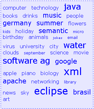
The TAGCLOUD control represents a collection of tags. A tag is a keyword assigned to an information resource (picture, video clip or others). In a tag cloud, the tags are mainly shown by their popularity.
The following topics are covered below:

As you can see, different tags can be added to a tag cloud. They differ by their popularity. The most popular tags are those with a bigger font size.
The XML layout definition is:
<itr>
   <tagcloud tagcloudprop="tagCloud"
          width="300" height="350"
          borderstyle="dotted" borderwidth="1px"
          bordercolor="#0000FF" backgroundcolor="#E6E6FA"
          textcolor="#0000FF">
   </tagcloud>
</itr>
The tag cloud can be customized by defining a background color.
DEFINE DATA PARAMETER
1 TAGCLOUD
2 TCLITEM (1:*)
3 ID (U) DYNAMIC
3 POPULARITY (I4)
3 TEXT (U) DYNAMIC
END-DEFINE
value-of-tagcloudprop.onSelect
| Basic | |||
| tagcloudprop |
Name of the adapter parameter that represents the control in the adapter. |
Obligatory | |
| width |
Width of the control. There are three possibilities to define the width: (A) You do not define a width at all. In this case the width of the control will either be a default width or - in case of container controls - it will follow the width that is occupied by its content. (B) Pixel sizing: just input a number value (e.g. "100"). (C) Percentage sizing: input a percantage value (e.g. "50%"). Pay attention: percentage sizing will only bring up correct results if the parent element of the control properly defines a width this control can reference. If you specify this control to have a width of 50% then the parent element (e.g. an ITR-row) may itself define a width of "100%". If the parent element does not specify a width then the rendering result may not represent what you expect. |
Optional |
100 120 140 160 180 200 50% 100% |
| height |
Height of the control. There are three possibilities to define the height: (A) You do not define a height at all. As consequence the control will be rendered with its default height. If the control is a container control (containing) other controls then the height of the control will follow the height of its content. (B) Pixel sizing: just input a number value (e.g. "20"). (C) Percentage sizing: input a percantage value (e.g. "50%"). Pay attention: percentage sizing will only bring up correct results if the parent element of the control properly defines a height this control can reference. If you specify this control to have a height of 50% then the parent element (e.g. an ITR-row) may itself define a height of "100%". If the parent element does not specify a width then the rendering result may not represent what you expect. |
Optional |
100 150 200 250 300 250 400 50% 100% |
| borderstyle |
Choose the style the controls border. |
Optional |
solid double groove dotted dashed inset outset ridge hidden |
| borderwidth |
Border size of control in pixels. Specify "0" not to render any border at all. |
Optional |
thin medium thick 1px 2px 5px 10px |
| bordercolor |
Sets the border color of the control. |
Optional |
#FF0000 #00FF00 #0000FF #FFFFFF #808080 #000000 |
| backgroundcolor |
Sets the background color of the control. |
Optional |
#FF0000 #00FF00 #0000FF #FFFFFF #808080 #000000 |
| textcolor |
Sets the text color of the control. |
Optional |
#FF0000 #00FF00 #0000FF #FFFFFF #808080 #000000 |