Charting multiple variables
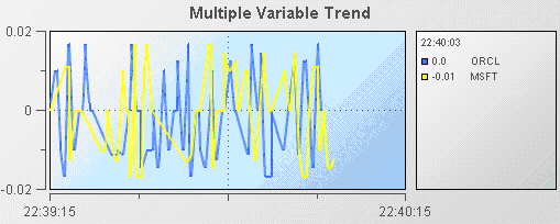
Trend charts are able to show up to 10 trace lines. This is useful for comparing changes in the values of multiple variables or fields. The following illustration shows the multiple variable trend chart from the Multiple Trend Lines tutorial sample.
Here the trend chart displays the Velocity of the stock price of two instances of the tutorial scenario; one where the Instrument is ORCL and the second where the Instrument is MSFT.
To recreate this sample, create a new dashboard and perform the following steps
1. From the Trends tab in the object palette, select the Multiple Variable Trend object and add it to the dashboard canvas.
The multiple and single variable trend objects are virtually the same. The only difference is that in the multiple variable trend object the traceCount property is set to 2. If you need to display more than two trace lines you can select either object and set the traceCount property to the number of traces needed.
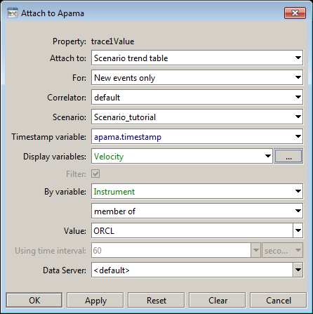
2. With the trend object selected, in the Object Properties panel, double-click the trend object's trace1ValueTable property and attach it to Apama by specifying the following information:
3. With the trend object selected, in the Object Properties panel, double-click the trend object's trace1Value property and attach it to Apama by specifying the following information:
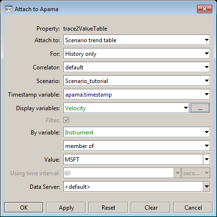
4. Attach the trace2ValueTable property to Apama by specifying the following information:
The trend chart will now chart the Velocity variable of the instances of the tutorial scenario which match the filters where Instrument equals ORCL and MSFT.
5. Attach the trace2Value property to Apama by specifying the following information:
The trend chart will now chart the Velocity variable of the instances of the tutorial scenario which match the filters where Instrument equals ORCL and MSFT.
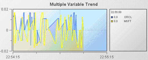
When displaying multiple traces, it is often useful to display them as filled regions. To specify this, select the traceFillStyle property and change its value to Transparent Gradient. The following illustration shows an example of a trend chart with filled regions.