HTML5 tables
The HTML5 table is an advanced HTML implementation of obj_table02 which provides enhanced filtering. The HTML5 table is available in the Thin Client only.
To display your data in a HTML5 table, select the Table (HTML5) table object instance in the Builder's Tables tab. One can also select any of the other table objects under Tables tab except the Rotated Table and check the webGridFlag property.
Requirements
HTML5 table appears in the Thin Client in any modern version of a supported browser. No plug-in is required. In older browsers which do not support HTML5, the HTML5 table will be rendered with the classic grid table. In this release, the HTML5 table is not supported on iPad.
Features
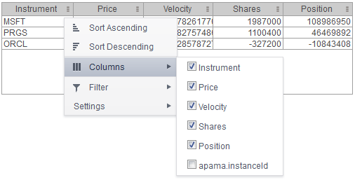
The HTML5 table supports advanced, interactive table features in the Thin Client: sorting on multiple columns, filtering on multiple columns, column resizing, column reordering, and hiding columns. In addition, you can unsort a previously selected sort column and, in a grid with rowHeaderEnabledFlag = true, additional columns can be locked into the row header. You can save all of those column settings permanently so that they are restored when you return to the display later. Many of these features are accessed from the column menu, shown in the screen shot above, opened by clicking on the menu icon in each column's header.
Also, for improved performance and usability, if a data table contains more than 200 rows the HTML5 table displays it in pages of 200 rows, using a page control that appears at the bottom of the grid.
Column Sorting
Click on a column header to sort the table by that column. On the first click, the column is sorted in ascending order. On the second click the column is sorted in descending order. On the third click, the column is returned to its original unsorted state. A sort on a string column is case-insensitive.
You can select multiple sort columns. In that case, the sorting is performed in the order that the column headers were clicked. Multiple column sorting is a very useful feature, but can also cause confusion if you intend to sort on a single column, but forget to "unsort" any previously selected sort columns first. You should check for the up/down sort icon in other column headers if a sort gives unexpected results.
Column sorting is reflected in an export to HTML and Excel.
Column Visibility
You can hide or show columns in the table by clicking on any column's menu icon, and choosing Columns from the menu. This opens a submenu with a checkbox for each column that toggles the visibility of the column. All columns in the data table appear in the Columns menu, even those that are initially hidden by the obj_table02 property columnsToHide.
If the grid has the rowHeaderEnabledFlag property checked then the leftmost column (the row header column) cannot be hidden.
Column visibility changes are not reflected in an export to HTML and Excel.
Column Filtering
You can create a filter on any column. If filters are created on multiple columns, only the rows that pass all of the filters are displayed.
The background of a column's menu icon changes to white to indicate that a filter is defined on that column. This is intended to remind you which columns are filtered.
You can configure a filter on any column by clicking on the column's menu icon and choosing Filter from the menu. This opens the Column Filter dialog.
Options in the Column Filter dialog vary according to the data type of the selected column:
 String columns
: You can enter a filter string such as "abc" and, from the dropdown list, select the operator (equal to, not equal to, starts with, contains, etc) to be used when comparing the filter string to each string in the column. All of the filter comparisons on strings are case-insensitive. You can optionally enter a second filter string (e.g. "xyz") and specify if an AND or OR combination should be used to combine the first and second filter results on the column.
Numeric columns: You can enter numeric filter values and select arithmetic comparison operators, (=, !=, >, >=, <, <=). You can optionally enter a second filter value and comparison operator, and specify if an AND or OR combination should be used to combine the first and second filter results.
Boolean columns: You simply select whether matching items should be true or false.
Date columns: You can select a date and time, and choose whether matching items should have a timestamp that is same as, before, or after the filter time. The date is selected by clicking the calendar icon and picking a date from the
Calendar dialog. The time is selected by clicking the time icon and picking a time from the dropdown list. Alternatively, a date and time can be typed in the edit box.
Data updates to the grid are suspended while the filter menu is opened. The updates are applied when the menu is closed.
Column filtering is reflected in an export to HTML and Excel.
Column Locking
This feature is available only if the obj_table02 instance has the row header feature enabled (rowHeaderEnabledFlag is checked). If so, the leftmost column is "locked" in position, that is it does not scroll horizontally with the other columns in the table. If the row header is enabled, then two items labeled Lock and Unlock appear in the column menu. These can be used to add or remove additional columns from the non-scrolling row header area.
If the row header is enabled, at least one column must remain locked.
Column locking is not reflected in an export to HTML and Excel.
Column Reordering
You can reorder the grid columns by dragging and dropping a column's header into another position. If the grid has rowHeaderEnabledFlag checked, then dragging a column into or out of the row header area (the leftmost columns) is equivalent to locking or unlocking the column.
Column reordering is not reflected in an export to HTML and Excel.
Paging
If the data table contains more than one page of rows, the page controls are displayed at the bottom of the grid. The default page size is 200 but can be set on each obj_table02 instance via the new property named webGridRowsPerPage. The default value of that property is zero, which indicates that the default size (200) should be used. If the height of the grid is less than 64 pixels, there is insufficient space to display the page controls so only the rows on the first page will be viewable.
Row Mouseover
A new property named webGridHoverColor is available on obj_table02. It is visible only if webGridFlag = true . The default value of webGridHoverColor is checked. If it is set to any other color index value, then that color is used to highlight the row that is under the mouse cursor. But if the obj_table02 filterProperties feature is used to color rows, that color takes precedence, so the webGridHoverColor may not be useful in those cases. Also, if the row header is enabled, the row header column and the other columns are highlighted separately, according to which section of the grid the mouse is over.
Saving Settings
You can permanently save all of the custom settings made to the grid, including filtering, sorting, column size (width), column order, column visibility, and column locking. This is done by opening any column menu, clicking Settings , and then clicking Save All.
The grid's settings are written as an item in the browser's local storage. The item's value is a string containing the grid's settings. The item uses a unique key comprised of the URL path name, the display name, and the obj_table02 instance's RTView object name. If the Thin Client's login feature is enabled, the key will also include the username and role, so different settings can be saved for each user and role for a grid on any given display, in the same browser and host.
If the user saves the grid settings and navigates away from the display or closes the browser, then the next time the user returns to the display in the same browser, the settings are retrieved from the browser's local storage and applied to the grid. The browser's local storage items are persistent, so the grid settings are preserved if the browser is closed and reopened or if the host system is restarted.
If the obj_table02 has autoResizeFlag = true, then the column widths are not restored from the saved settings, and the values computed by the auto-resize feature are used instead. This is by design.
You can delete the grid's item from local storage by clicking Settings -> Clear All in any column menu. This permanently deletes the saved settings for the grid and returns the grid to the state defined in the display file. Note that each browser has its own local storage on each host. The local storage items are not shared between browsers on the same host or on different hosts. So, if a user logs in as Joe with role = admin in Internet Explorer on host H1, and saves grid settings for display X, then those grid settings are restored each time a user logs in as Joe, role admin, on host H1 and opens display X in Internet Explorer. But if all the same is true except that the browser is Chrome, then the settings saved in Internet Explorer are not applied. Or if the user is Joe and role is admin and the browser is Internet Explorer and the display is X, but the host system is H2 not H1, then the grid settings saved on H1 are not applied.
Support for Large Tables
The HTML5 table can support data tables with many rows and columns. However, for best performance the display server's cellsperpage property should be specified so that the server sends large tables to the client in pages, rather than sending all of the rows. In this server paging mode, large tables are also filtered and sorted in the Display Server, to improve performance and decrease data traffic. See the RTView documentation for a description of the cellsperpage property, and the related cellsperexport and cellsperreport properties. A typical value for cellsperpage is 20000.
Unsupported obj_table02 Features
The following are existing features of obj_table02 that are not supported by the HTML5 table:
The
rowHeaderEnabledFlag property is supported, but
rowHeaderBgColor,
rowHeaderTextColor,
rowHeaderTextFont,
rowHeaderTextSize are ignored. Instead the row header column is rendered like all other columns.
The
columnResizeEnabledFlag is ignored if it is false, the HTML5 table always allows column resizing.
The
editDataEnabledFlag is ignored, the table editing feature using custom commands is currently not supported.
Other limitations, and differences between the new and classic grids:
Time zones: The strings shown in a date column are formatted by the display server using its time zone. But if a filter is specified on a date column, the date and time for the filter are computed using the client system's time zone. This can be confusing if the display server and client are in different time zones.
Selected rows: The grid's row selection is cleared if the sort is changed or if columns are resized or reordered.
Scrollbars: In general the grid only displays scrollbars when they are needed. However, the HTML5 table and the classic grid use different algorithms for deciding when to show or hide scrollbars, and do not use identical row heights and column widths. So the HTML5 table may sometimes display scrollbars when the classic grid does not, for a grid instance with a given width and height.
Keyboard traversal: In the classic grid, selecting a row and then using the up/down arrow keys changes the selection to the previous/next row. In the HTML5 table, the arrow keys moves the keyboard focus to another row, as indicated by a highlight border around the focused table cell, but the user must press the space bar to select the row that contains the highlighted (focused) cell.
Column widths: On a HTML5 table with no locked columns (
rowHeaderEnabledFlag = false), columns expand to fill any unused width in the table, even if
autoResizeFlag = false. That is, if the total width of the columns is less than the grid width (ie. the columns don't use all of the available width) then each column is expanded proportionally to fill the table. In contrast, the classic and Swing (Viewer) grids just leave unused space at the right edge of the grid. If the grid has locked columns (
rowHeaderEnabledFlag = true), then the HTML5 table behaves the same as the classic and Swing grids.
Export: The export to HTML and export to excel features are supported on the HTML5 table, and behave much the same as on the classic grid. The exported table respects the grid's filter and sort settings but ignores any column reordering, sizing, or hiding changes made by the user.
Data updates to the grid are suspended while the filter menu is opened. The updates are applied when the menu is closed.